This Place

Brand Strategy, Visual Identity System, Packaging, Editorial Content, Tone of Voice

Image showing the four tubes and their boxes on a gray seamless. The tubes are either green, soft pink, yellow, or charcoal gray.
Challenge

This Place tasked YummyColours to combine a medically-backed CBD product line with a lifestyle brand experience with deep thought leadership/customer education. The German brand of CBD cream needed strategy, design, a tone of voice, product naming, and editorial direction from YummyColours.

Solution

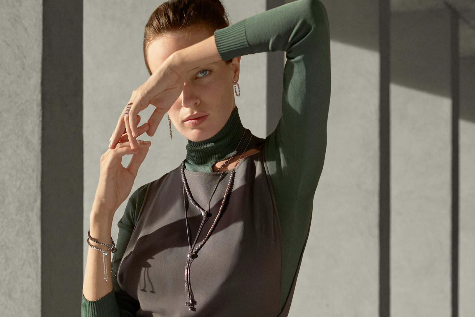
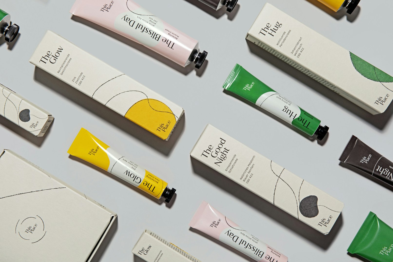
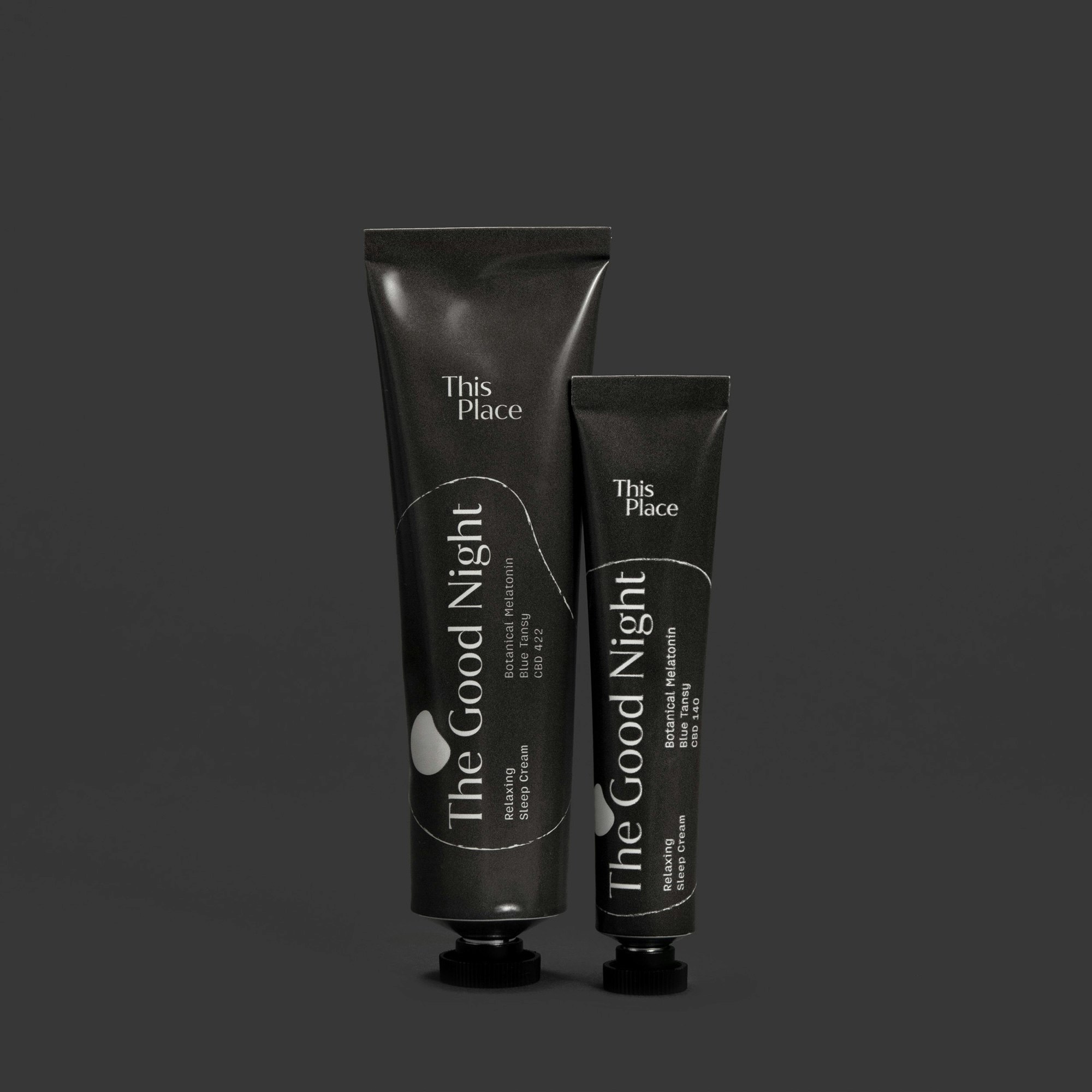
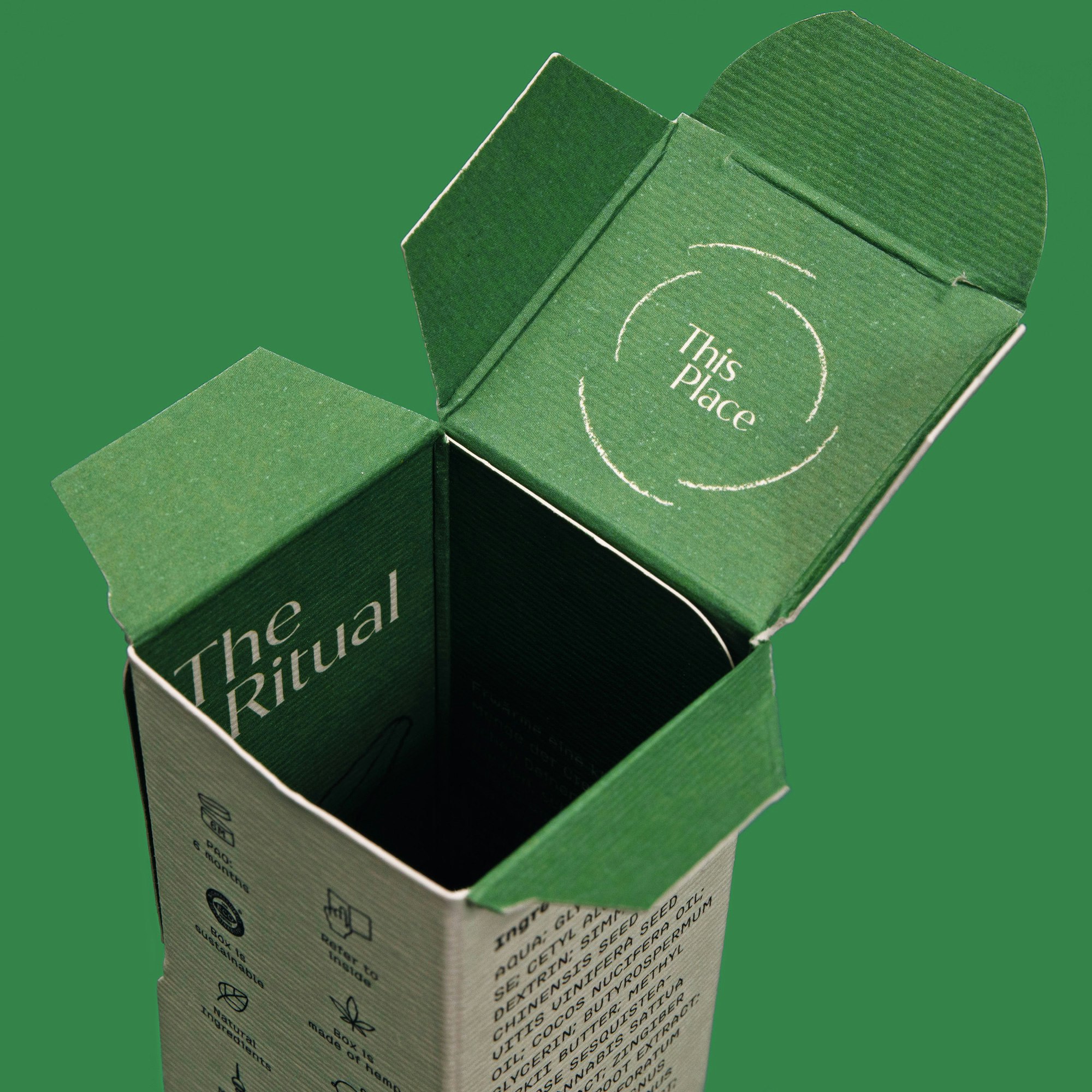
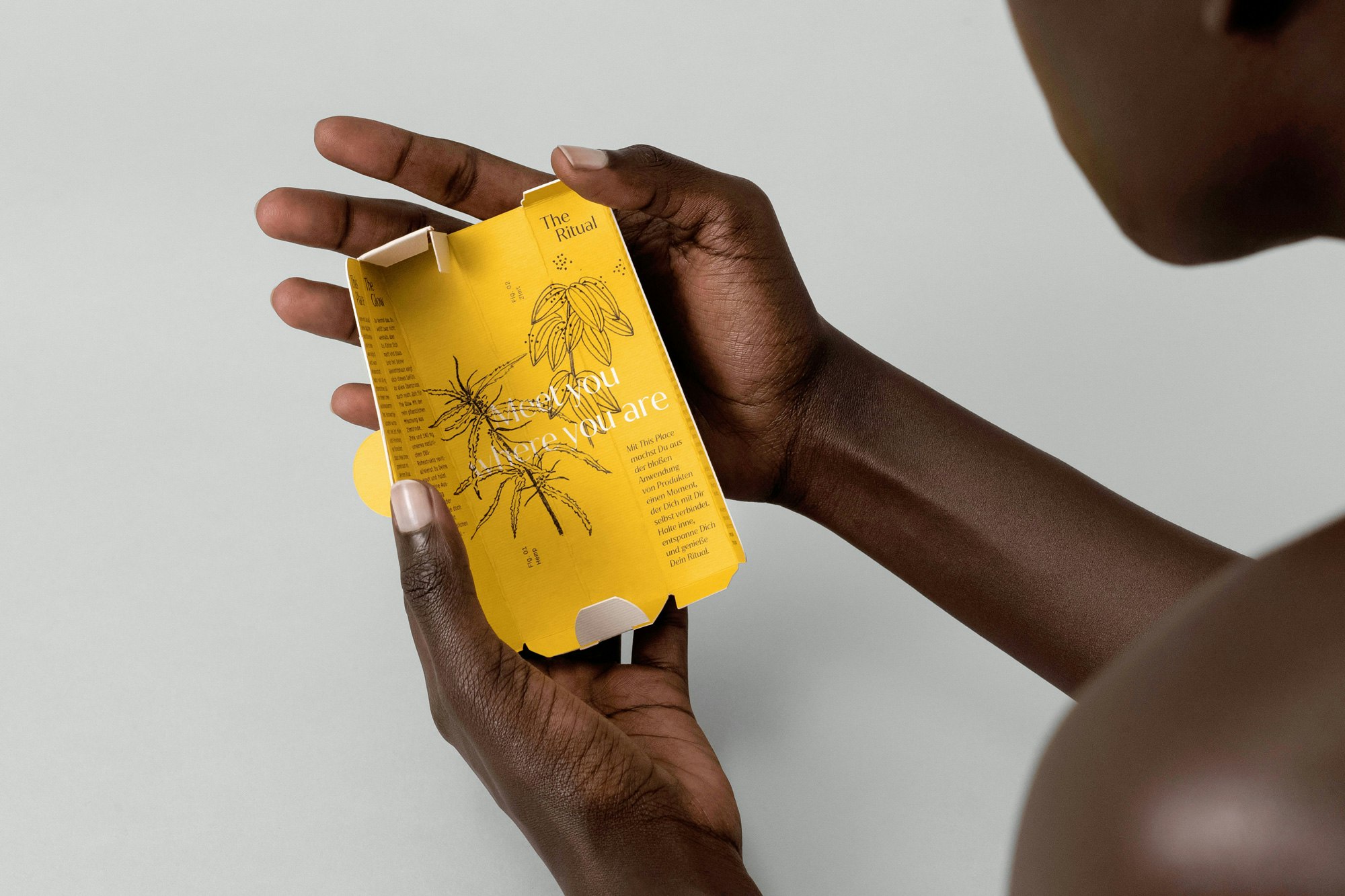
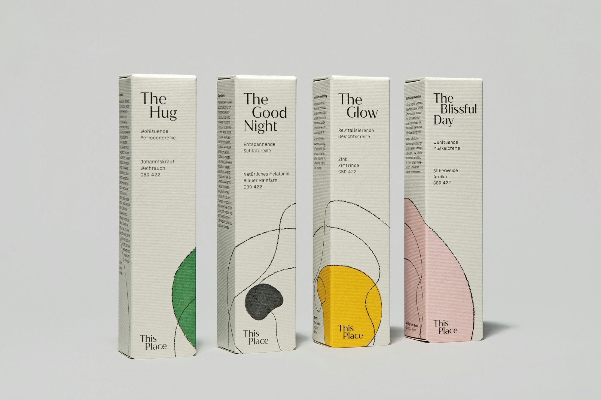
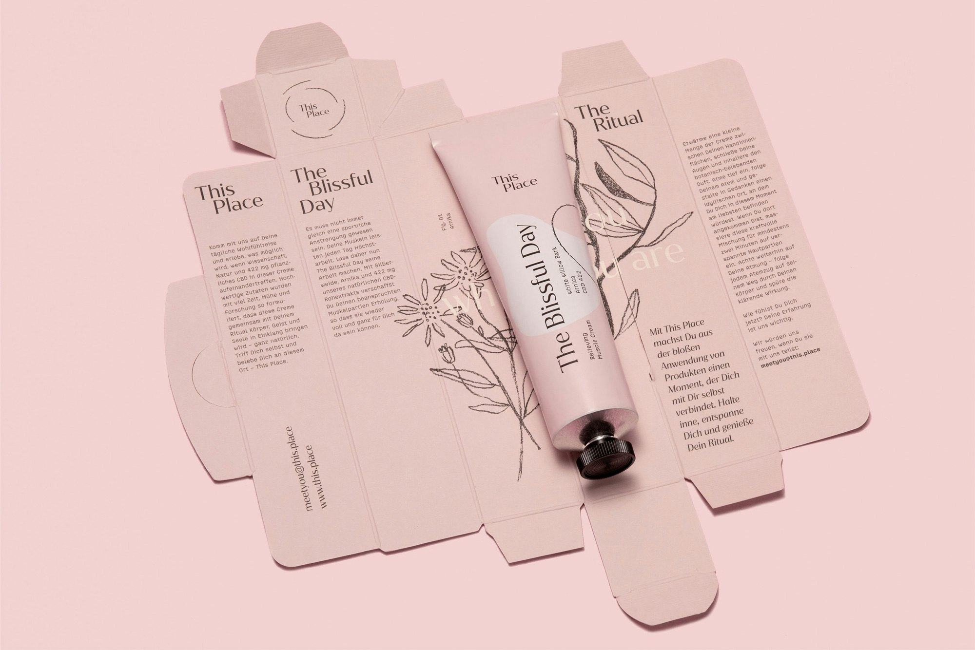
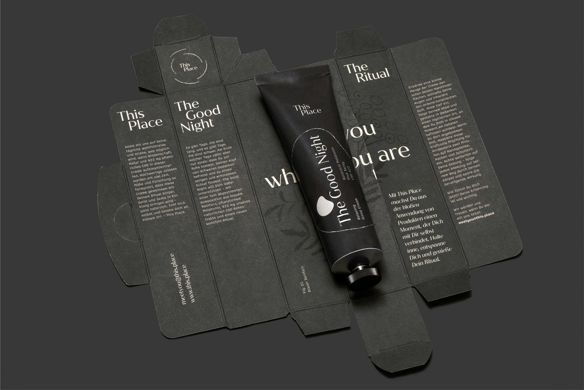
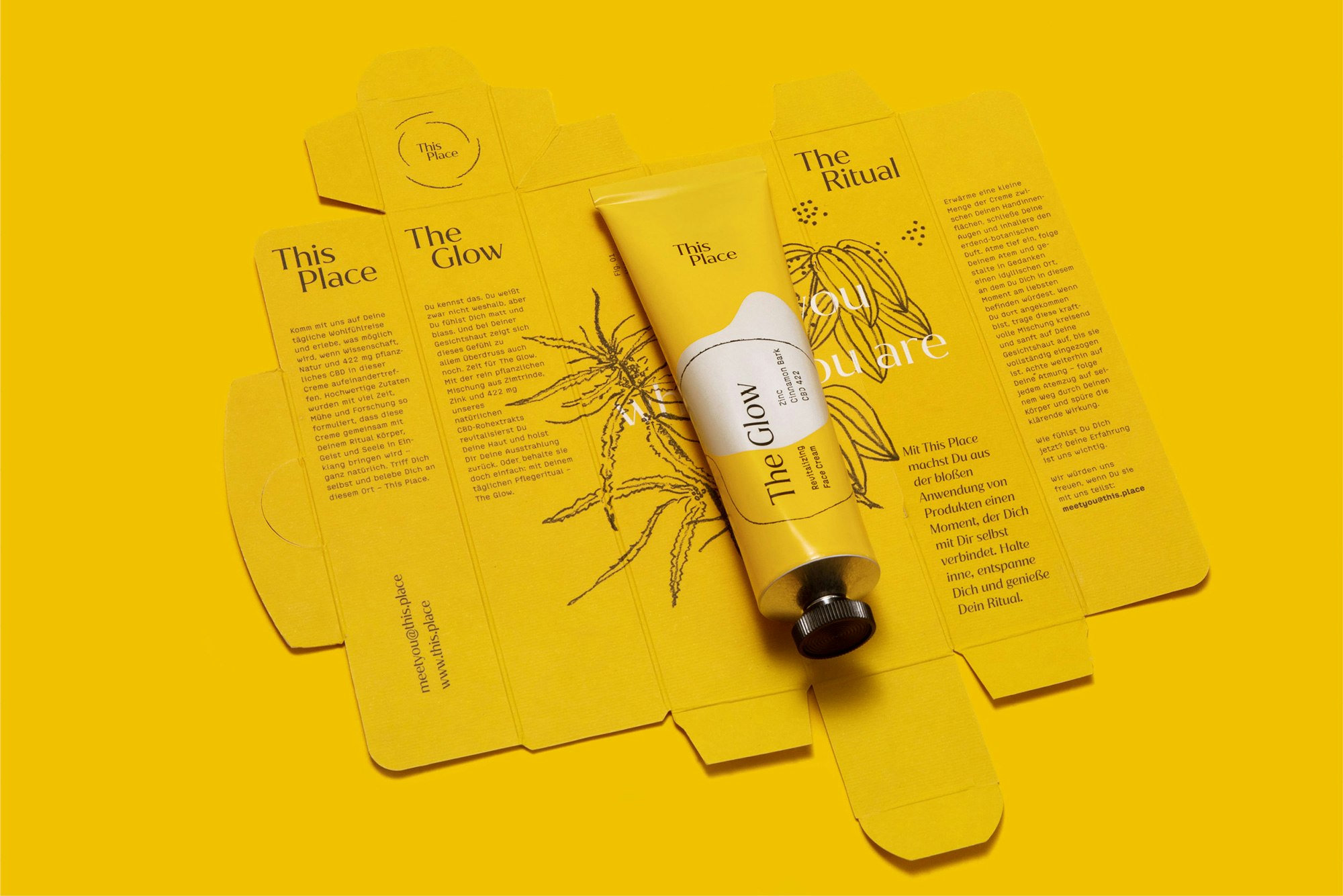
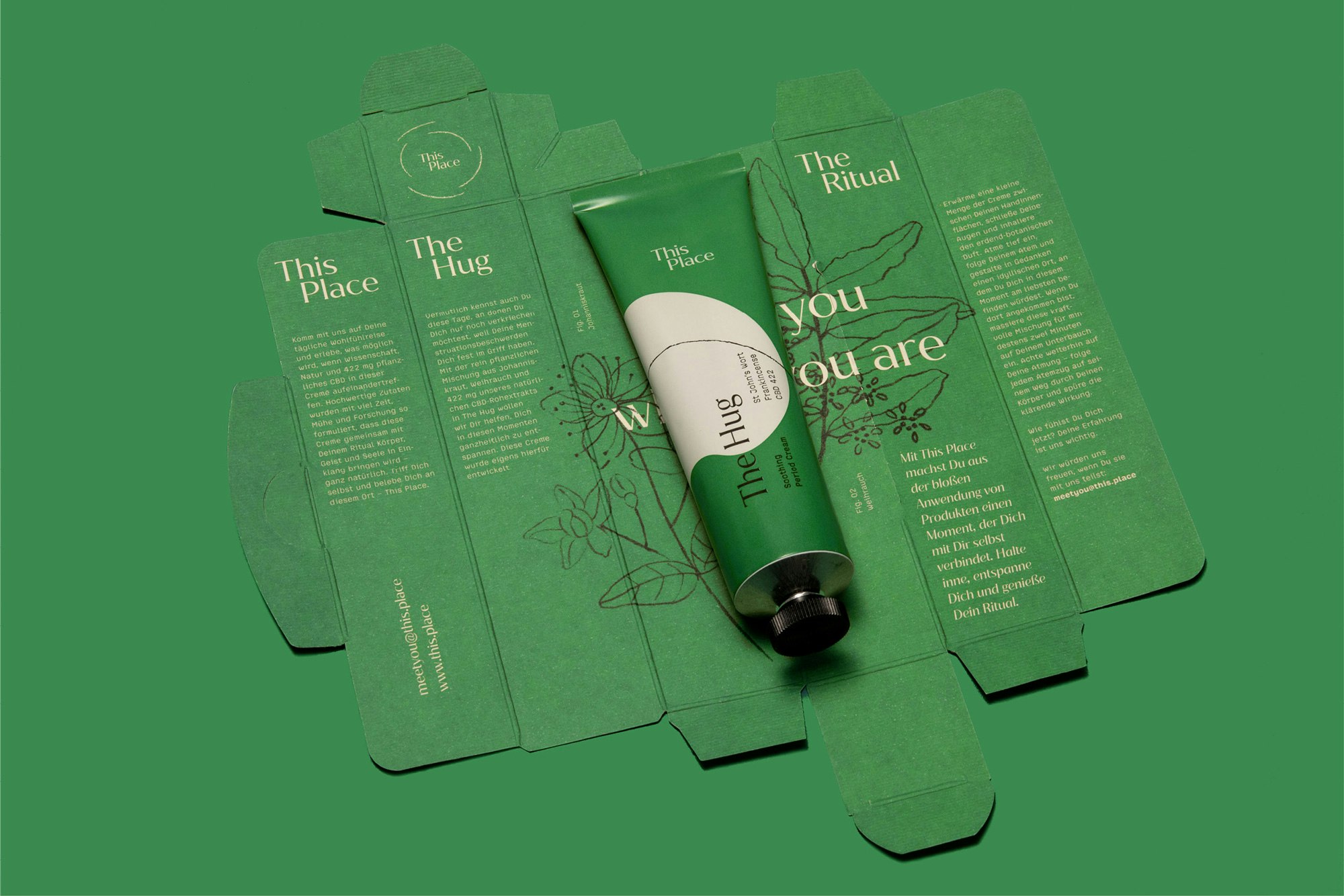
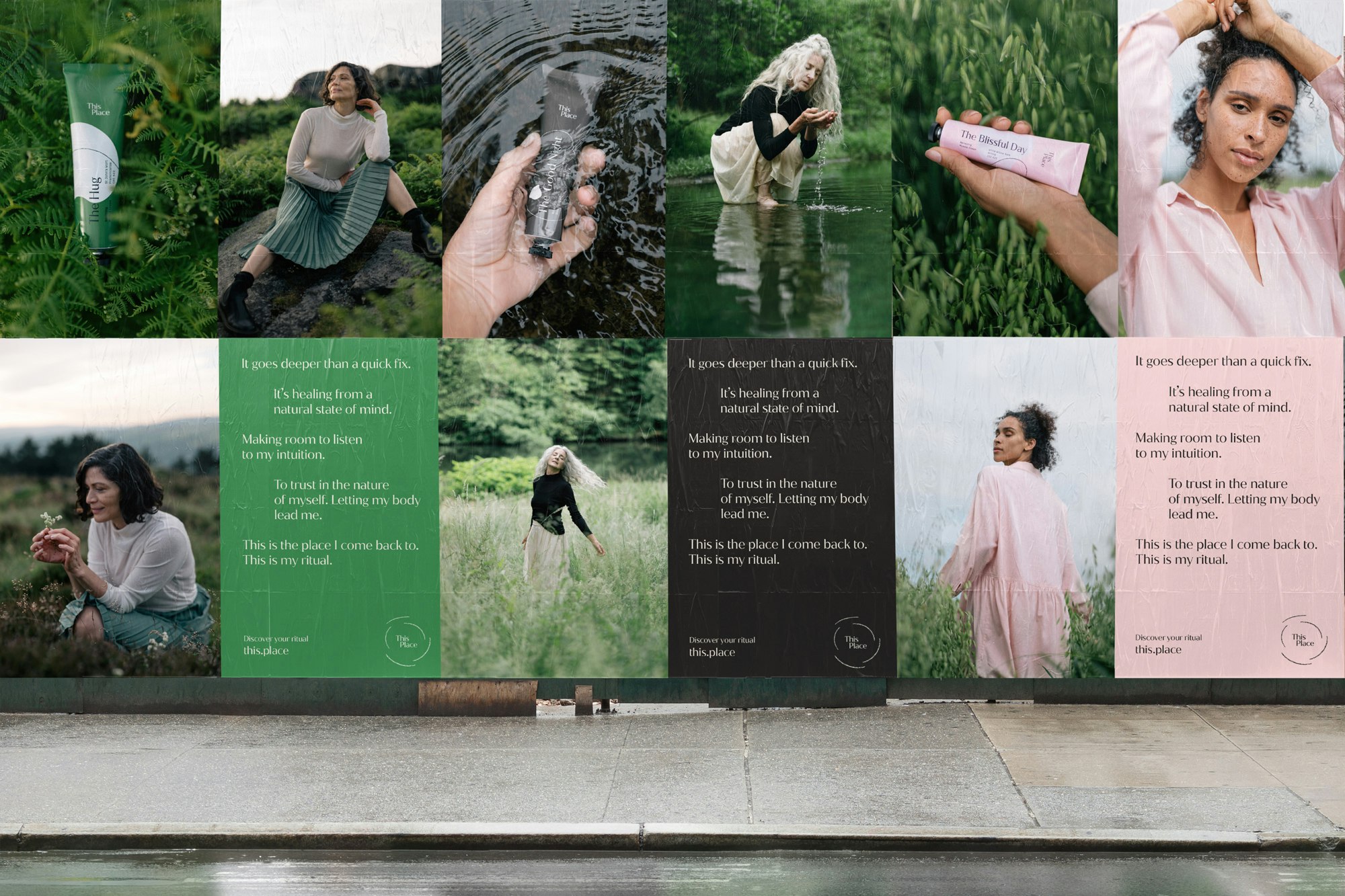
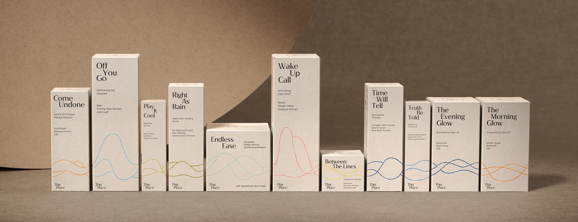
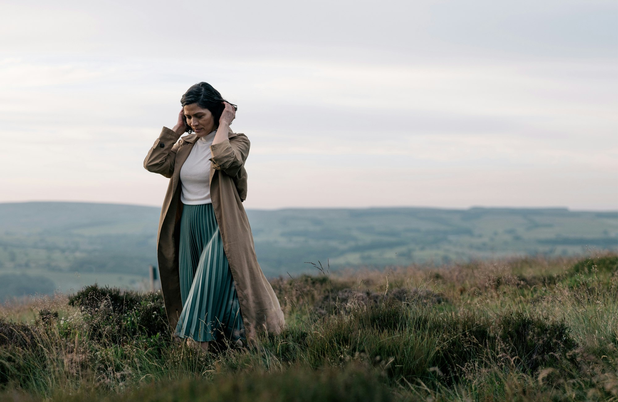
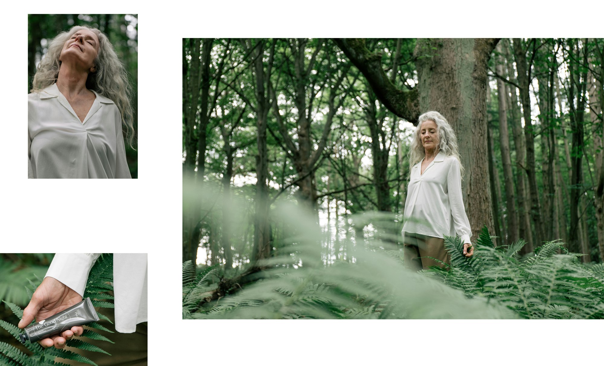
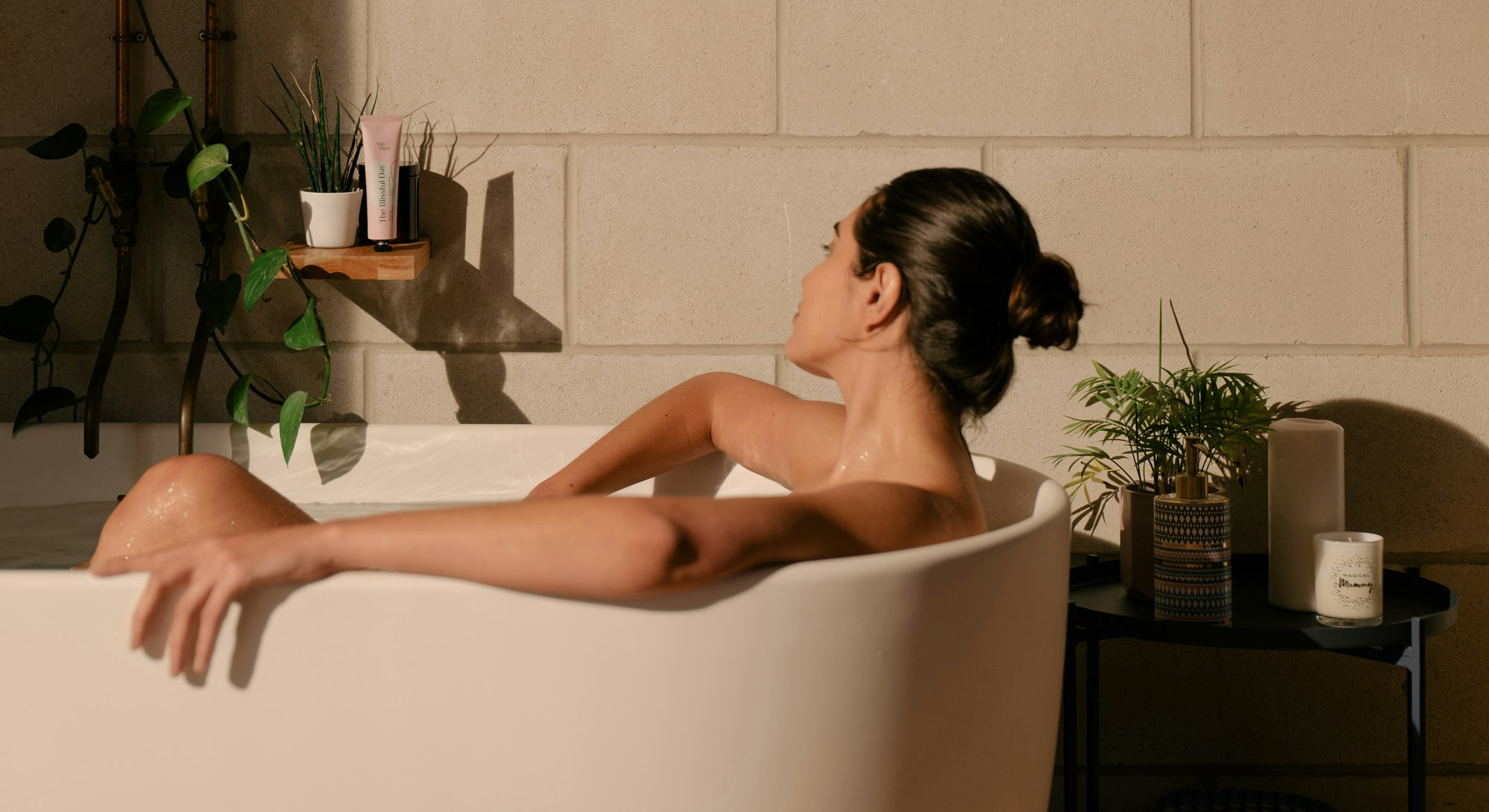
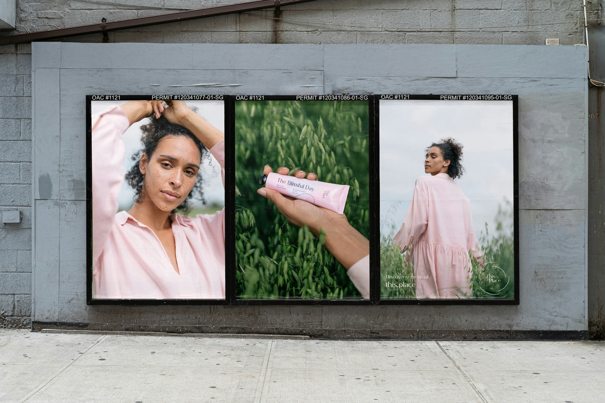
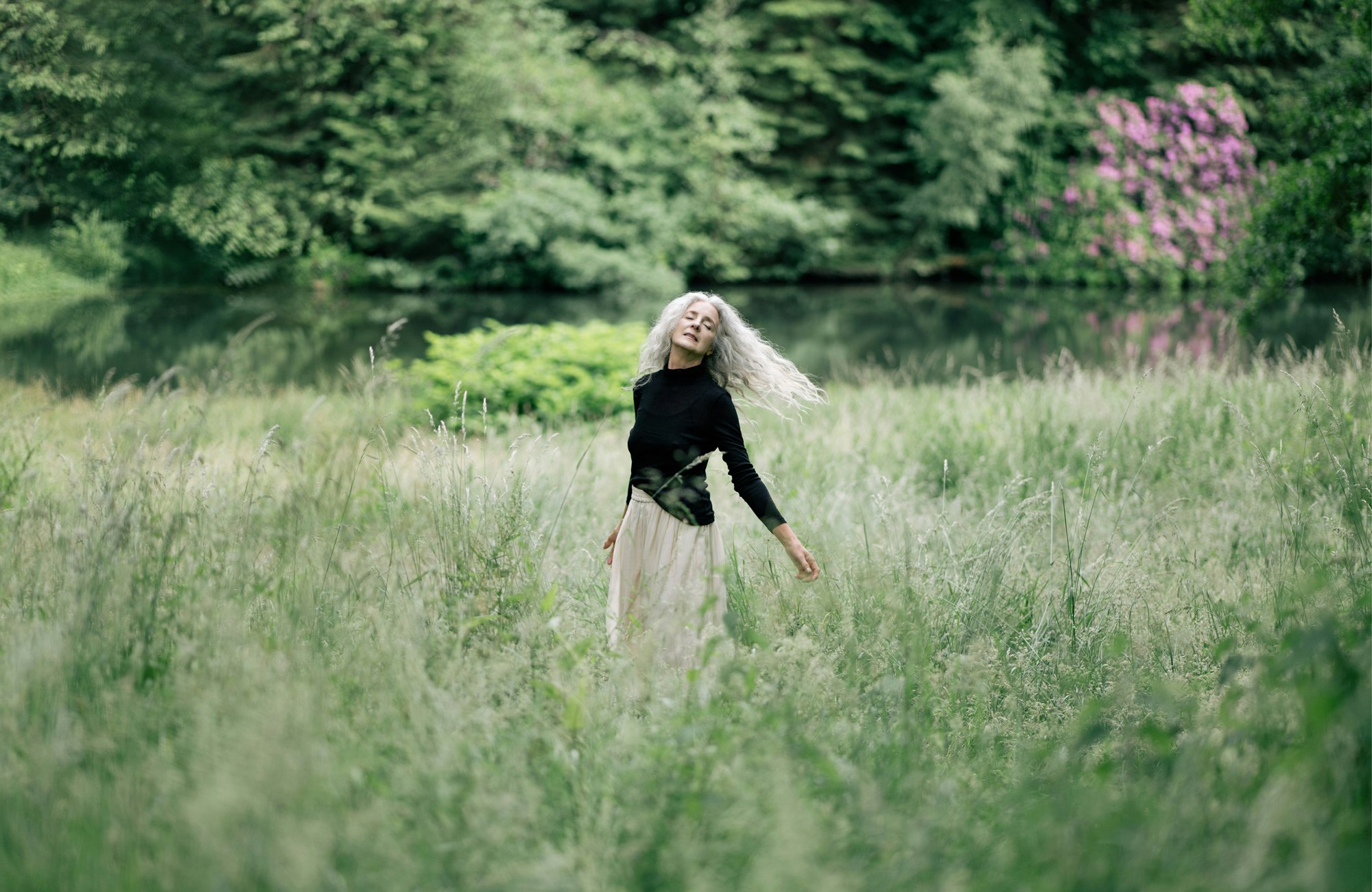
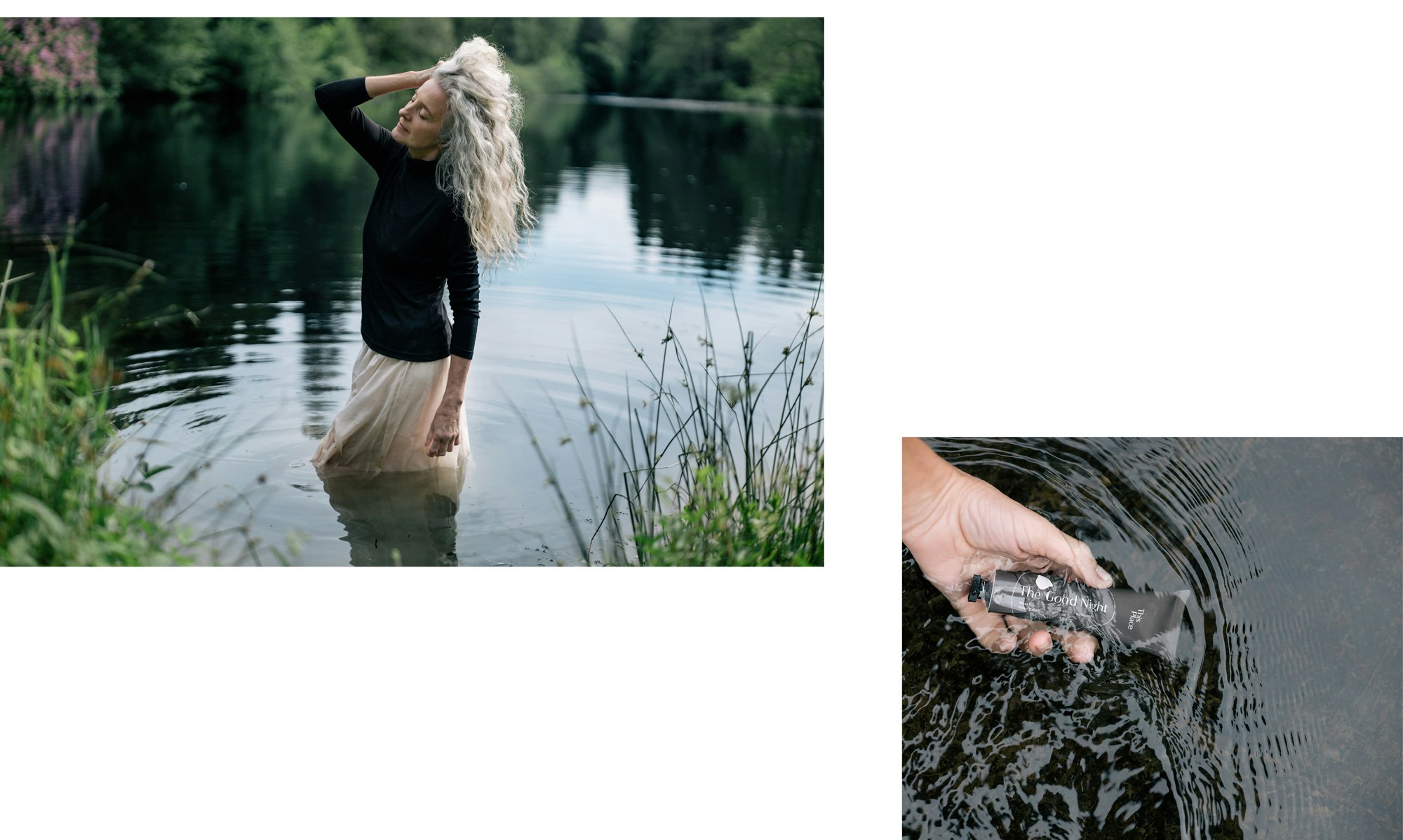
Through the kickoff in Berlin, where the two teams spent days together envisioning, explaining, and educating on the science and the brand, YummyColours saw a clear direction for This Place - a focus on women and more experiential than a topical cream line. YC came up with the idea of This Place based on the concept of organic connection inspired by the product’s natural ingredients and architectural spaces that people can pass through freely. The name, naming system, and visual identity are developed through this concept, and the packaging system further highlights the idea of the inner/outer where each individual box is a part of the whole by connecting through a hand-drawn illustration. YummyColours went beyond the brand, beyond the product design, and created “the first German wellness platform around CBD and natural scientific healing.”

Yellow tube on a yellow seamless. Animation showing the tube rolling up and down.
Photo showing two green tubes on a green seamless. The Hug is written across the tubes in black type.
Two pink tubes standing on a pink seamless. The blissful day is written in black across the tubes.
Two charcoal colored tubes standing on a charcoal seamless. The Good Night is written across the tubes in cream type.

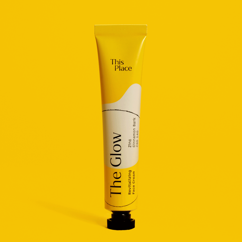
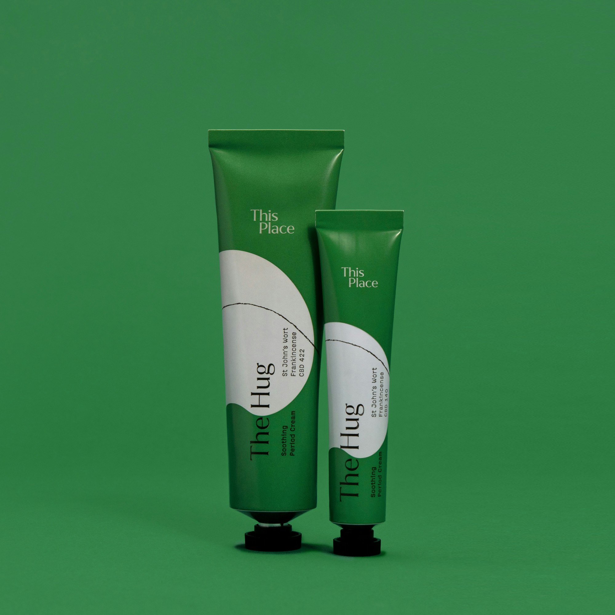
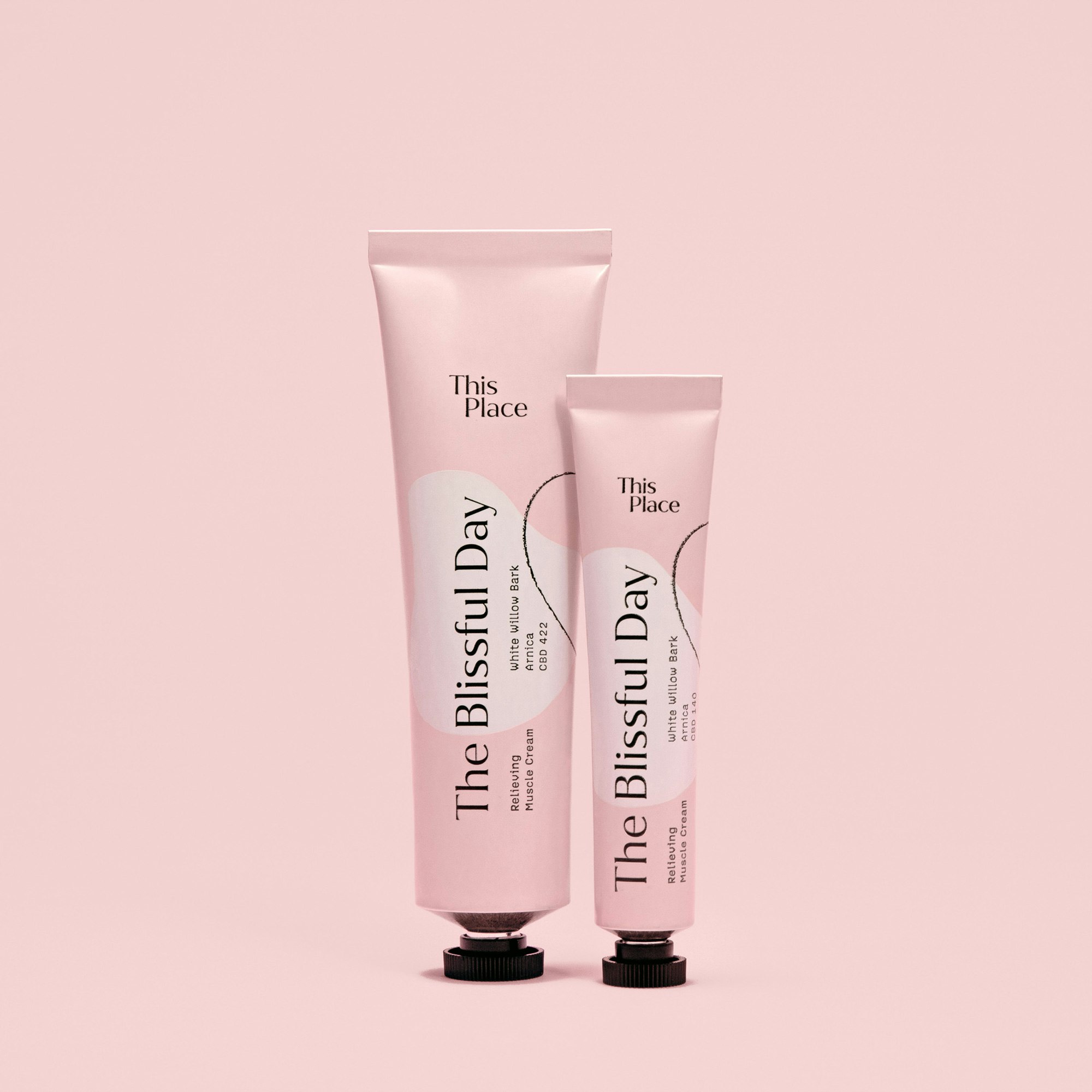
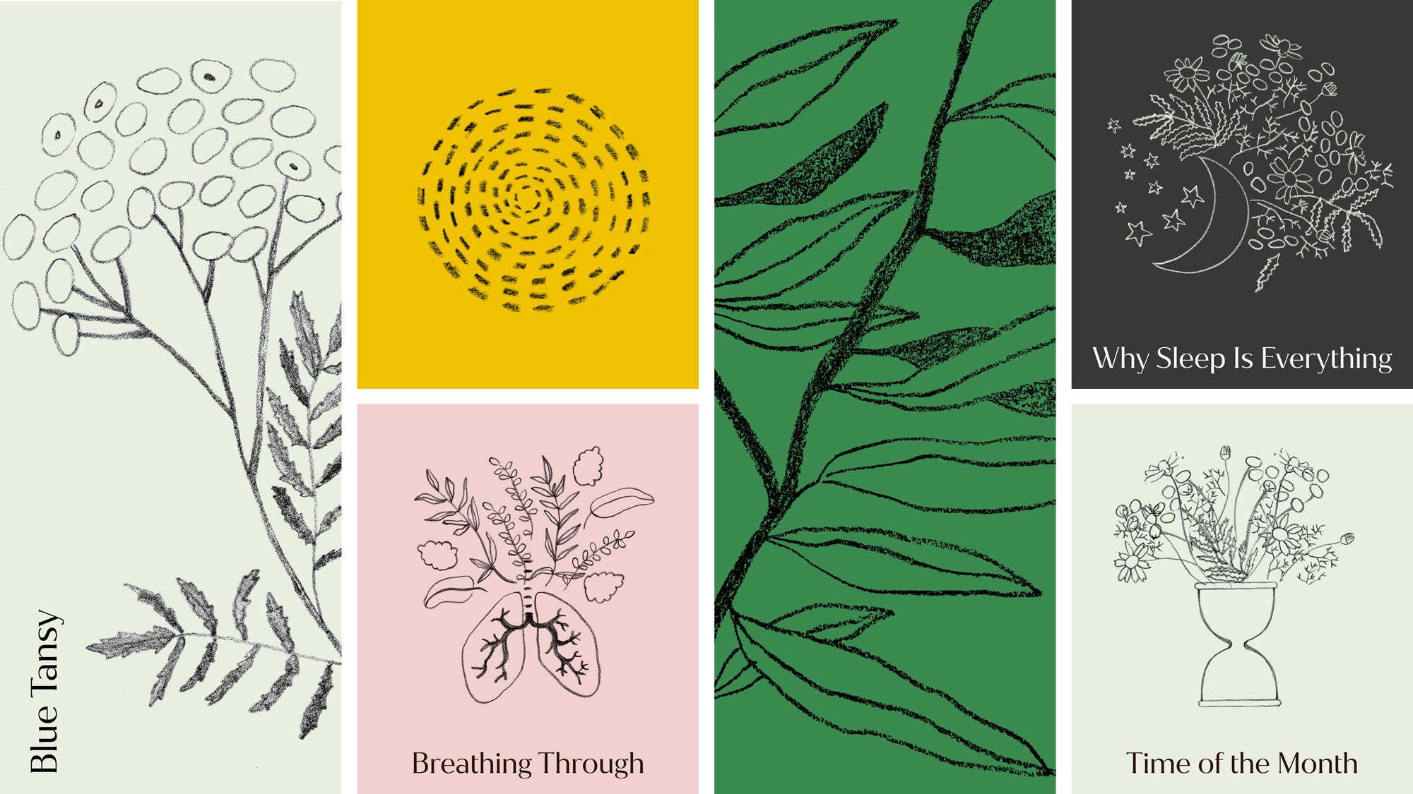
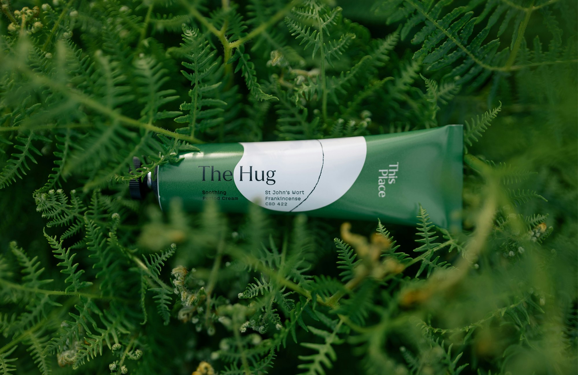
Prompted by the brand’s desire to embrace an organic, handmade aesthetic, the line artwork used in the logo and on the packaging illustrations was created by drawing lines using a wax pencil on a masonry surface and digitizing them.

Photo showing a closeup of the green packaging with the top open revealing the logo printed inside.
Unmute
Photo showing person holding the packaging open, reading the inside writing on the ingredients.
A photo of some of the ingredients in the creams. There is a pink flower, a small glass bottle with an orange oil, and a handful of hazelnuts. In the background there is a wooden bowl with a few dark grey pebbles inside.
A photo of a radiant old person, eyes closed, wavy hair tied back. They are wearing a soft green robe and holding their hands up close to their face. They are smiling, looking joyful.
Charcoal textured lines showing organic shapes on a cream ground.
Cream type on a green ground showing the three brand fonts.

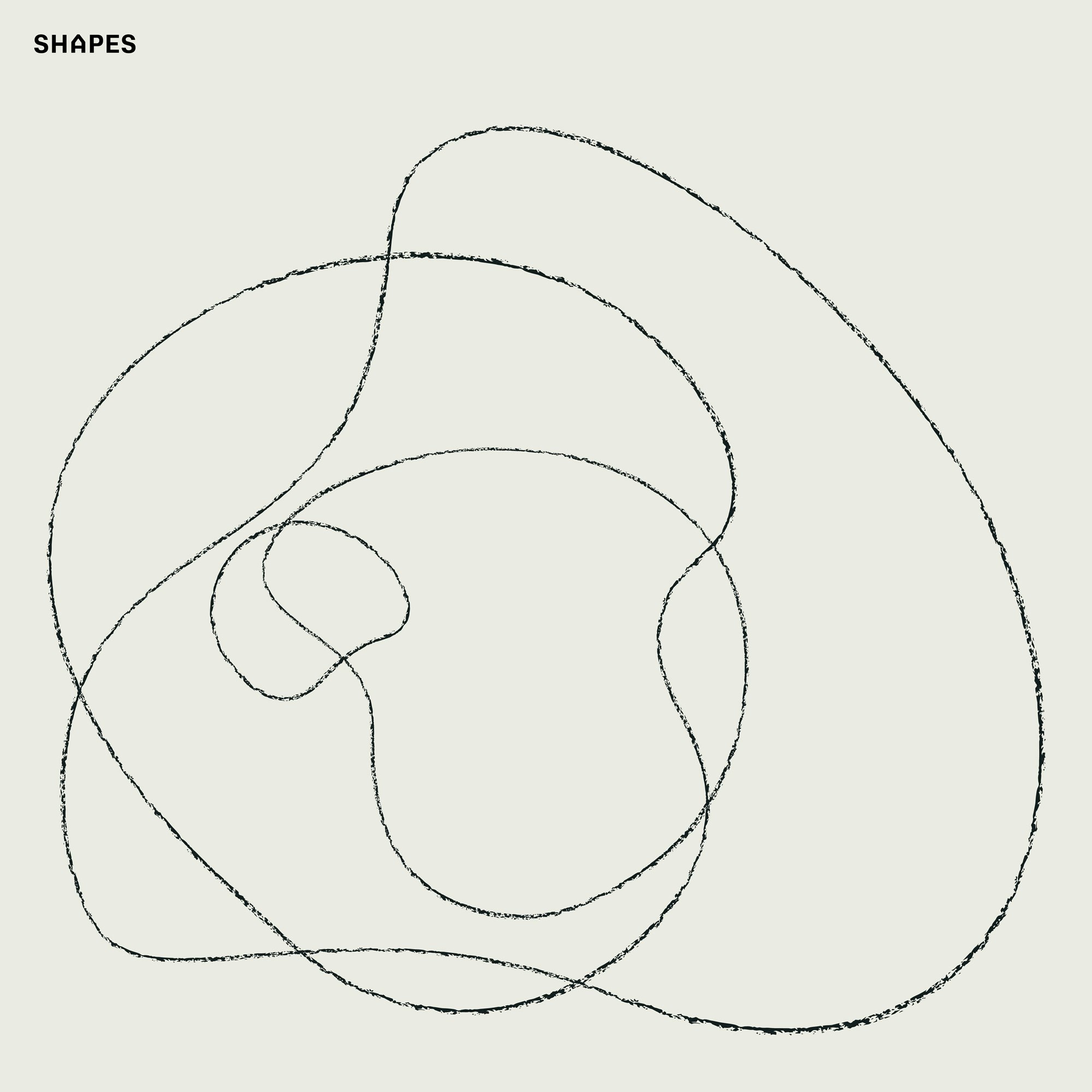
Each product has an associated shape that is used on packaging and informational digital content. The four shapes come together to form an abstract illustration that can grow with the addition of future products.

Image showing the fours tubes packaging on a gray seamless.
Image showing the pink tube lying on top of the open, flattened packaging.
Image showing the charcoal tube lying on top of the open, flattened packaging.
Image showing the yellow tube lying on top of the open, flattened packaging.
Image showing the green tube lying on top of the open, flattened packaging.
ooh english web
A 3D rendering showing 12 different size boxes next to each other. There are multi-colored lines connecting the boxes across the front.
A collection of illustrations showing the plants that are part of the ingredients as well as the topics the brand covers (sleeping, menstruation, aches, etc).

Working with the YummyColours team was a truly unique experience. First, the outstanding analytical ability to think deeply, creating a foundation based on market analysis that our team can rely on moving forward. Second, the incredible taste and sense of design. I always felt that YC was building something unique and tailored specifically to our project rather than an agency cookie-cutter solution.

— Laura Simonow
CEO & Founder This Place
Unmute
Photo showing a happy person smiling while putting on a face cream using both hands. Their long dark hair is brushed back behind their shoulders and they wear light rose pajamas.
A photo showing two pomegranates, one cut in half, as well as two prickly pears and four ginko leaves.
Image showing how the brand should organize their Instagram feed alternating between ingredients, influencers, etc.
Unmute
22 ThisPlace6
22 ThisPlace2
22 ThisPlace
22 OOH-Web
22 ThisPlace3
Unmute
22 ThisPlace4
22 ThisPlace8
Credits
Creative Direction:

Diego Marini, Connie Lui, Denize Maaløe

Design:

Katie Osborne, Mia Le

PM:

Krystal Greven, Jen Holsman

Strategy:

Thea Hughes, Kassia Graham

Copywriting:

Hardeep Gill

3D Rendering:
Photography Still:
Animation:

Friction FX

Lifestyle Photography:

Jacob James, Daniel Farò

DP:

Adam Lyon

Production:

Sophie Kingsley, Amelie Rehm

Styling:

Isabel Lea, Imogen Lea

Hair / Makeup:

Amanda Cordoza, Anna Neugebauer, Susanna Jonas

Post Production:

Studio Atypical

Props:

Pelin Gebhard

Other projects

This website uses cookies to enhance your browsing experience.

Accept