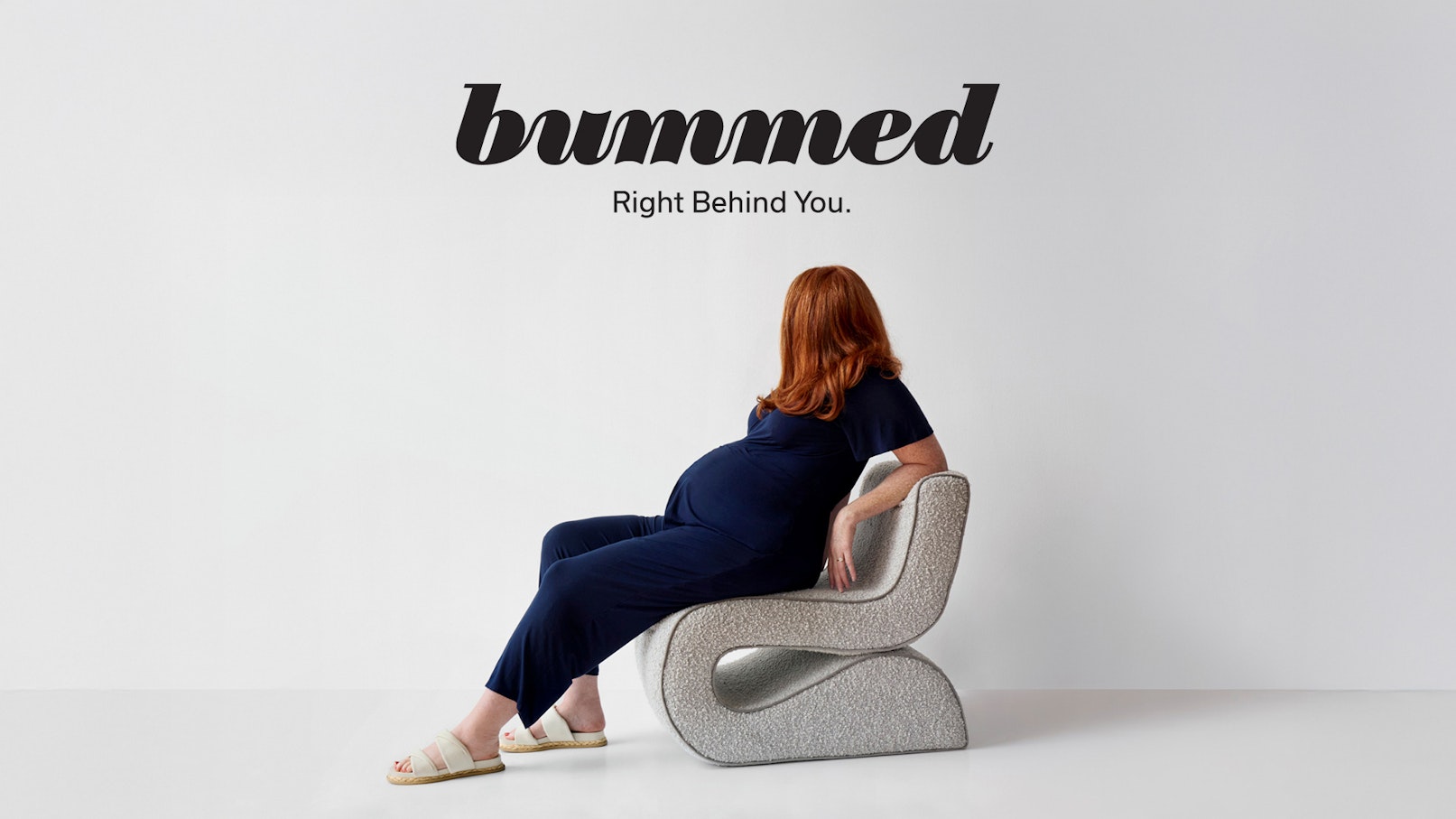
Bummed
Brand Strategy, Visual Identity
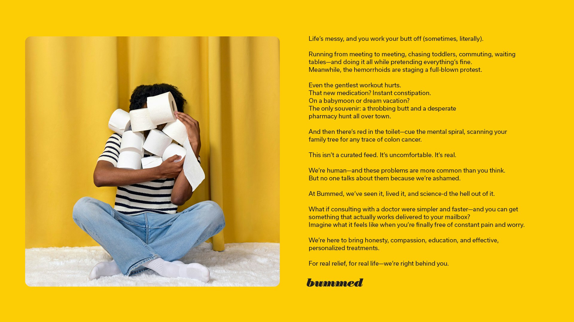
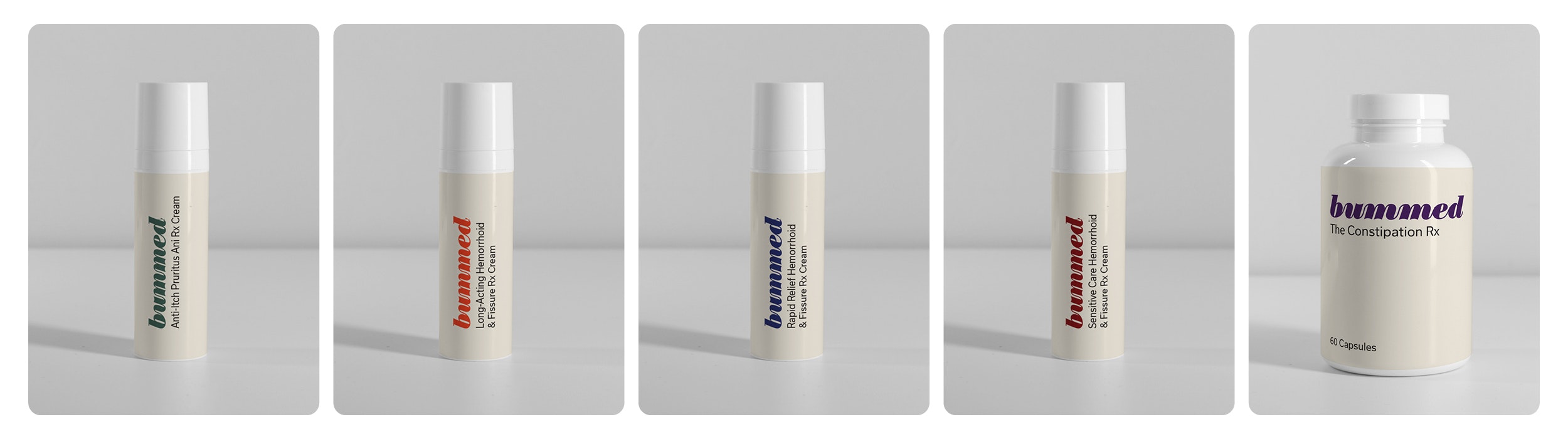
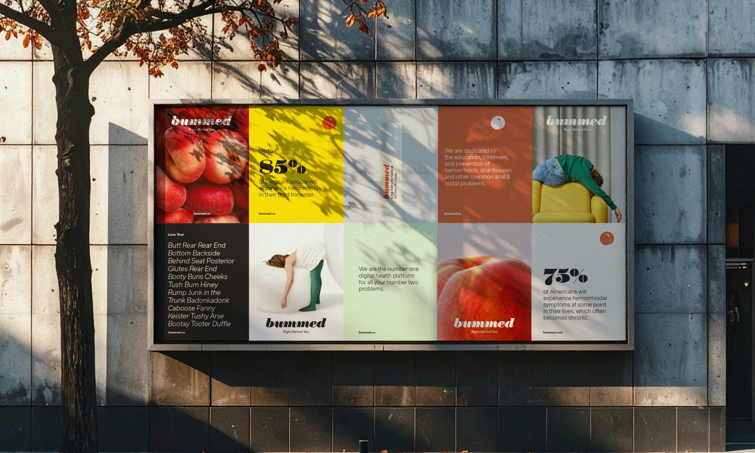
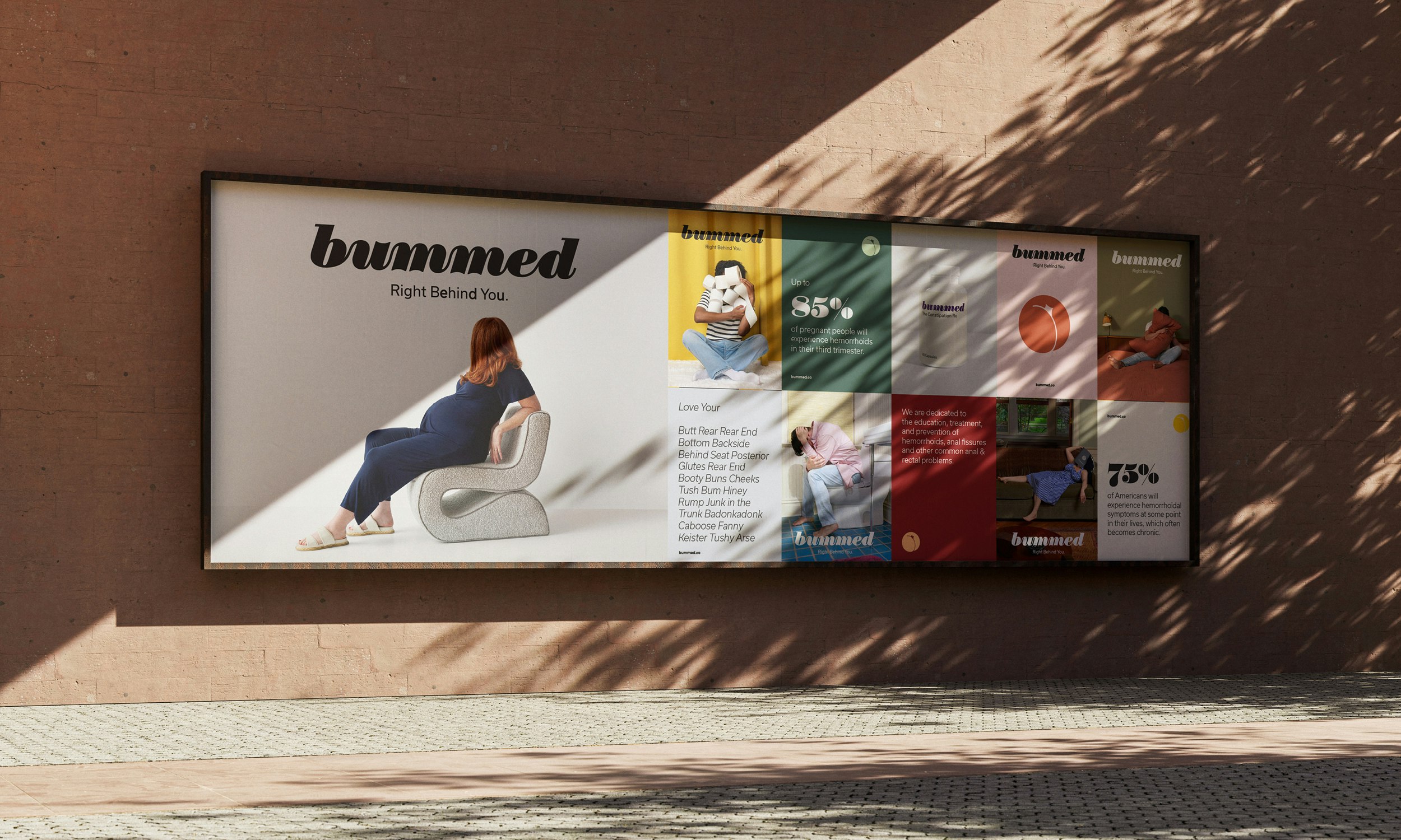
Bummed partnered with YummyColours to build the very first telehealth brand focused on anorectal care. Founded by two brilliant women in telehealth, Jenny and Rebecca, the company emerged from their deep personal experiences navigating treatment that was often inaccessible and expensive. They also discovered that there has been very little education around hemorrhoids, fissures, and constipation, and that innovation in the OTC sector has been minimal until recently. As a result, most existing products treat only the symptoms, not the underlying problems.
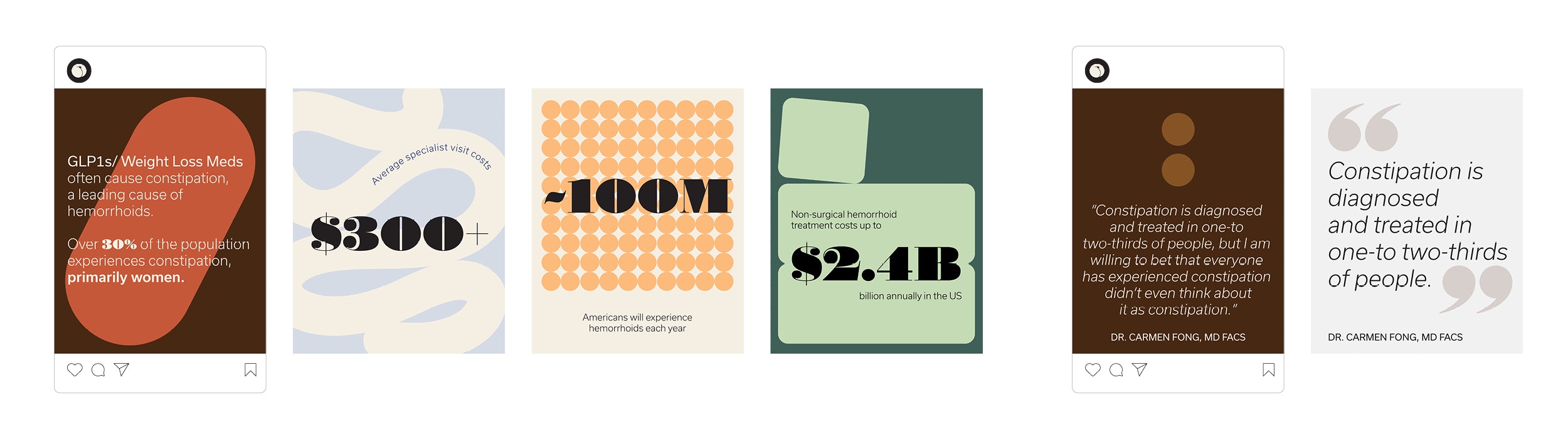
Their research uncovered several critical insights: 75% of Americans will experience hemorrhoidal symptoms at some point in their lives; 85% of pregnant people will experience hemorrhoids in their third trimester; and with the rise of GLP-1s, many more people are experiencing constipation—a leading cause of hemorrhoids. Together with their Chief Medical Officer, Dr. Carmen Fong, they are formulating custom compounded medication to treat root causes, as well as offering preventative care and education for everyone.
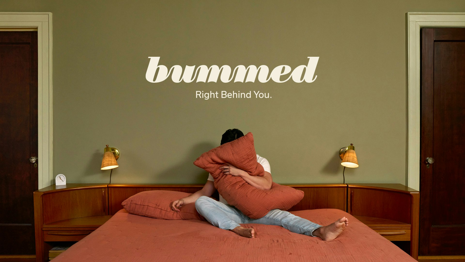
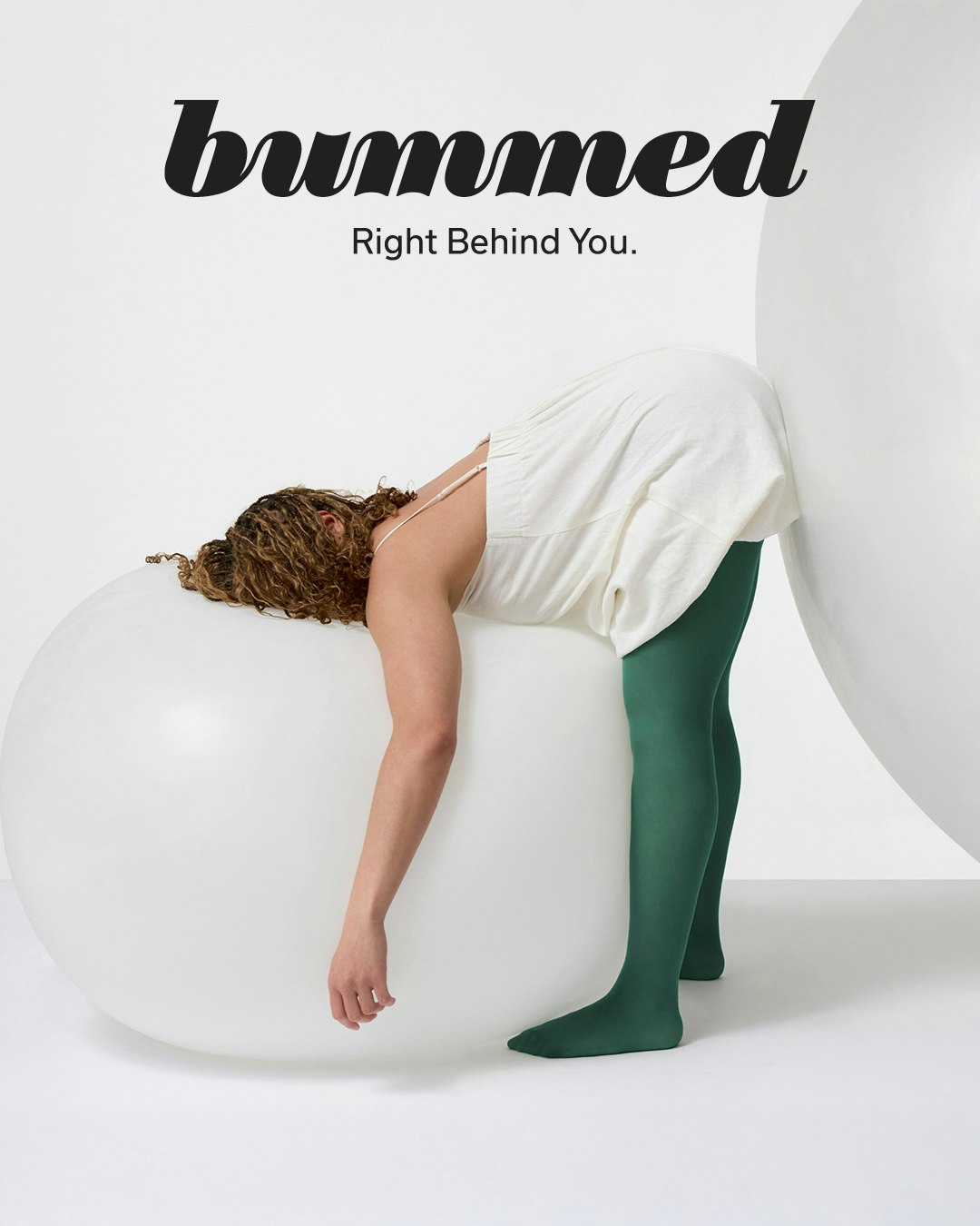
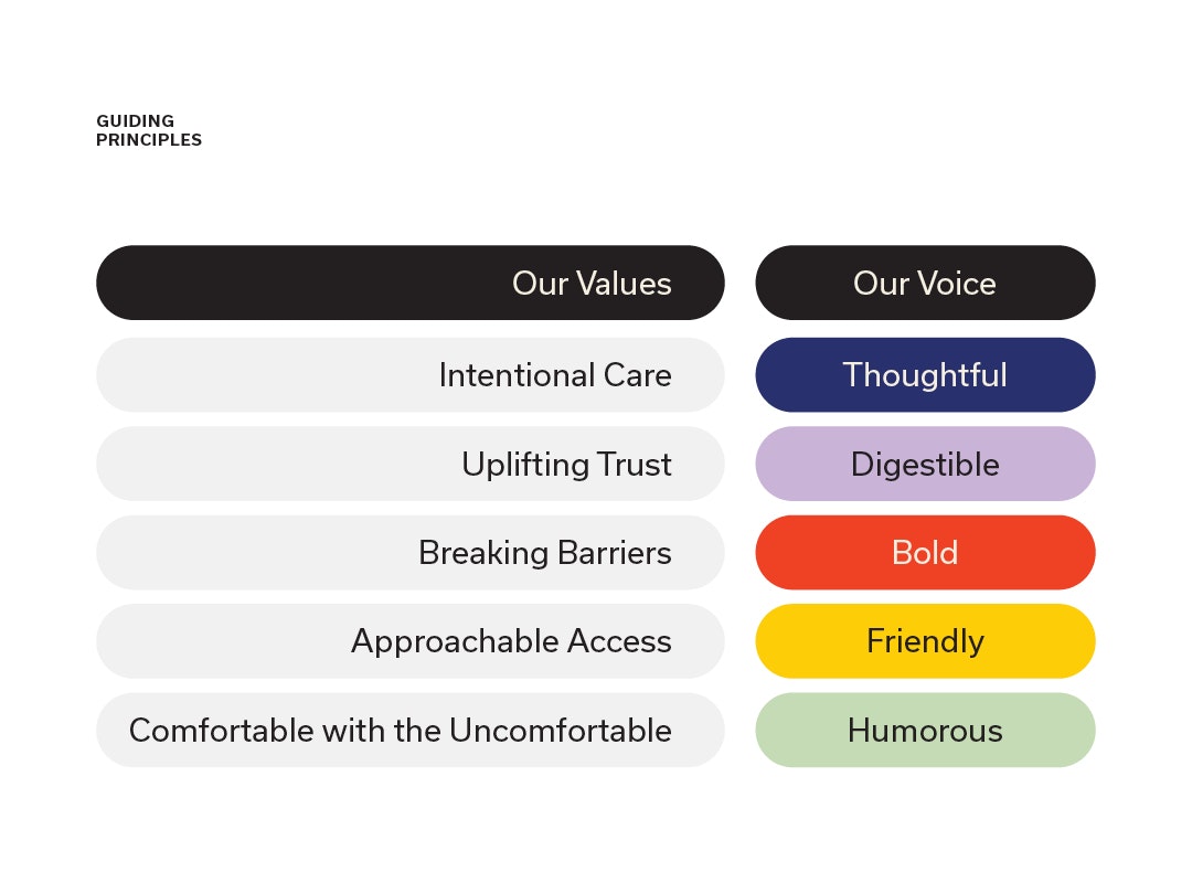
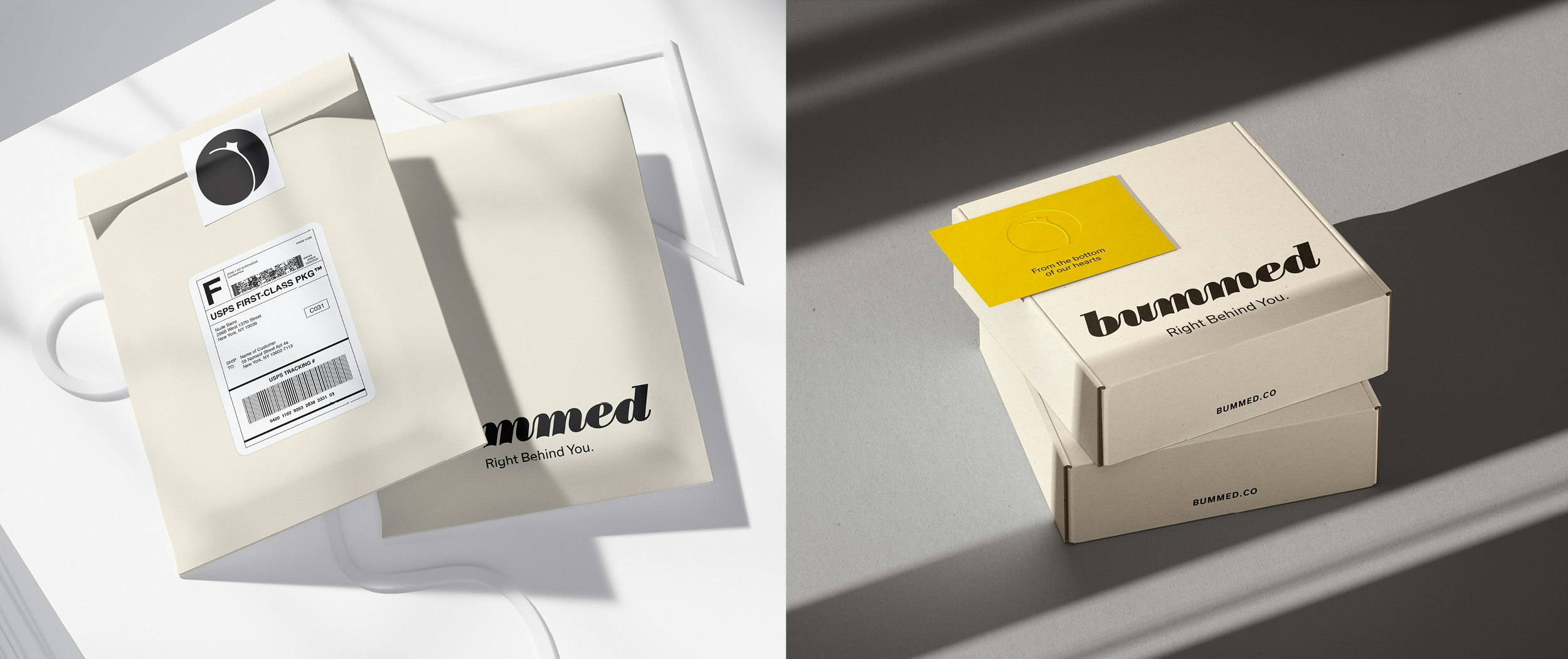
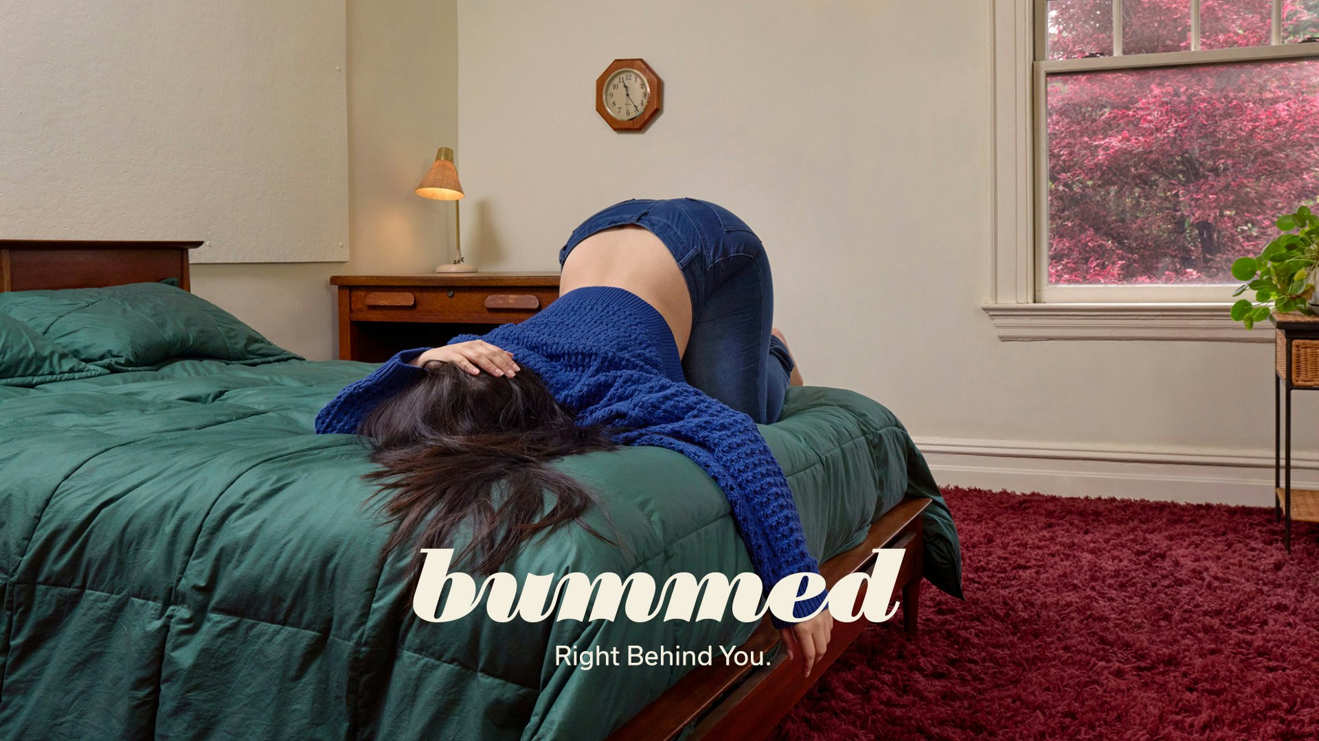
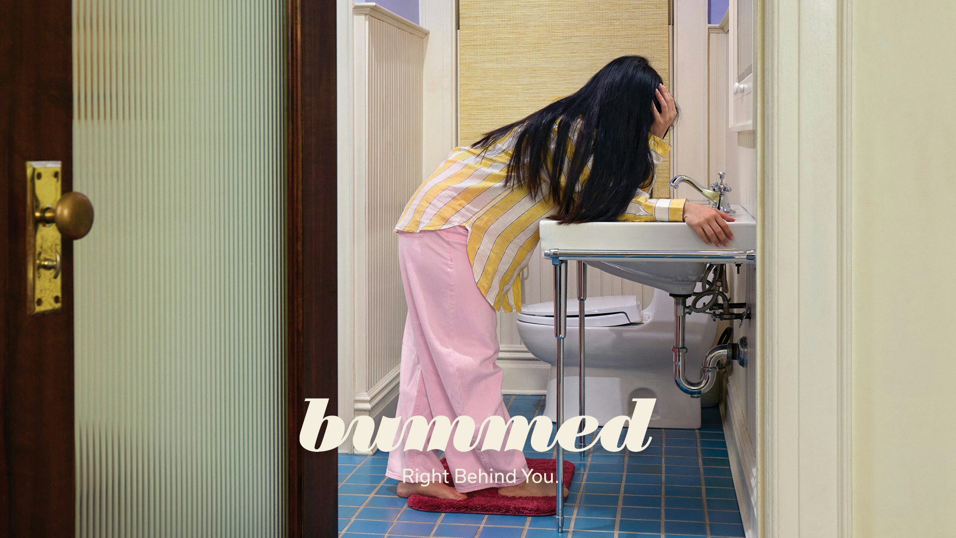
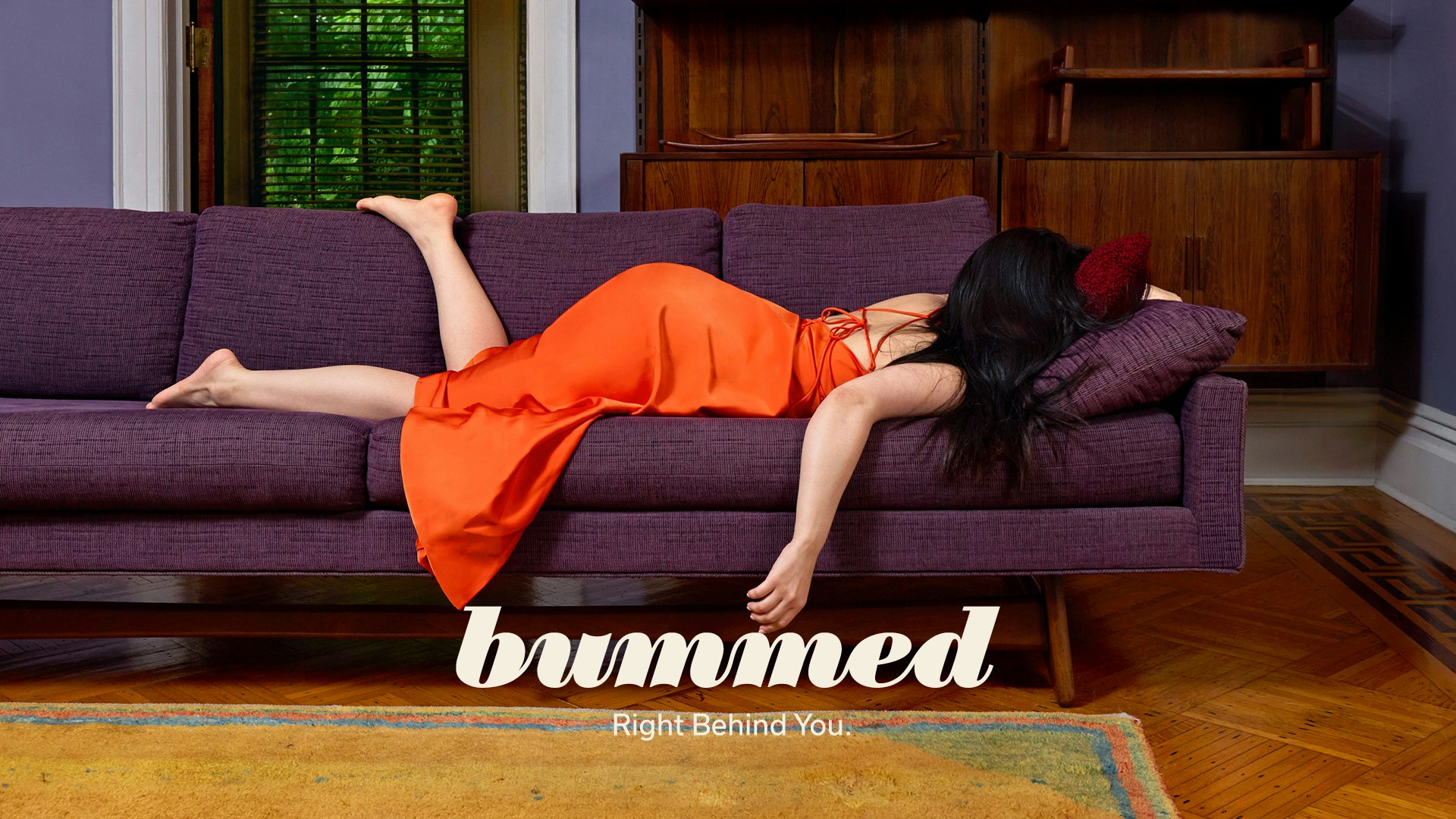
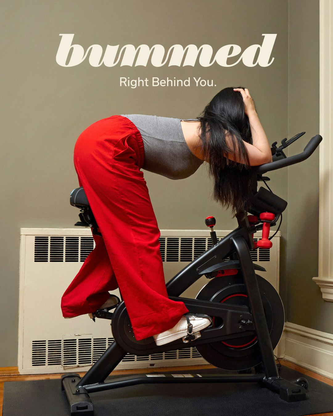
As a subject often wrapped in shame and embarrassment, Bummed approached YummyColours to break barriers. YC began by setting a tone that carefully balances humor, seriousness, and care. The name Bummed expresses the empathy the brand has for its patients, and the tagline “Right behind you” brings a smile—showing support in a playful, disarming way.
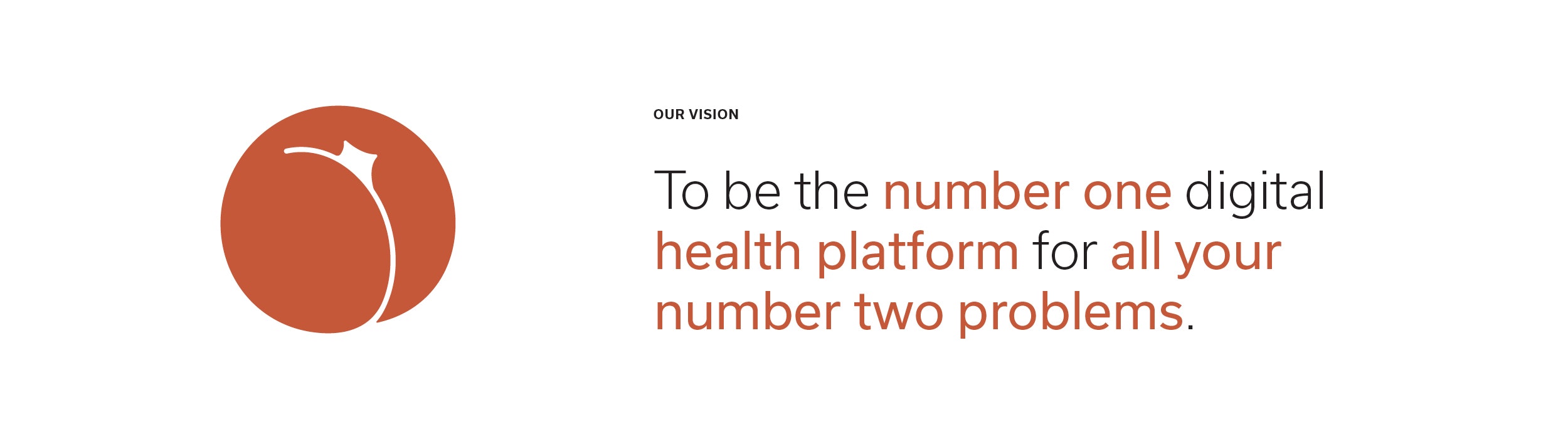
With a vision to become the number one digital health platform for all your number two problems—and a mission to provide access to personalized, science-backed solutions for anorectal health—Bummed is here to challenge stigmas and reshape perceptions around taboo health topics.
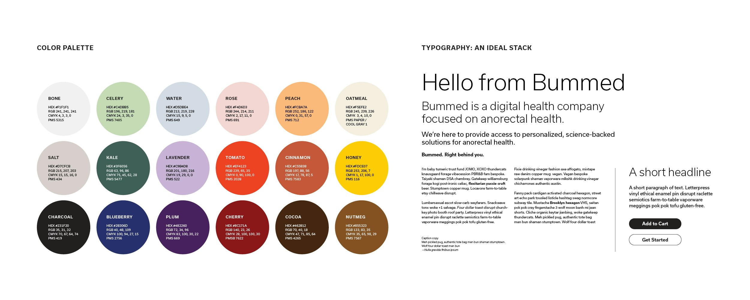
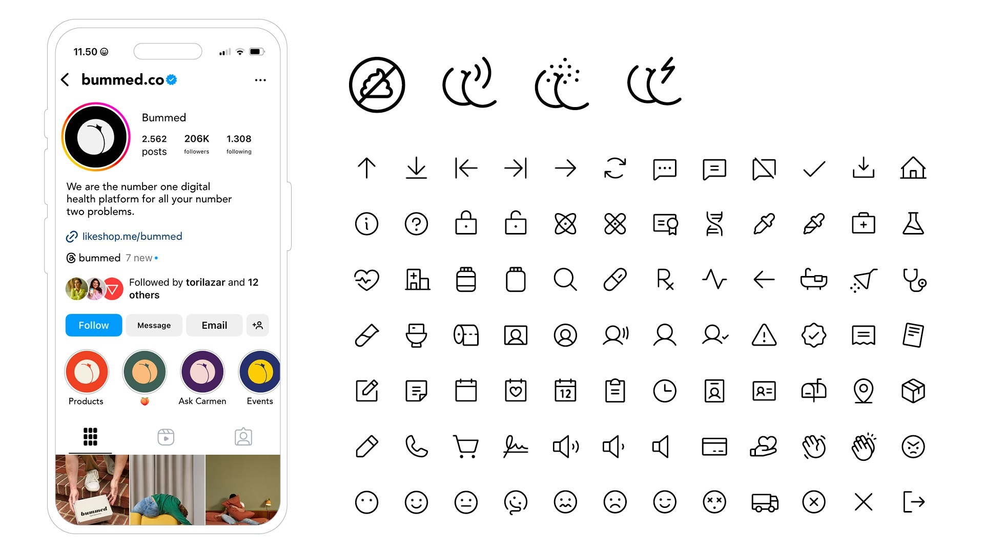
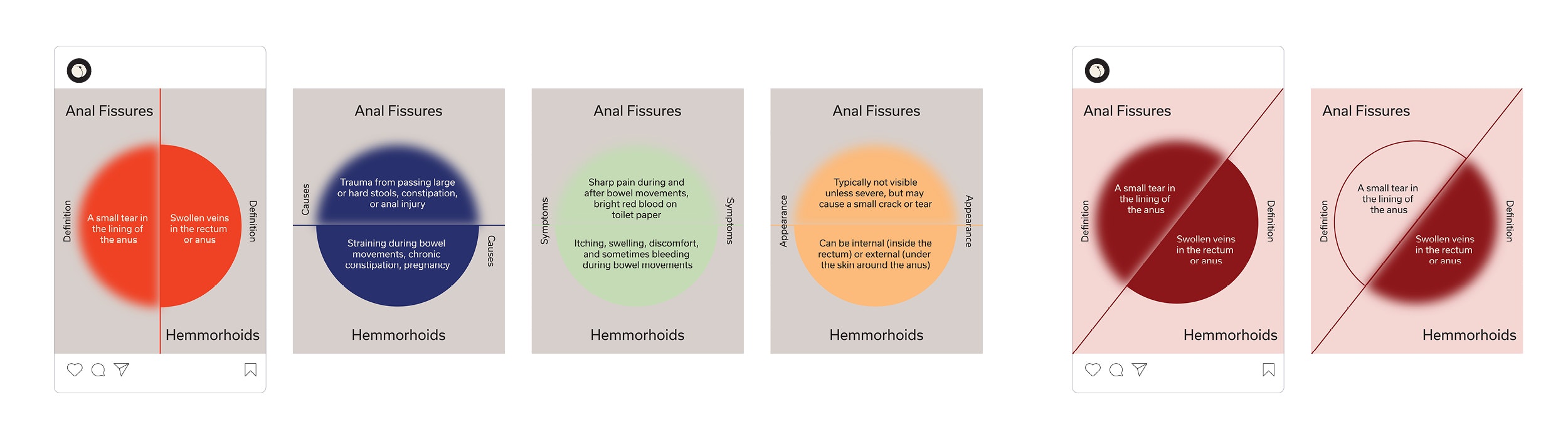
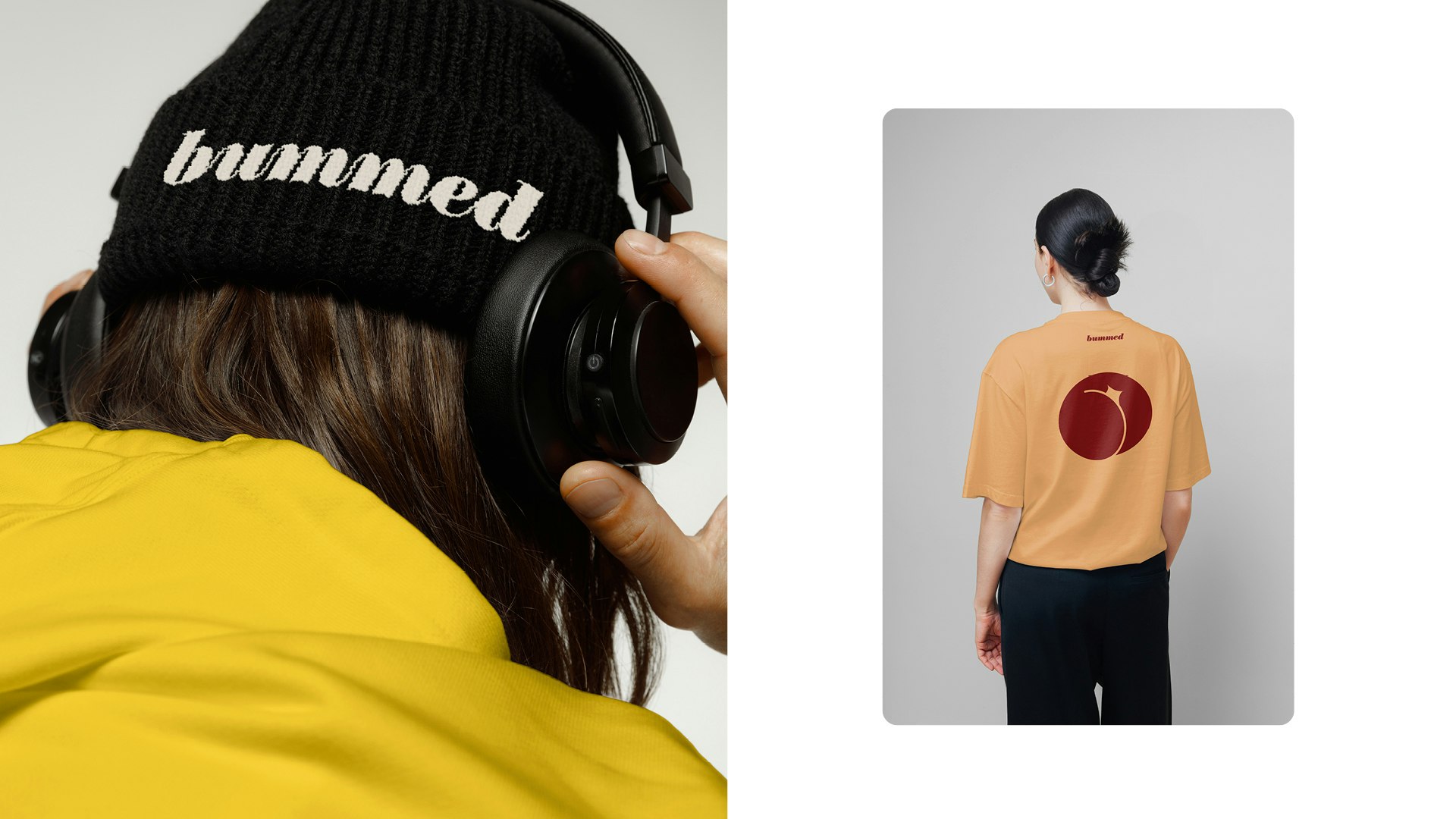
Its visual identity is as colorful, modern, and human as its tone of voice. A lowercase scripted wordmark features beautiful repetitive curved strokes suggestive of the digestive system, while a graphic peach as the logomark gives the brand a soft and inviting feel. Bold, stylized display serifs used for numerals and titles lend an editorial look to infographics, social posts, and educational content. The tone of voice is conversational, digestible, punny, and clever. The photographic art direction captures the discomfort patients feel when these issues arise—bummed.


Connie Lui
Denize Maaløe
Diego Marini
Libba Smith