Browzwear
Brand Strategy, Visual Identity System, Motion, Tone of Voice
As an established leader in 3D fashion technology, Browzwear works with more than a thousand fashion and apparel companies worldwide. They provide products and services that make it possible to design, produce, and sell with remarkable efficiency. Virtual prototypes are true to life, sampling and production are streamlined, and ideas come to market faster - all with cost and waste reduced at every step of the way. Browzwear engaged YummyColours to evolve the brand to reflect its global attitude and appetite for innovation on purpose. They needed a branding and communication strategy that spoke to both C-level deciders and designers and makers alike, as well as a fresh, cutting-edge look that confers technological advancement in an approachable way.
As a response, YummyColours started by creating the strategy to position Browzwear as an enterprise solution and the most trusted partner for their client’s digital transformation journey. It began by honing in on what Browzwear was already doing right - emphasizing on their game-changing efficiency, power to break down silos, and true-to-life accuracy - and raising the bar everywhere else, from how they communicate to their engagement through their website and social media.
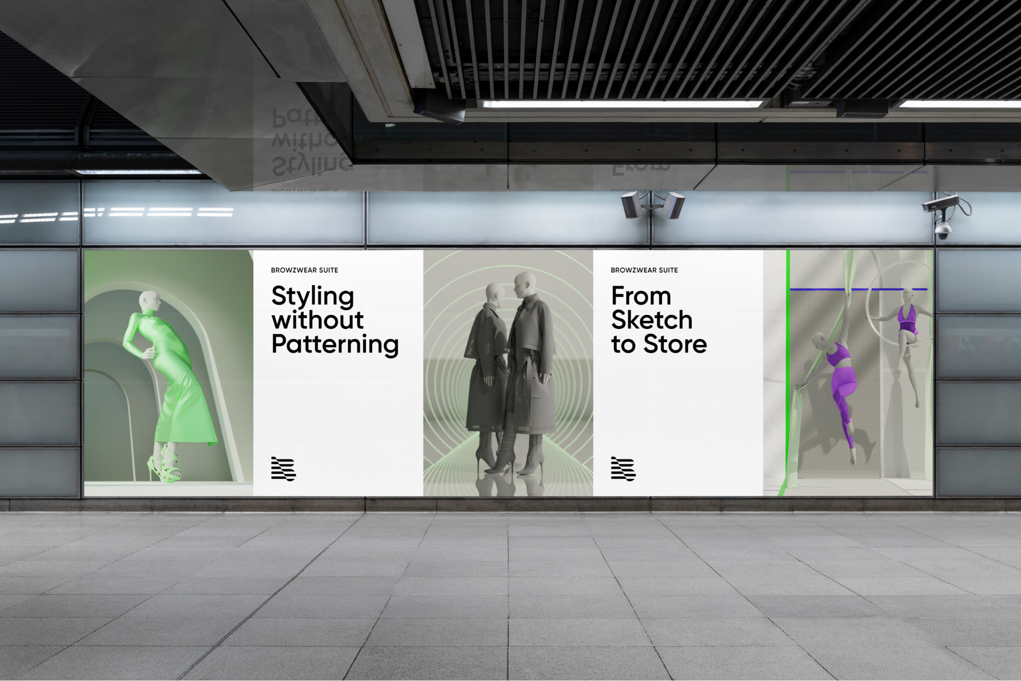
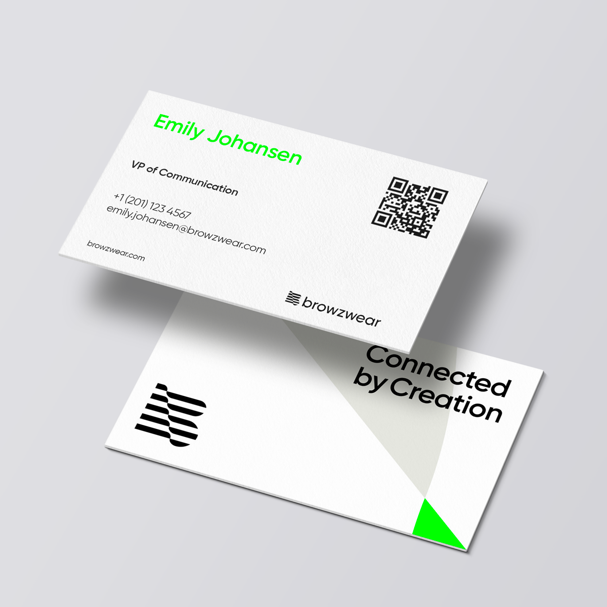
Through this foundational work arose their brand essence: Connected by Creation. Creation is fashion’s common thread, yet in practice, it is often viewed as an isolated phase rather than a first step. Browzwear allows the creative act that fuels fashion to flow across the value chain, from sketch to store. To unlock the full power of digital craftsmanship, their tailored solutions connect processes and teams to products: from design to manufacturing, from planning to multi-channel sales.


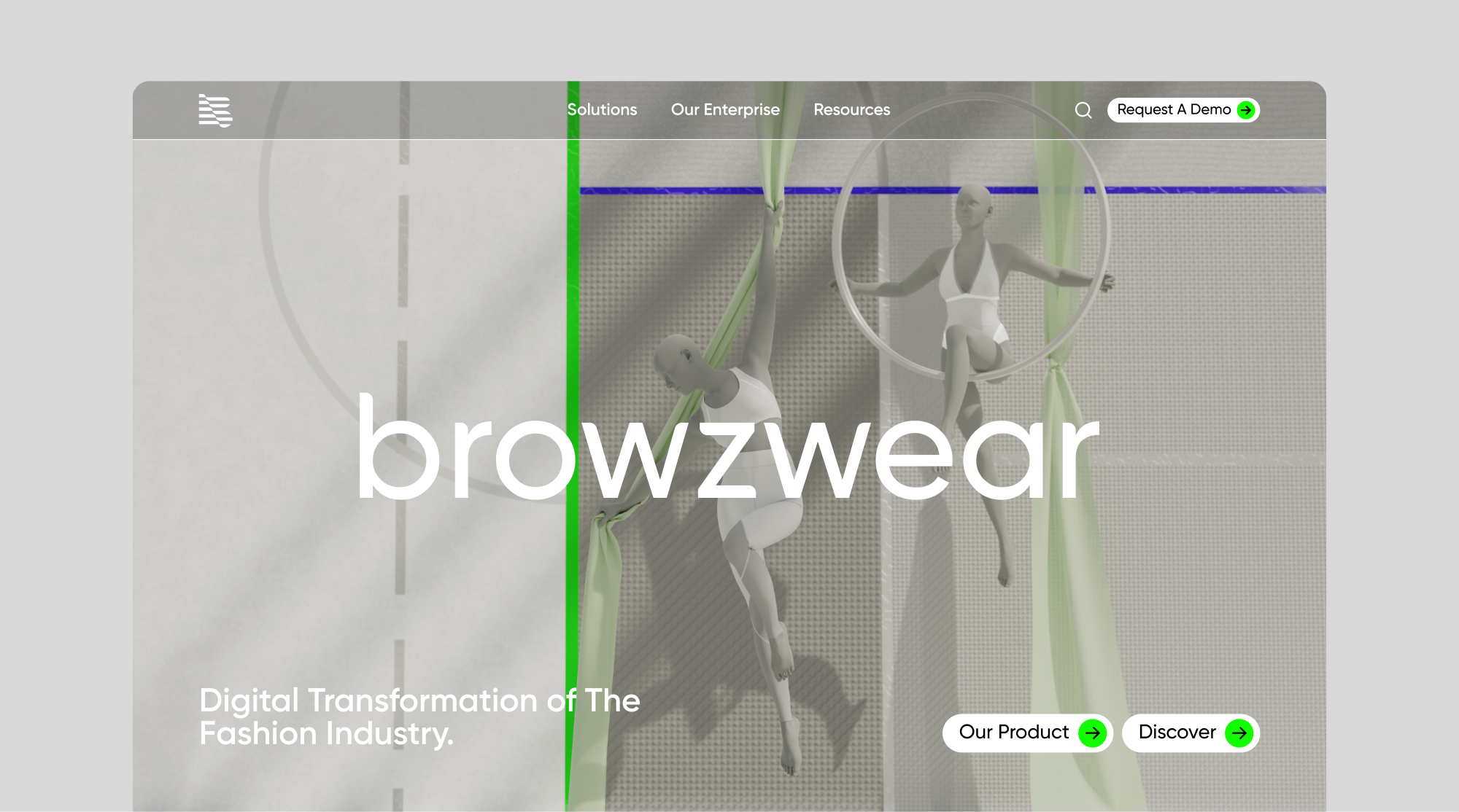
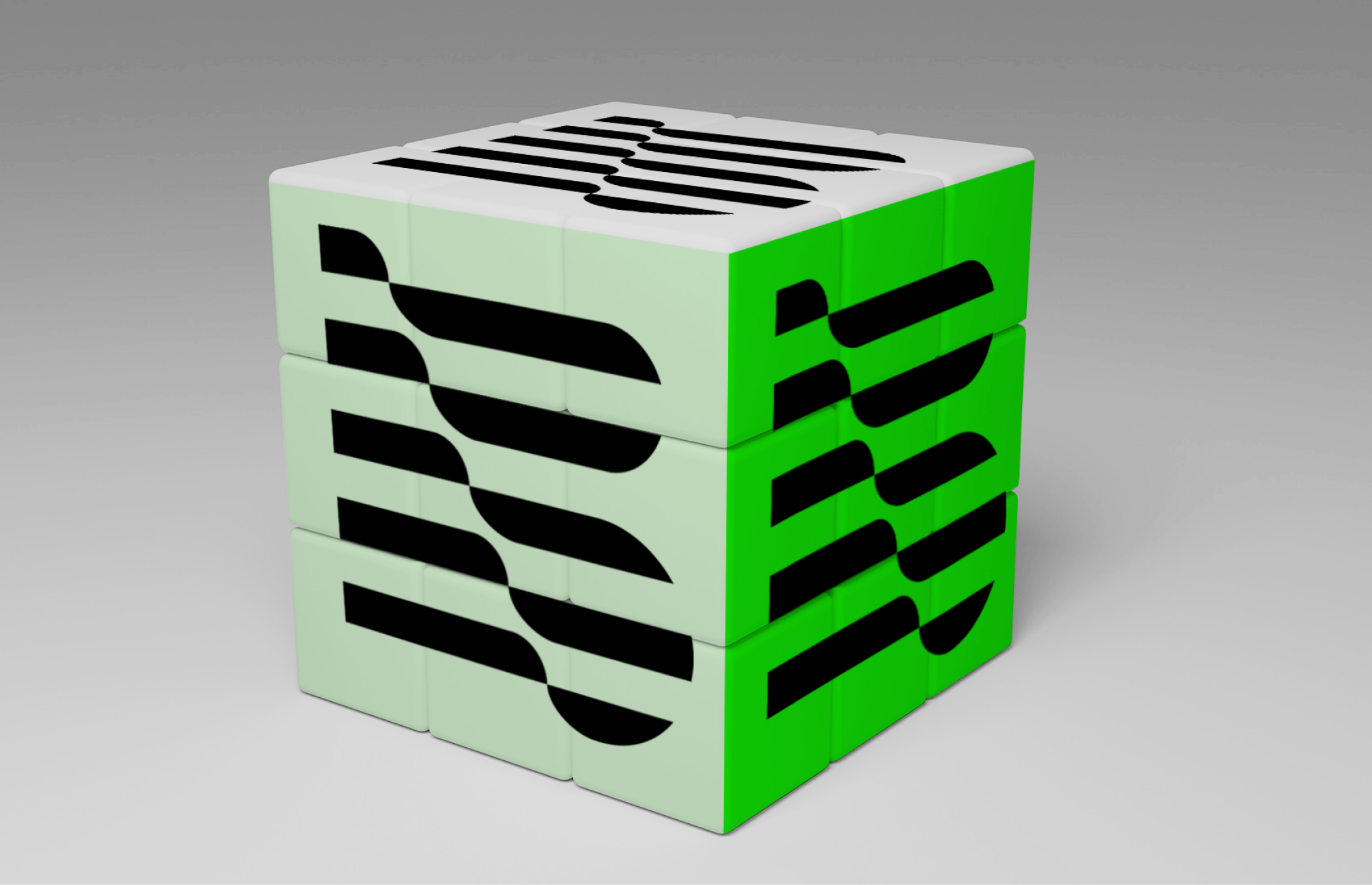
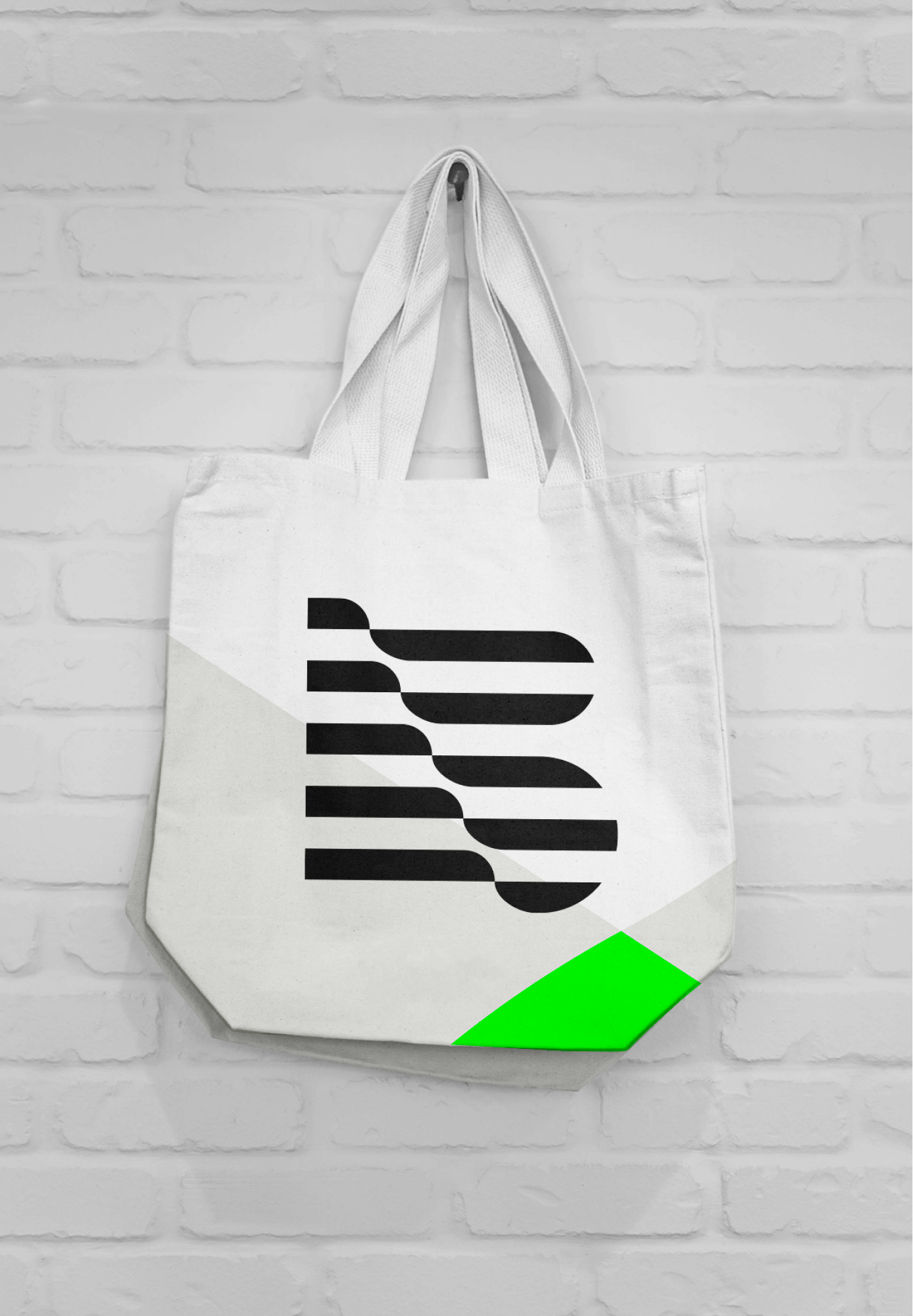
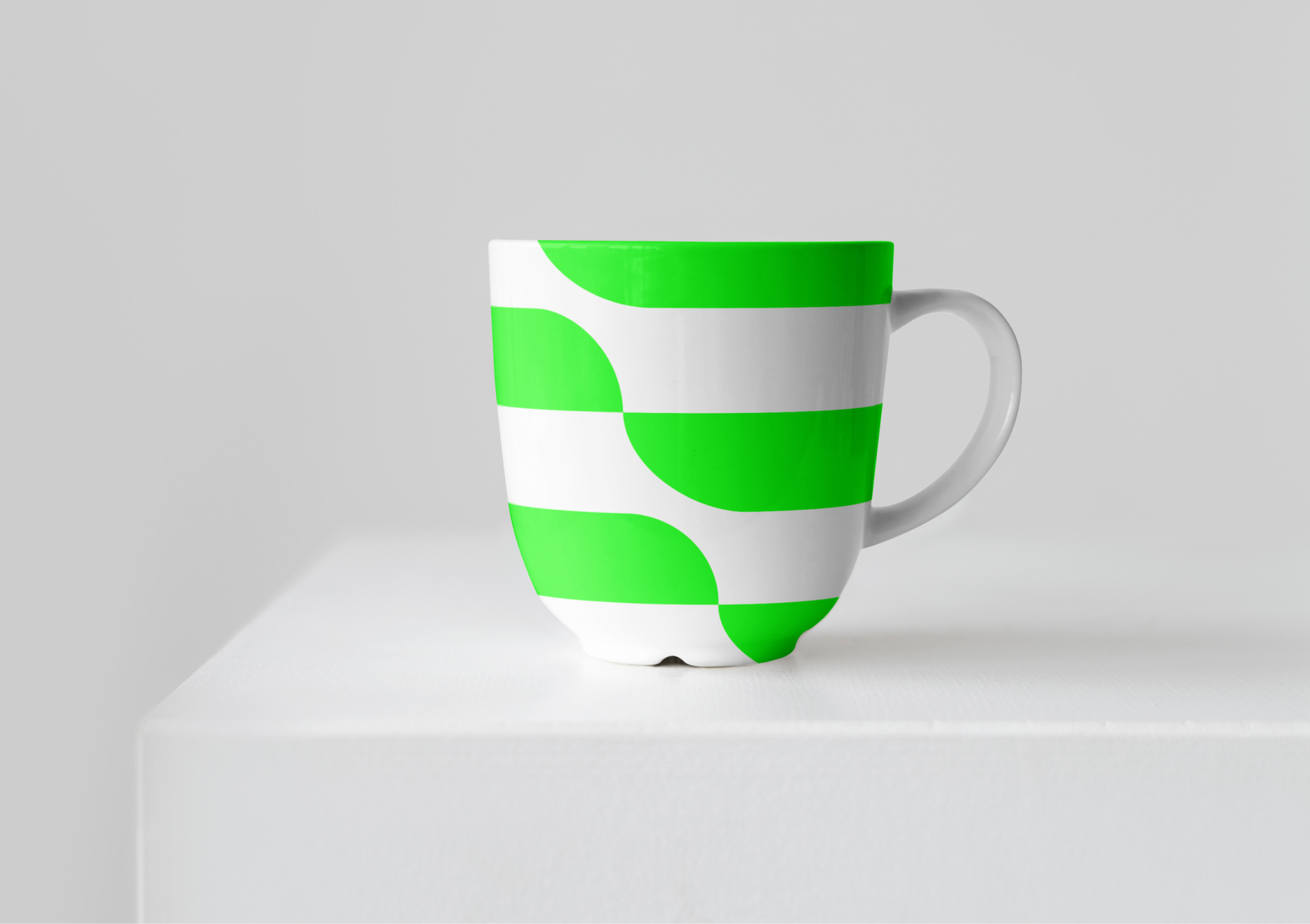
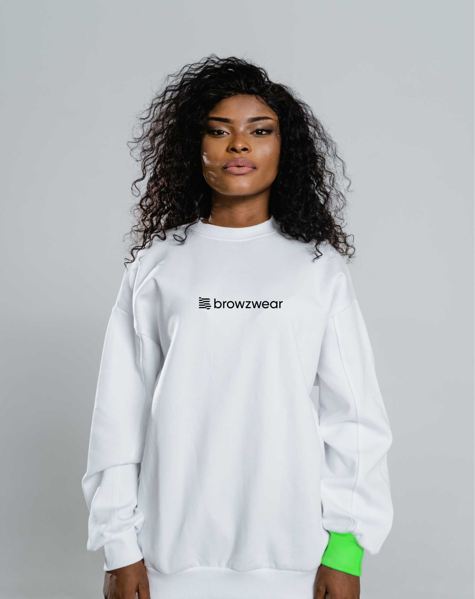
This approach informed every aspect of their visual identity from the dynamic and transformative moment and usage of the logomark to the more literal interpretation of connection using a grid system. Color also played a large part in creating a visual language that expressed Browzwear's personality and ethos. The focus of the core color palette is their branded Dianthus Green. It’s bright, bold, and really makes a statement, but is also only applied very intentionally in a way that elevates and focuses instead of overpowers.


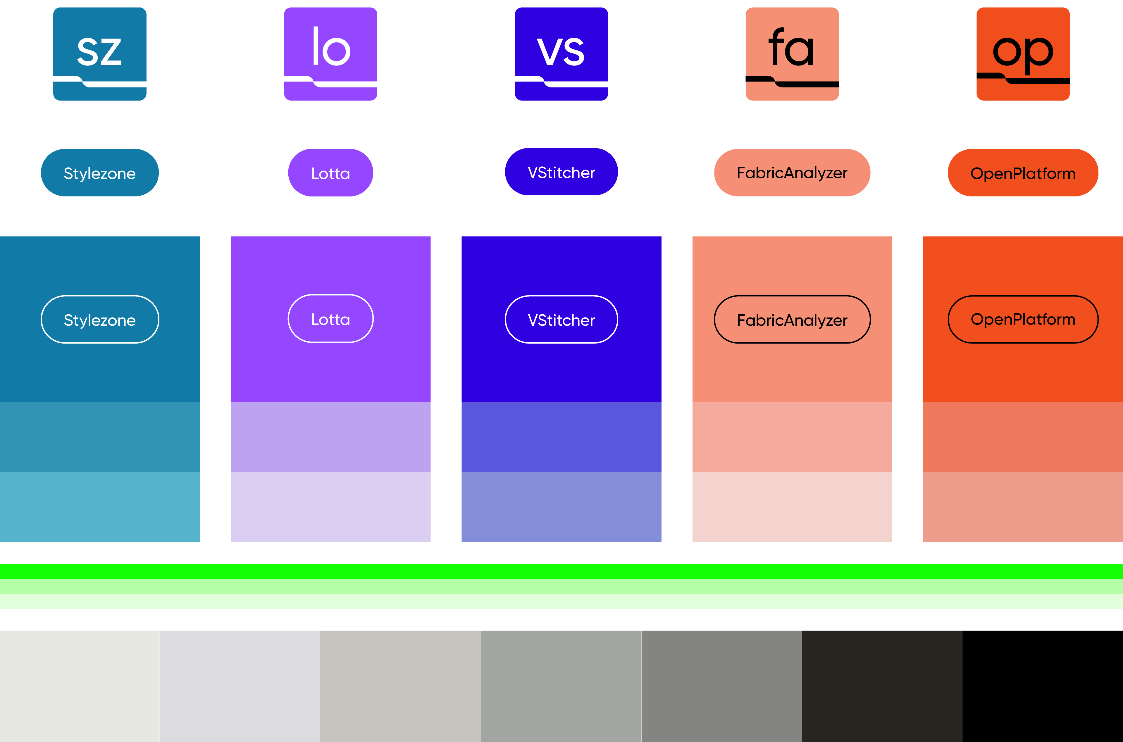
In addition to the core palette, we created a unique palette for each of Browzwear's products.

Denize Maaløe
Lukas Weber
Mia Le
Diego Marini
Stephanie Murg
Jen Holsman
RocketPanda