Seeding Sovereignty
Visual Identity
Seeding Sovereignty tasked YummyColours to design a more vibrant visual identity and website that is reflective of their mosaic work. The Indigenous-led collective sought to create an inviting online home for people to contribute to and learn about their projects and movements. Moving away from antiquated and reductive depictions of indigeneity, Seeding Sovereignty’s goal is to communicate information in a future-facing interconnected way.
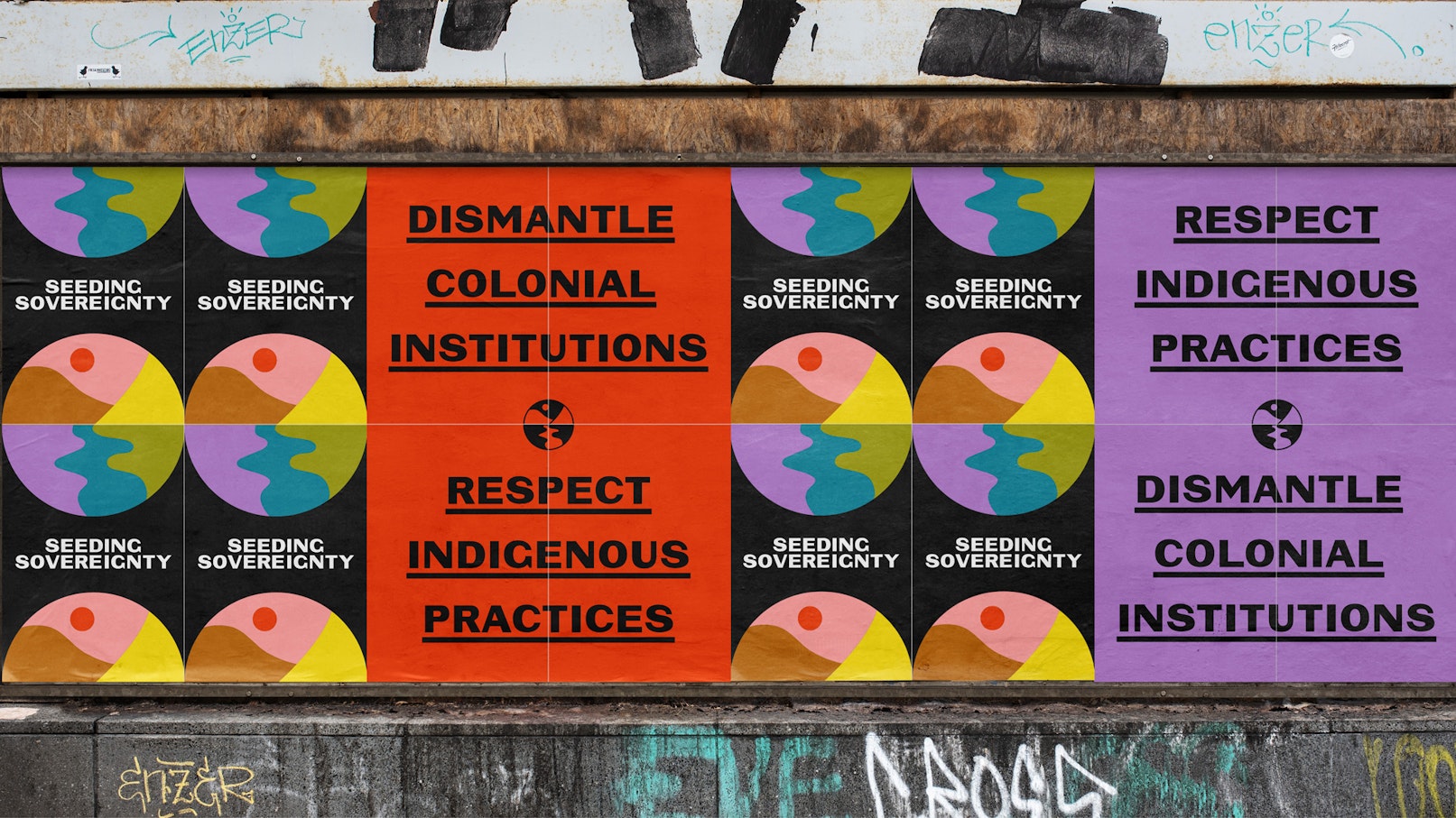
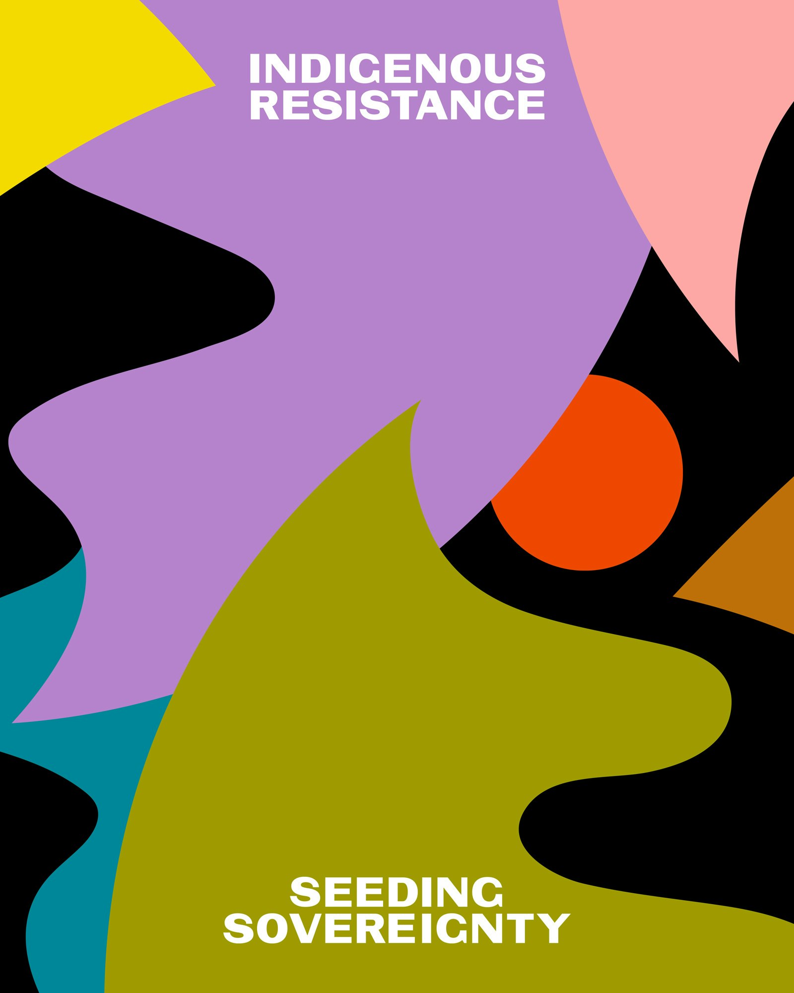
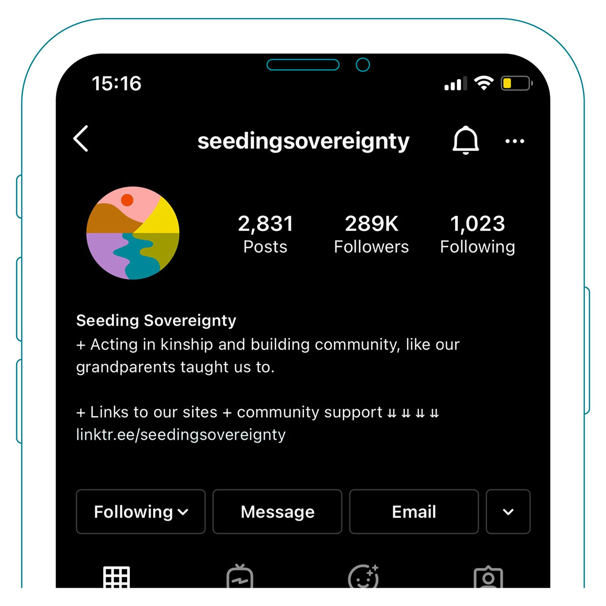
Seeding Sovereignty’s logo is a forward-leading natural landscape that breaks apart in a number of ways, allowing for flexible use and conveying the type of work that the collective does. It references many pieces coming together to create a whole and symbolizes the work around healing and decolonizing, which involves dismantling and rebuilding. Each piece and color of the logo represents a different area of Seeding Sovereignty’s work. For example, the orange-red (a color that tends to be associated with MMIWGT2S/MMIP) small circle was used with care to represent healing, and the bright yellow sharp-edged shape represents support given to several pressing movements on the ground.
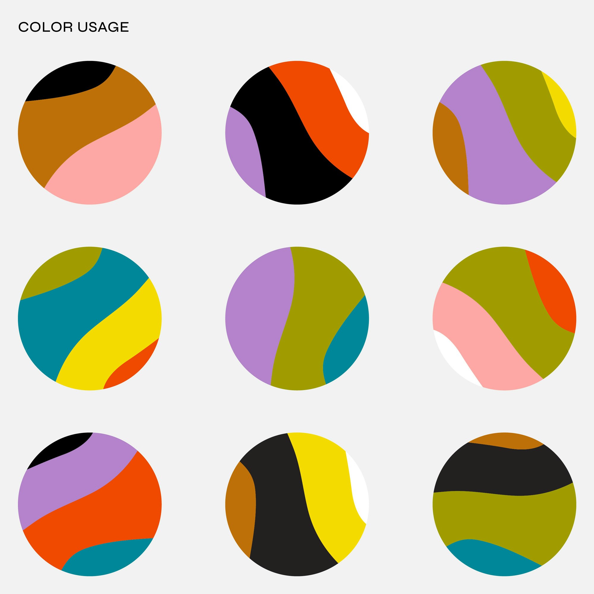
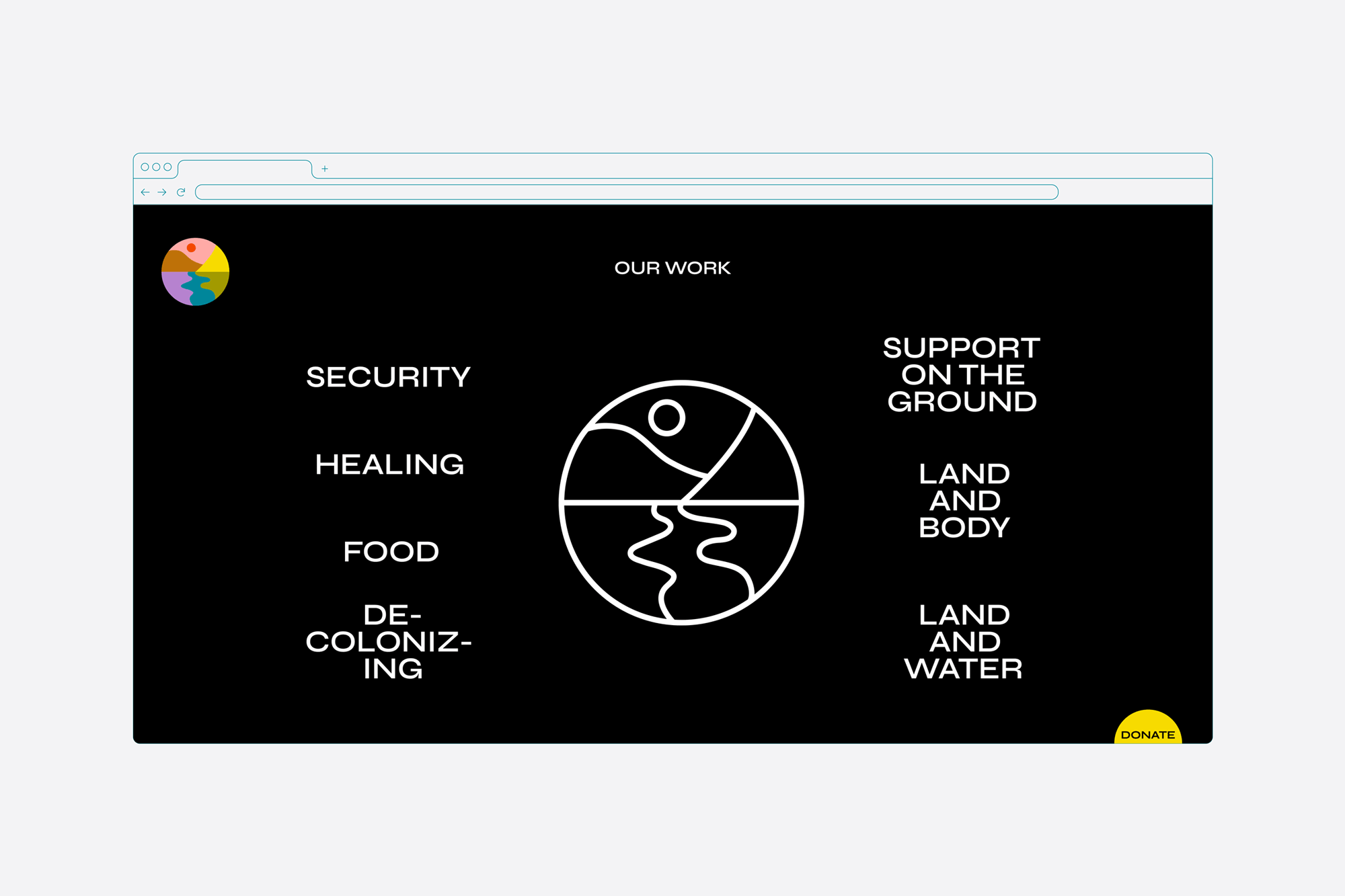
The palette was chosen to convey a connection to the natural world as well as a digital presence and youthful perspective. It allows for combinations that create different moods and captures the many different tones Seeding Sovereignty’s messaging takes. For their website, YummyColours set up a color-coded filtering system that encourages visitors to learn more about the collective’s various areas of work. The new system allows to explore initiatives and resources in a nonlinear, continuous way, while organizing the extensive activist content.
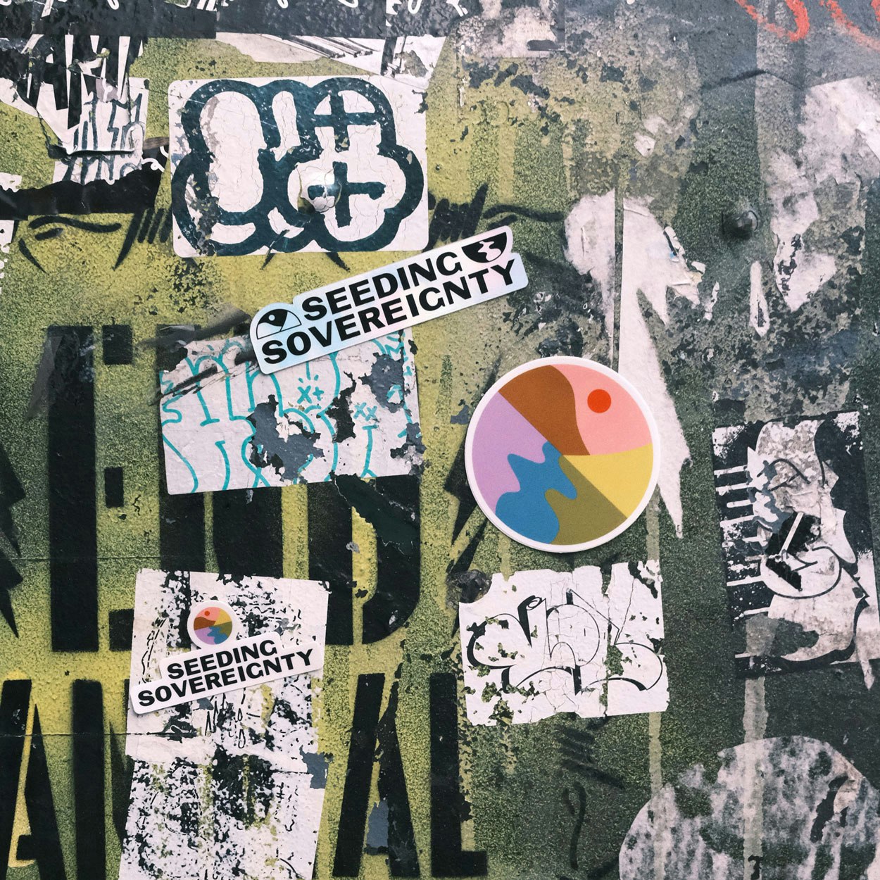
The Seeding Sovereignty symbol is designed to be taken apart and reassembled in a variety of ways. This design is referential to the work the collective does: dismantling, rebuilding, growing, learning, and adapting. It is intended to be used in several different ways.
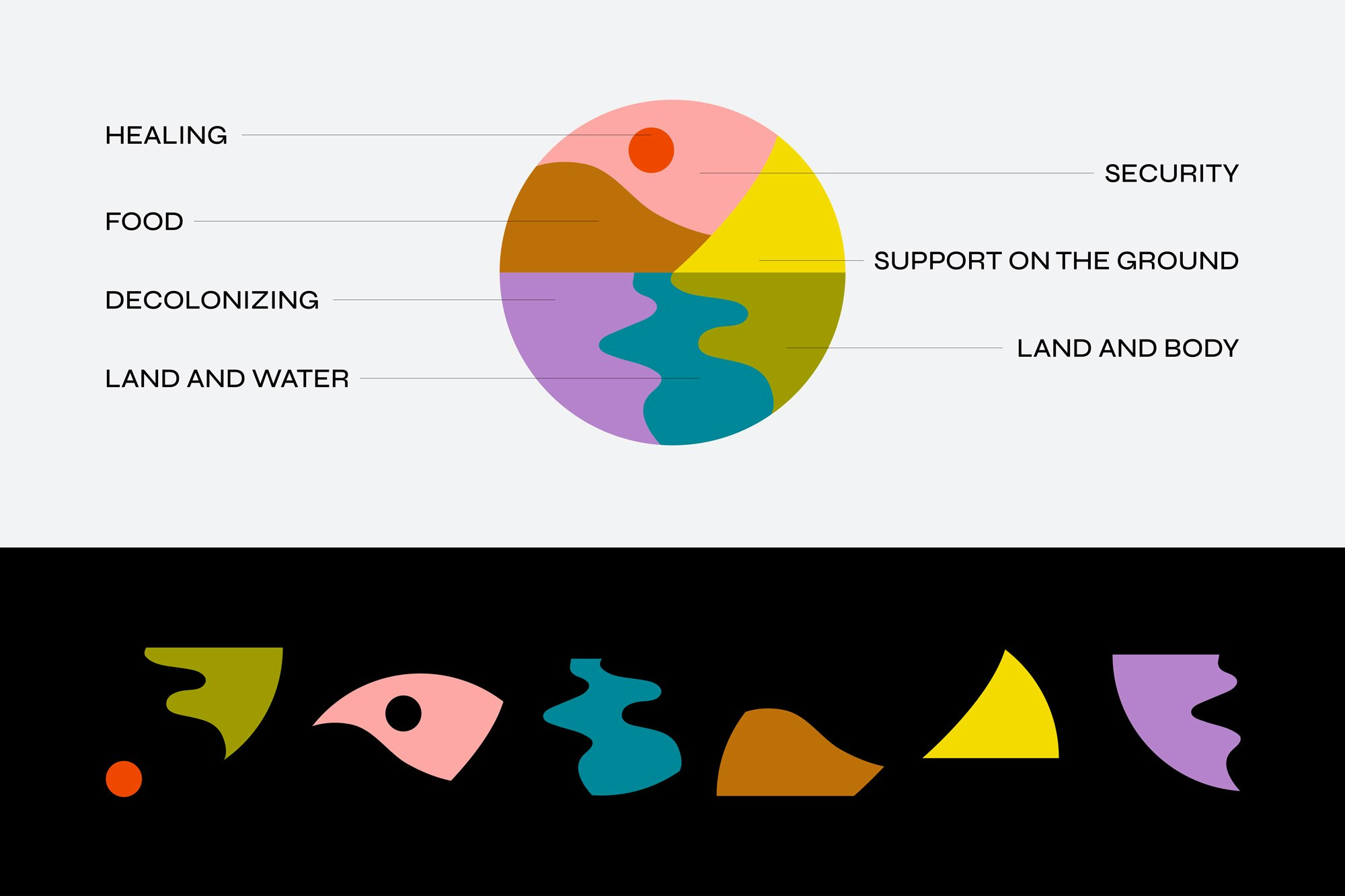
Each piece and color in the logo represents a different area of the collective's work. All of the topics addressed in Seeding Sovereignty's work are interconnected. The natural landscape they create when combined represents how all of these pieces come together to form a whole, which ties back to the earth and also leads us forward, toward liberation.
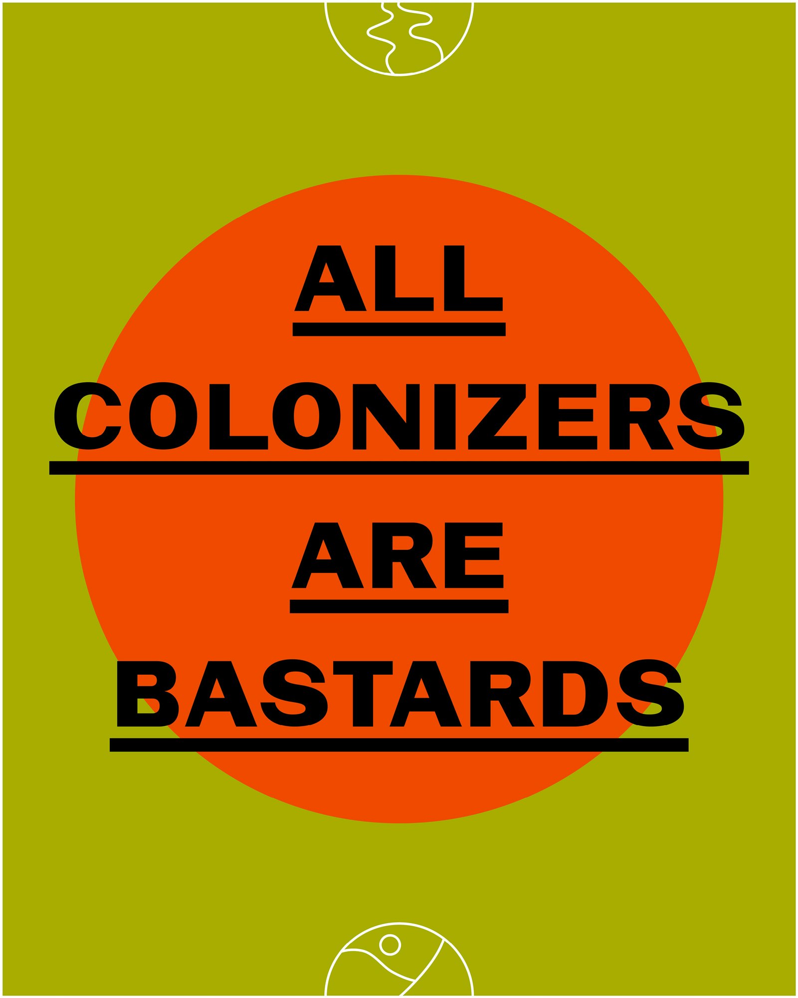
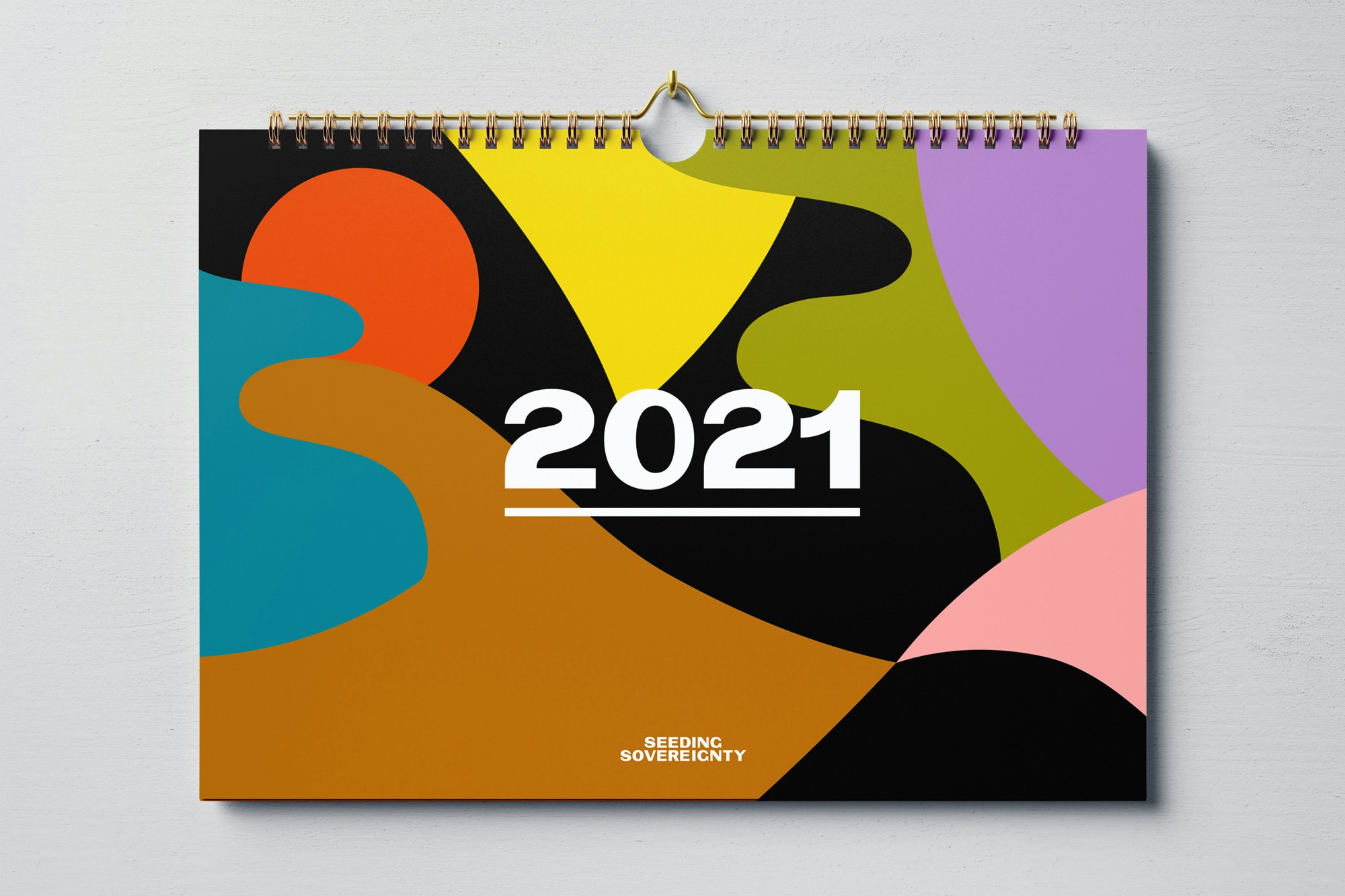

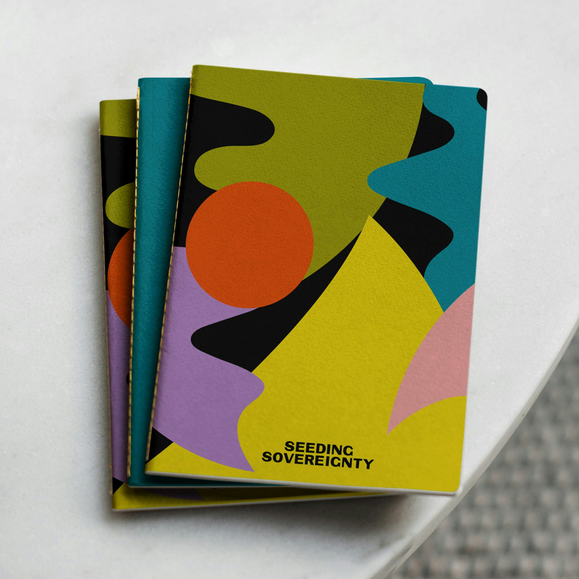
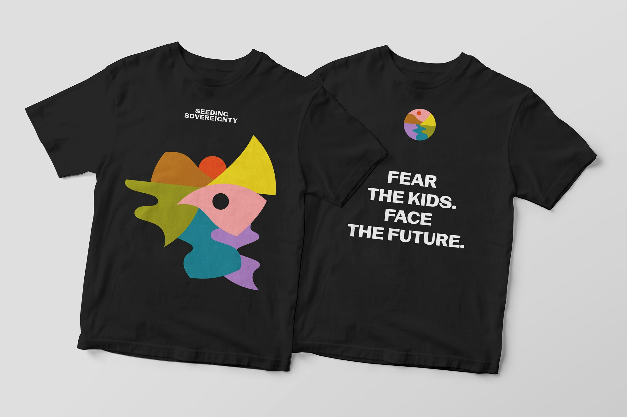
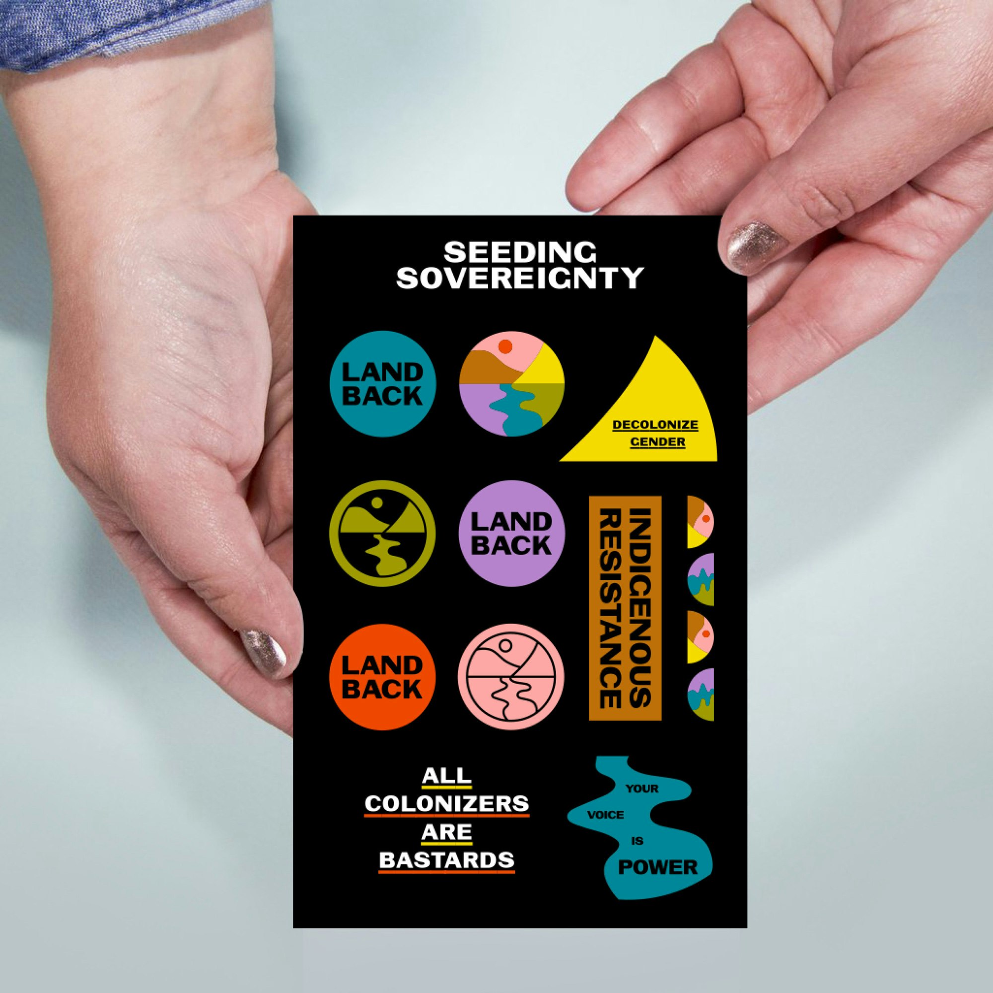
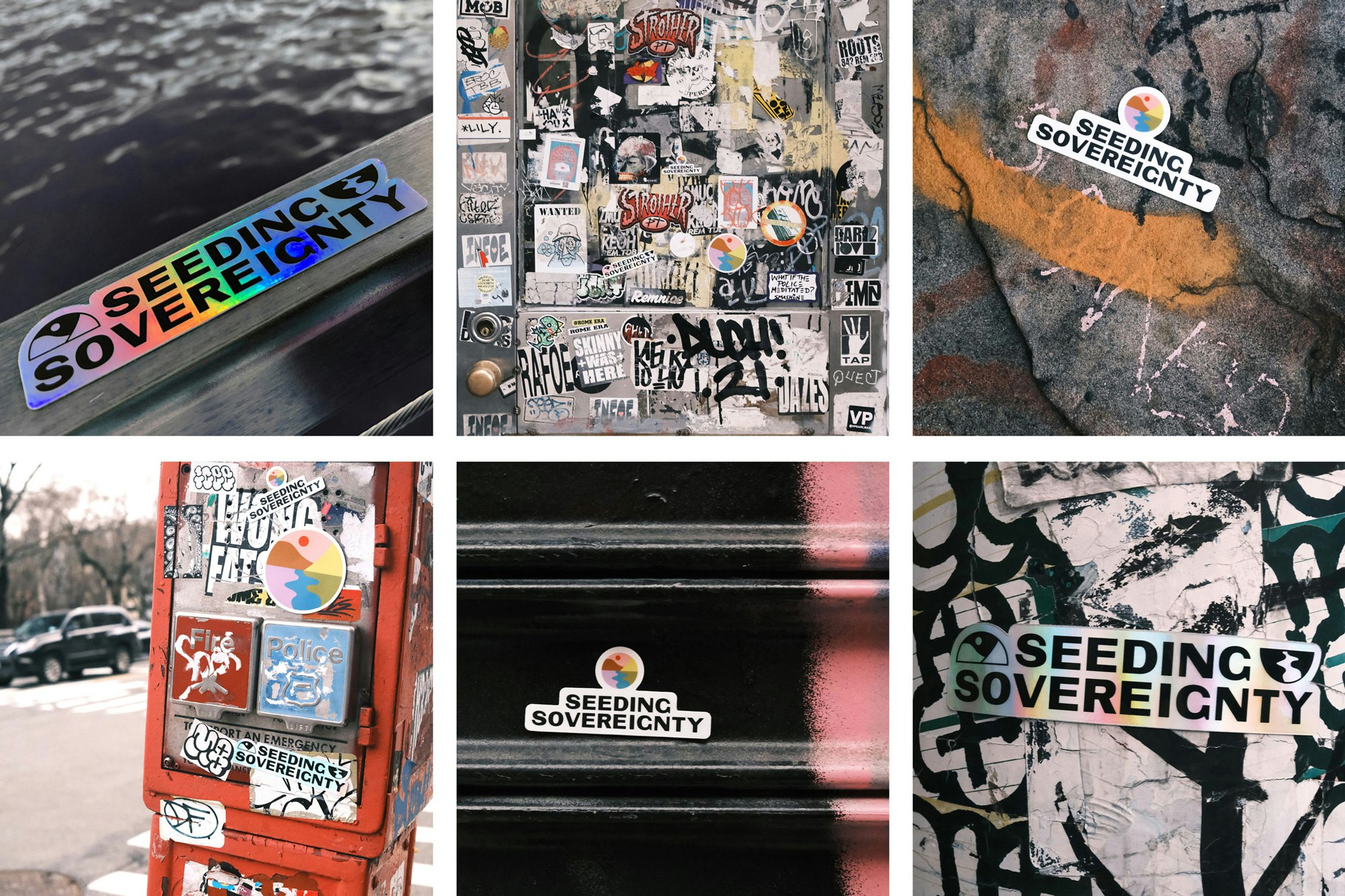
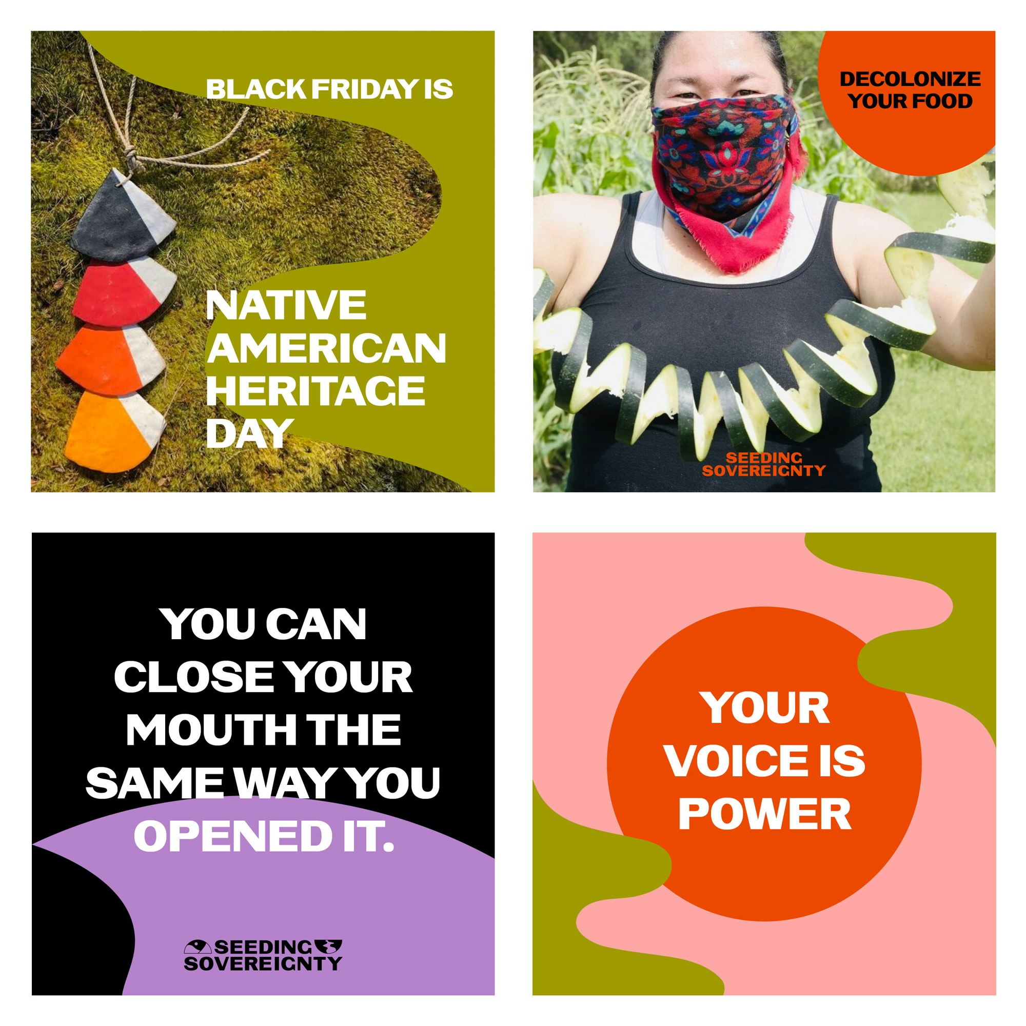
Because Seeding Sovereignty has such a large following on social media it was important that their identity system allowed for quick and flexible creation of social media graphics. The library of shapes can be used however needed to add a graphic or colorful element to their posts or digital zines.
We worked with Seeding Sovereignty to reorganize the content on their website around the areas of work, and implemented a filtering system within the redesign to keep people on the website interesting in learning more about the collective's work.
Diego Marini
Katie Osborne
Krystal Greven
Code4Dependent