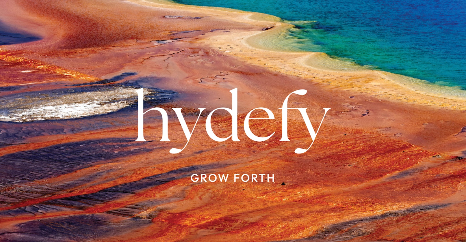
Hydefy
Brand Narrative
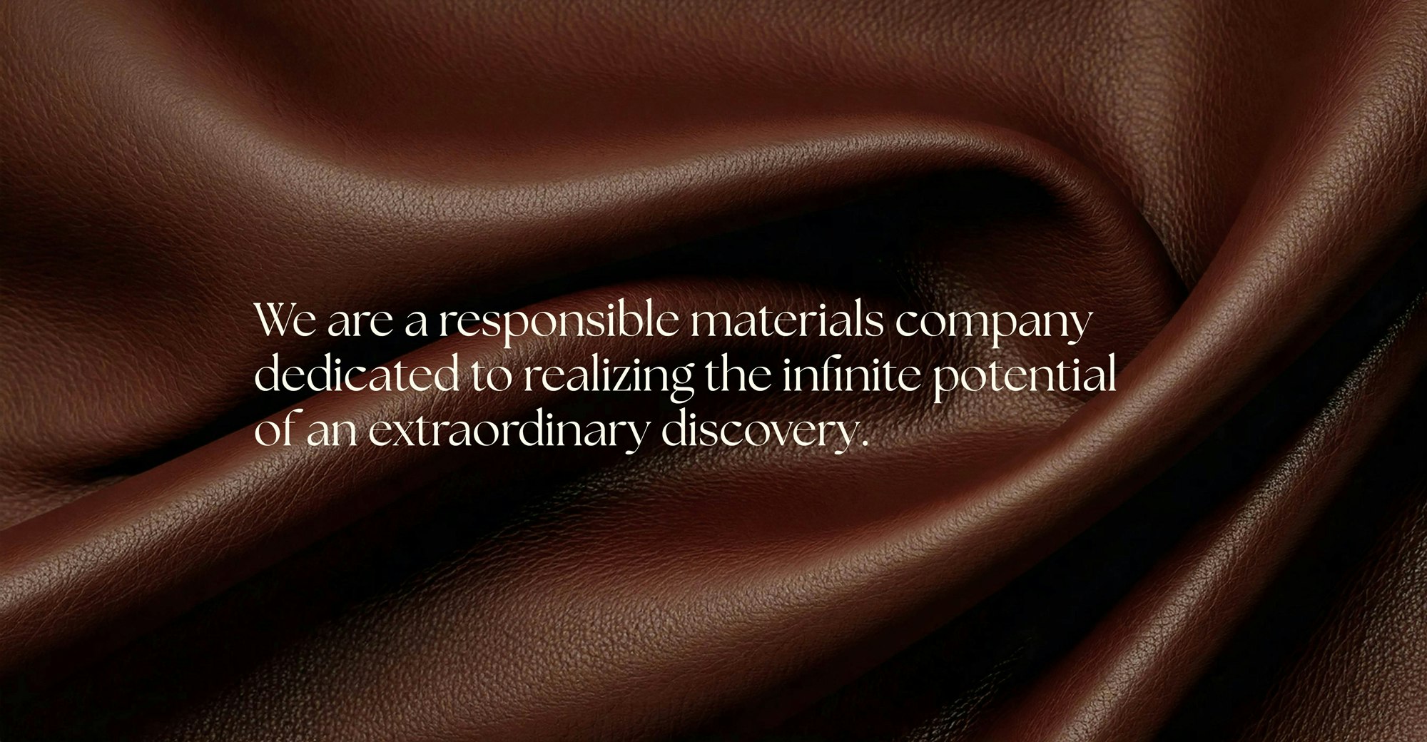
During an expedition in Yellowstone National Park with NASA, scientists from the Fynder Group discovered a microbe they named Fy™. Using the company’s proprietary fermentation technology and Fy™, they can manufacture materials using only a fraction of the resources required for traditional animal- and petroleum-based products. To introduce this groundbreaking innovation to the world, Fynder partnered with YummyColours to develop its naming, strategy, brand narrative, and full visual identity. Fynder’s goal is not only to provide the design and manufacturing industries with truly sustainable material solutions but also to inspire future generations of makers and explorers. With Stella McCartney as one of its first collaborators, Hydefy is setting a new standard in sustainable innovation—leading the industry with cutting-edge materials and making a real impact on the future of sustainability.
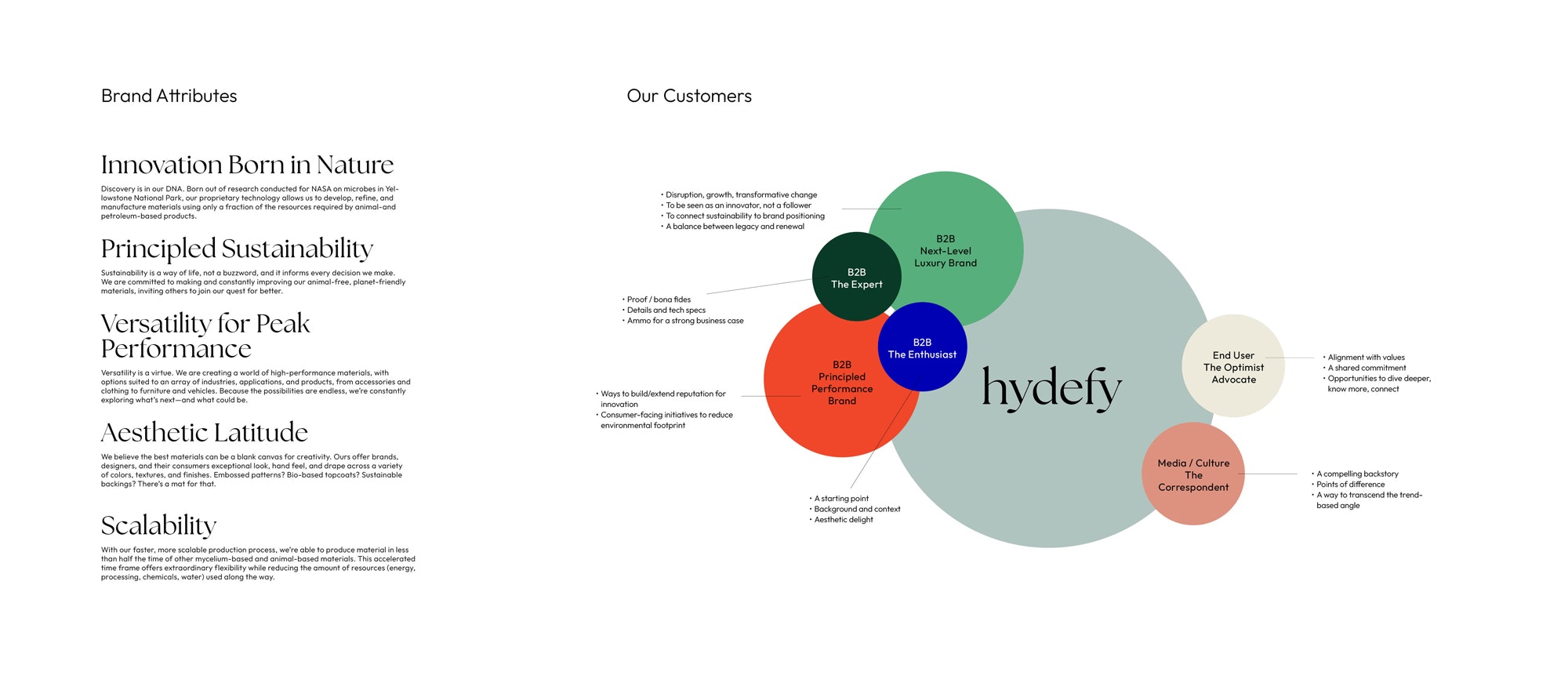
Leveraging its origins and sustainability story was key to building the Hydefy brand.
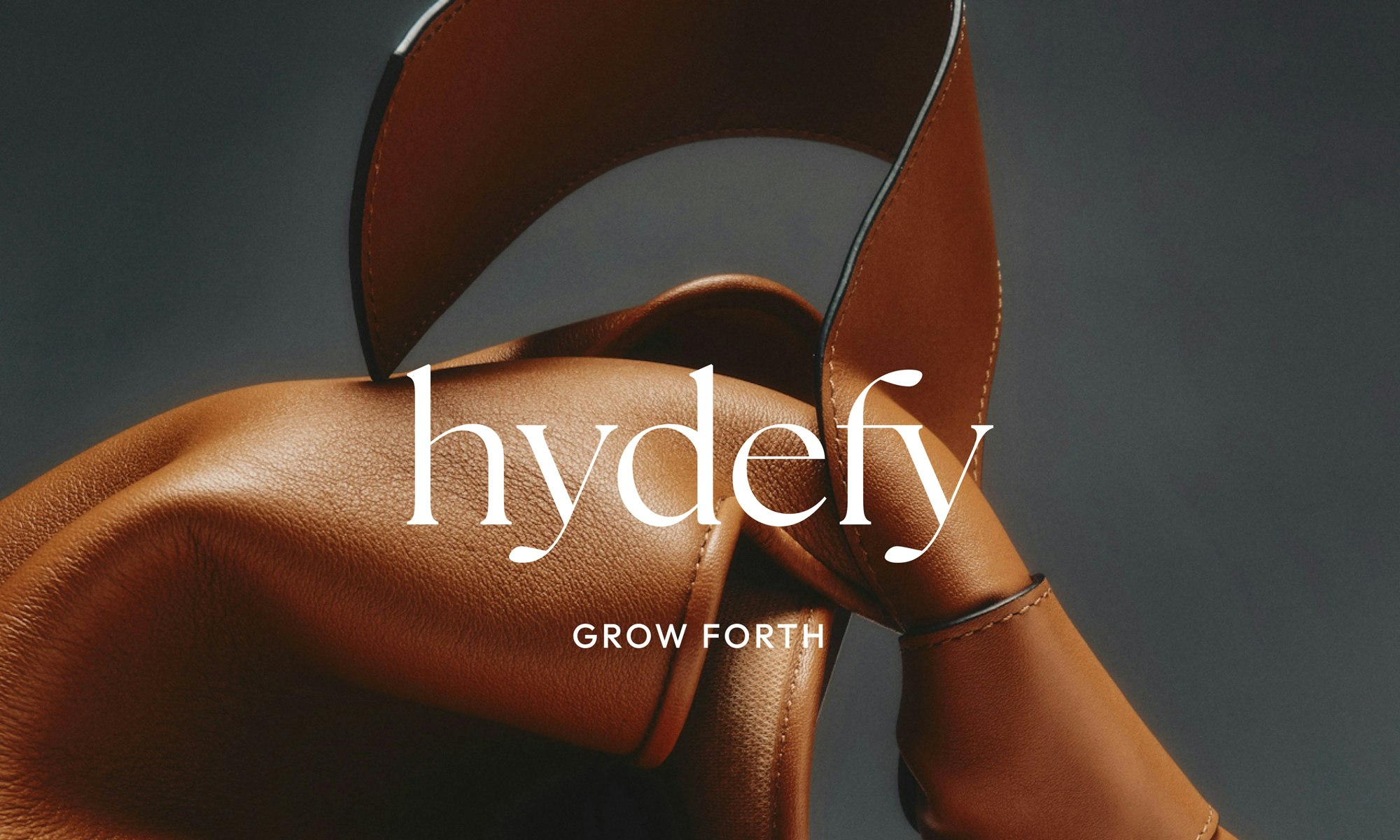
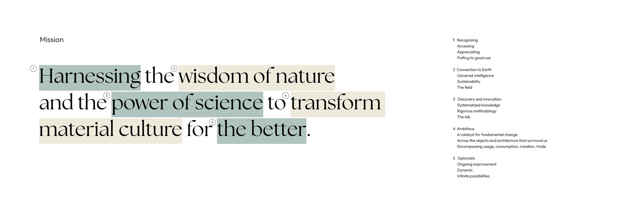
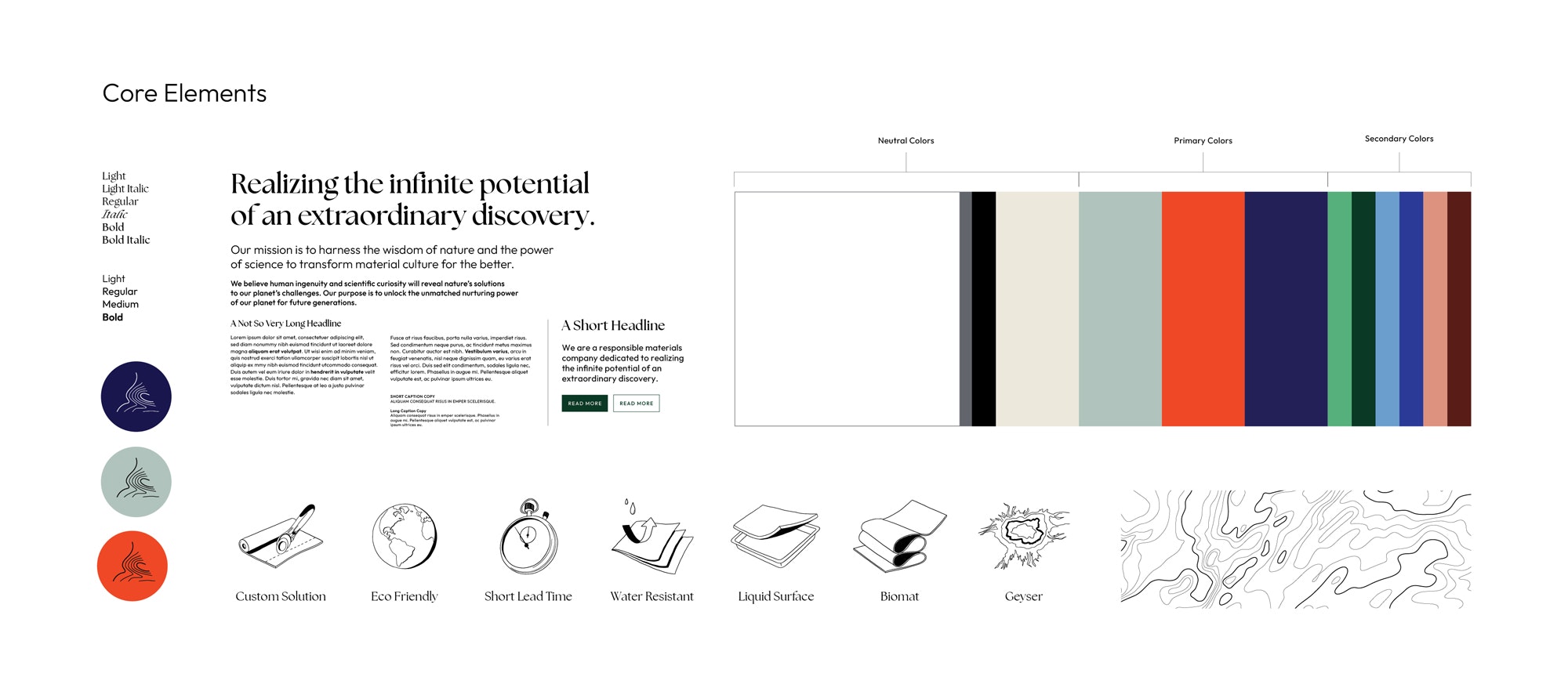
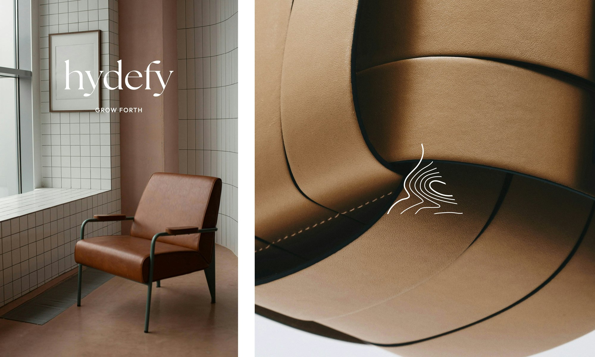
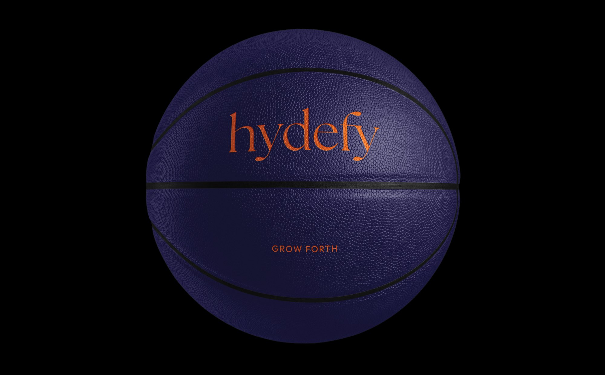
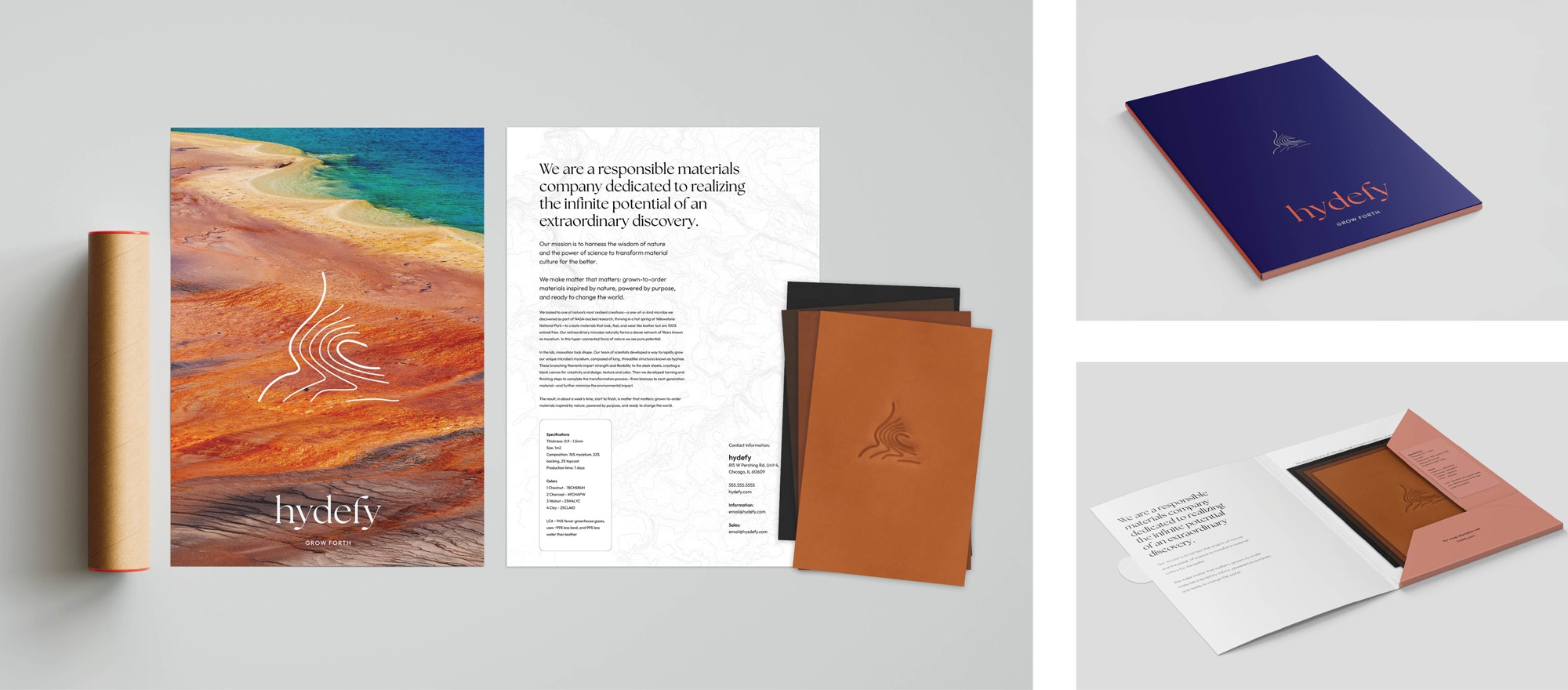
From developing a distinctive name to establishing the brand’s foundations—including a comprehensive visual and verbal framework—YummyColours infused Hydefy with its core mission: harnessing the wisdom of nature and the power of science to transform material culture for the better. The name Hydefy is a layered linguistic creation. It references hyphae (the mycelium structures in fungi), hide (as in animal skin), Fy™ (the name of its microbe), and defy, representing the company’s ambition to push boundaries in material innovation. The brand’s creative platform, "Grow Forth," serves as both an inspiring call to action and a reflection of the process through which the material is cultivated.
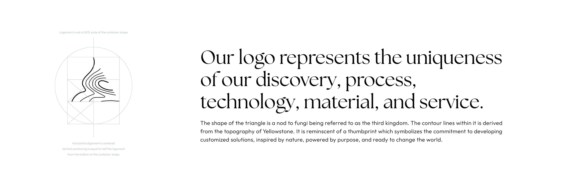
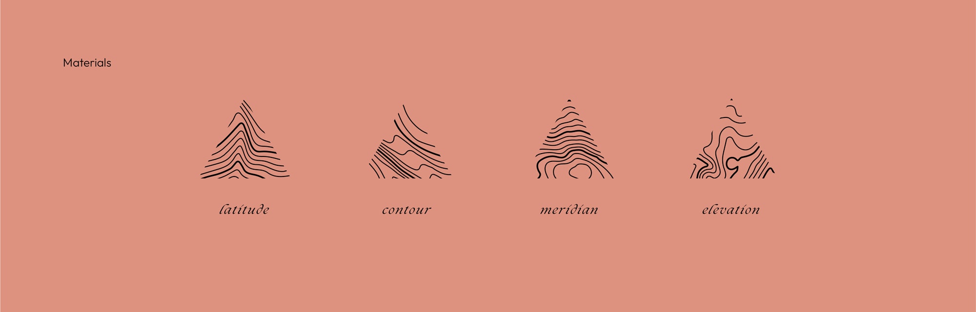
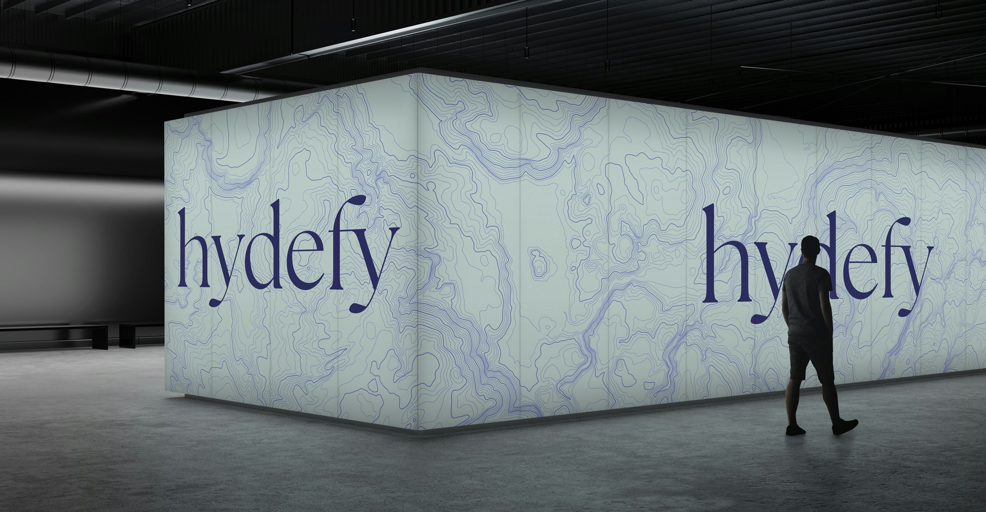
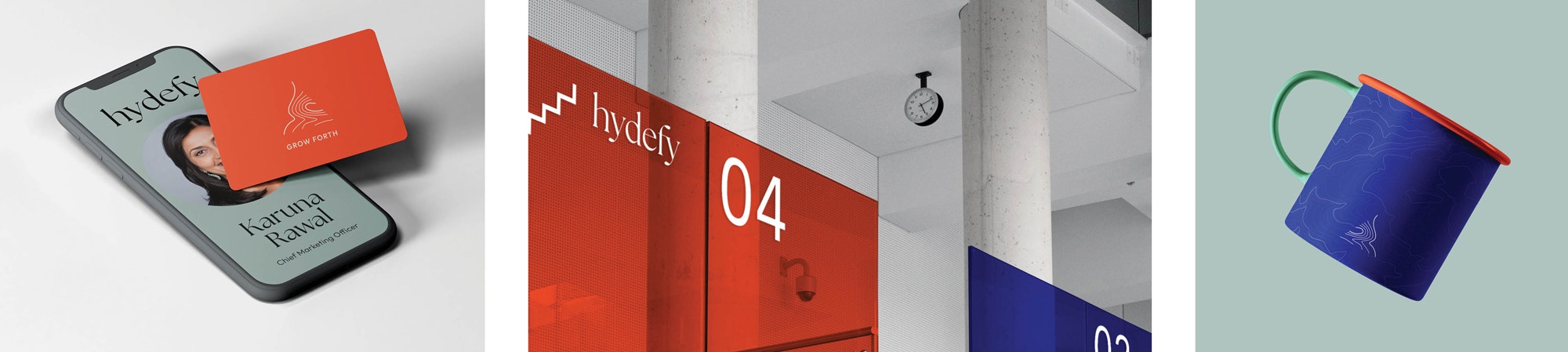
Every element of Hydefy’s visual identity is crafted with intention and meaning. The logomark, a borderless triangle, contains topographic details of Yellowstone—a tribute to the place of Fy's discovery. The triangle shape also nods to fungi, often referred to as the "third kingdom" of life. The color palette blends hues drawn from both nature and technology, while the graphic and illustration style is inspired by the sketches and doodles commonly found in explorers’ field guides and notebooks. Hydefy’s story is as distinctive as the novel organism at the heart of its breakthrough technology. Our goal was to reflect this uniqueness in the brand’s expressions—building on continuity, authenticity, and a forward-thinking vision for the future.


Connie Lui
Mia Le
Krystal Greven
Stephanie Murg