Circus Street
Brand Narrative
Circus Street evolved from helping marketing and media companies in their digital spaces to completely transforming the education across entire organizations of global Fortune 500 companies. To align with this exponential growth, and to create a unique and compelling position in the marketplace, Circus Street needed to bring their brand up to date and incite a feeling of maturity, capability, and longevity. The brand needed to communicate their newly minted brand purpose, values, and sales proposition.
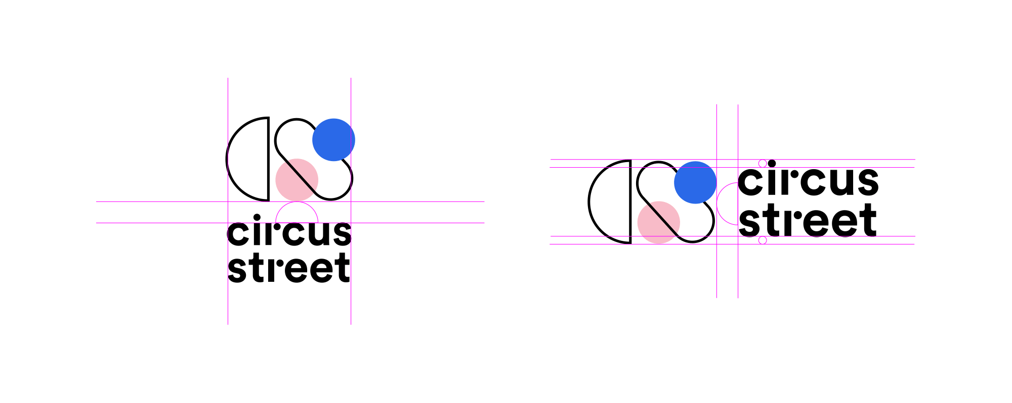
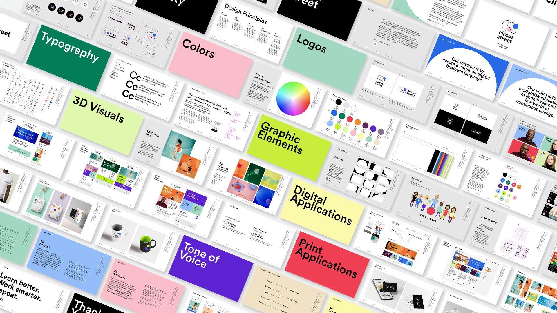
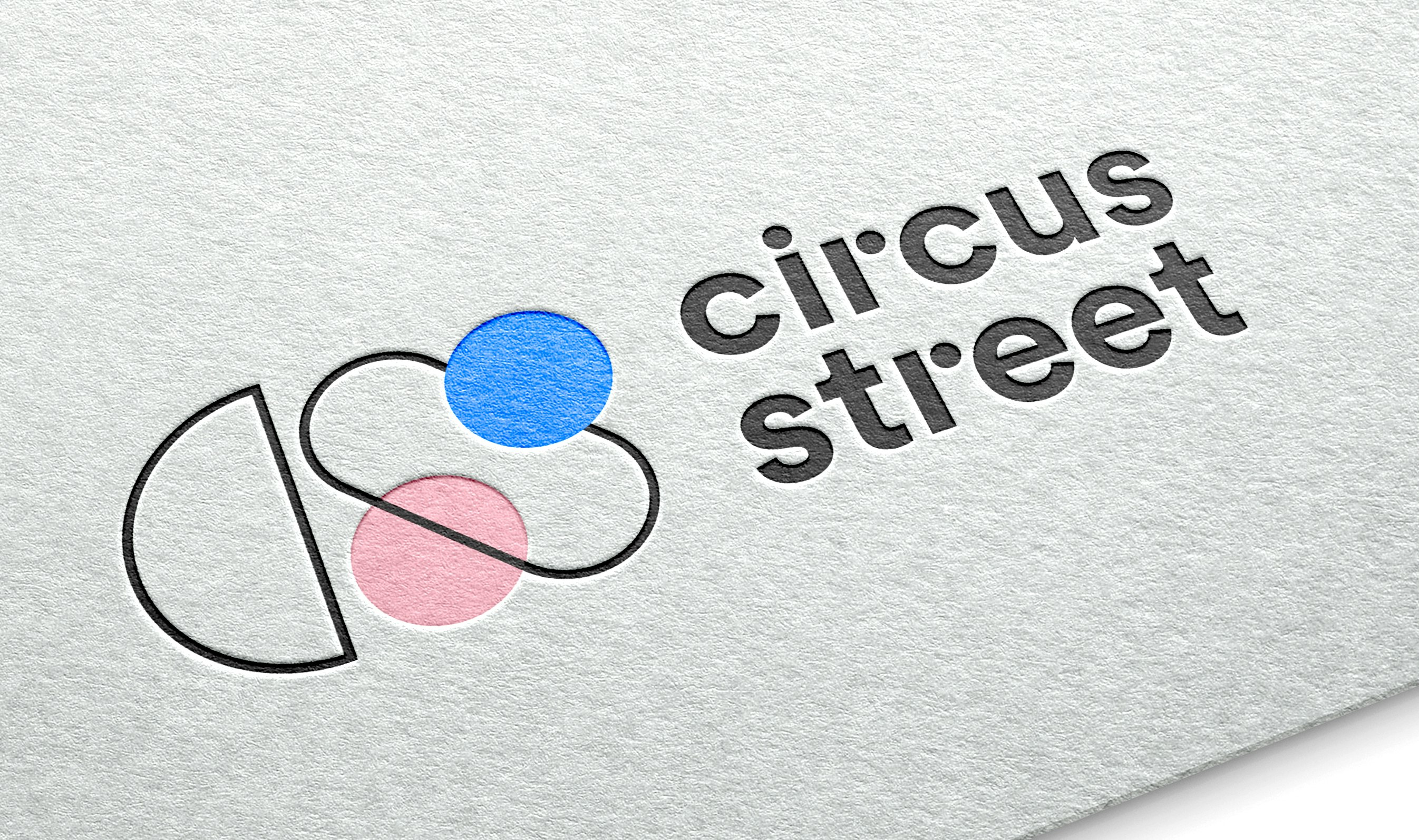
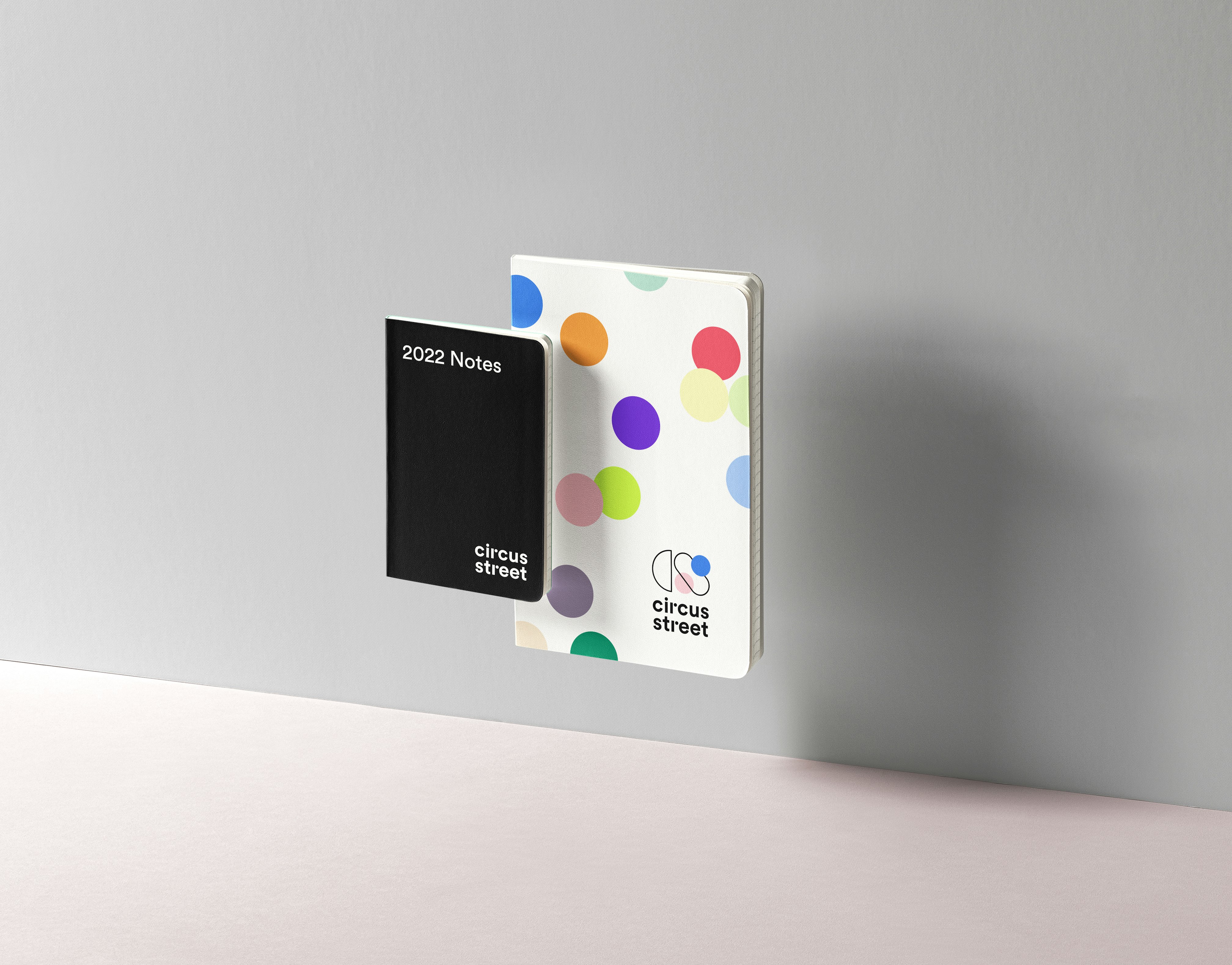
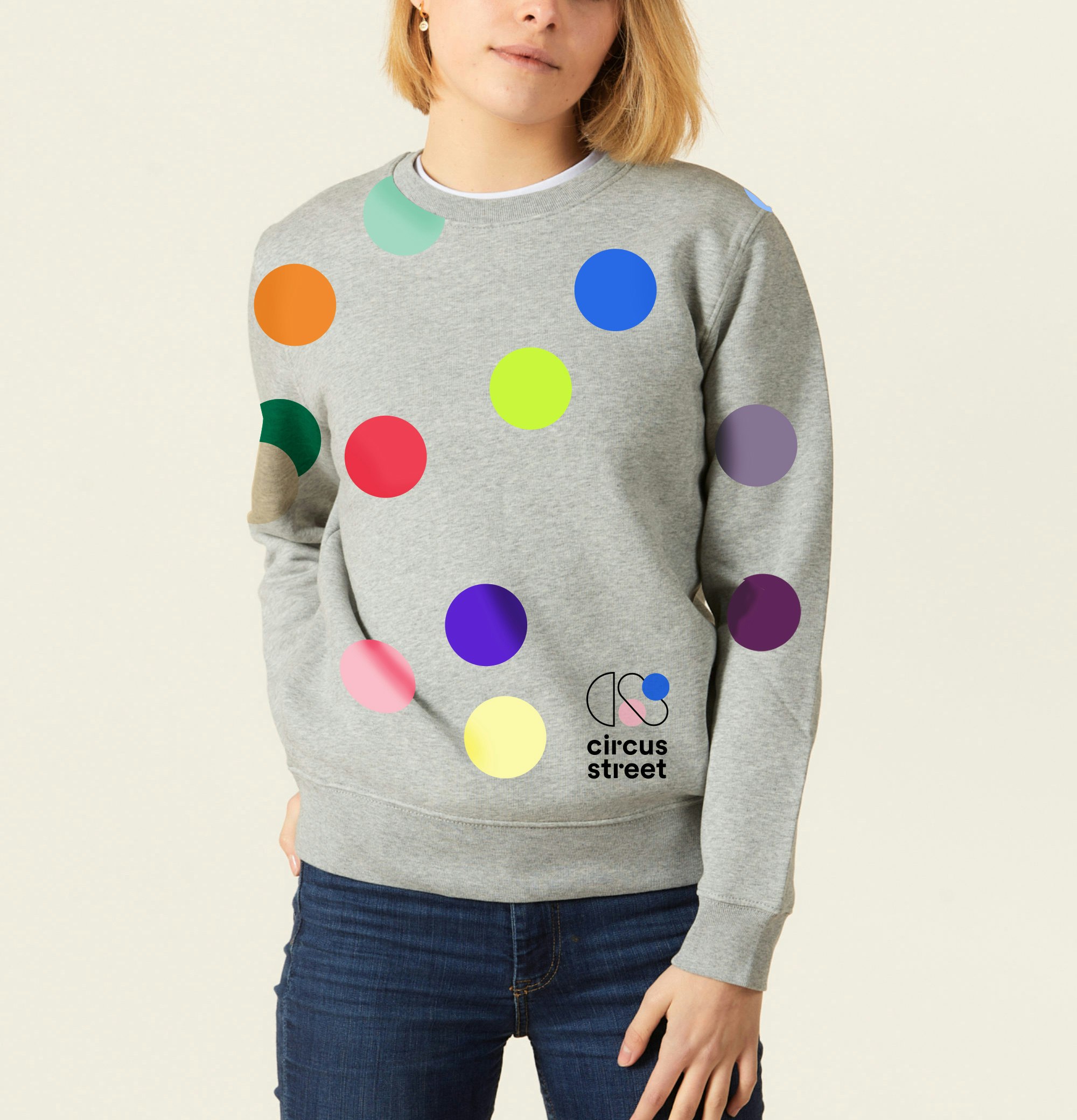
Recognizing the brand’s need for a new set of comprehensive visual guidelines to provide consistency in communication across all areas of the business, YummyColours started with an audit of Circus Street and its competitors. These analyses revealed that the Circus Street name is different, non-traditional, and personal to the brand. And the circular aspect of the name inspires continuity which aligns with the brand story of being the place where business education comes full circle. We used this foundational motif throughout the brand’s visual identity and tone of voice.
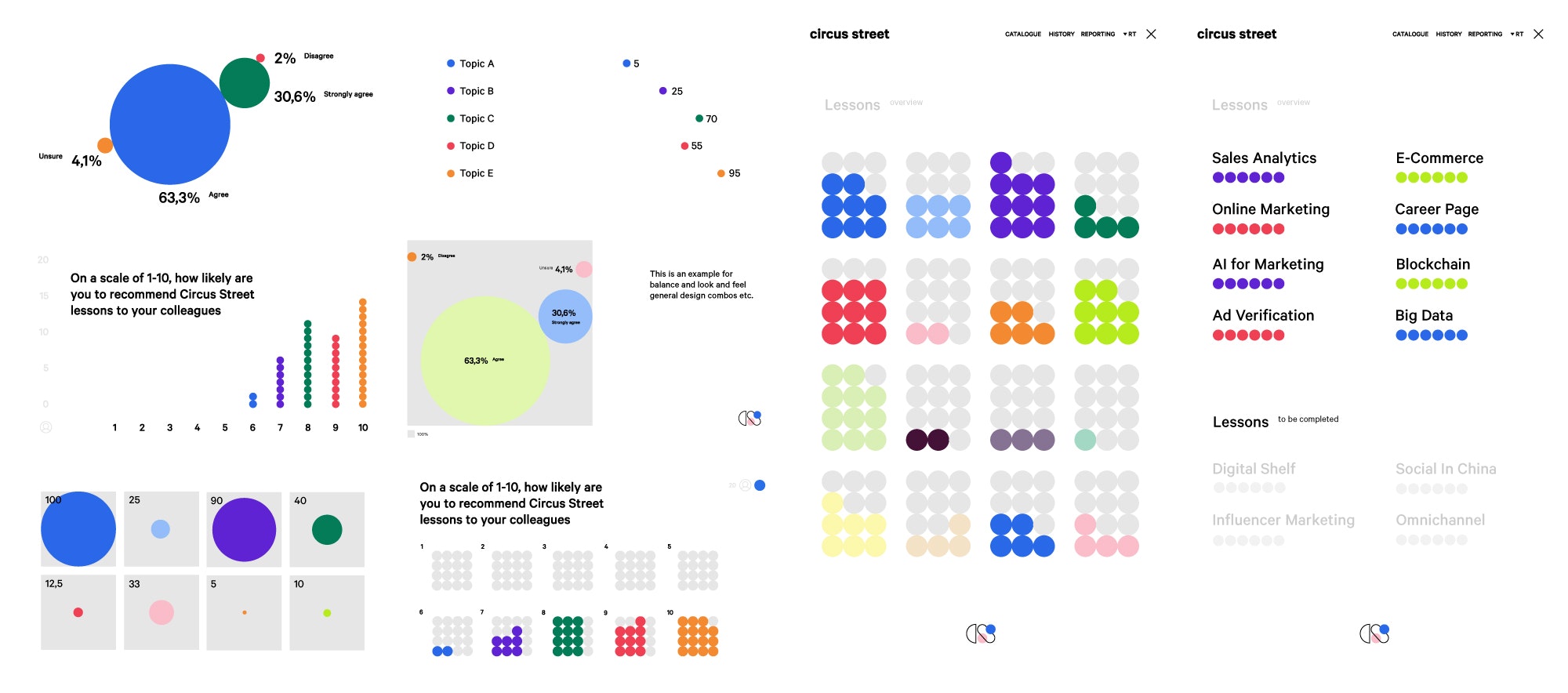
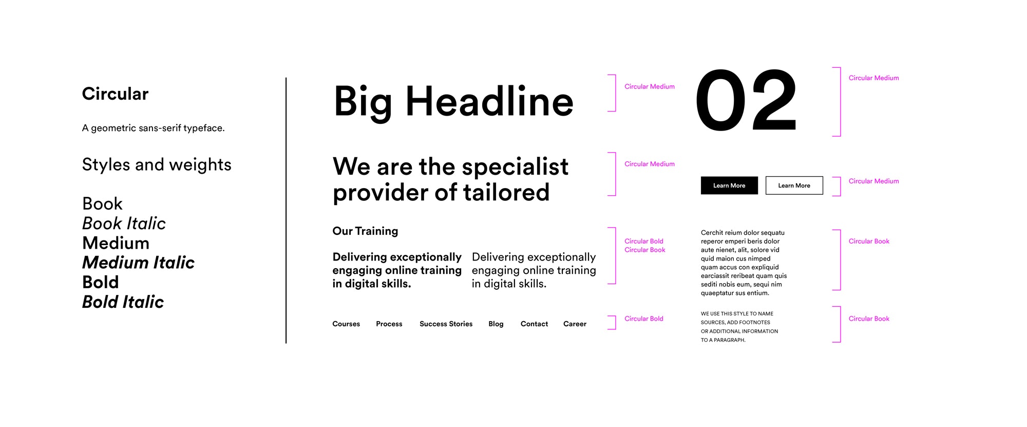
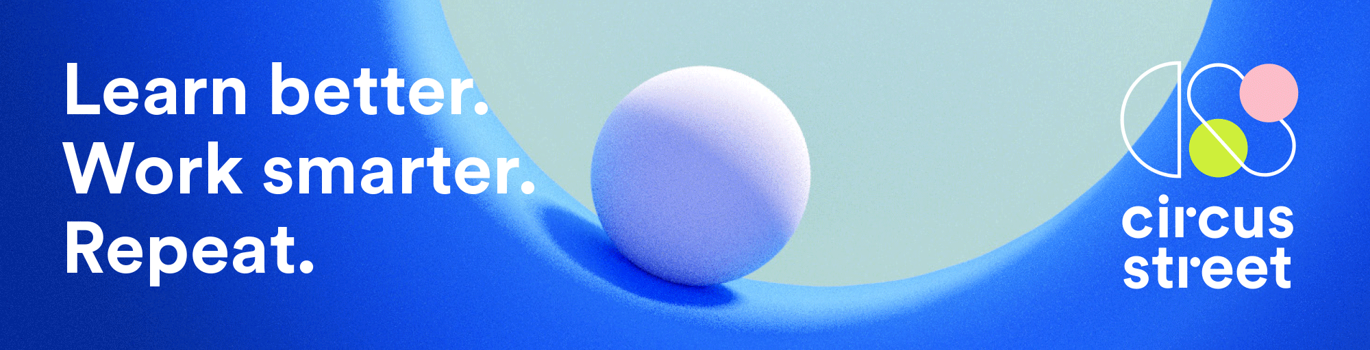
The logo is playful, and it evokes endless opportunities which is further strengthened by the expansive color palette. The typography is simple and a new 3D language was developed for the brand’s key visuals. This new look and feel bridges the gap between the environments used in individual lessons and branded campaign content. Now, with a set of design and brand voice principles, Circus Street can confidently bring the new identity to life with consistency. Overall, the new brand identity builds on all the “magic” that has made Circus Street the success it has been to date, all while balancing the fun of learning and the gravitas of its new audiences. Learn Better. Work Smarter. Repeat.


Connie Lui
Krystal Greven
Stephanie Murg
Lukas Weber
Rita Edwards