Afterpay
Brand Narrative

Afterpay needed visually ownable, elevated, and connected points of view to solidify the brand within the fashionable spaces of Millenials and Gen Z, so Afterpay tasked YummyColours to create a brand perspective that both lives within the company and consistently translates across each of its global markets.
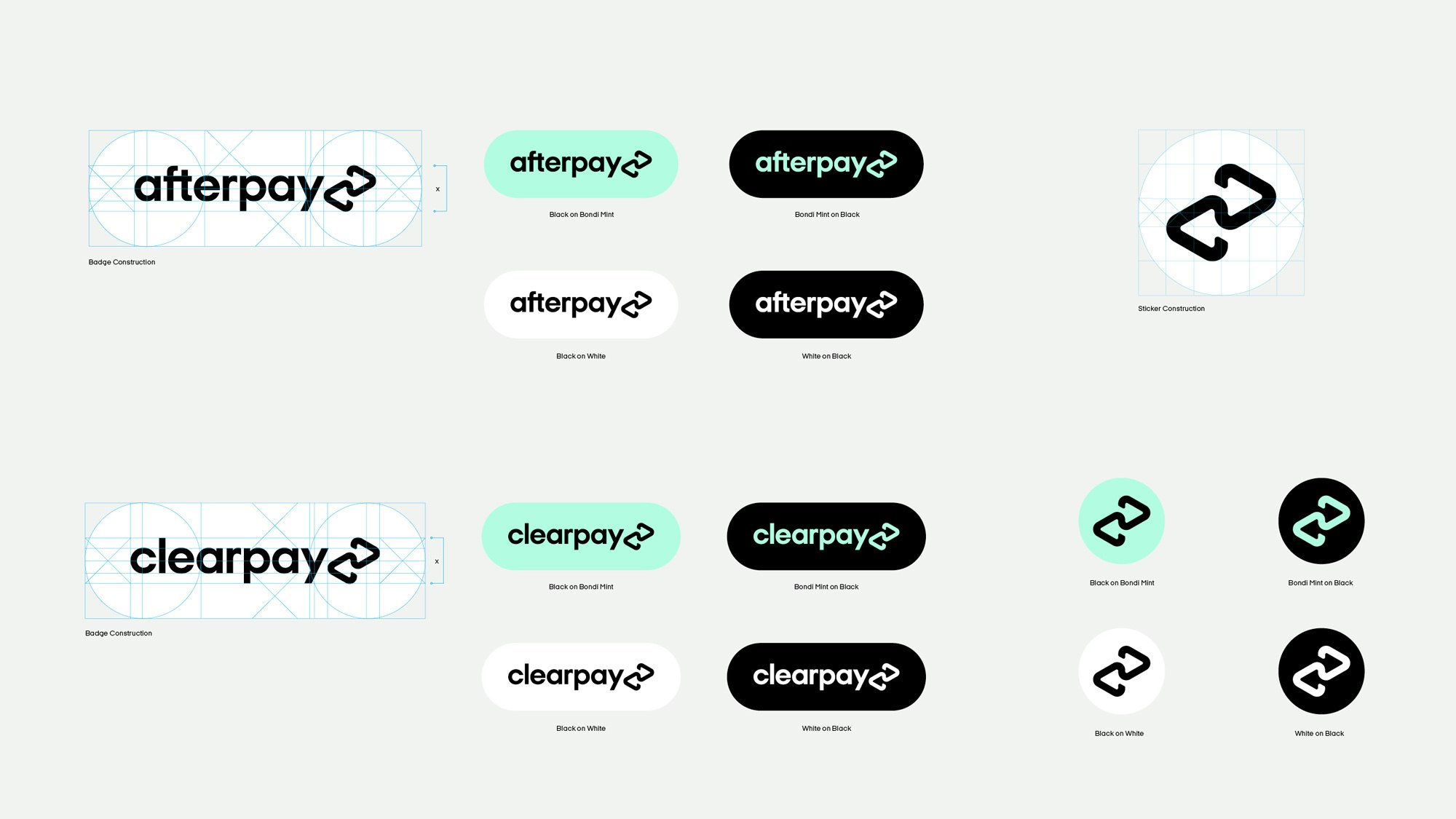
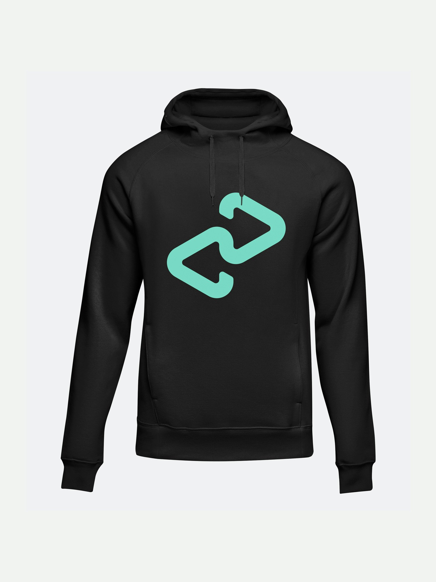
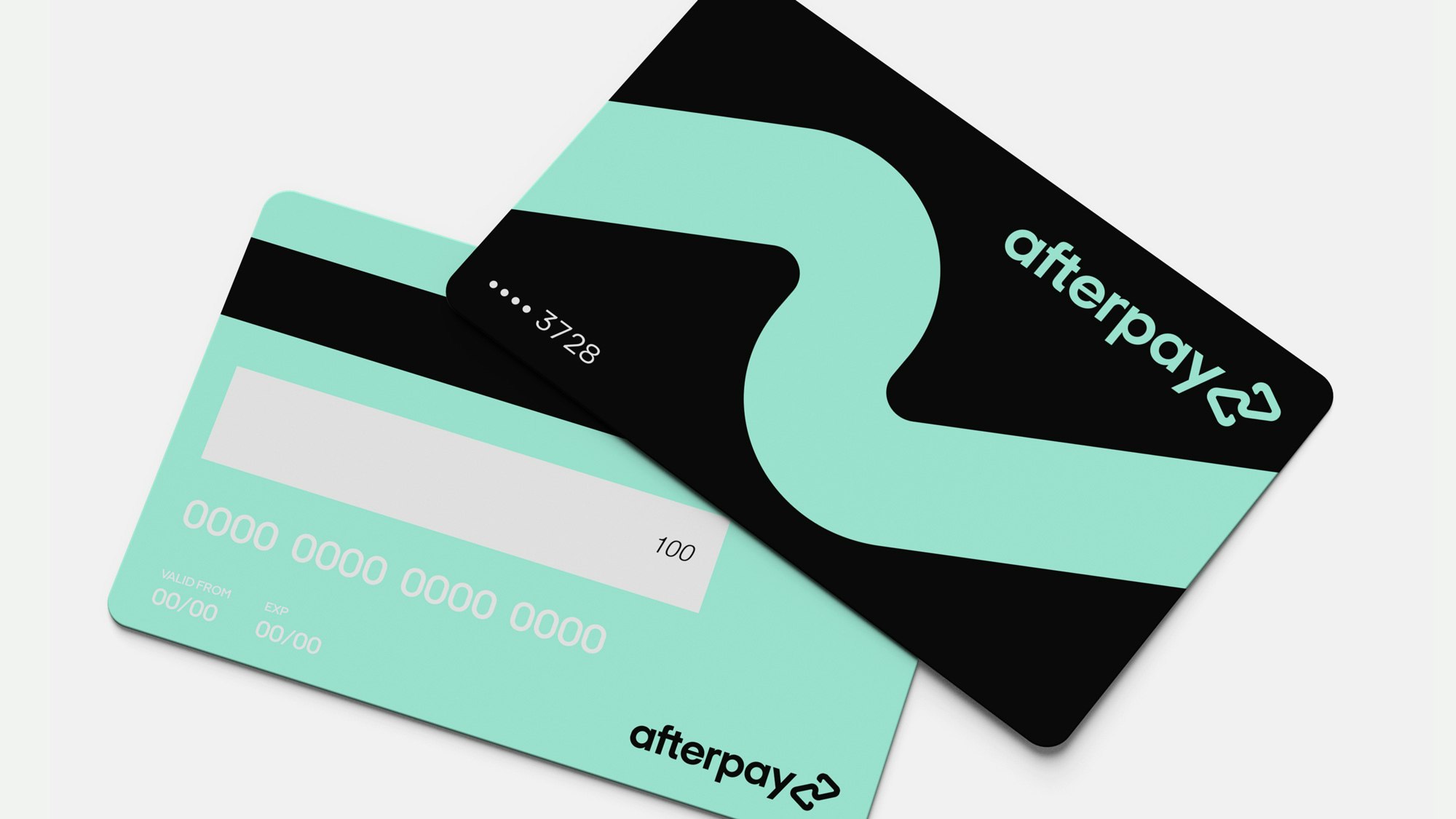
YummyColours created an all-encompassing global language for the leading fintech brand Afterpay deepening its visual identity with a new logo, signature color, and an extensive system for expression across physical and digital platforms. Afterpay’s new identity was developed as a resolute evolution of the brand and its services to unite the messaging across multiple regions and demographics. YummyColours reimagined the two arrows prominent in the original logo design into a linked, continuous form that evokes balance and interconnectedness. The resulting logo represents how the relationships between Afterpay, their partner merchants and customers are continually strengthened each time they interact with one another.
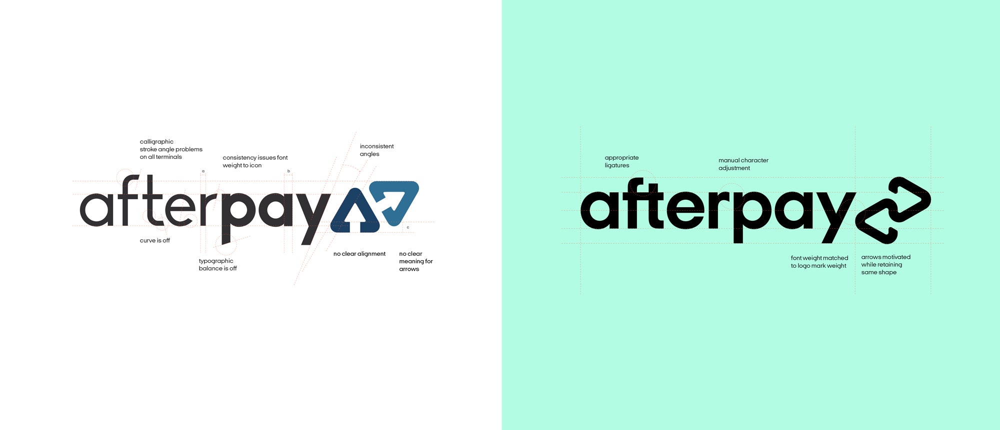
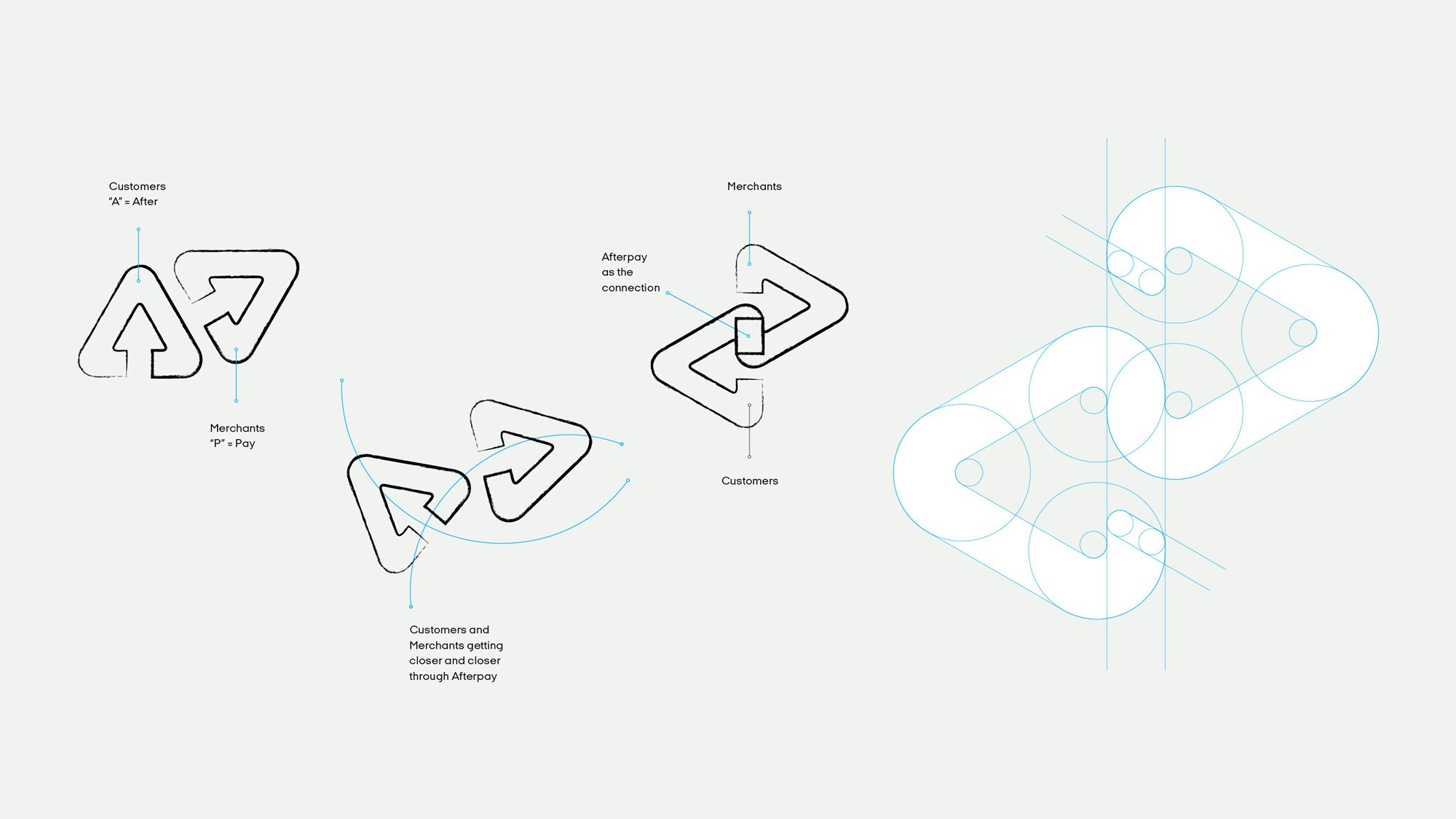
Afterpay’s new identity is an evolution of the brand and its services. The new mark embodies the brand’s values and retains the balance of the previous symbol, combining the existing two triangles into a new, continuous shape. The interconnected brand mark expresses how Afterpay acts as a link between the company, merchants, and customers. This loop represents the way the relationship among all parties is continually strengthened each time they interact with one another.

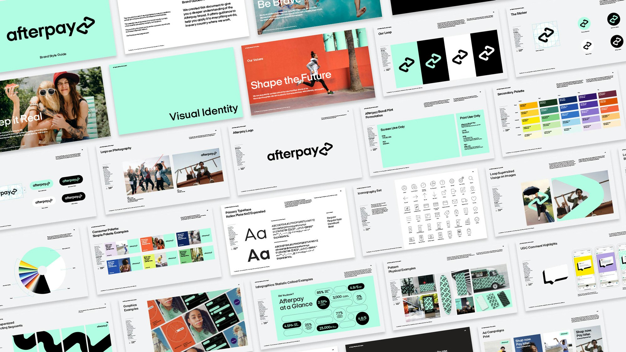


The launch of Afterpay’s new identity comes at a time when consumers are moving away from paying with expensive credit cards and loans - preferring instead to use their own money to pay over time. “Afterpay enables financial freedom and responsible spending, offering solutions to consumers who want flexibility with payments now more than ever. The collaborative work YC did around the brand's visual representation and tone of voice weaves in core financial wellness and human-centered narratives into merchandising, content, and other means of brand expression.
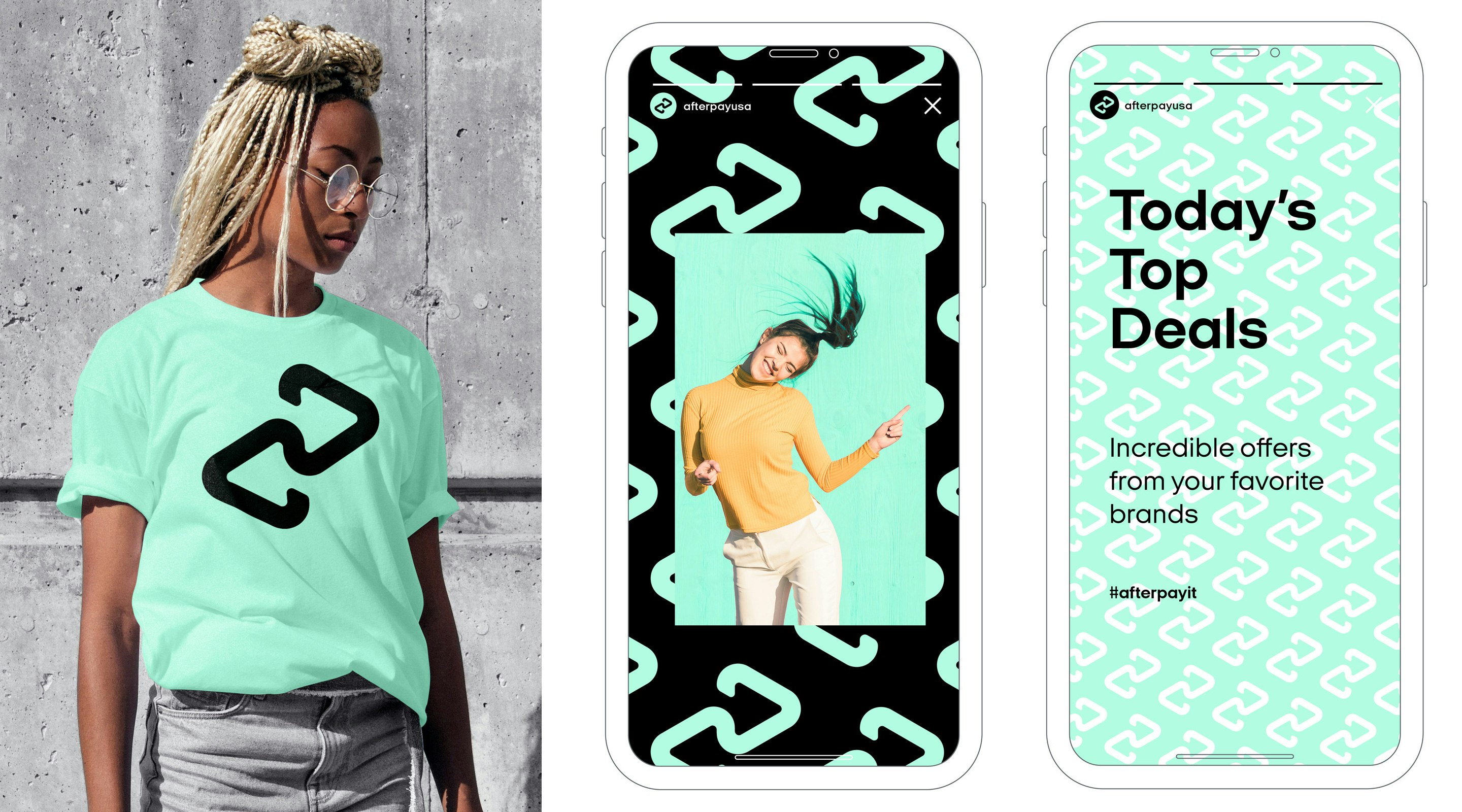
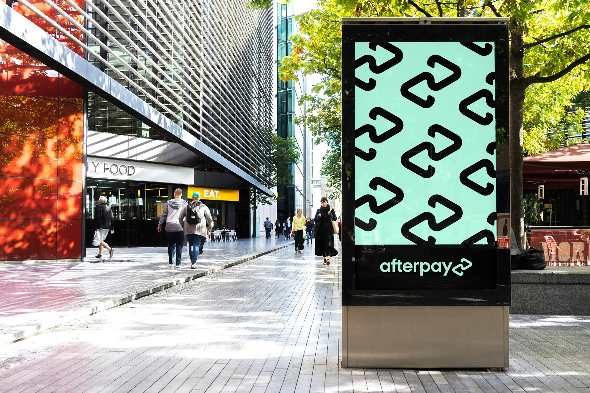
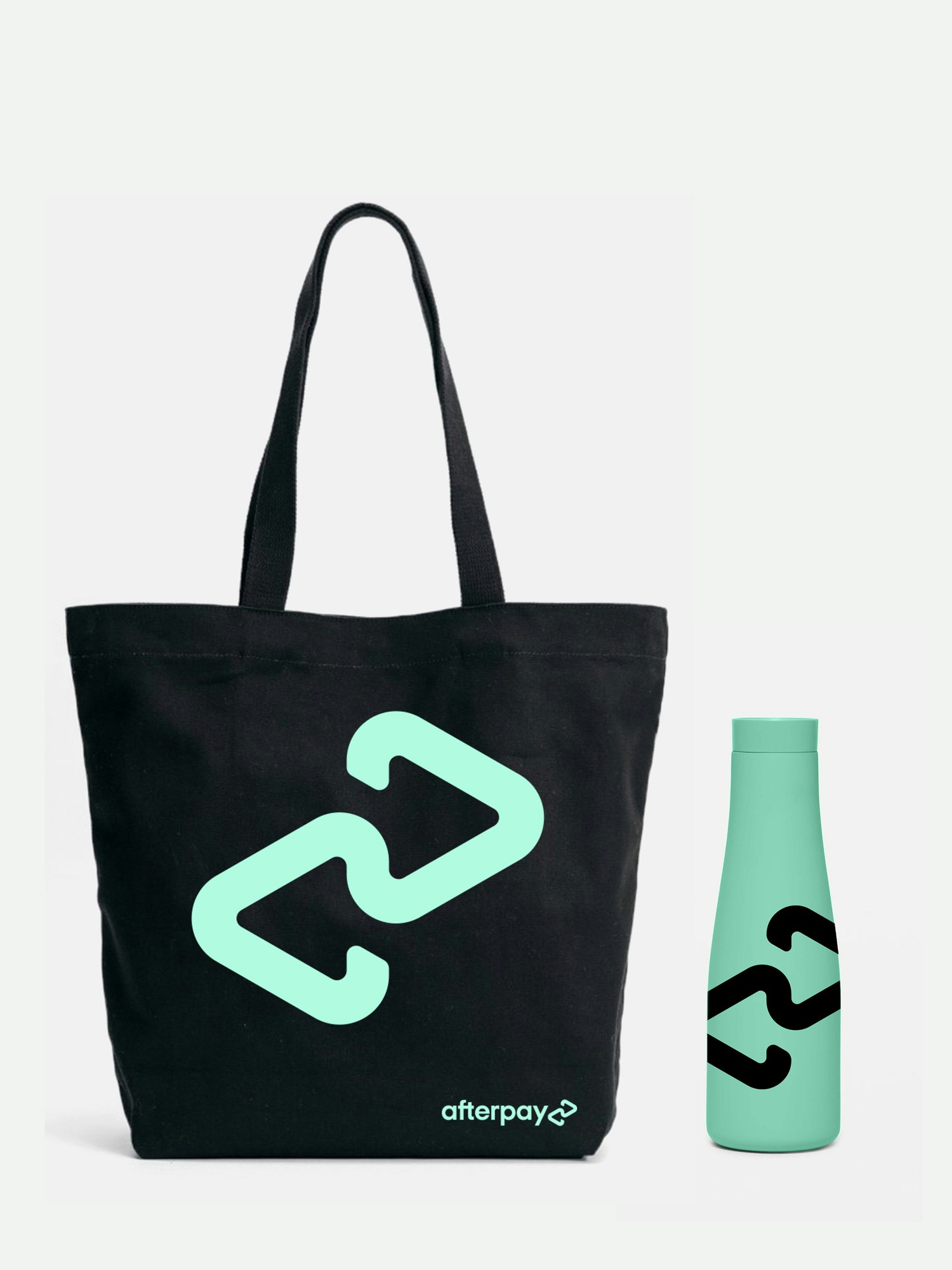
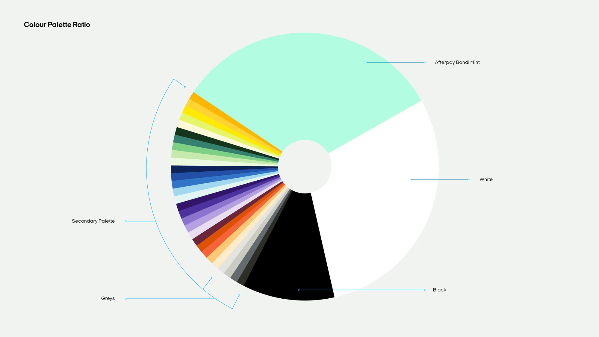
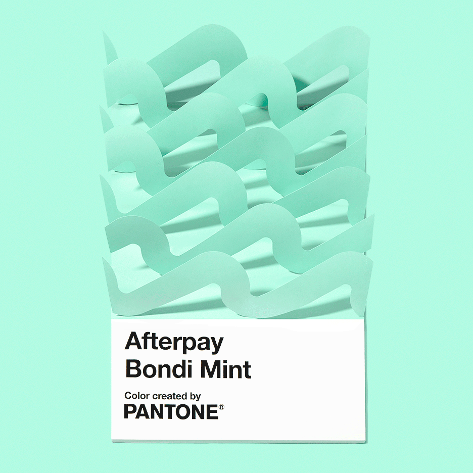
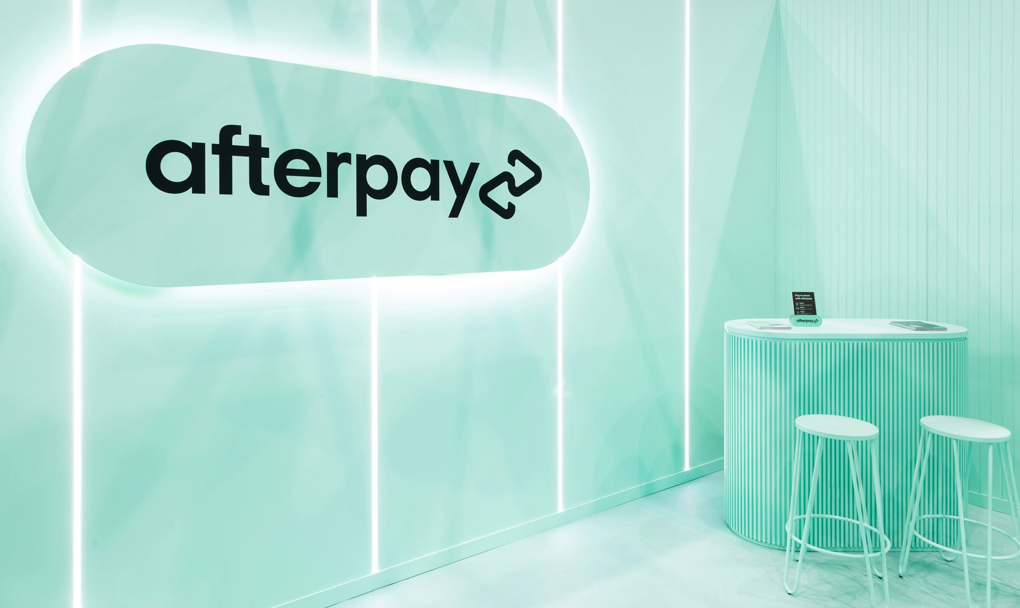
YummyColours used this unique opportunity to design a custom new signature color for Afterpay in collaboration with Pantone: Afterpay Bondi Mint.
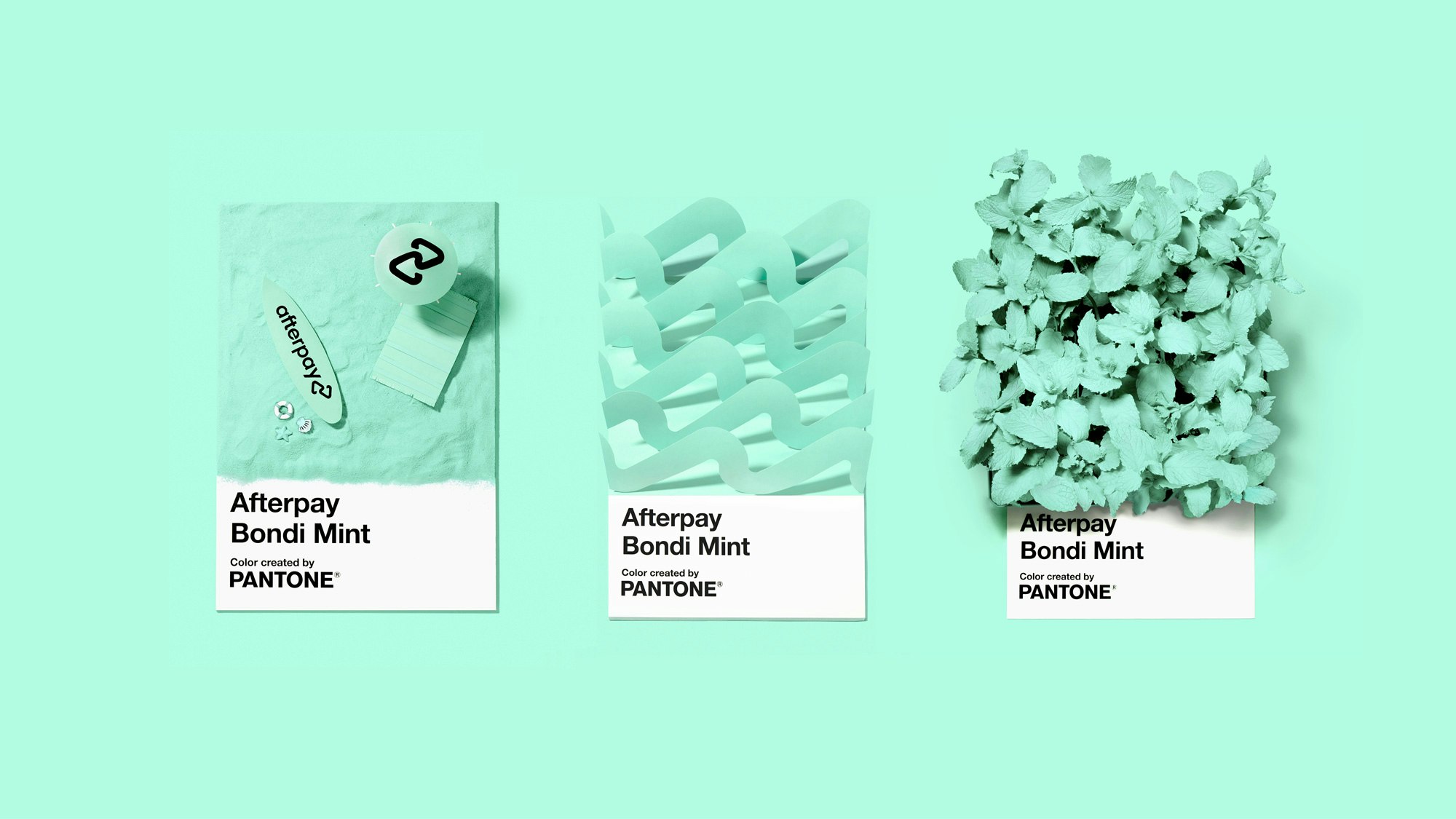
“Color is one of the easiest and most effective ways to highlight to a consumer the unique qualities and promise behind the brand because the brand color is the most tangible representation of who they are. Bondi Mint boldly anchors Afterpay’s visual language, rooting it in forward-thinking Australian culture with human connection at the core.”


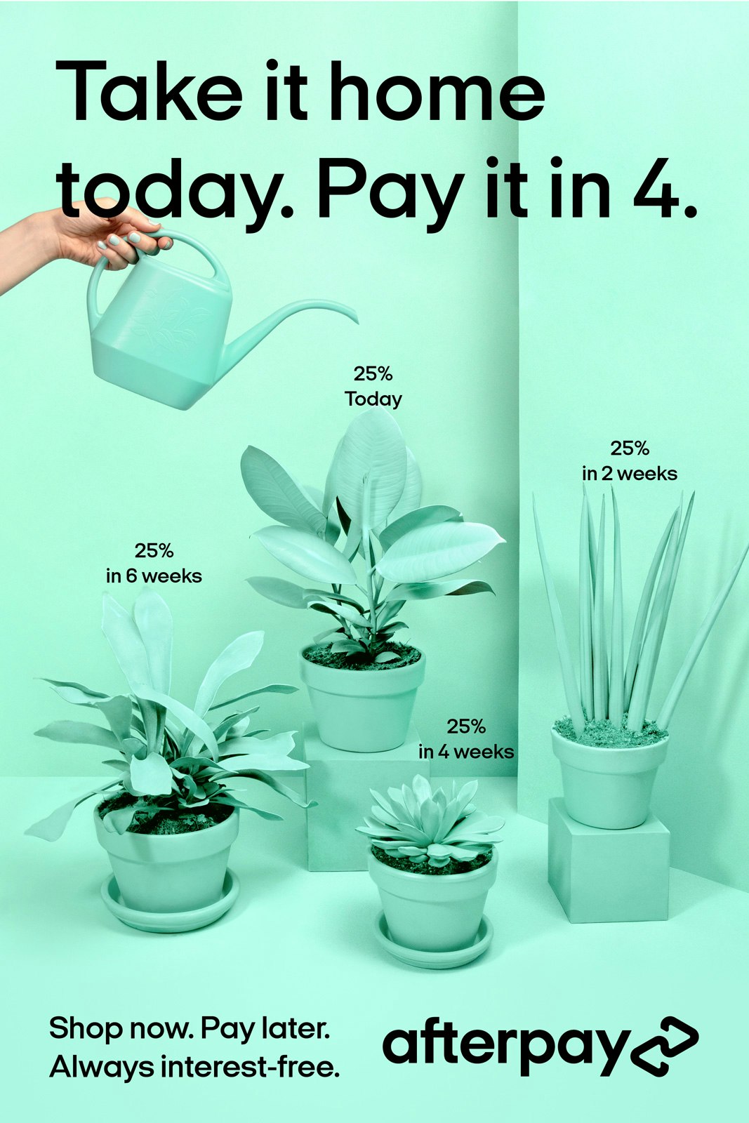
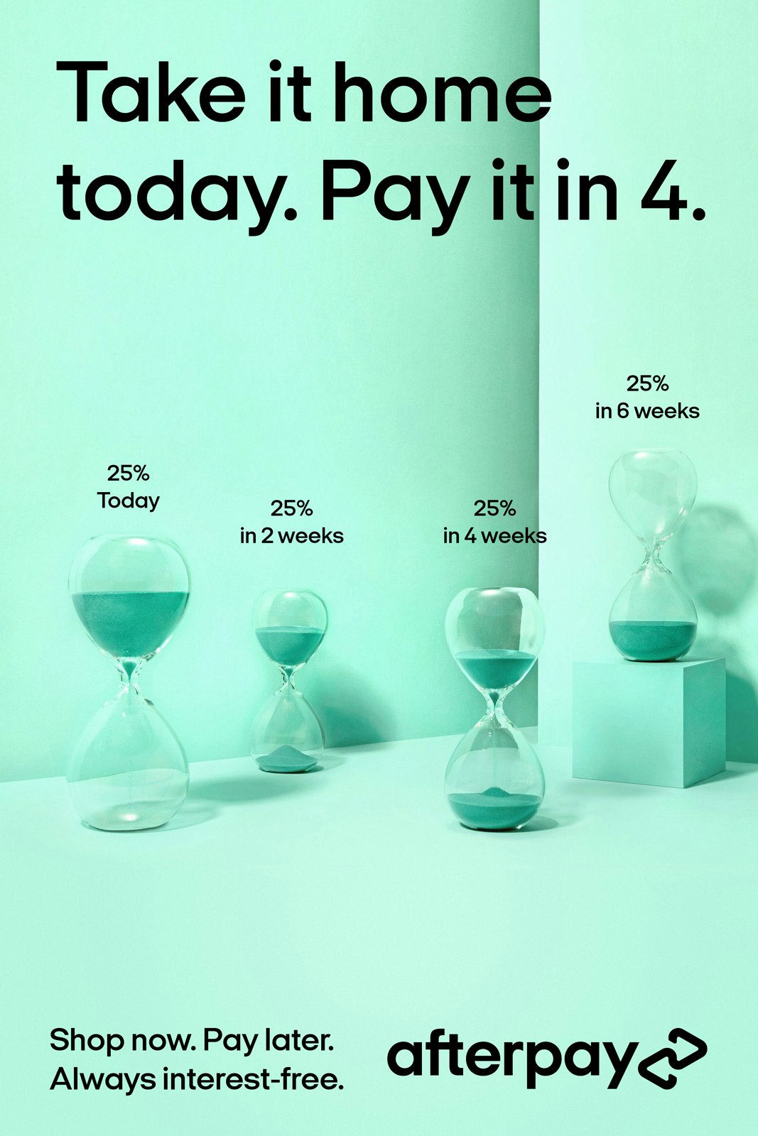
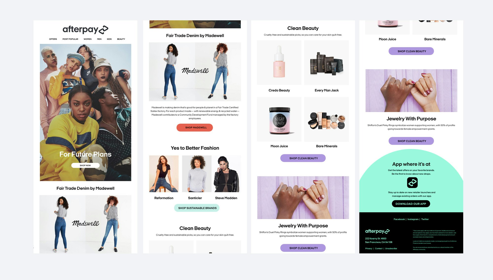
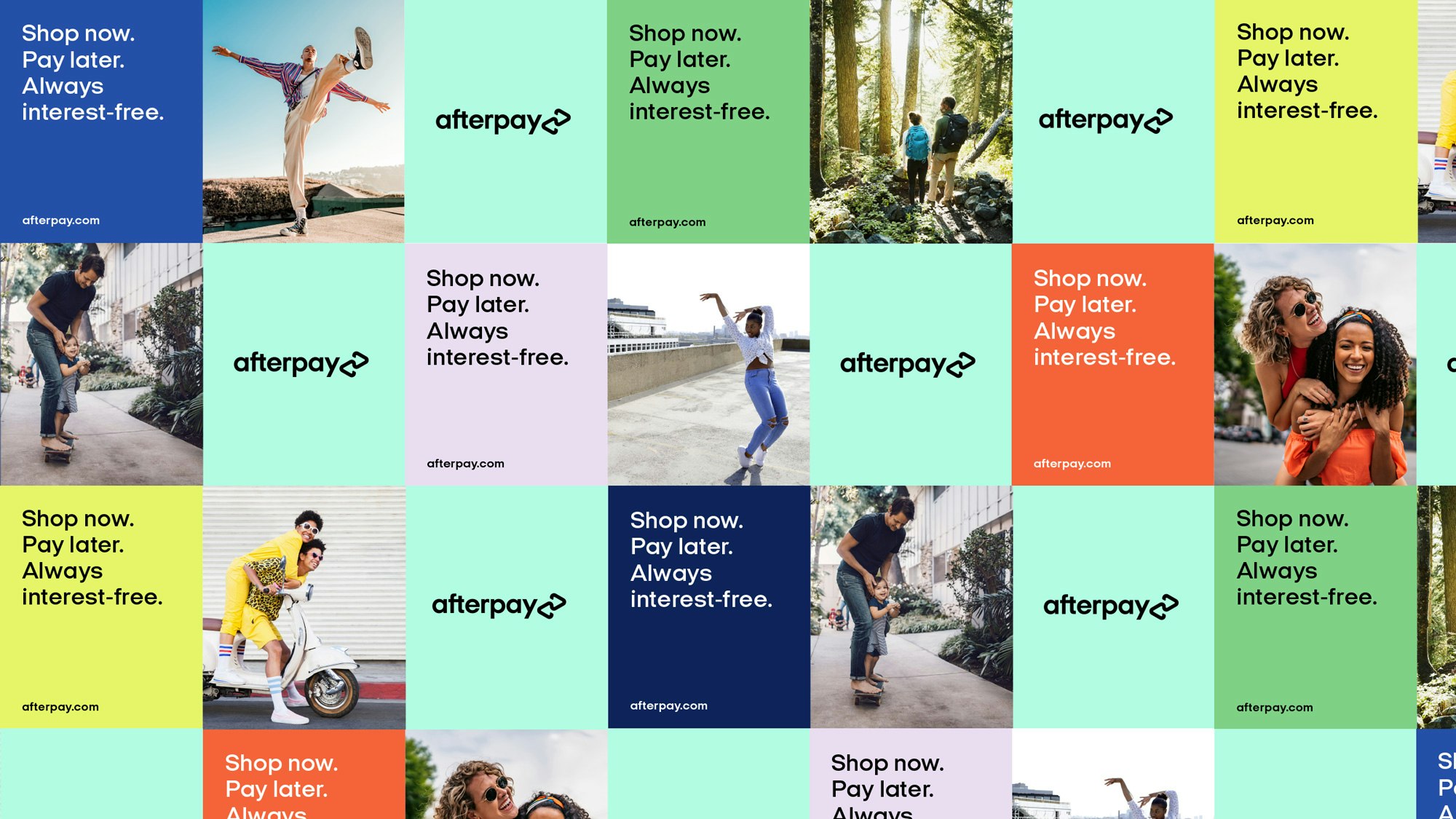
A simple grid system was developed for print, OOH, and digital ads. For consistency across the variety of formats and proportions, branding is applied on a solid Afterpay Bondi Mint background, while messaging live on a solid secondary colour block. A secondary colour is carefully selected to compliment the photography the ad features. The grid span with two or three equal sections: messaging on secondary colour block, an image, and Afterpay branding on Bondi Mint. Vertical ads are image-focused where messaging is applied to the left side of the layout and branding appears on the right. Digital ads are divided into two sections—photo and messaging plus branding on Bondi Mint.


Connie Lui, Diego Marini
Isabel Lea, Rachel Gingrich, Katie Osborne, Bridget Pavlick
Krystal Greven
Alyssa Benjamin, Christine Wennekamp
LBR Insight
Peter Rhoads, Emily Pellerin, Sarah Robb
Helen Slavutsky, Friction FX, Aaron McGuire
Chiara Luzzana
Denize Maaløe, Diego Marini
Ten Hats Agency (Concept, Design, Execution)
Francesca Bandiera, Artur Dias