Aerosoles
Brand Narrative
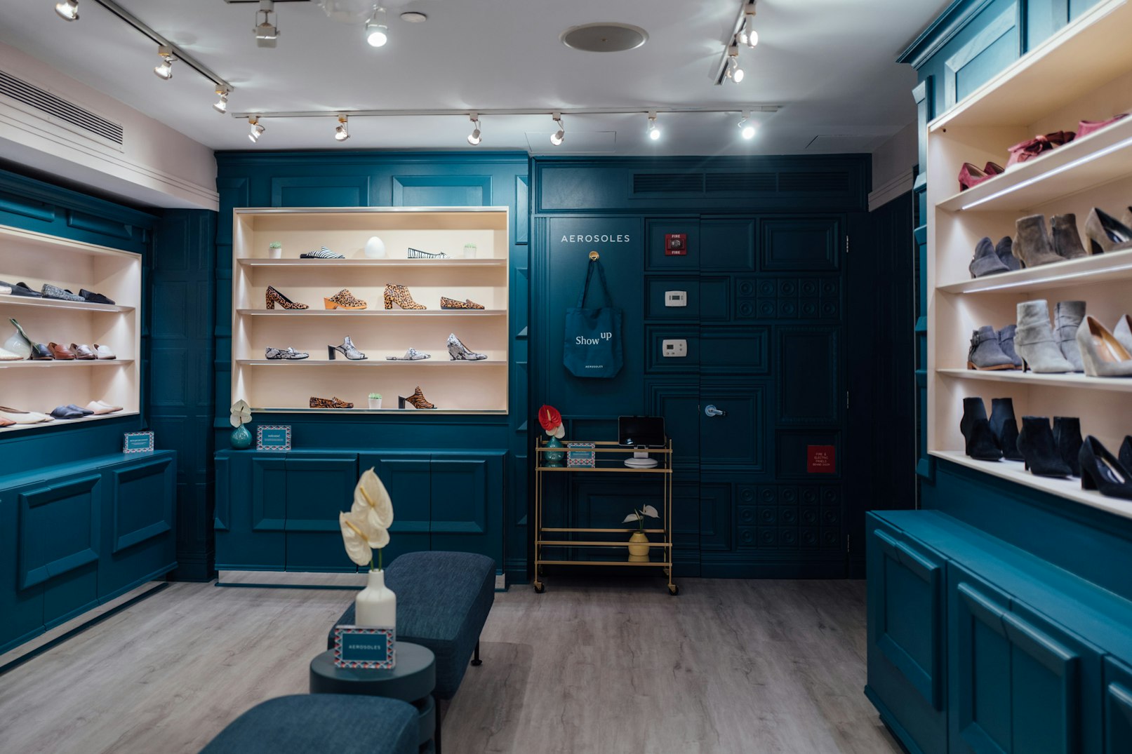
Aerosoles, a heritage footwear brand, has traditionally focused its branding efforts on brick and mortar stores and print. Eventually, the company’s approach to retail shifted as they started seeking a digital-first brand. YummyColours took on the challenge of modernizing and repositioning Aerosoles to appeal to shoppers that are digitally-centric while remaining connected to its original consumer base.
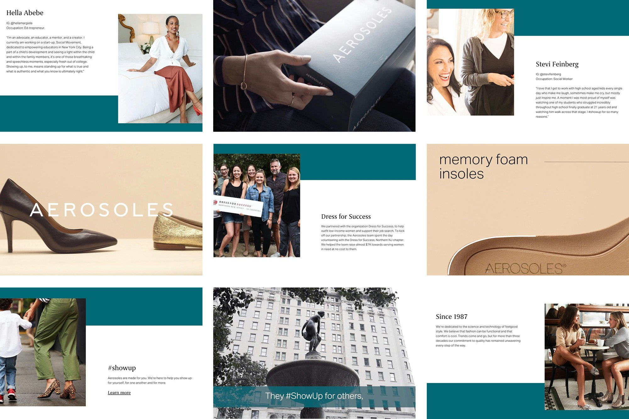
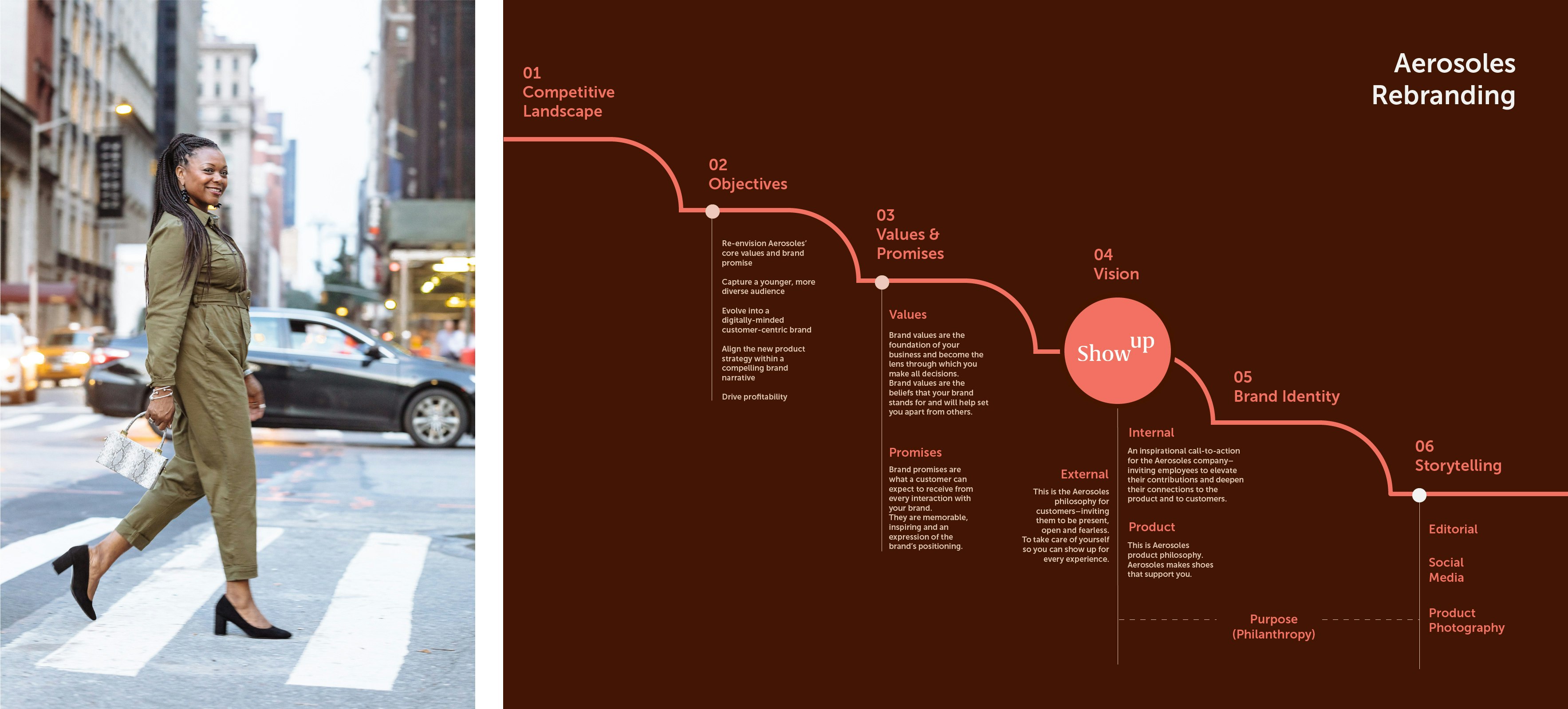
To evolve Aerosoles into a digitally-minded brand that encompasses both personality and inspiration, YummyColours prioritized Aerosoles’ consumers and their lifestyles, habits, and needs to support a brand strategy. The strategy is also guided by Aerosoles’ core ethos and new product strategy. This movement helped lead to a fresh and compelling visual identity and editorial direction while positioning the brand as an ally in defining one’s own success. By prioritizing true consumer stories, YummyColours helped to celebrate different people, professions, and lifestyles that then helped showcase true product impact. Iconically comfortable and affordable, under YummyColours’ creative guidance, Aerosoles has also become stylish, contemporary, and people-driven.
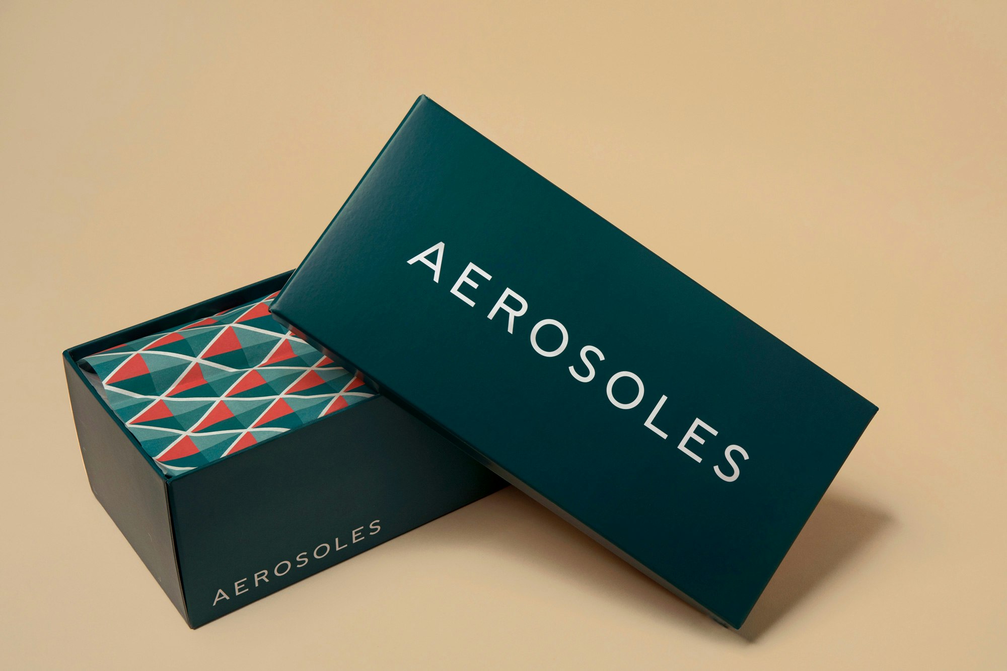
After embarking on a competitive analysis and identifying consumer segmentations, YummyColours created the action-forward tagline “Show Up.” The prompt reoriented the Aerosoles brand and company toward the consumer by responding to real-world customers and scenarios. The tag also extended to corporate relationships and product expectations. YummyColours implemented a new editorial direction around the “Show Up” concept, focusing on campaigns, user-generated content, and social media strategy. In addition to overall brand strategy and editorial direction, YummyColours created Aerosoles’ new visual identity. Tone of voice, logotype, colorways, and more help to support “Show Up” as a contemporary call-to-action that engages with young and diverse audiences without alienating existing ones. The project ultimately modernized the Aerosoles brand with an inclusive and inspiring angle, focused on real people, real stories and real engagement.


Diego Marini
Katie Osborne
Krystal Greven
Alyssa Benjamin
Matt Gleuckart, Aaron Bernstein
One Rockwell