Divya's
Visual Identity System, Packaging
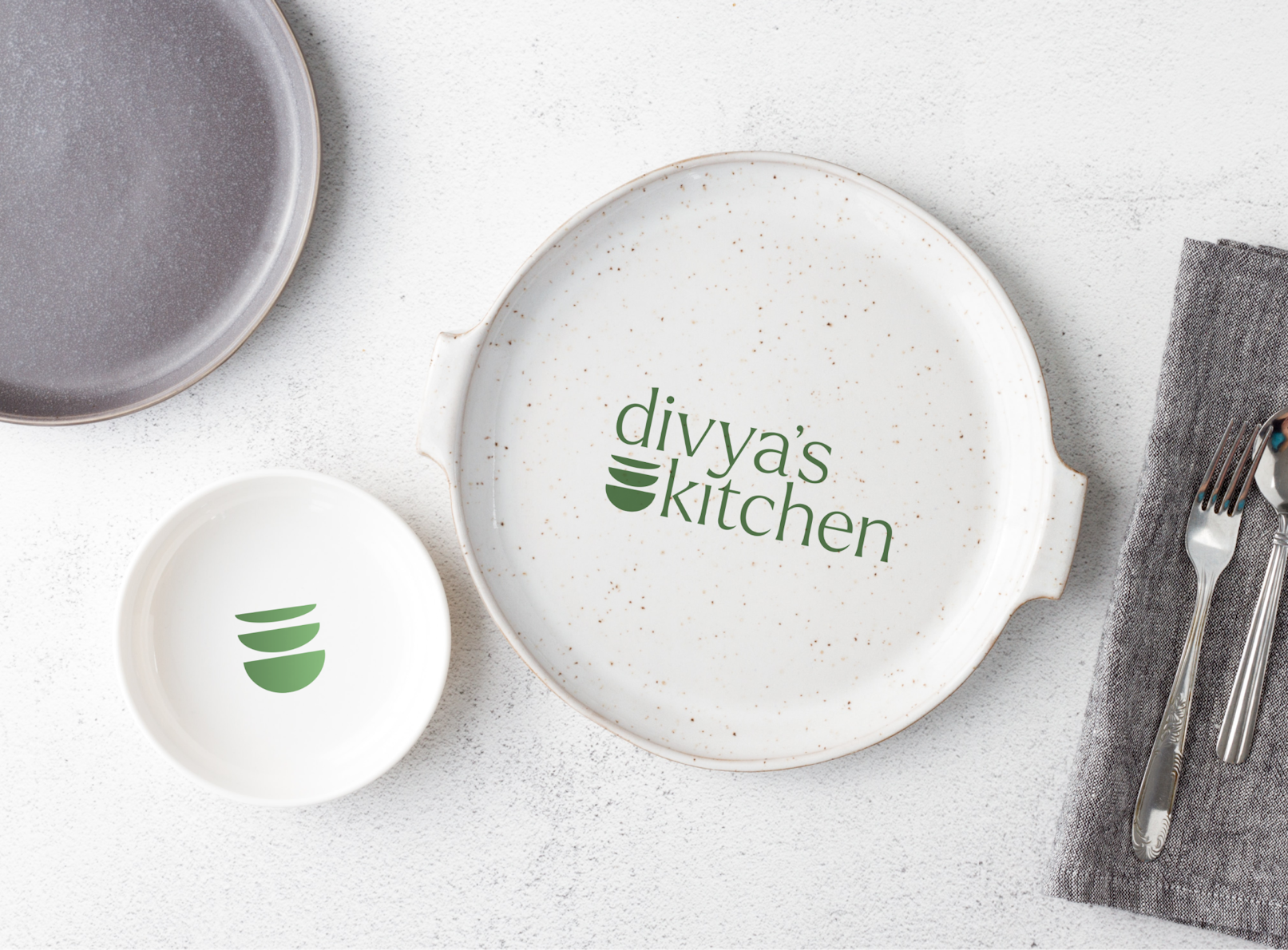
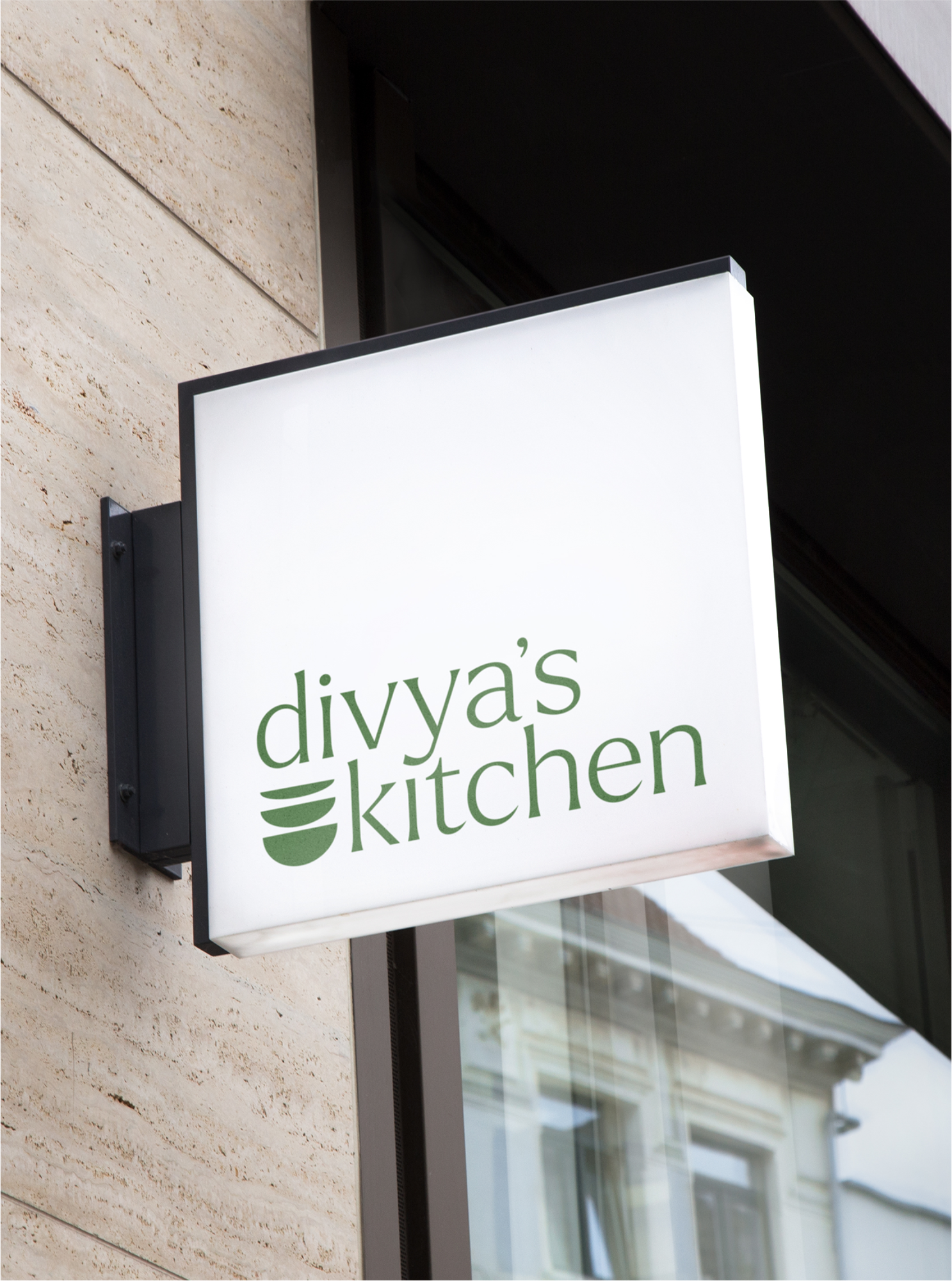
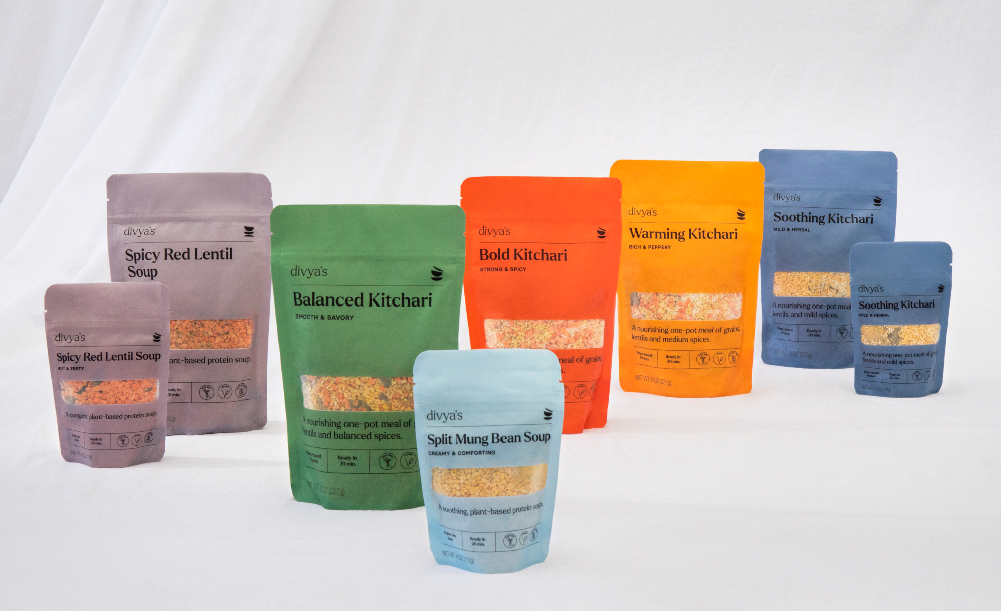
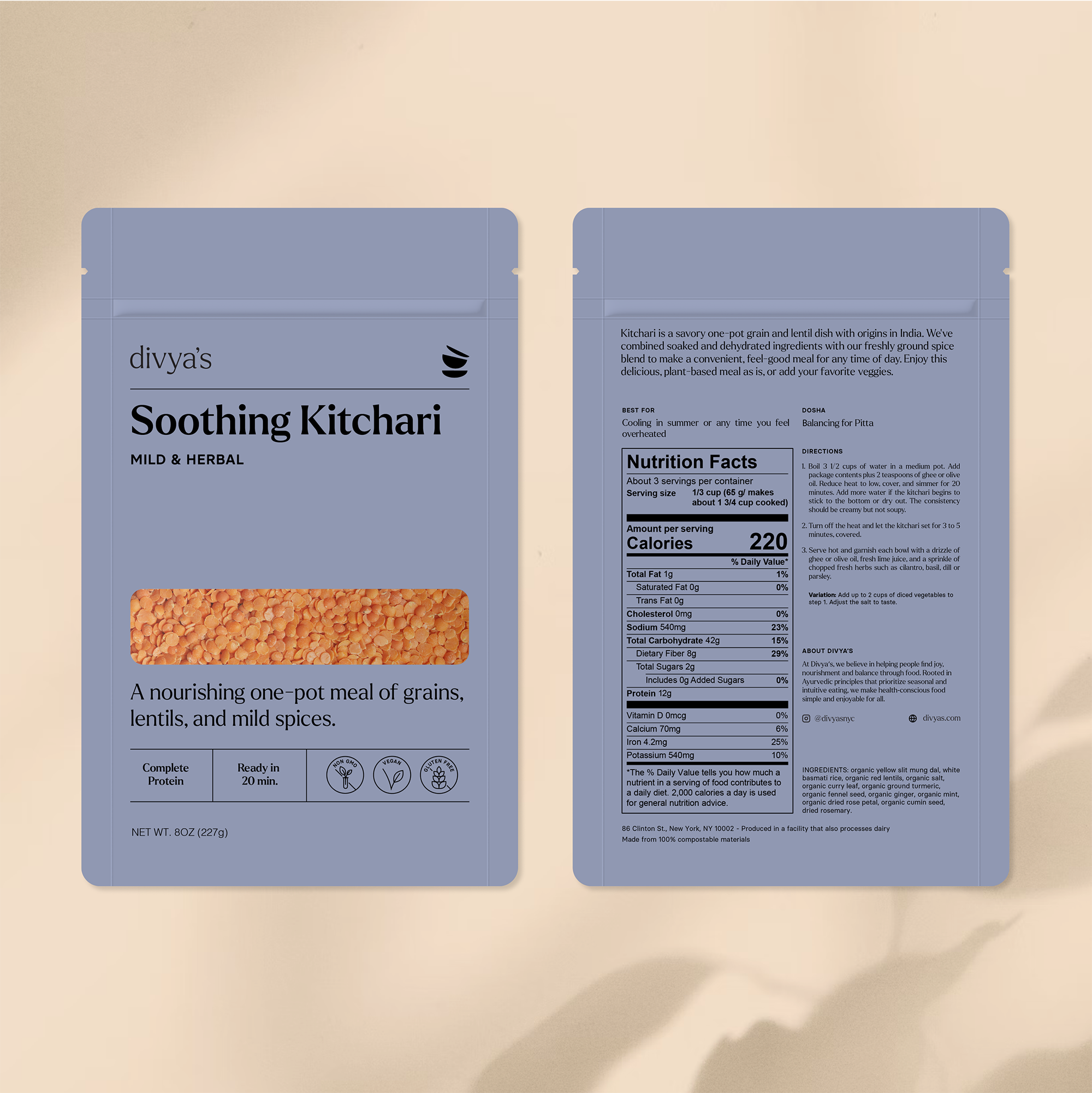
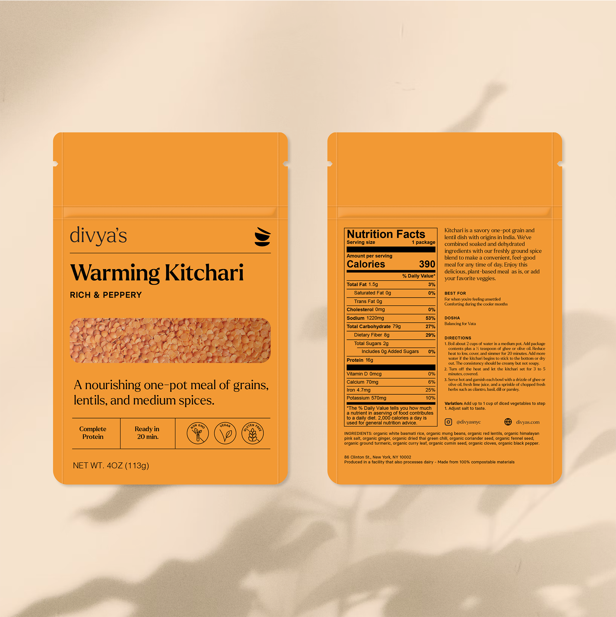
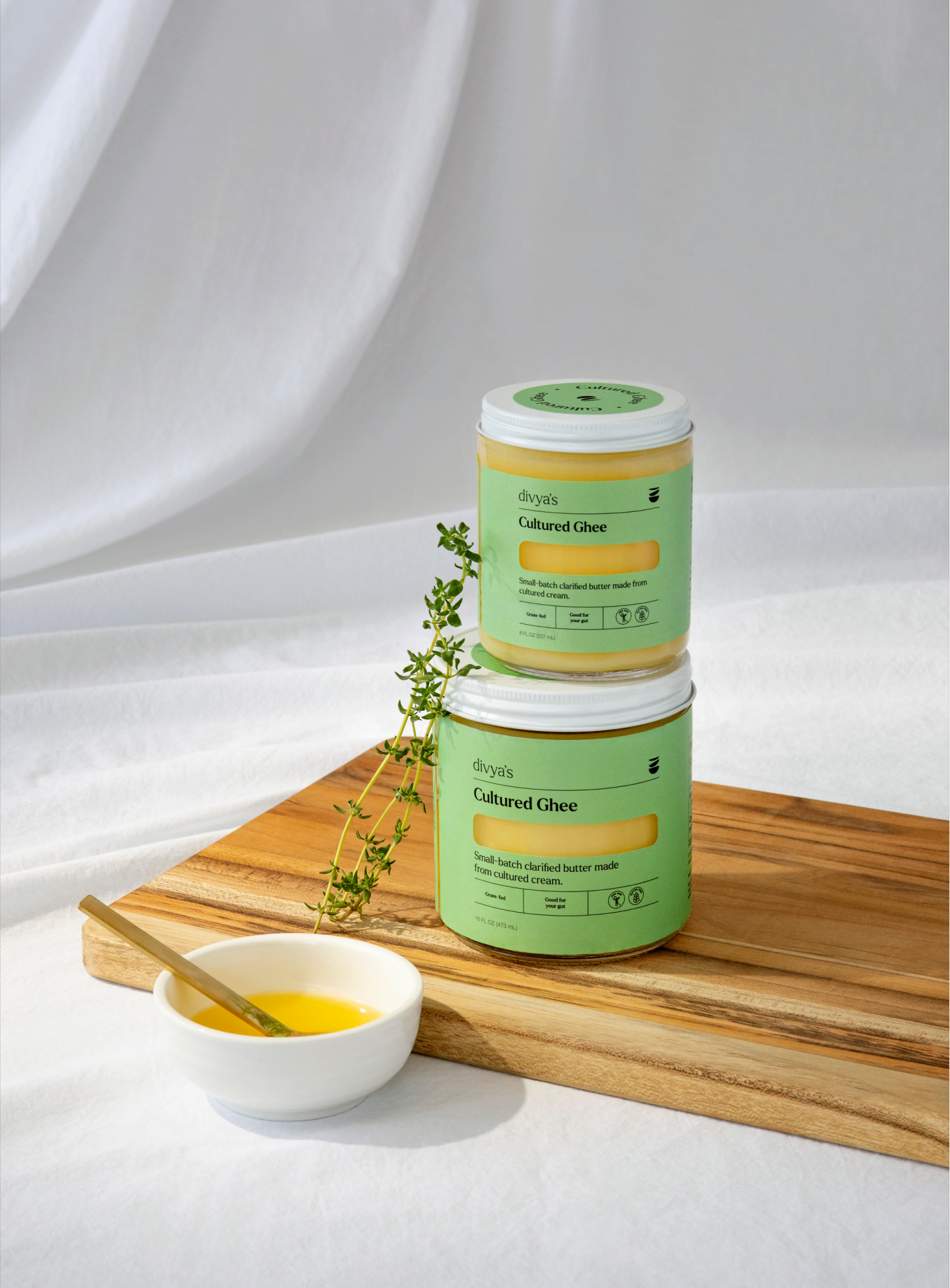
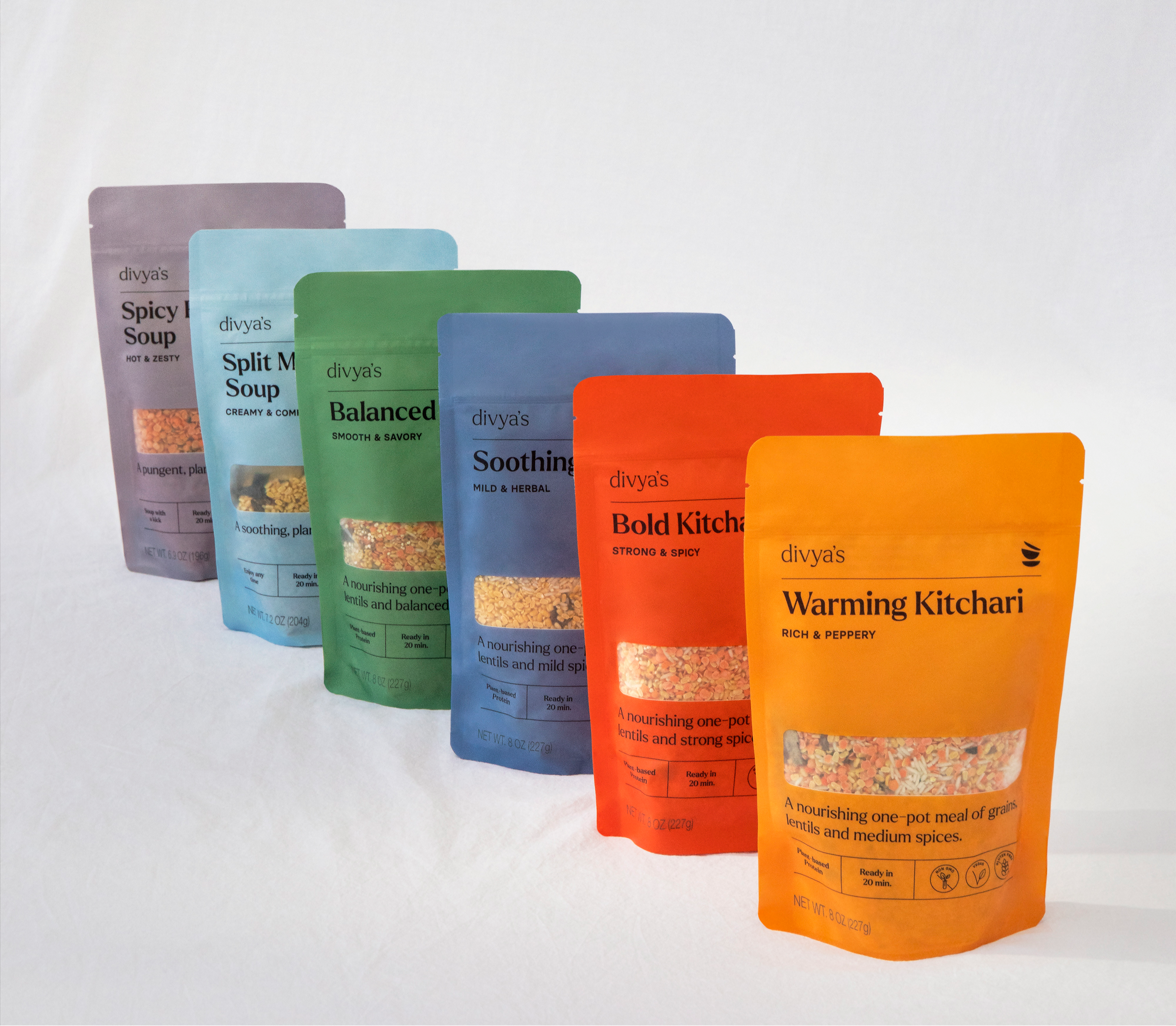
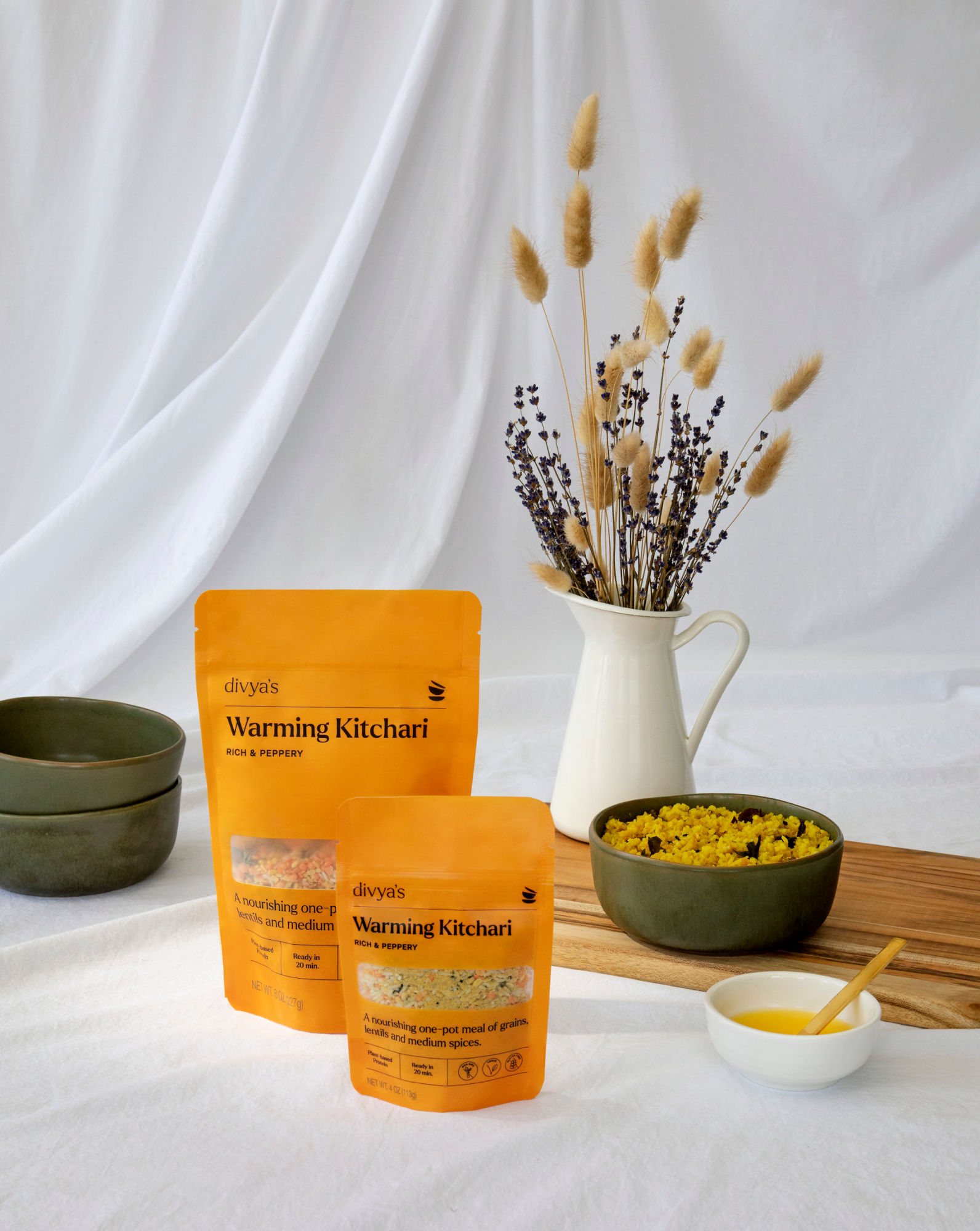
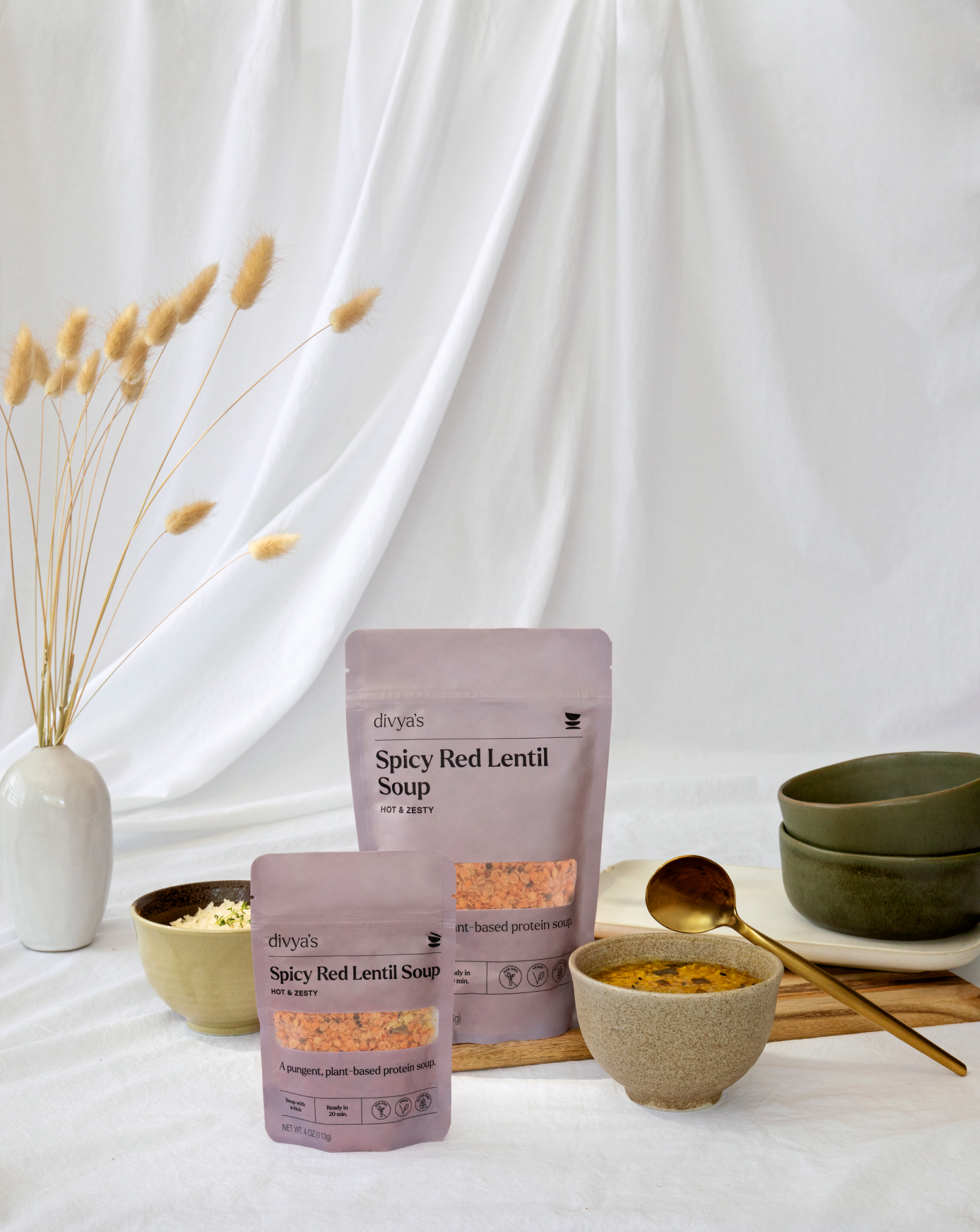
Divya’s Kitchen, a NYC plant-based restaurant rooted in Ayurveda, needed a new visual identity to match their brand strategy and bring their tagline “live in balance” to life.
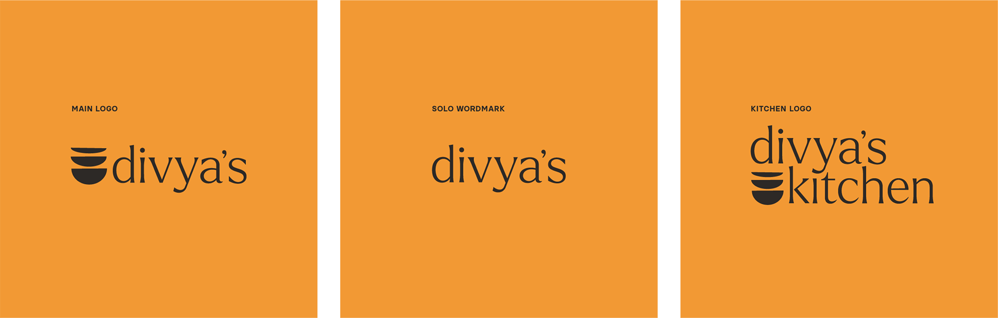
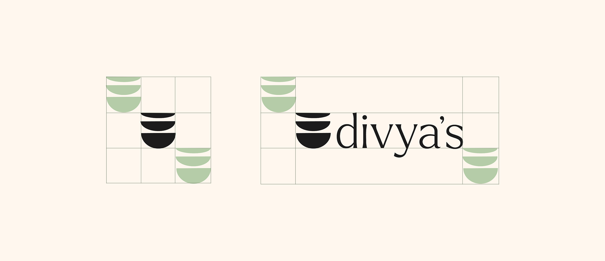
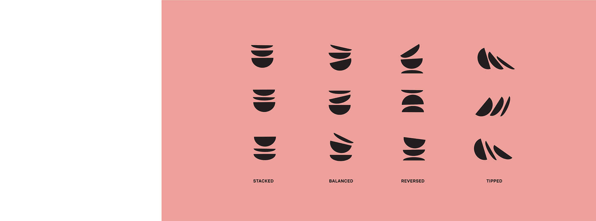
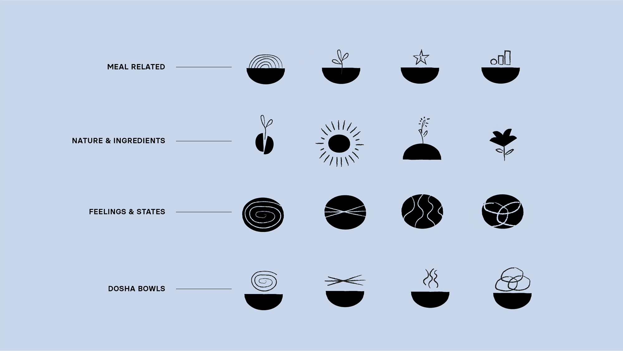
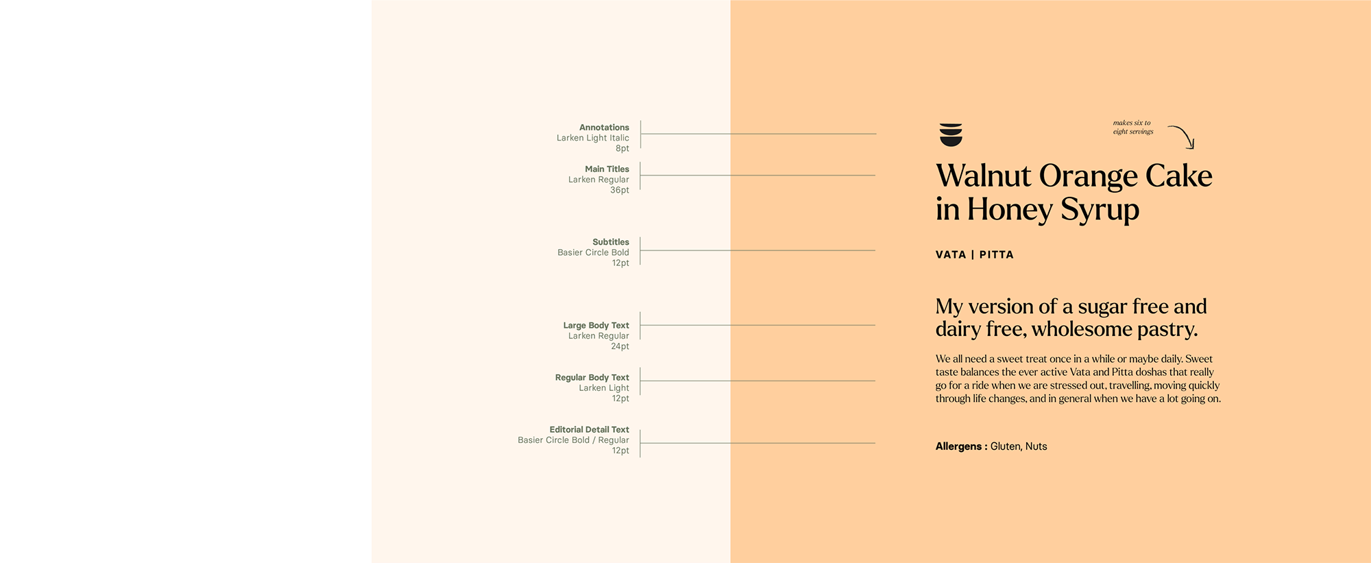
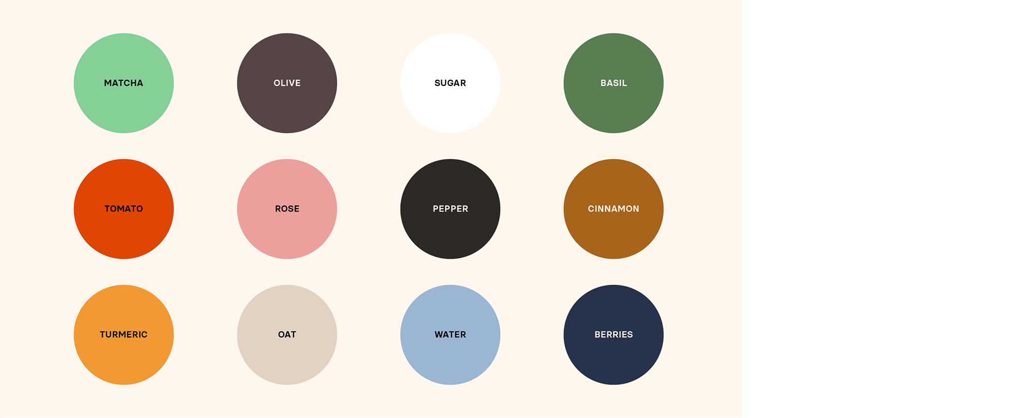
YummyColours studied the three Ayurvedic doshas (vata, kapha, and pitta) that make up a person’s constitution to inspire the new logo which is three bowls able to balance themselves in multiple ways. This logo reflects the importance of balancing ingredients and highlights the customization and flexibility in such a system. The color palette is inspired from Divya’s use of ingredients and how everything is rooted in nature. The illustration style also has the look of hand-drawn ones to emphasize the natural and back-to-basic concepts.

Diego Marini
Studio ATYPICAL
Mia Le
Anna Parnigoni