Moxie Scrubs
Brand Narrative
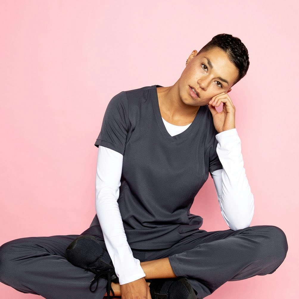
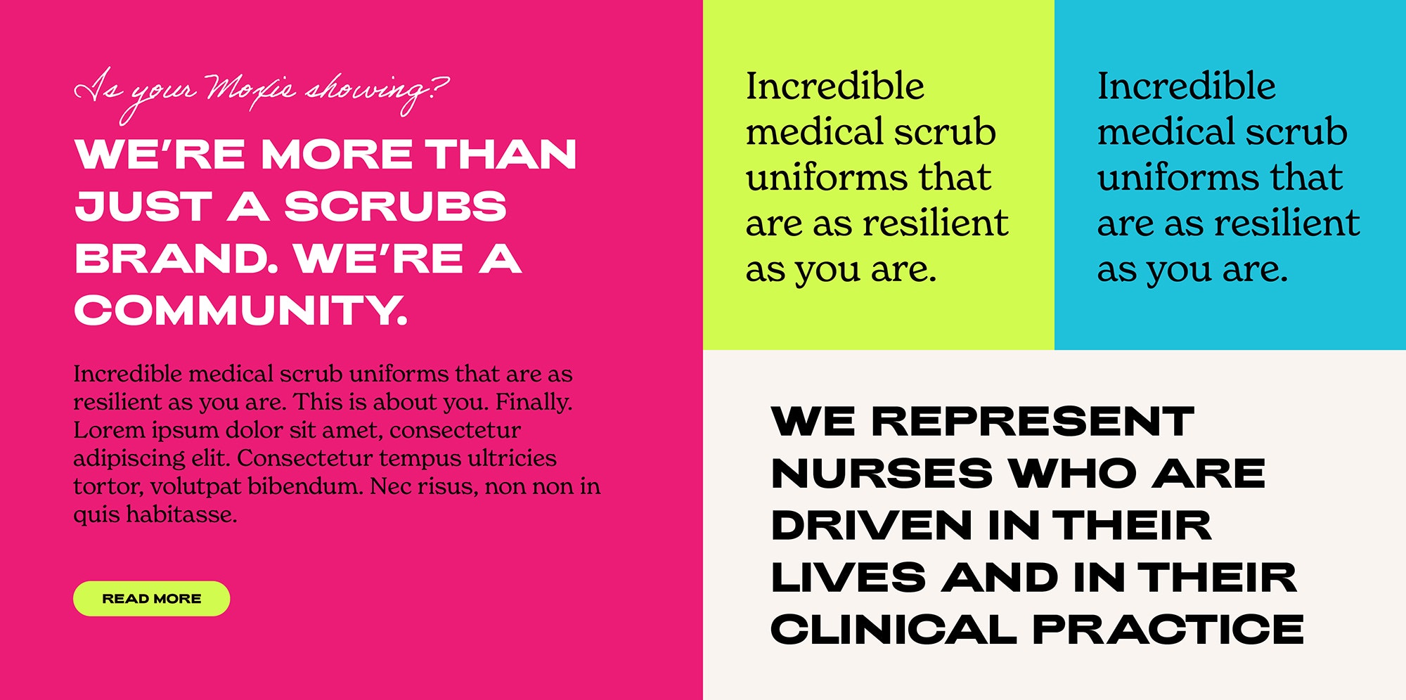
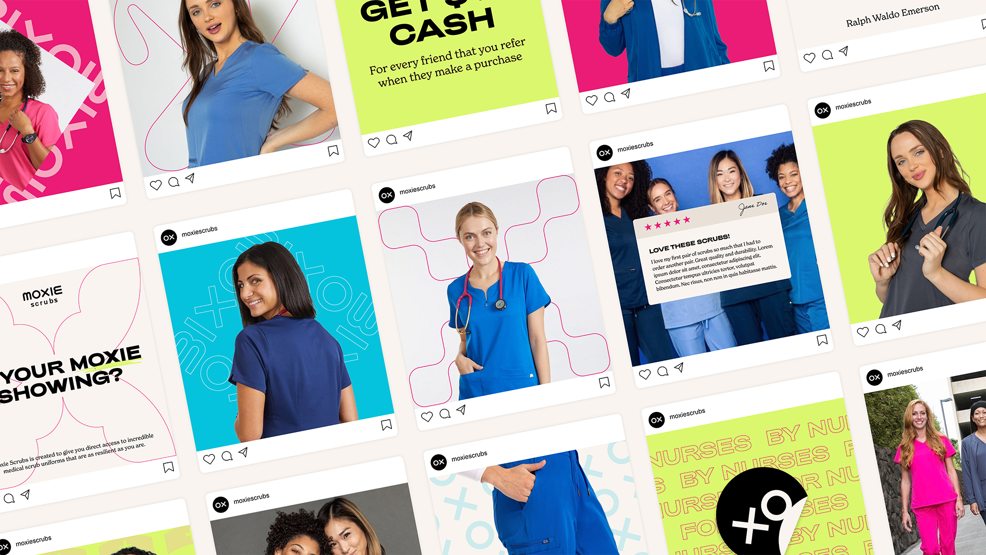
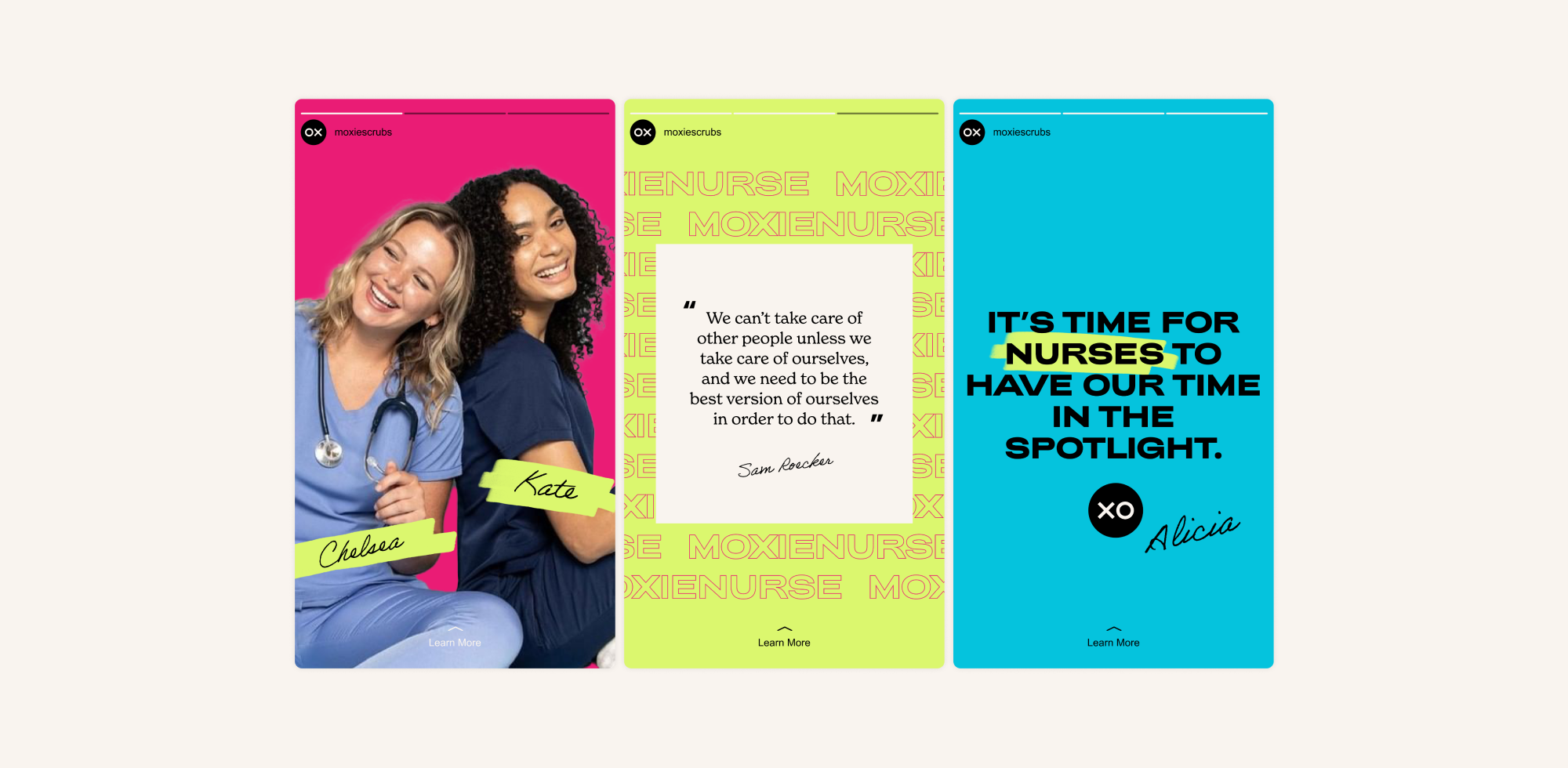
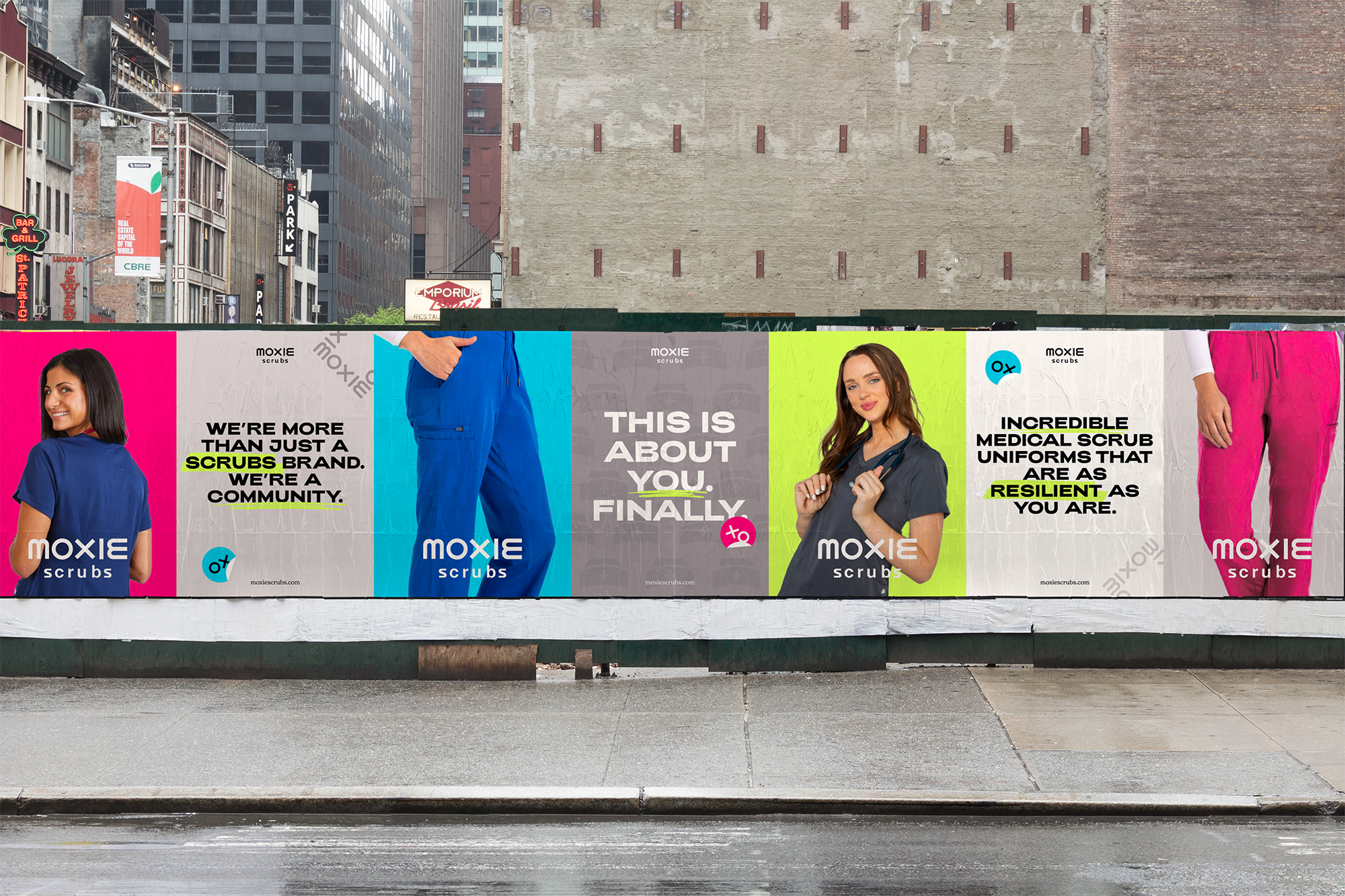
Moxie stands out in a crowded scrubs market by being the first to bring nurses into the design process directly. Nurses thrive on the human connection and love being a caregiver. Moxie wanted to take that and create a brand that makes being a nurse cool. Through their branding and campaigns, they aim to shine a light on a nurse’s daily life—the grit, guts, and intensity, but also the tenderness. Their goal is to be the brand that defines what it means to a nurse today, as a force to be recognized.
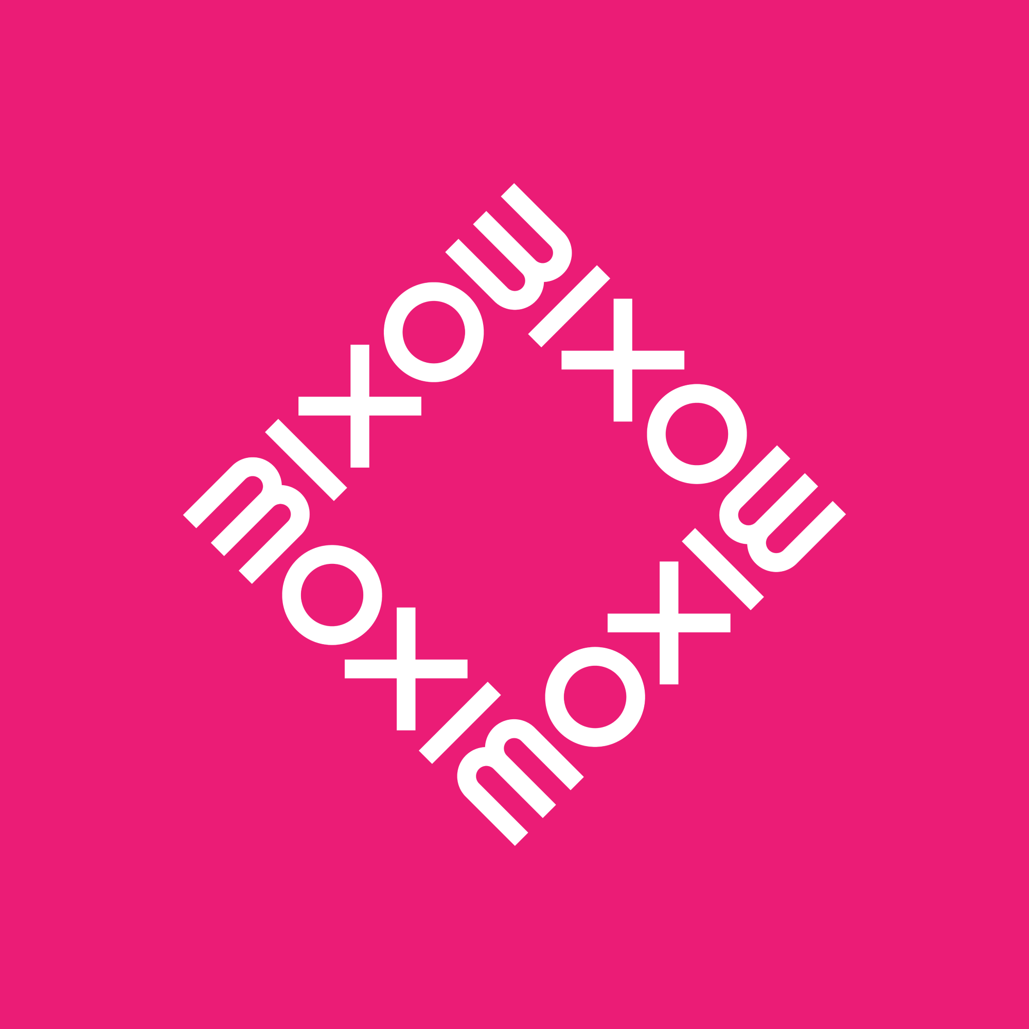
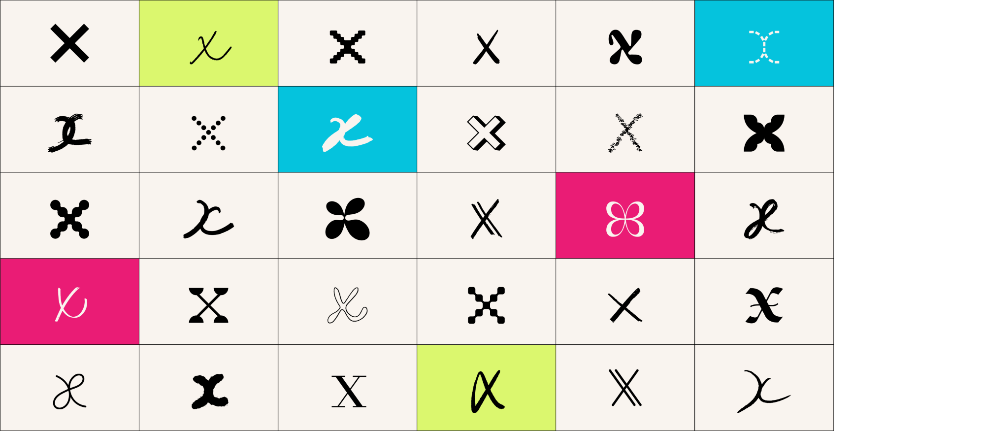
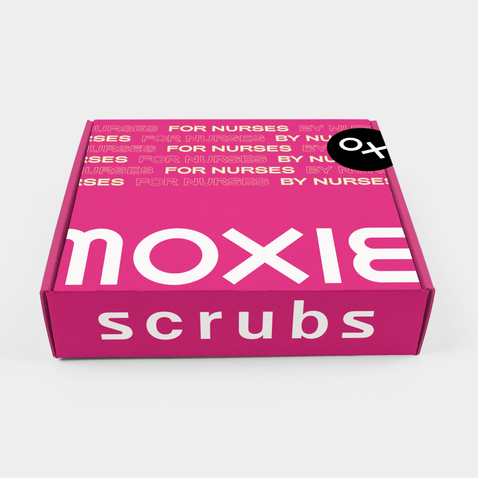
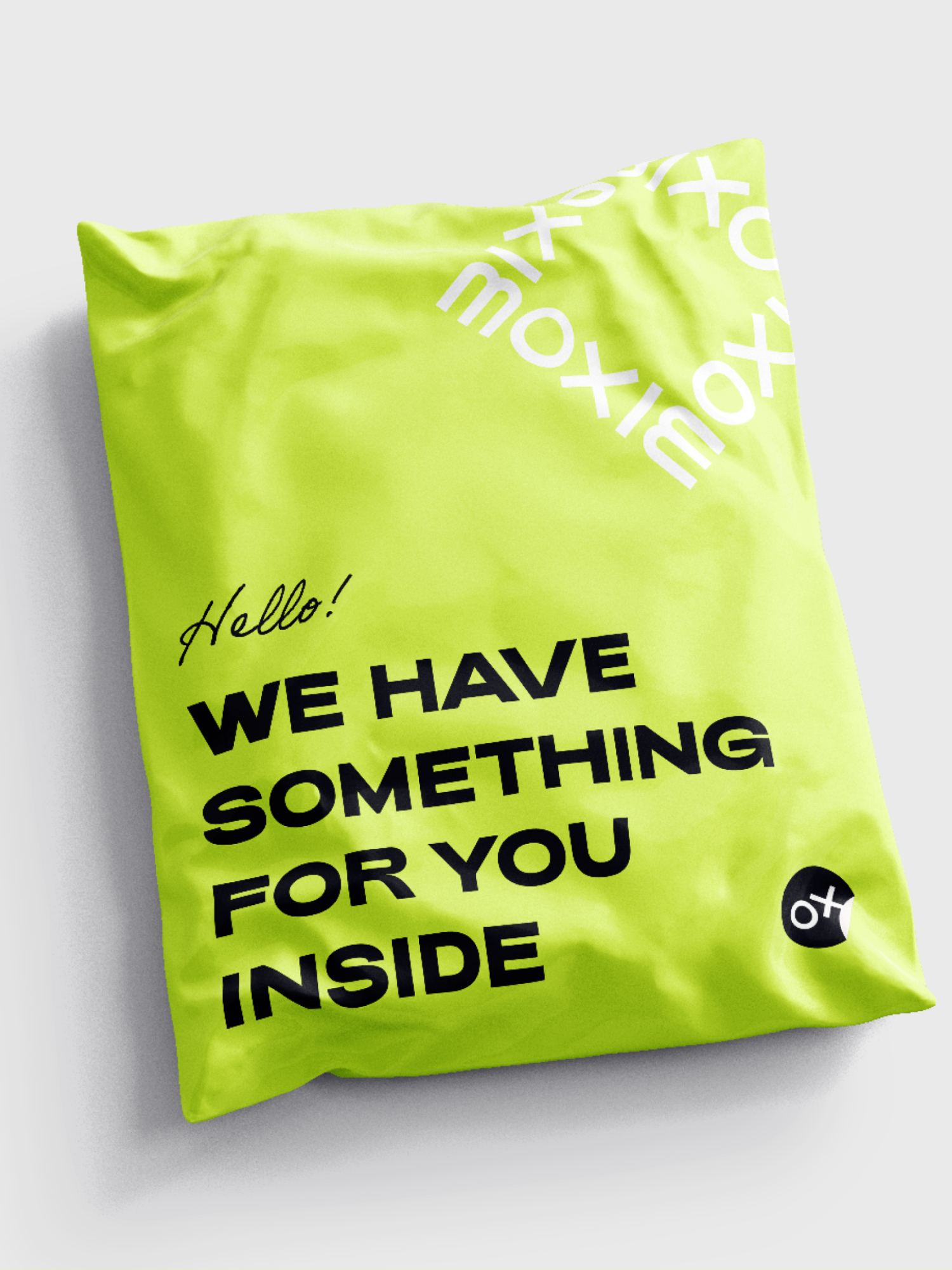
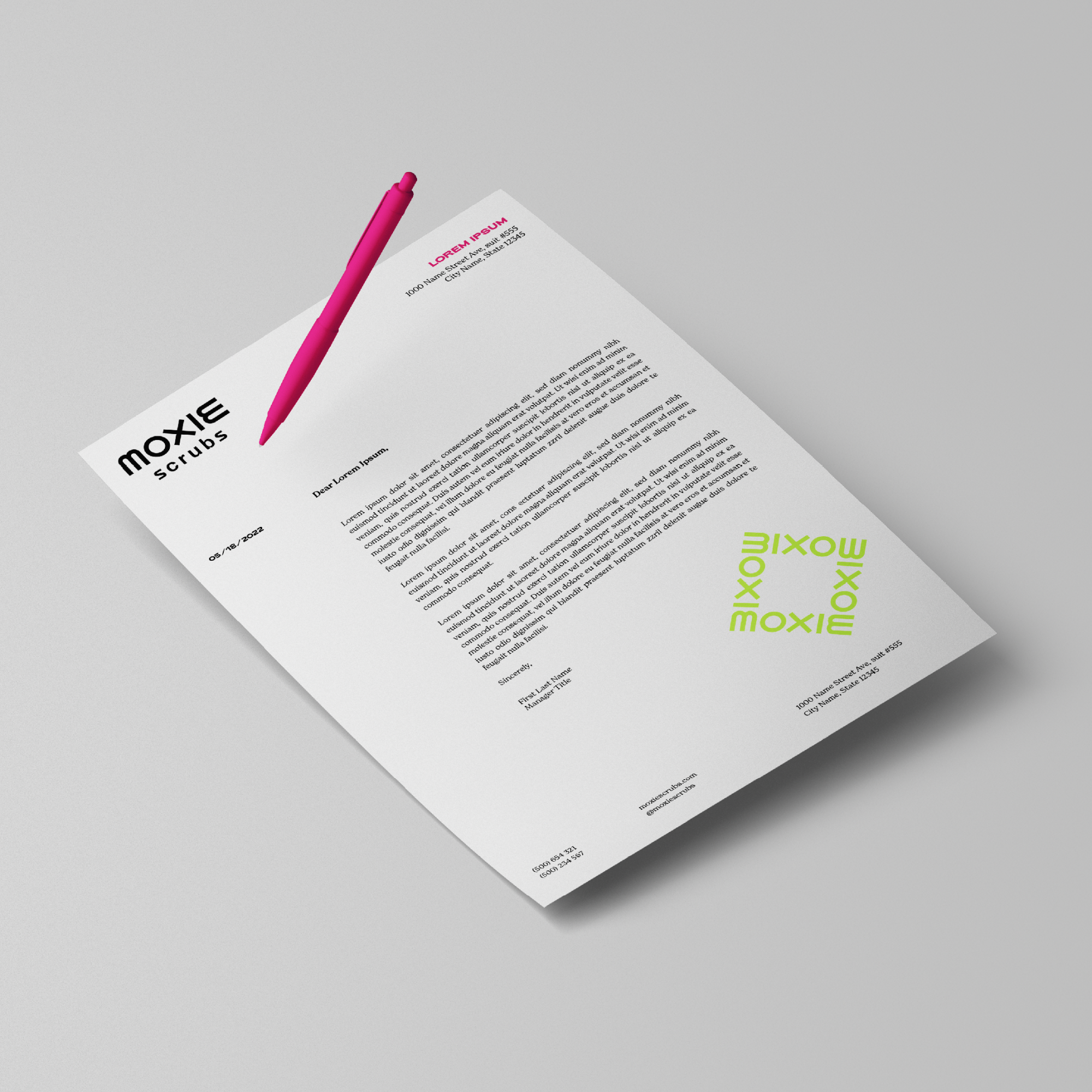
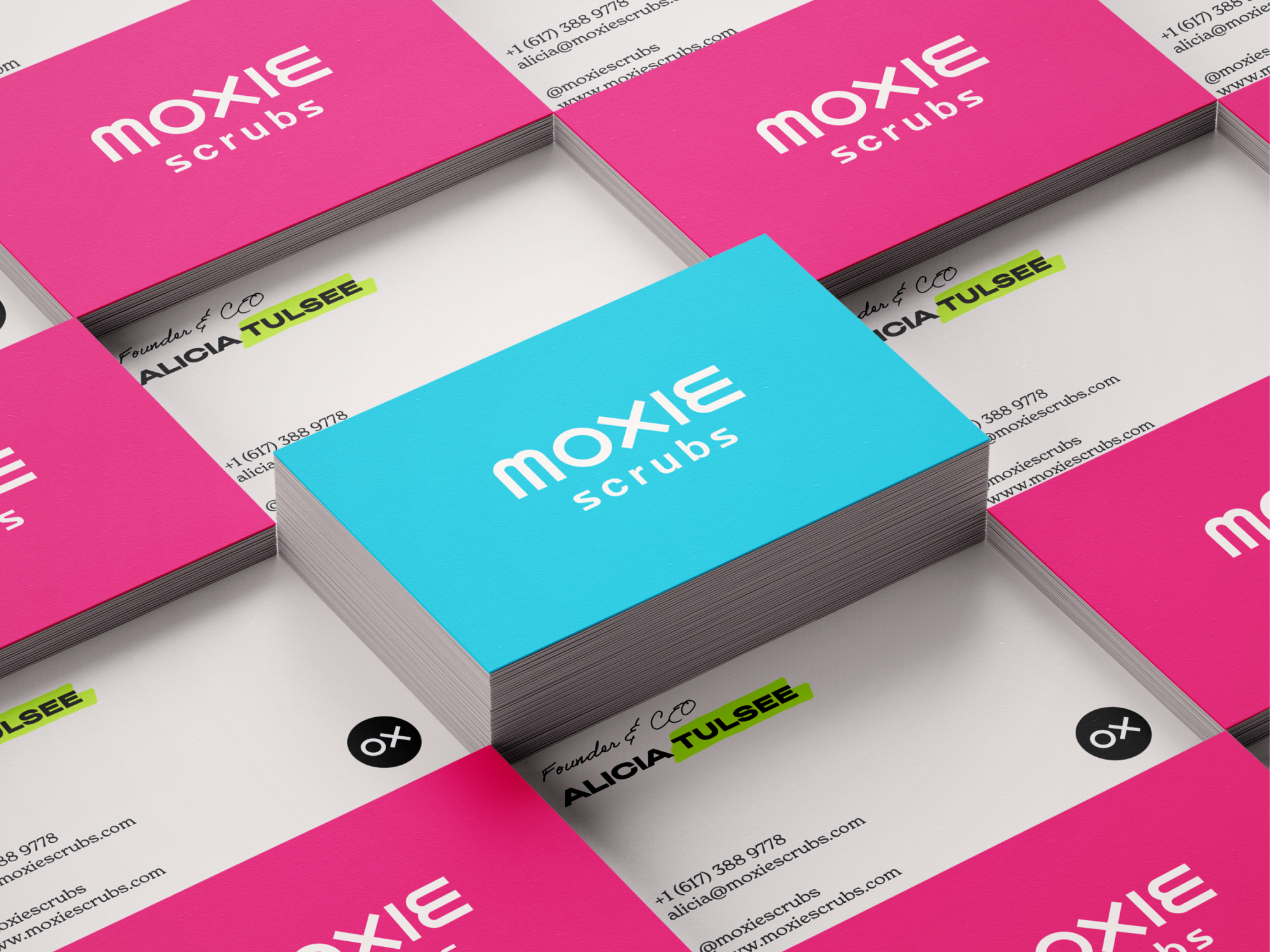
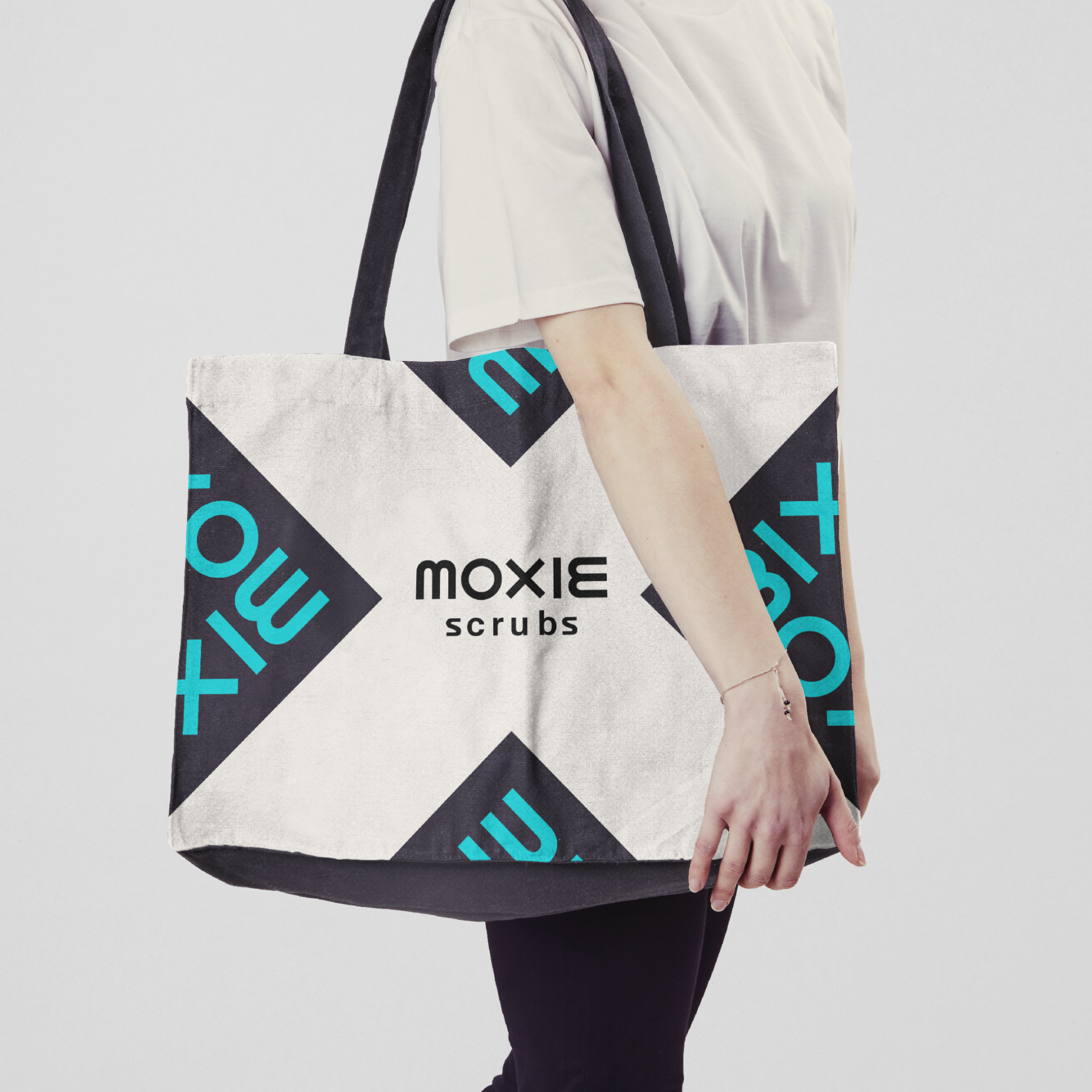
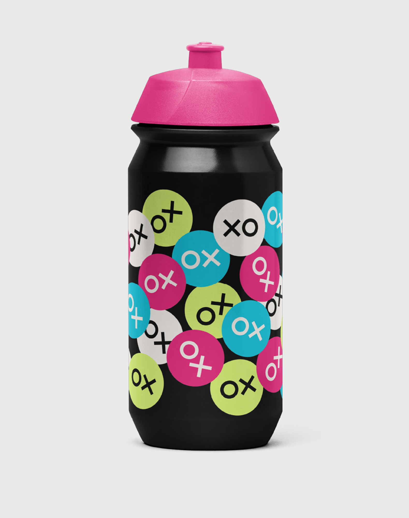
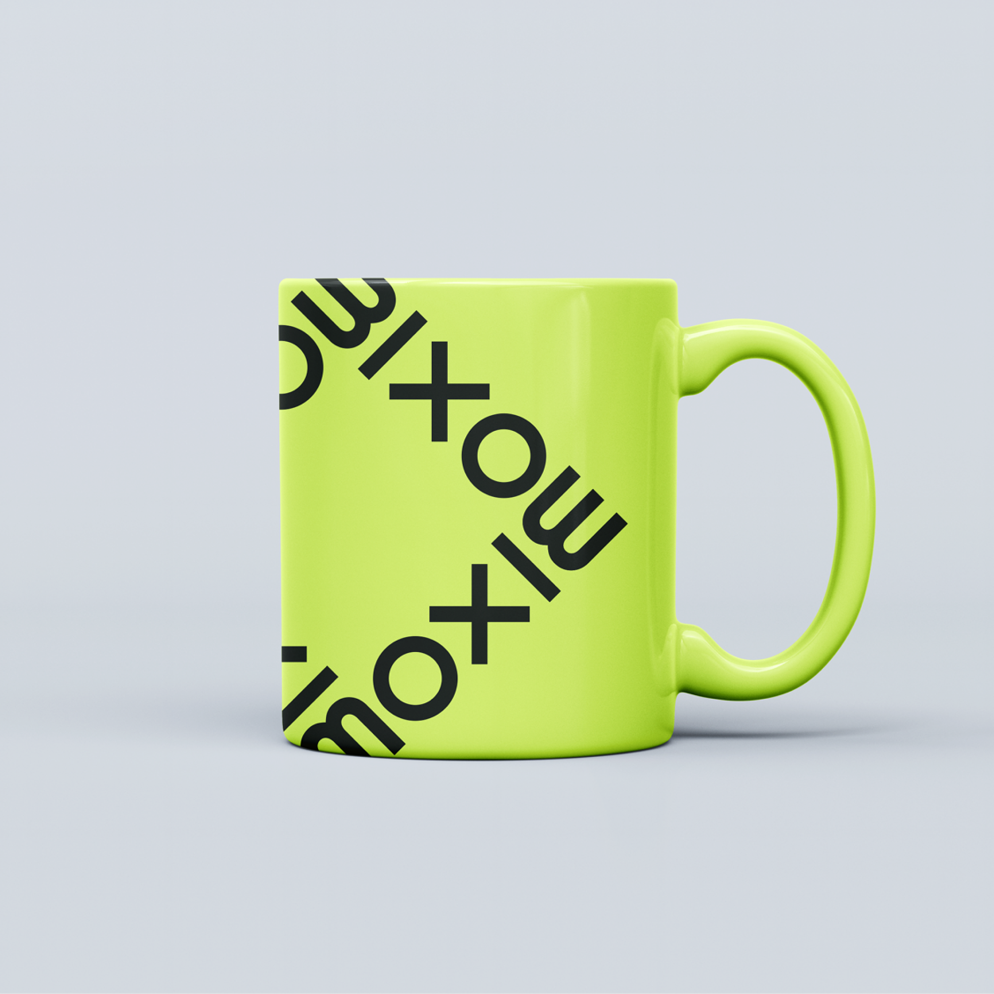
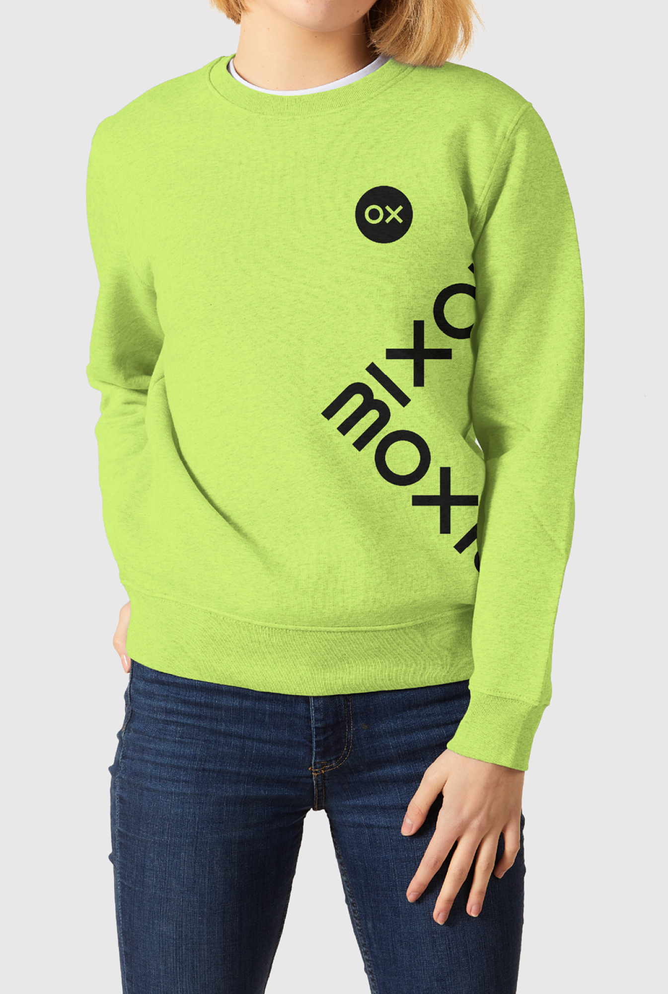
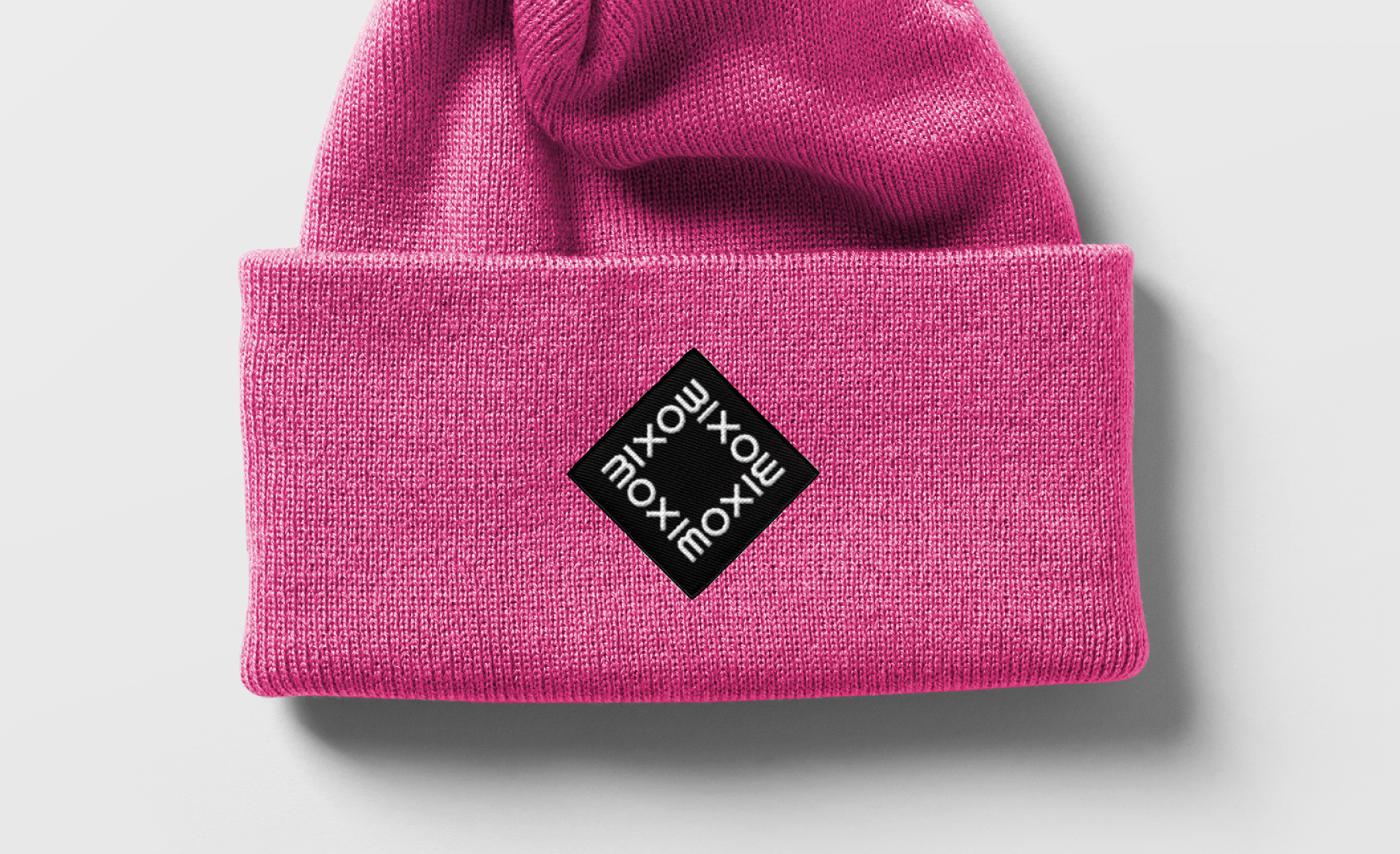
In response to the ask, YummyColours created a bold wordmark to emphasize the strength of nurses. The wordmark can turn on itself at a 90 degree angle and has a full library of X’s to use within the word “MOXIE” both to communicate the individuality of each nurse, as well as their ability to go in many directions. We paired the boldness of the wordmark with a concise color palette consisting of 3 highlighter colors. This color palette together with a handwriting font gives a nod to the real work nurses do. As a brand symbol, we created an “OX” sticker that again adds familiarity and closeness to the community.
Denize Maaløe
Mia Le
Krystal Greven