Diane Von Furstenberg
Brand Narrative
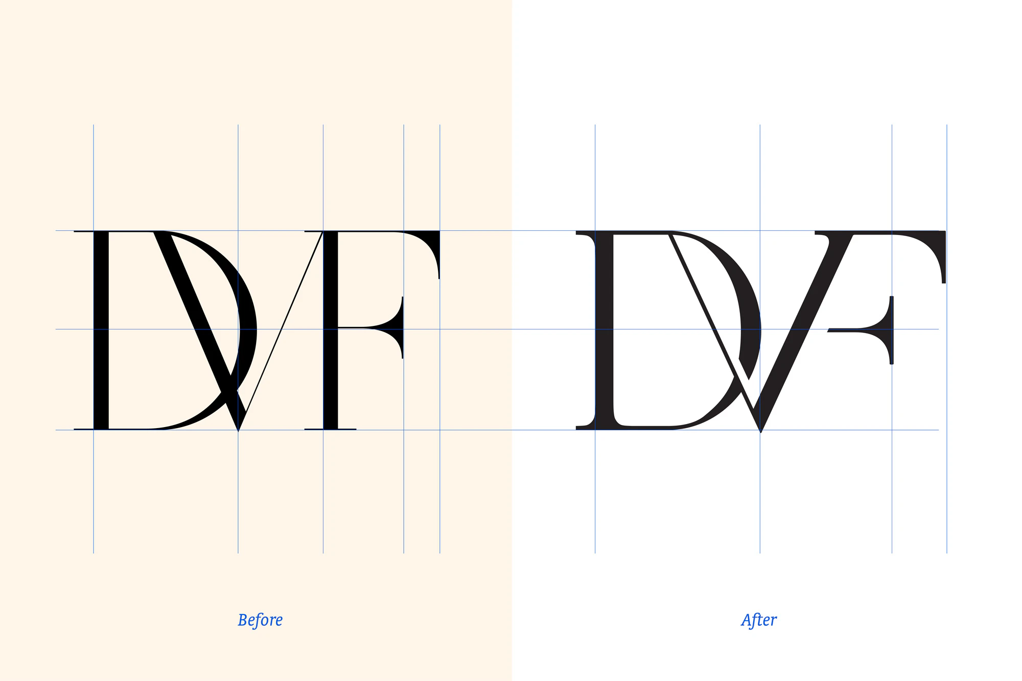
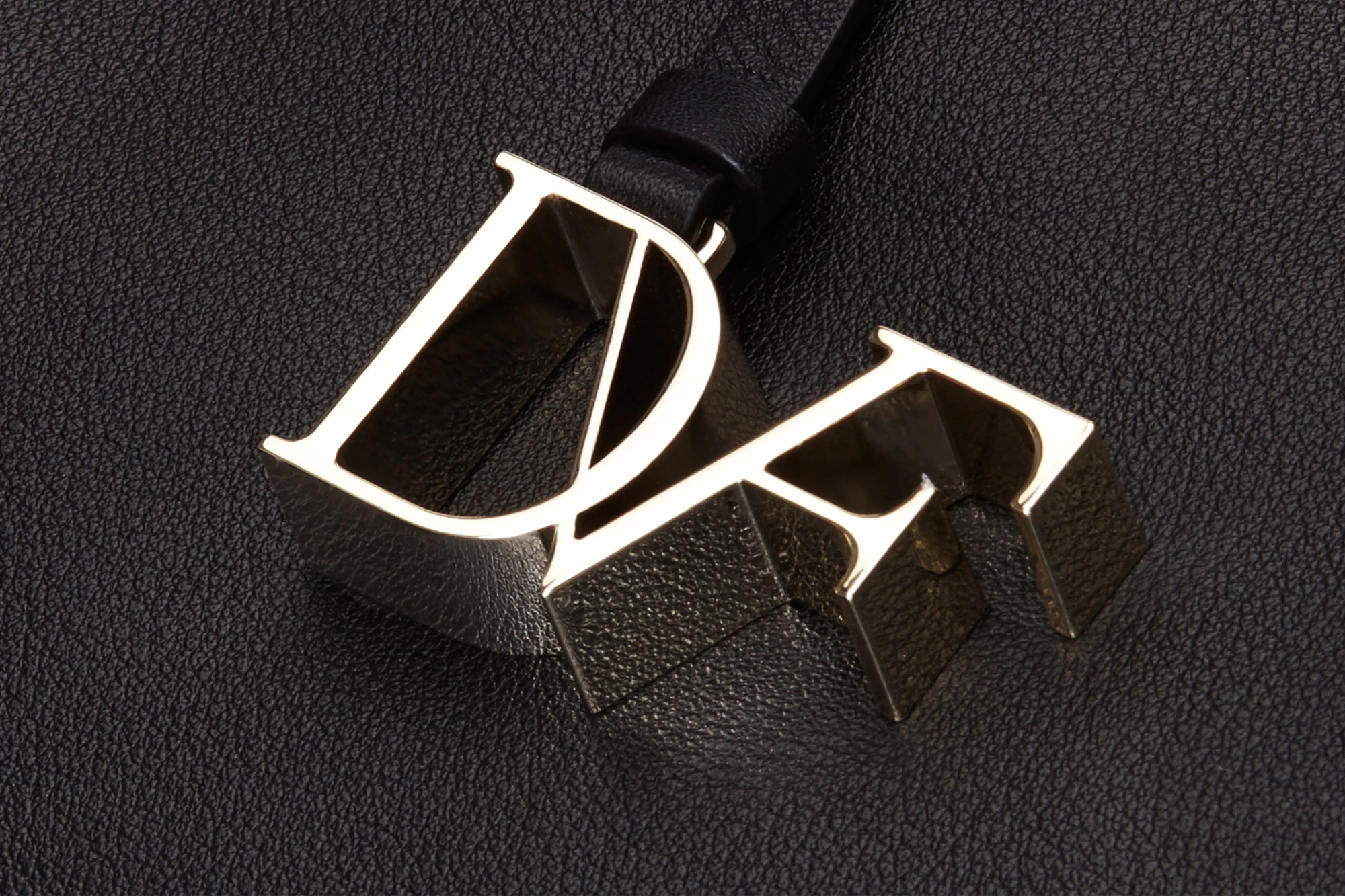
An analysis of the former DVF logo concluded that the existing monogram was not modular or scalable, and that it veered toward illegibility in certain formats. It needed to be revamped as a visual element that would maintain clear brand association, and that would function as a monogram translatable across all brand materials, products, and scales.
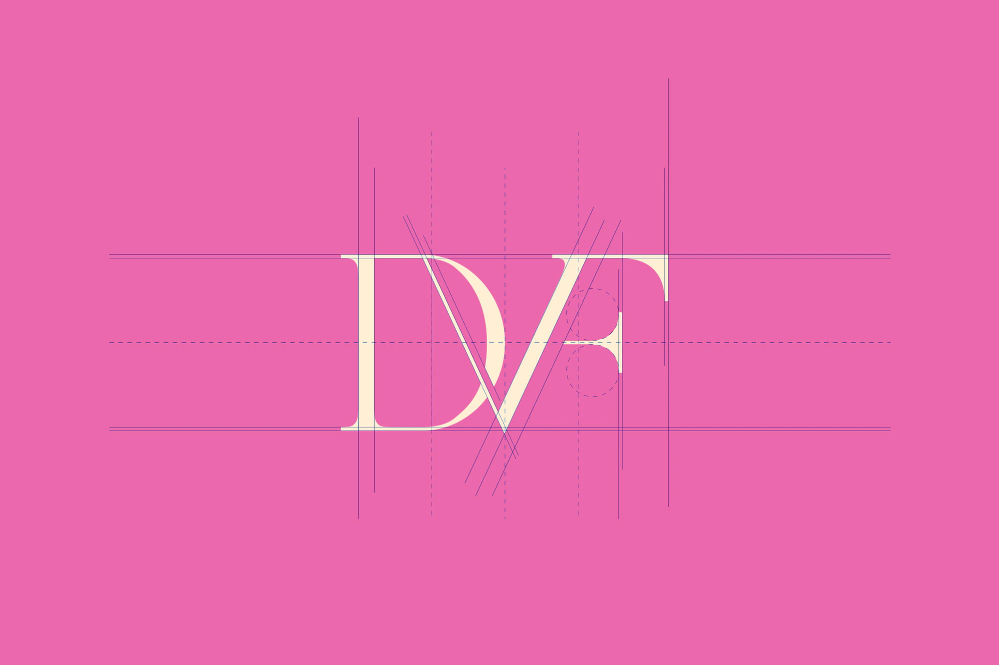
With this new creative direction, the logo would rival that of other international fashion houses, and would withstand reproduction in a variety of mediums, patterns, or formats. Specific research-based tactics for the redesign included instilling consistency and rhythm in line thickness, improved legibility and distinguishability of the three characters “DVF,” implementing a successful modular system allowing for the logo to be arranged patterned, and creating a separate element in the “F” that withstood manufacturing and production qualifications.
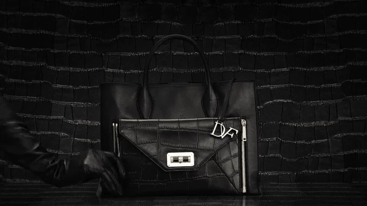
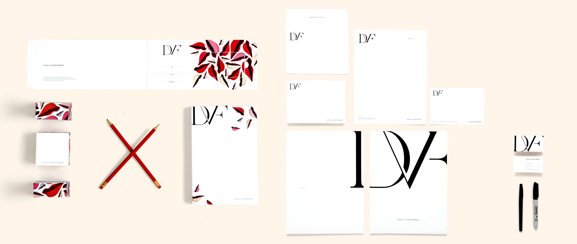
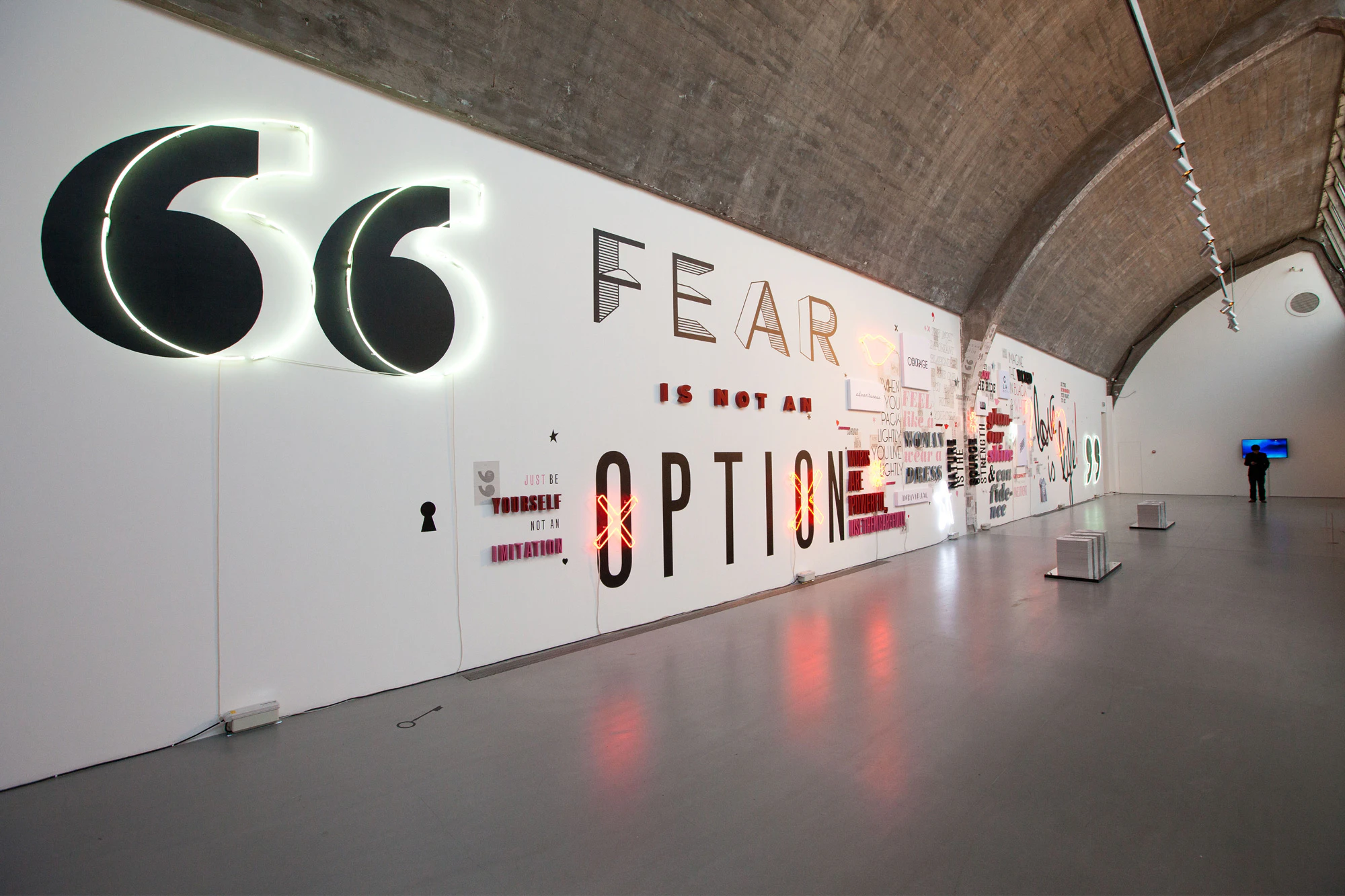
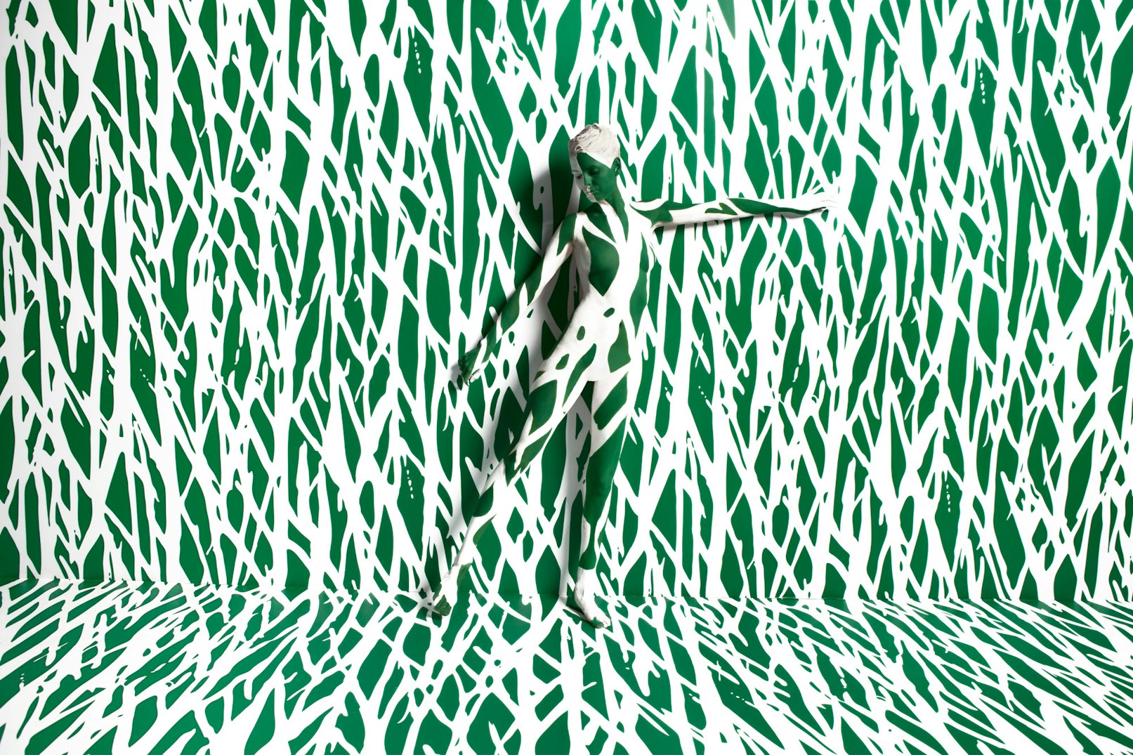
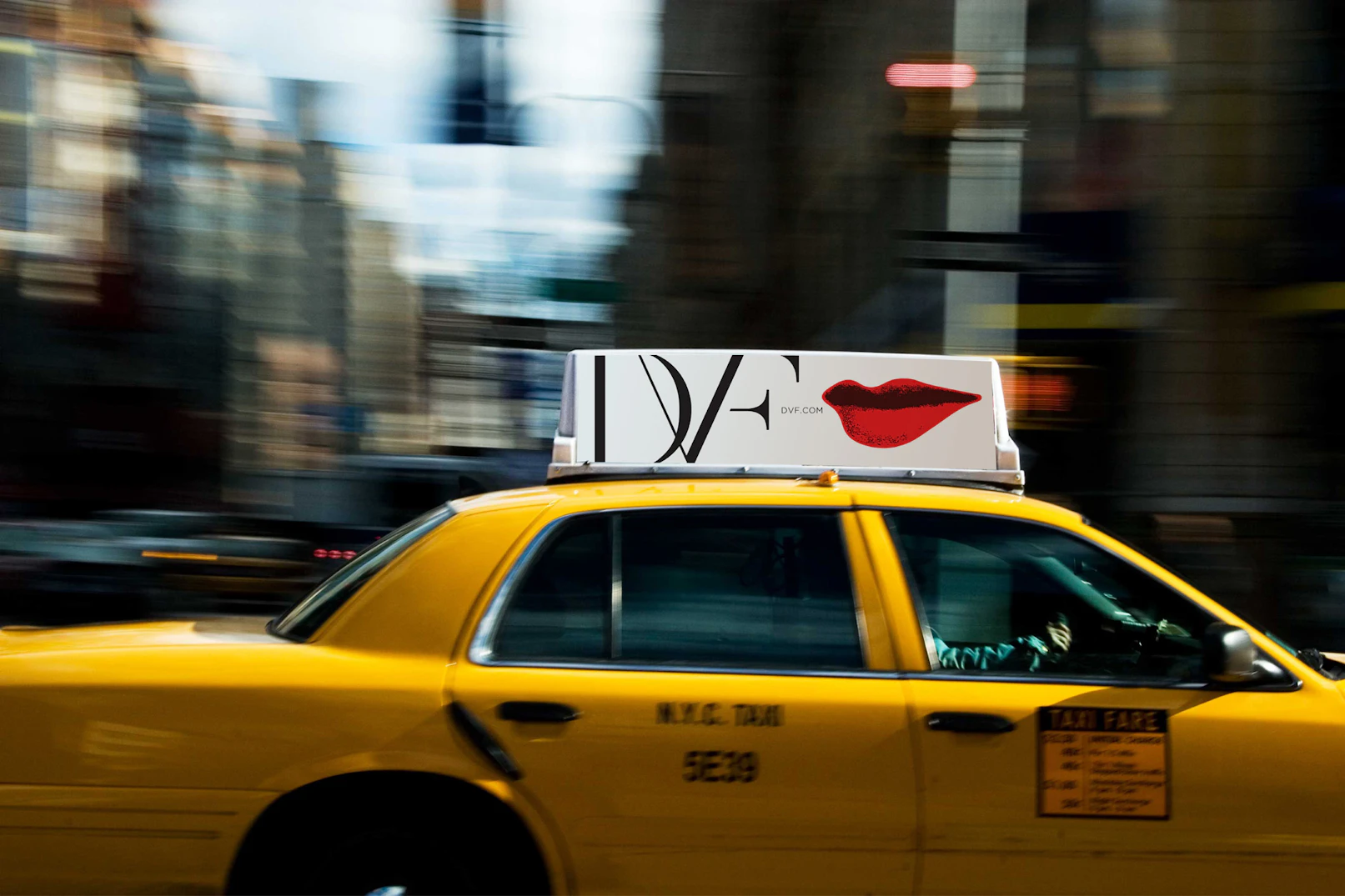
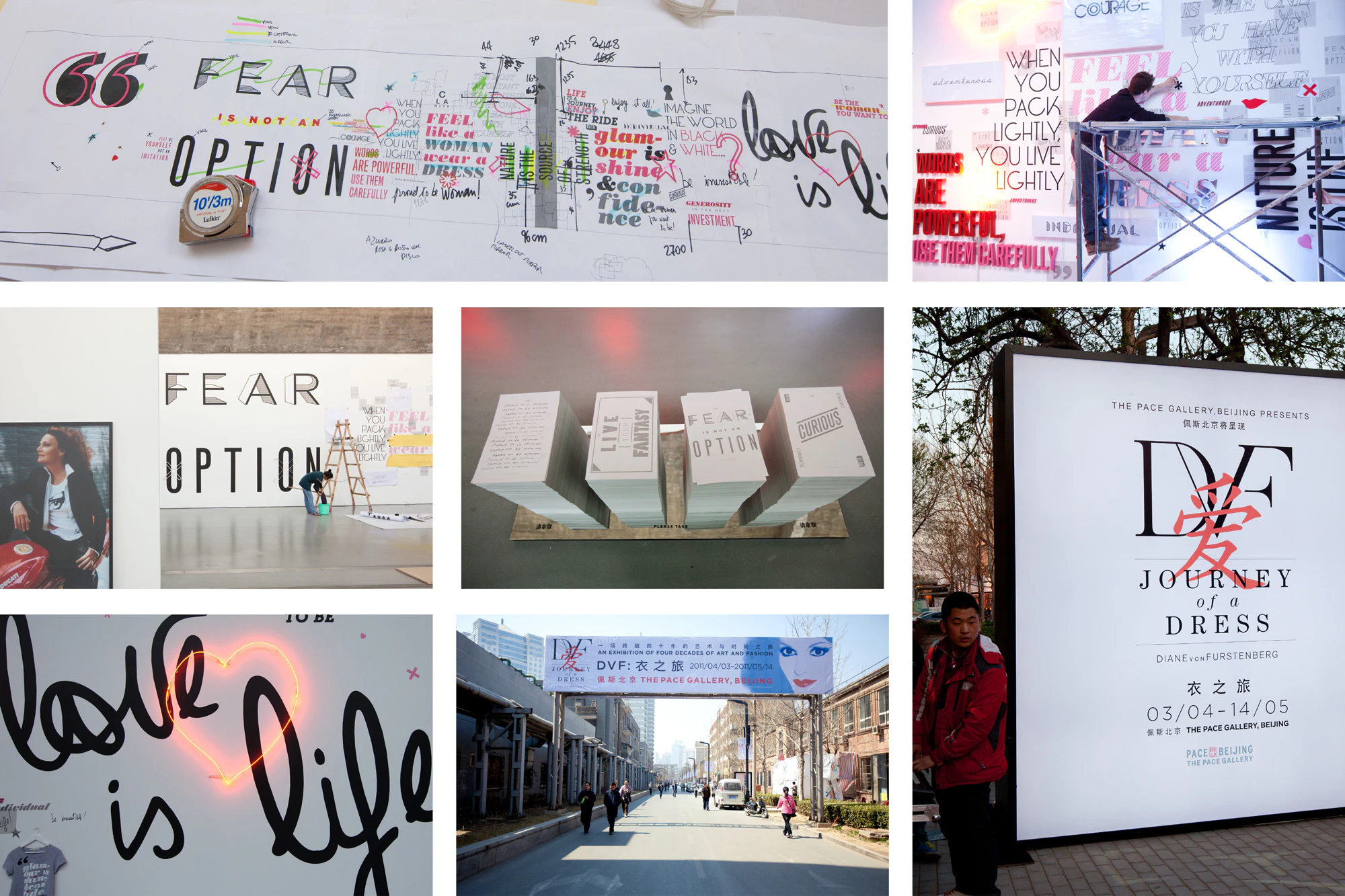
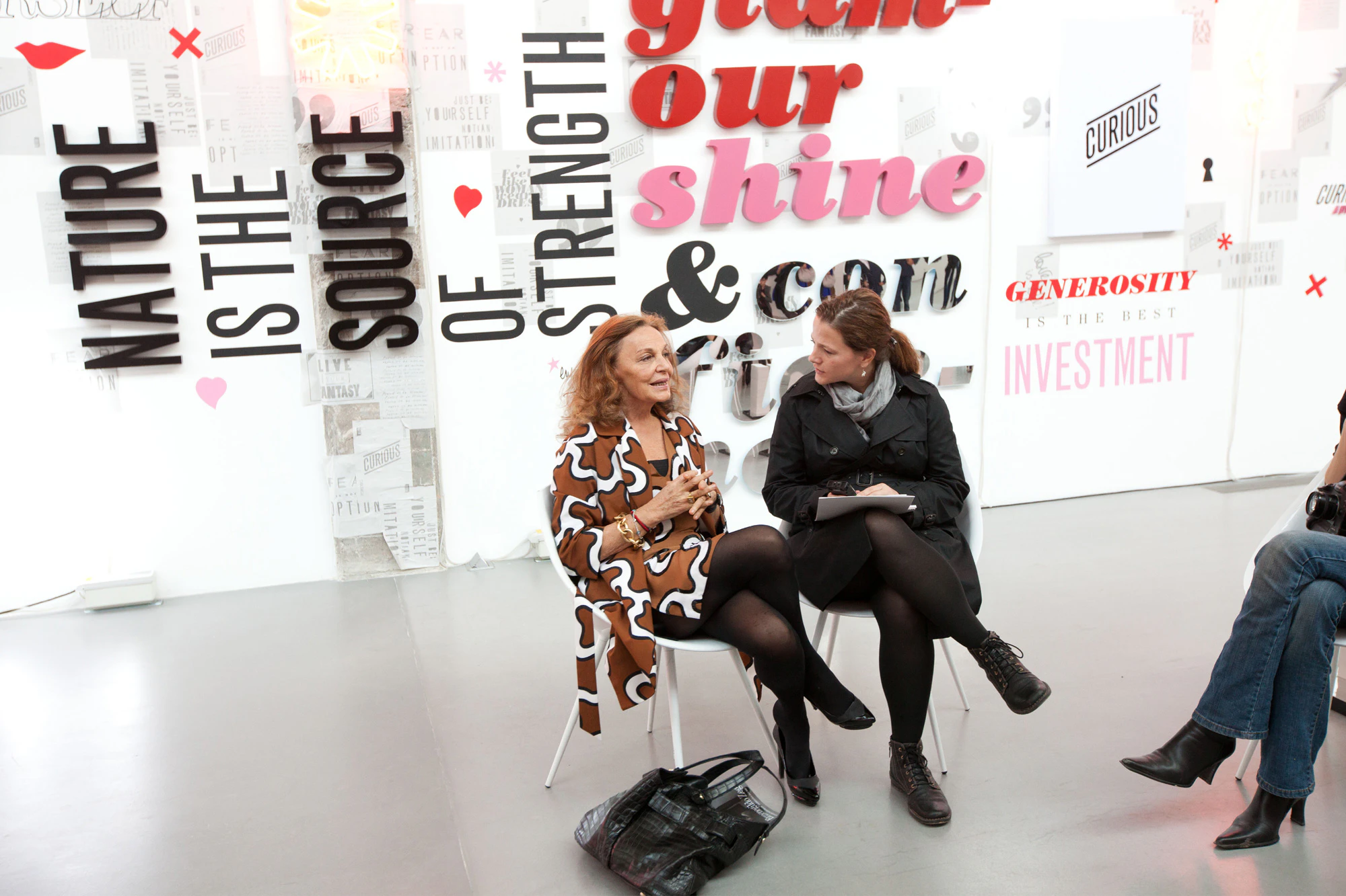
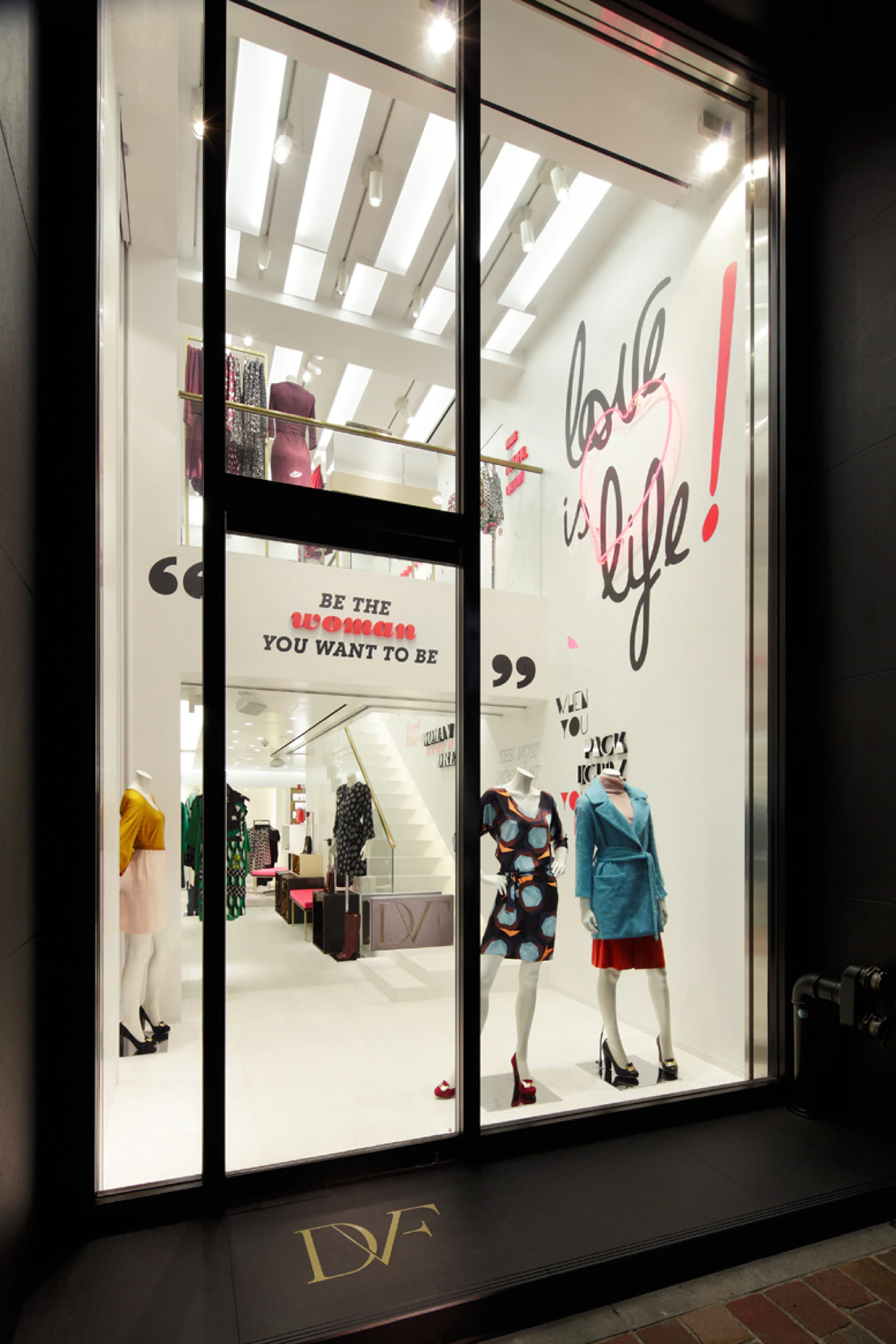
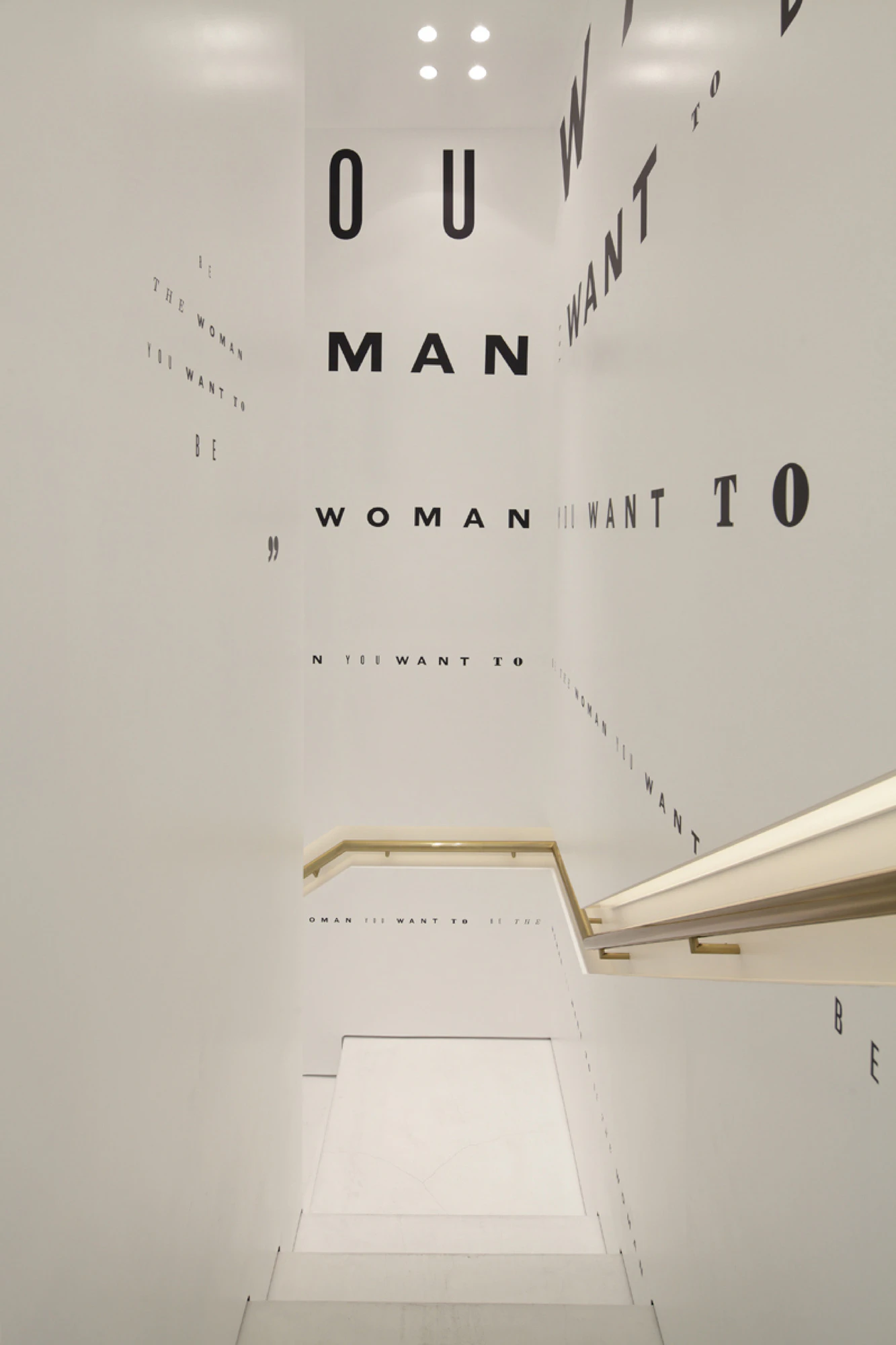
The monogram was deployed across all DVF mediums, from collections to runway, labels to e-commerce, and editorial to exhibition. The identity was specifically reflected in the exhibition’s traveling engagements at Pace Gallery in Beijing, China, which included illustrated DVF quotations spanning a 40-meter “Mantras Great Wall,” and at the Ginza DVF store in Tokyo, Japan, where the monogram was highlighted across the entirety of an interior graphics wall.
Diego Marini
Jasper James, Nathan Kraxberger
Guild