Fiveable
Visual Identity
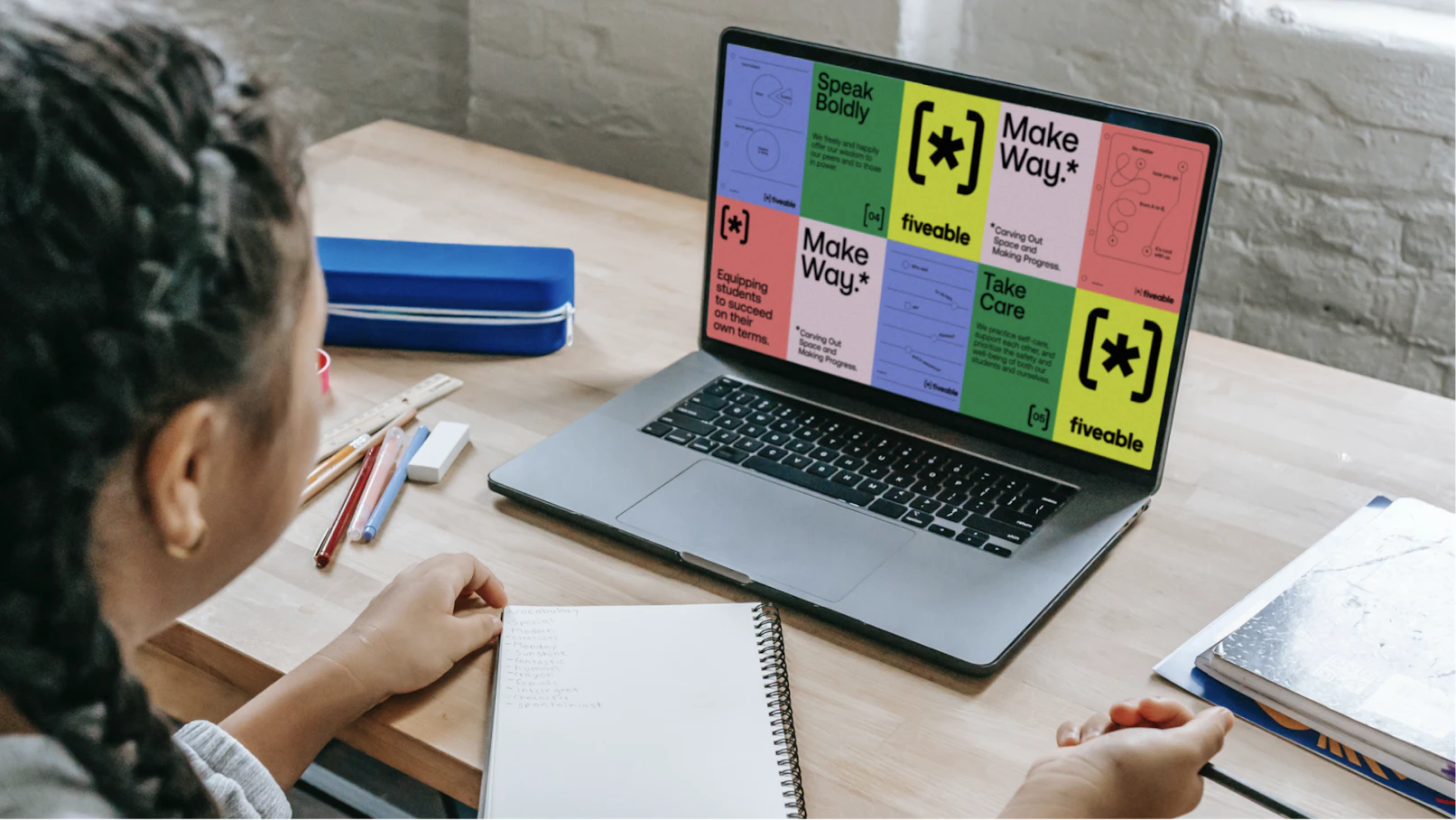
When Fiveable, an AP student content library, and Hours, an online platform for creating study space, merged, they needed a new strategy and visual identity that brought them to life as one future-proof brand. We were challenged to redefine productivity as a common ground for both AP and non-AP audiences and to craft a clear and universal brand story that would inspire confidence and agency in every student.
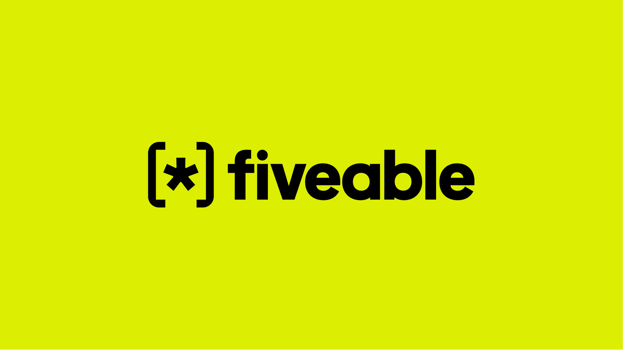
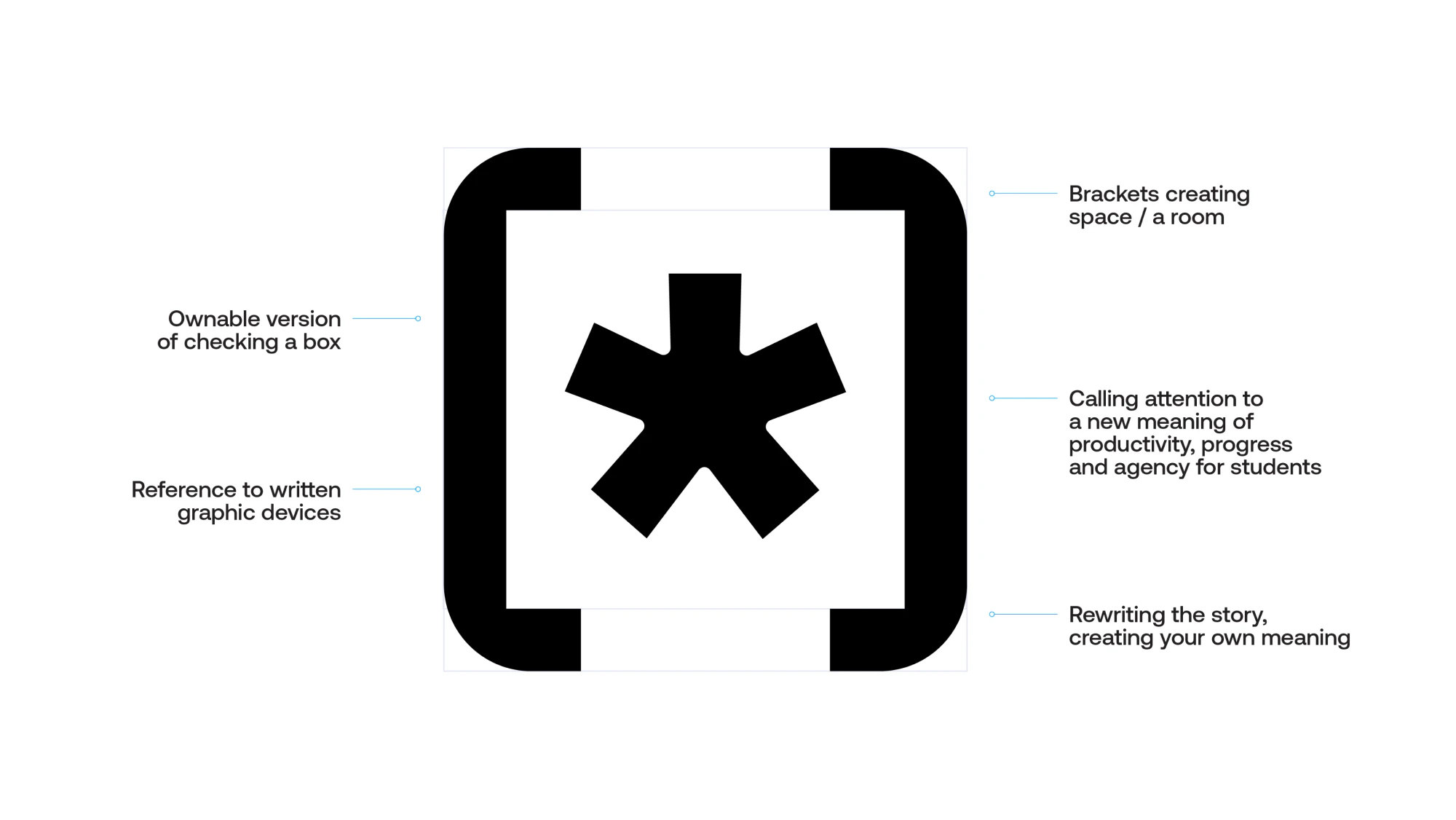
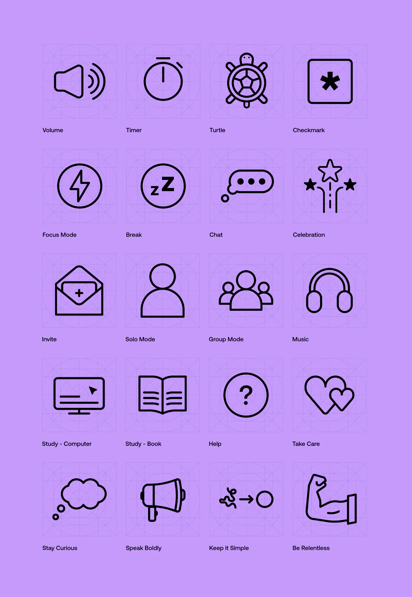
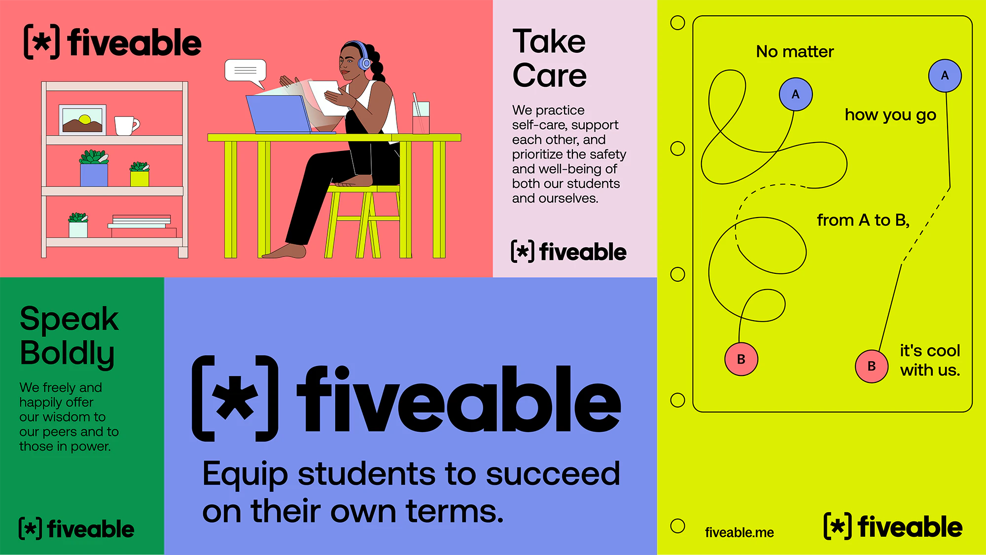
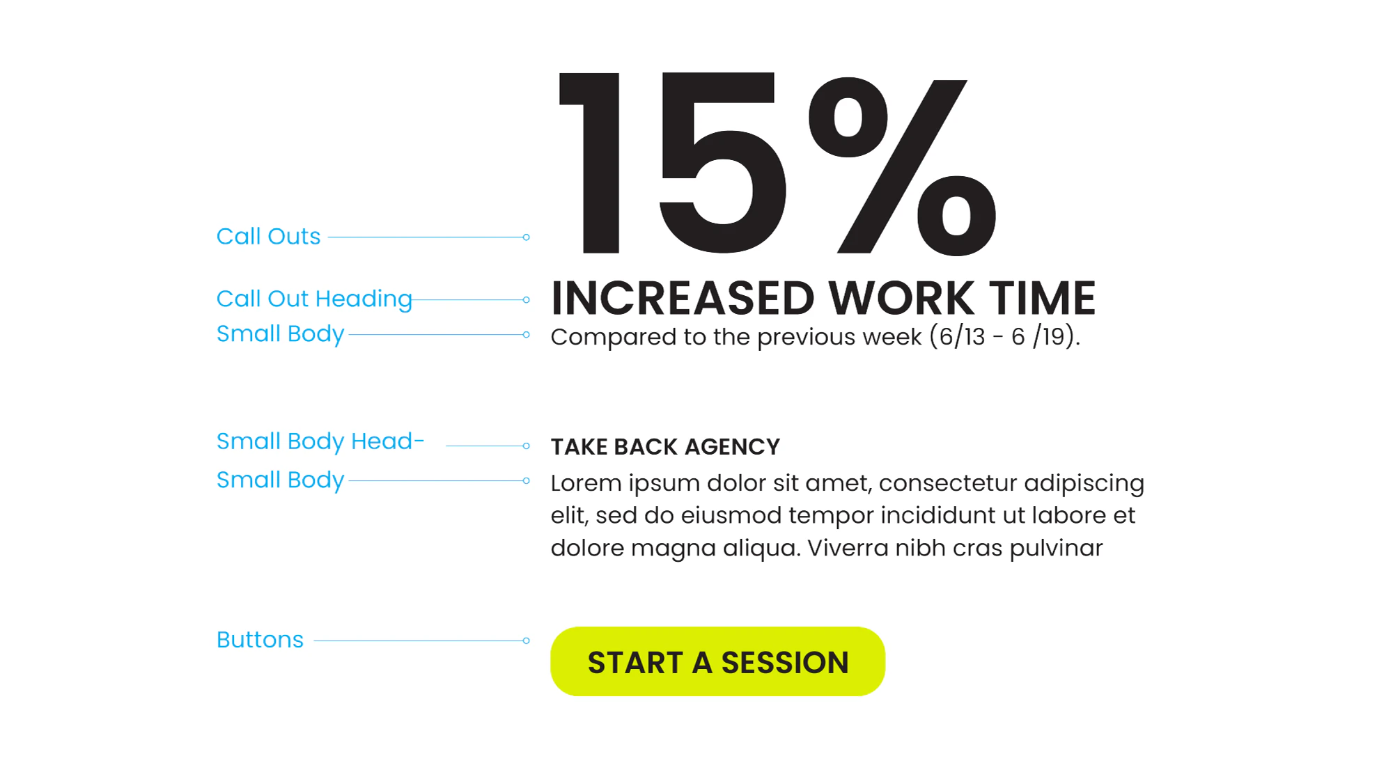
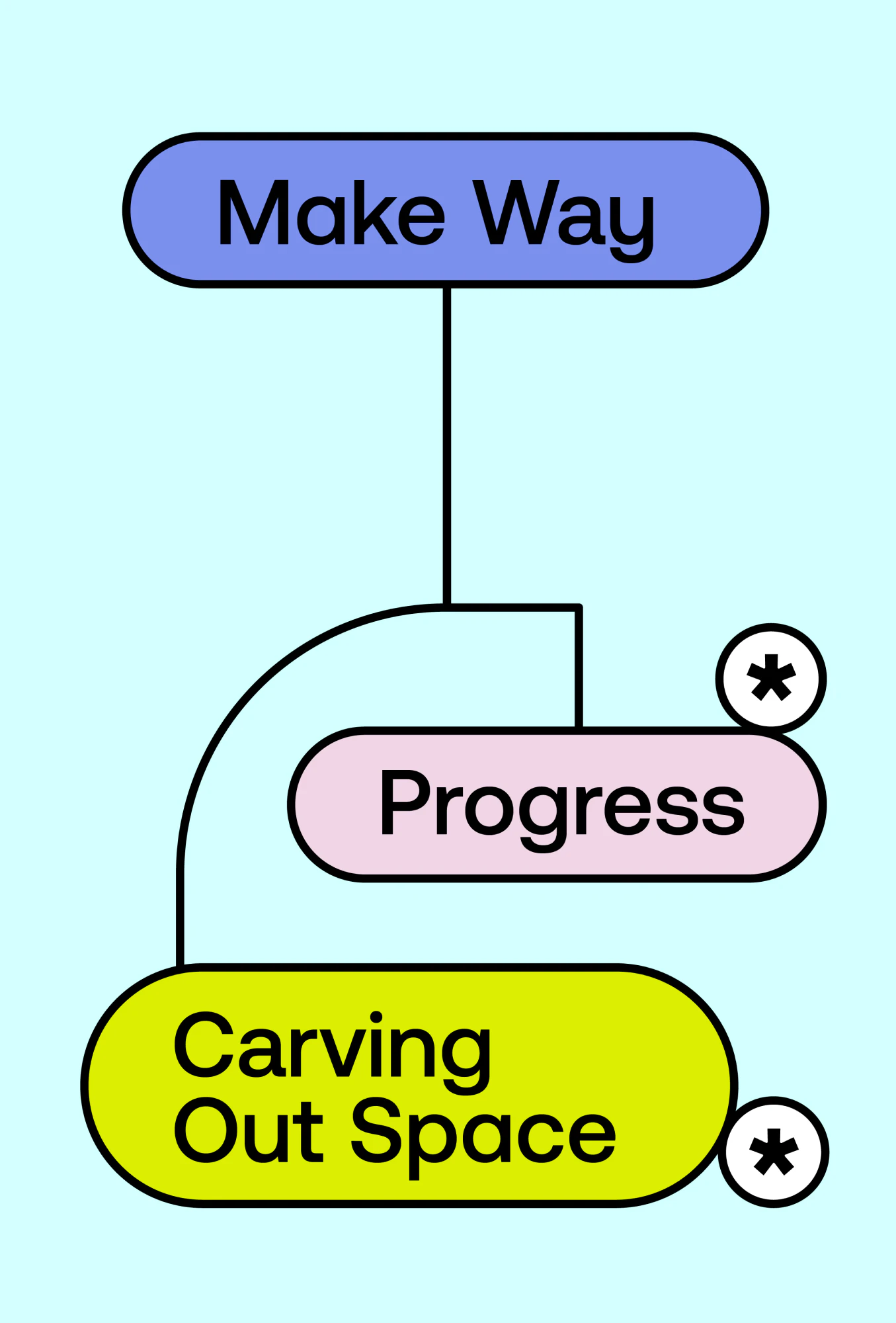
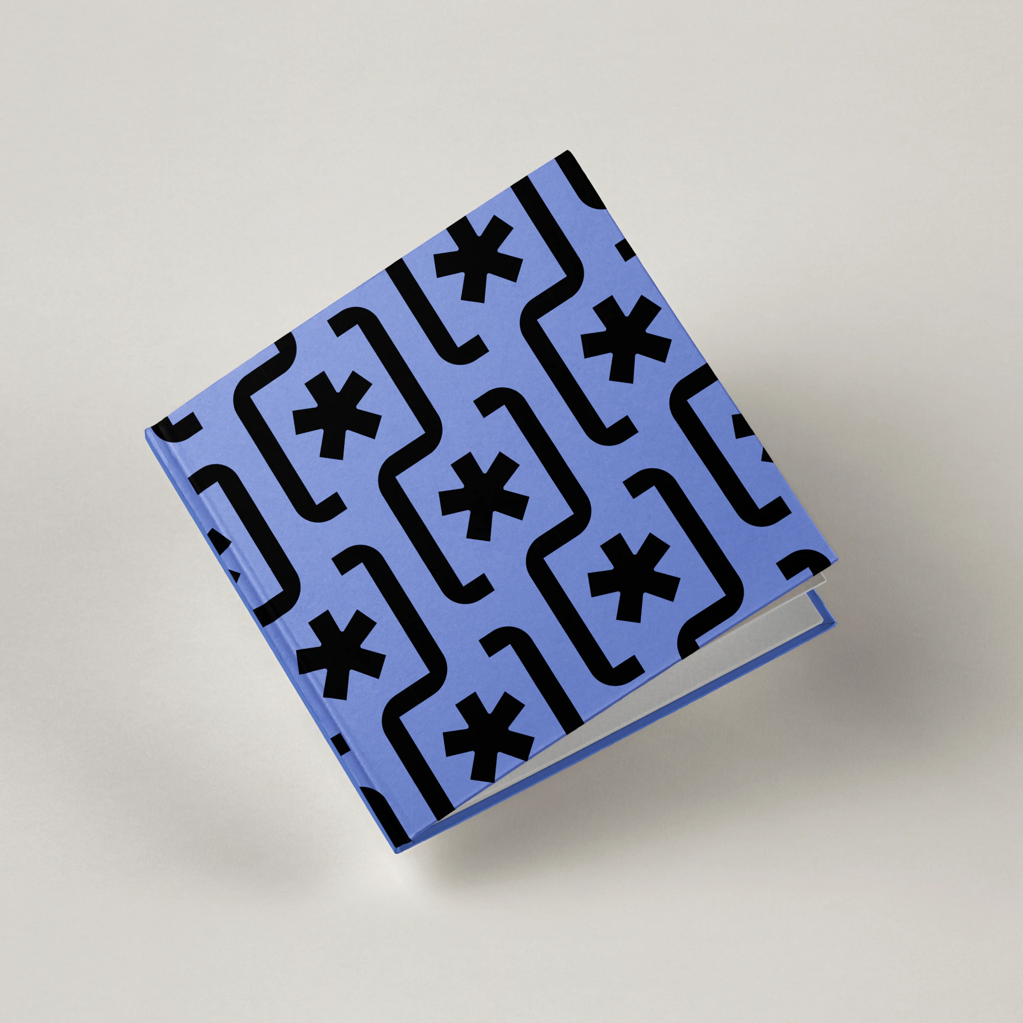
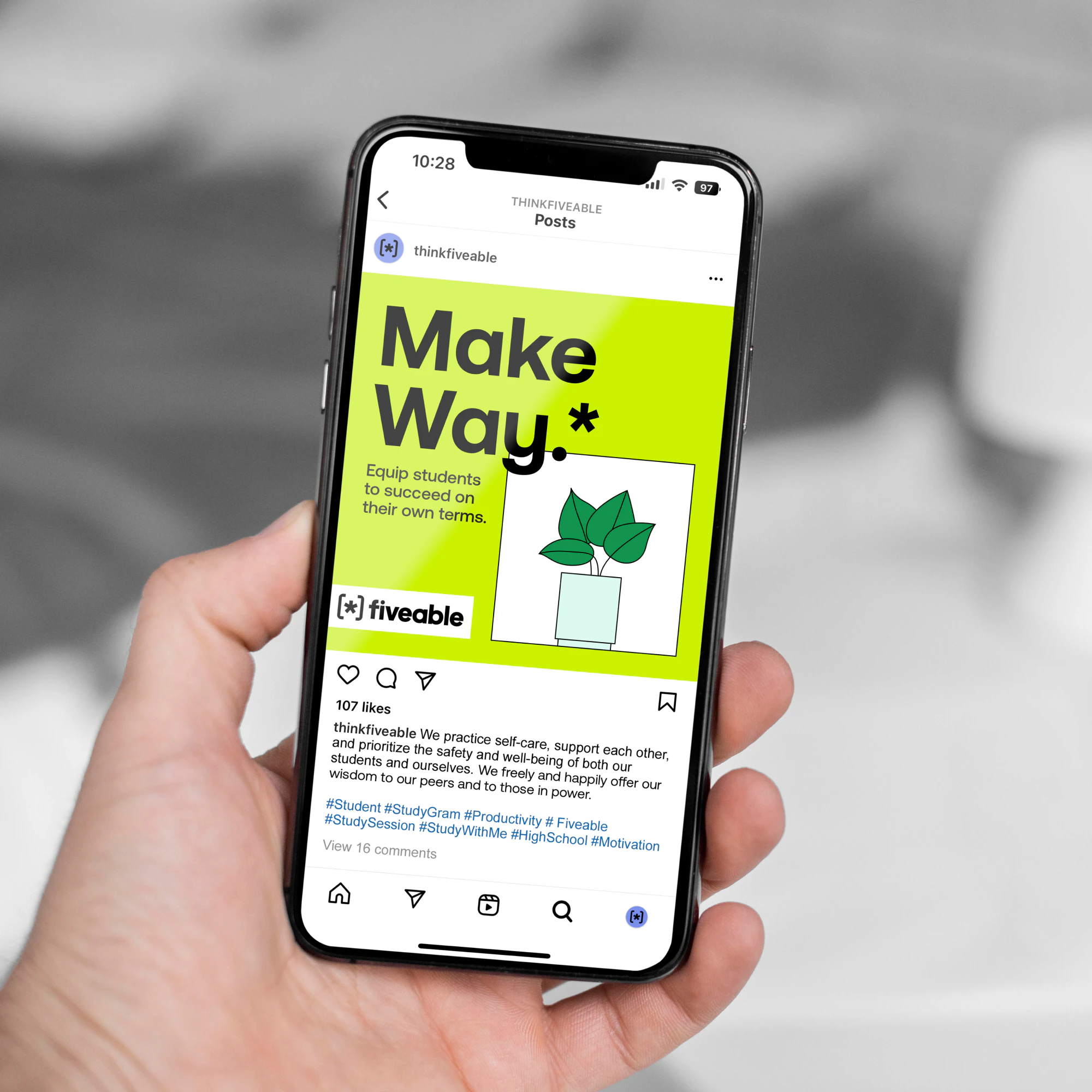
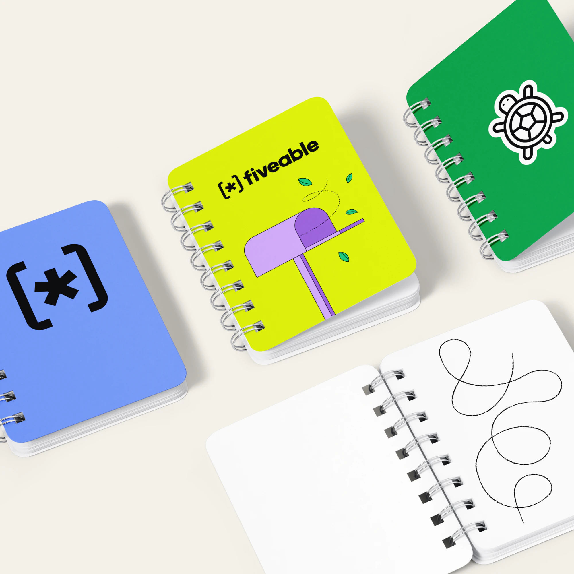
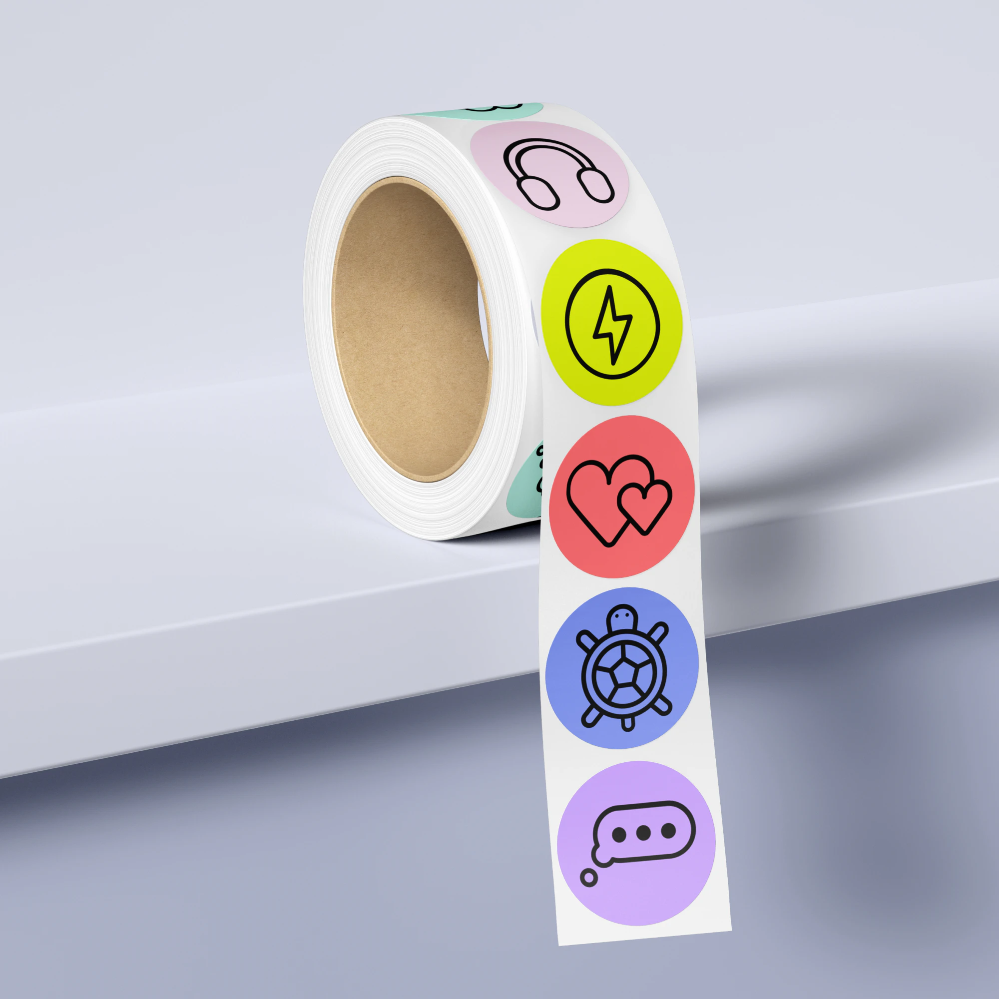
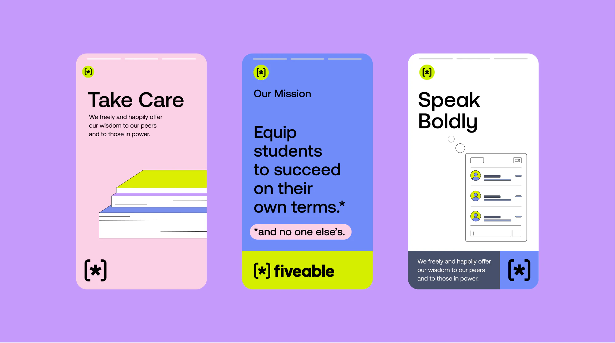
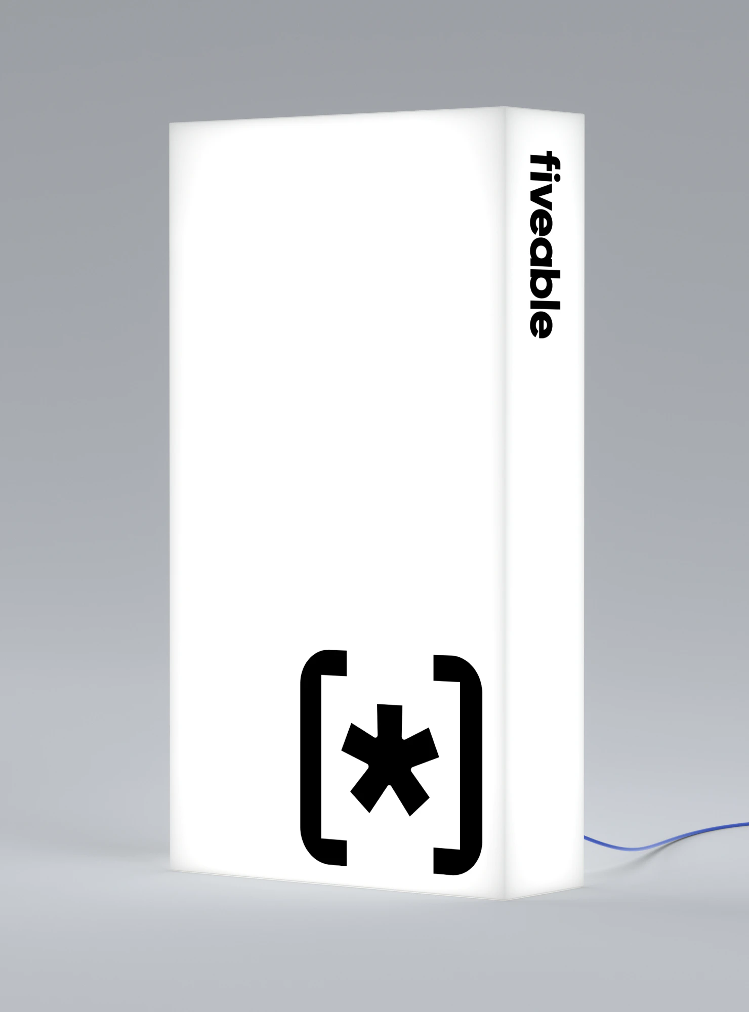
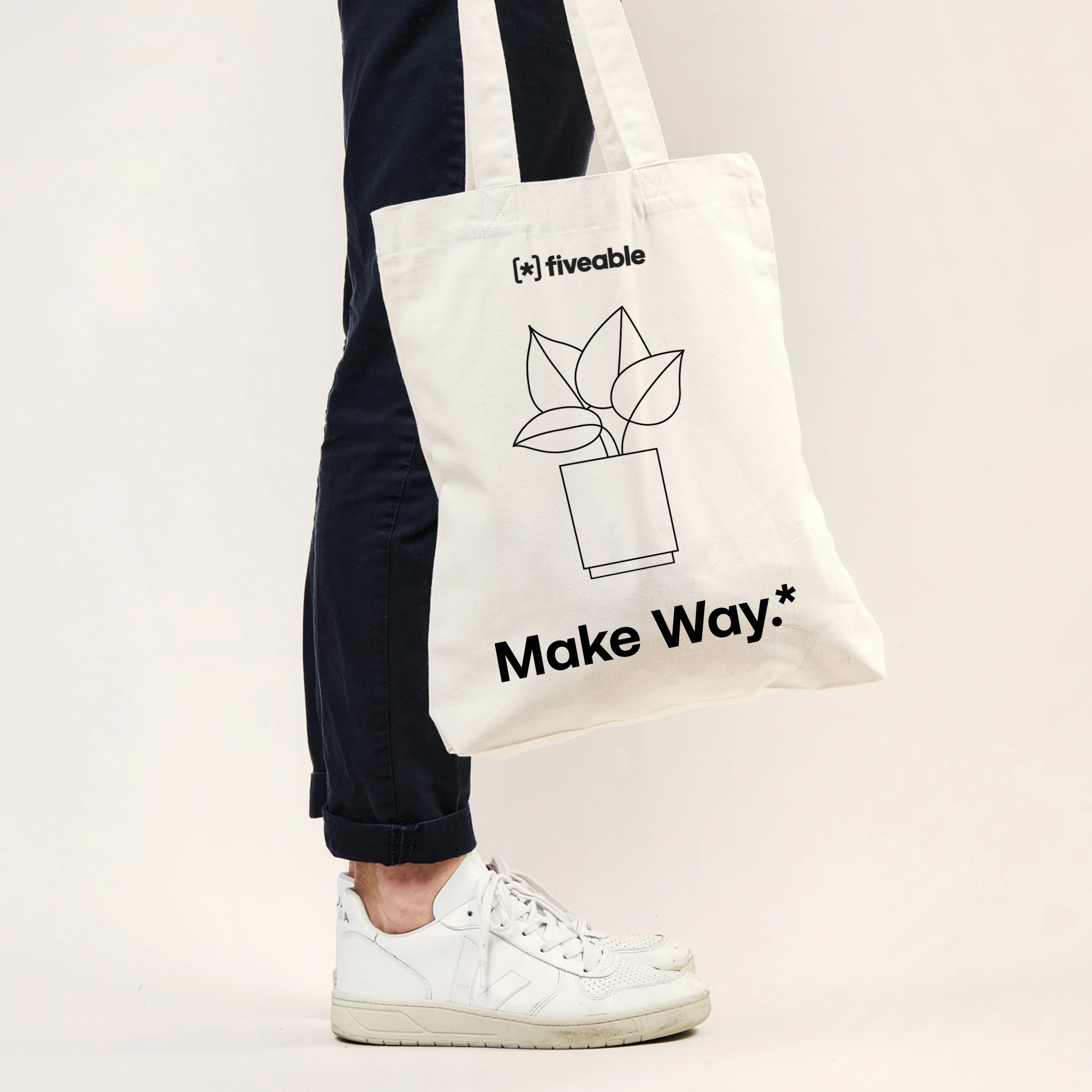
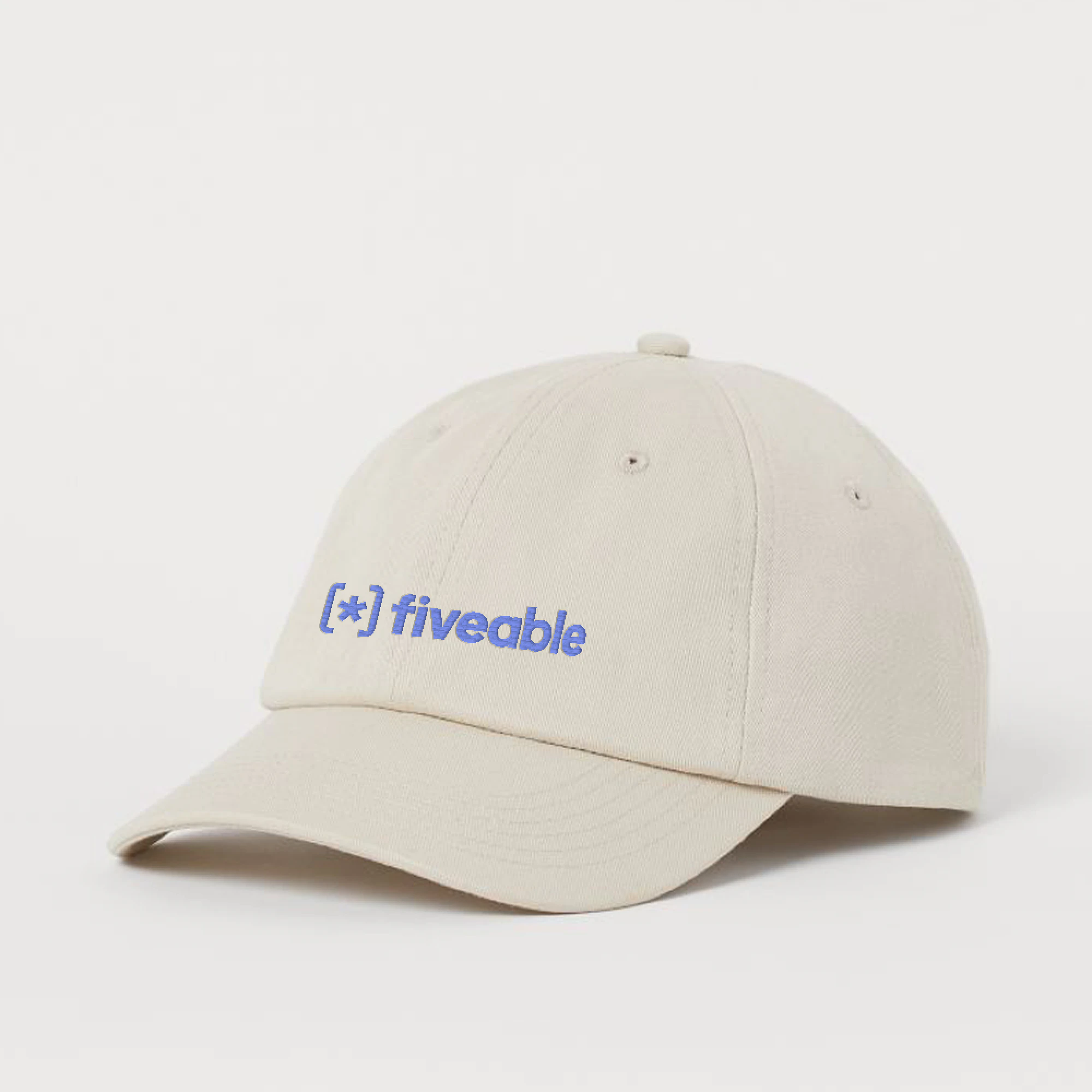
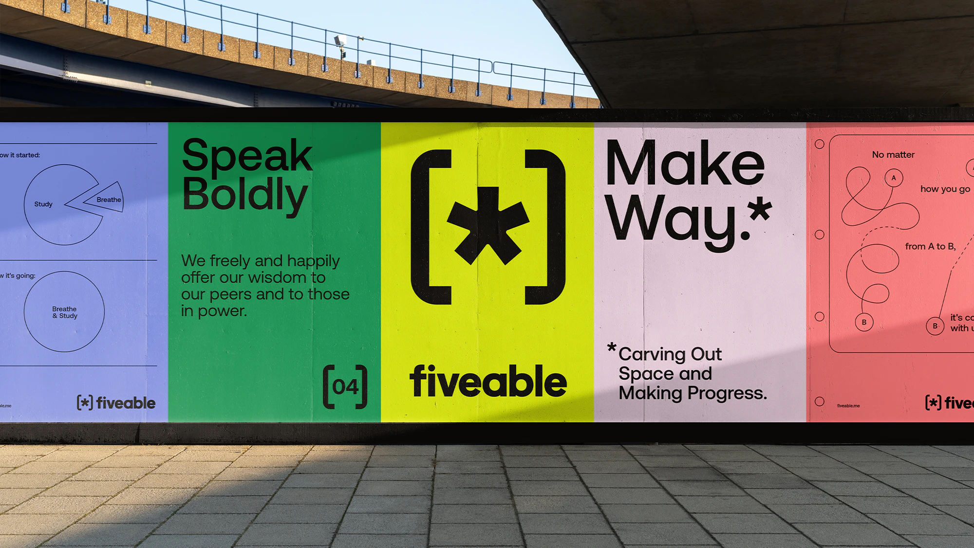
We began by developing a strategy that positioned Fiveable as a relationship-builder and a network with no boundaries—both trusted and personalized. Our creative platform, Make Way*, propelled Fiveable fearlessly forward, carving out a community space where all voices are heard and supported. We developed an ultra-fresh, bold—yet simple—brand identity to complement this confidence step forward of a strategy. The brand’s primary color palette features a distinctly youthful Highlighter yellow paired with a cool, grounding Recess blue. Fiveable’s new logo commands attention with a combination of the timeless Aeonik font locked up geometrically with the Make Way* asterisk. We also use the asterisk to create a dynamic pattern that suggests movement, playfulness, and moxie. Supporting brand identity elements take the shape of illustrated classroom mainstays: note paper, pens, charts, and graphs—all relatable to our target audience and evocative of productivity.


Diego Marini
Steven Ebert
Bridget Pavlick
Mariana Gonzalez Vega
Krystal Greven, Jen Holsman