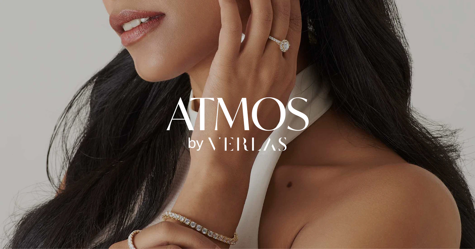
Atmos by Verlas
Brand Strategy, Visual Identity System, Tone of Voice
Verlas is a new kind of diamond jeweler that brings you brilliant, designer-quality pieces right to your home. When they decided to expand their diamond collection to include lab born ones, they needed a campaign strategy and execution plan that highlighted its sustainable origin and affordable price point, as well as the craftsmanship that went into each piece of jewelry. All this, while continuing to emphasize the exquisite quality and beauty of their earth-mined diamonds.
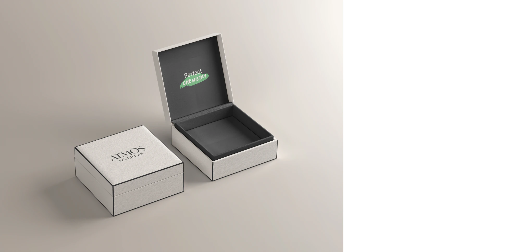
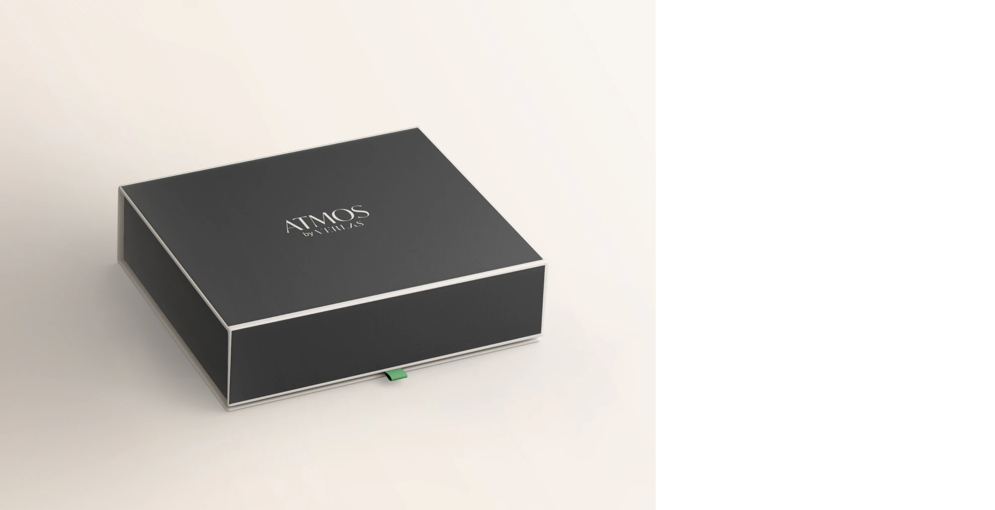
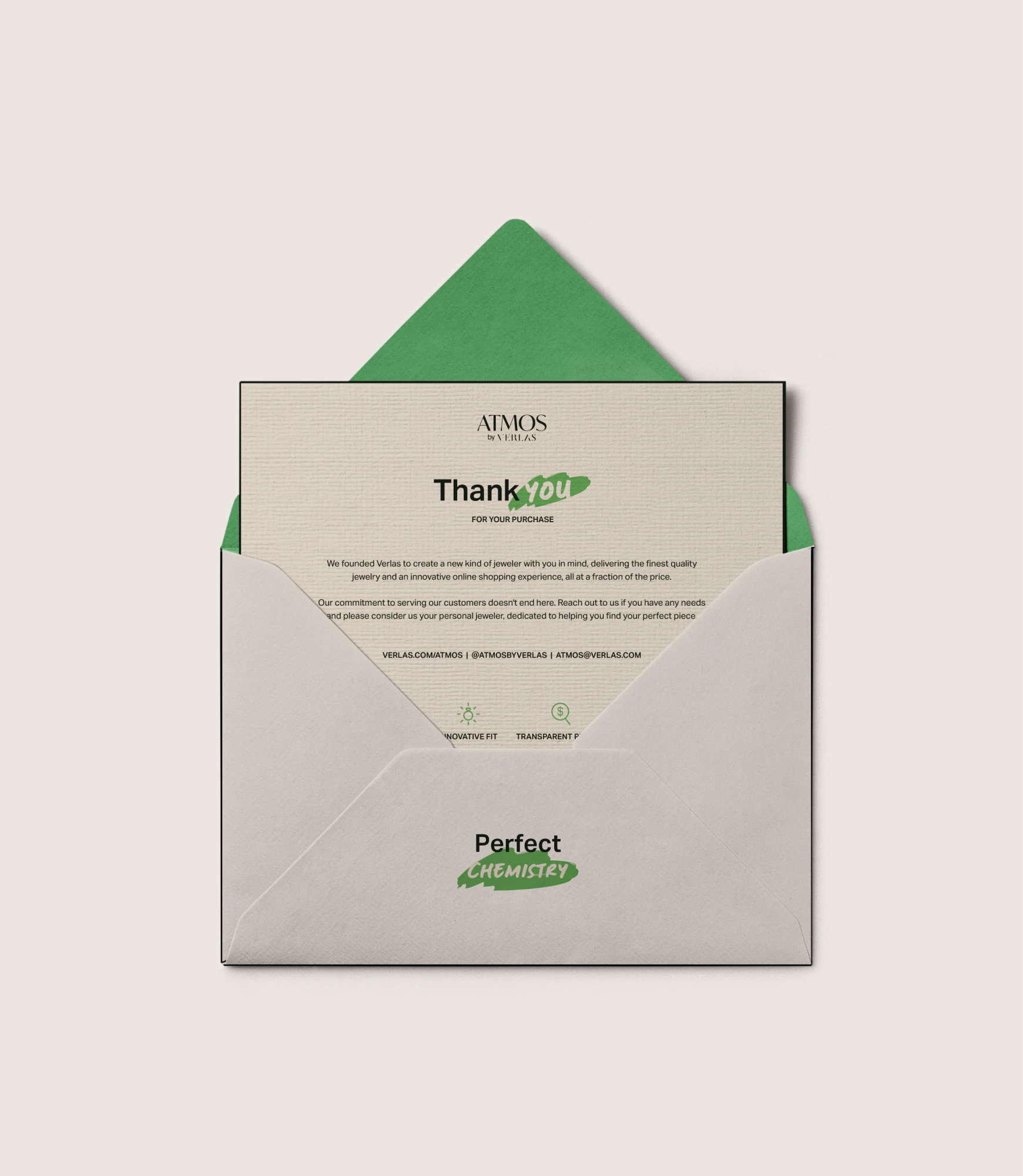
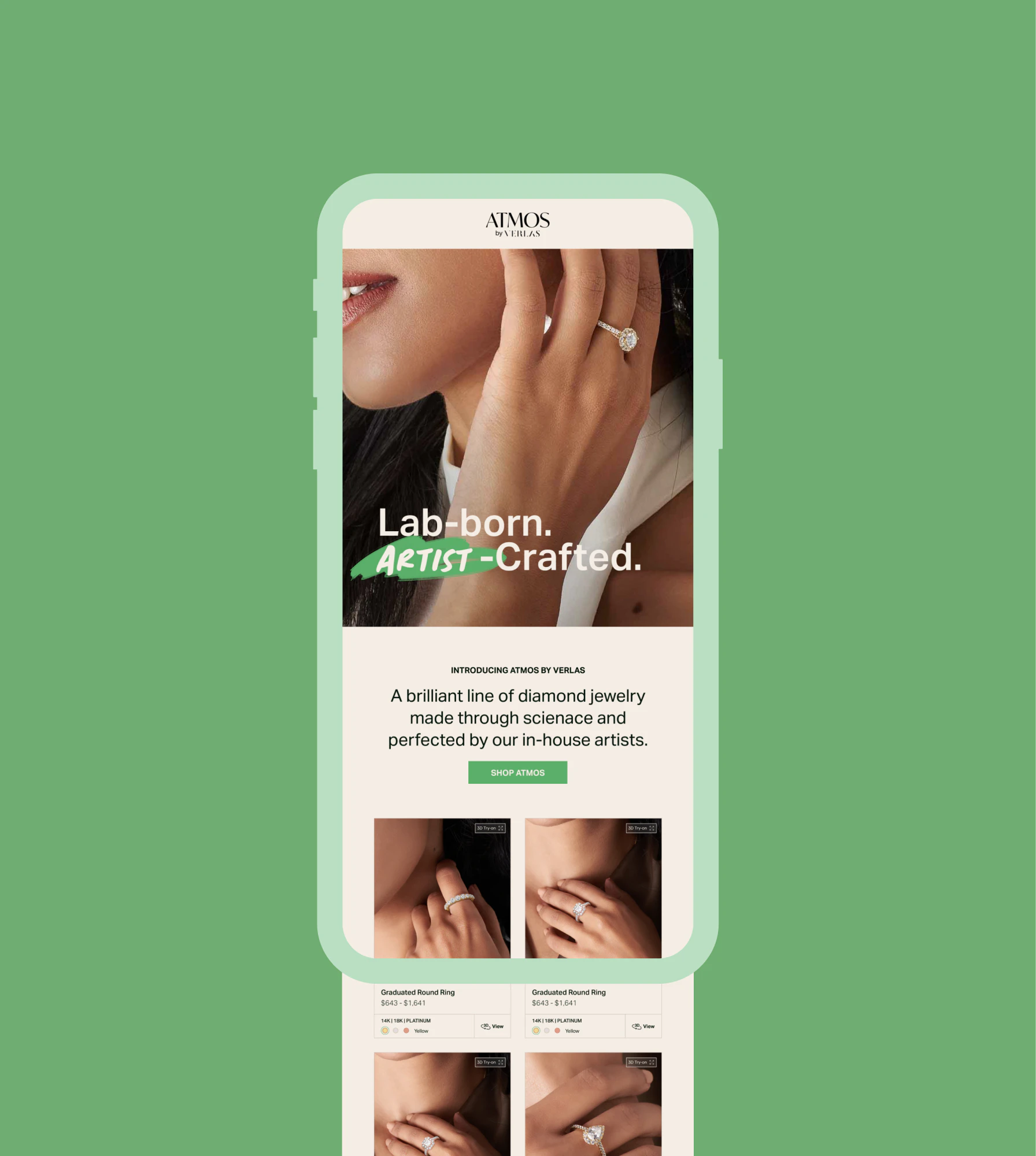
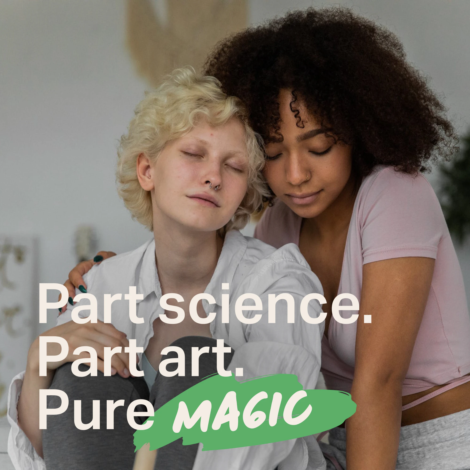
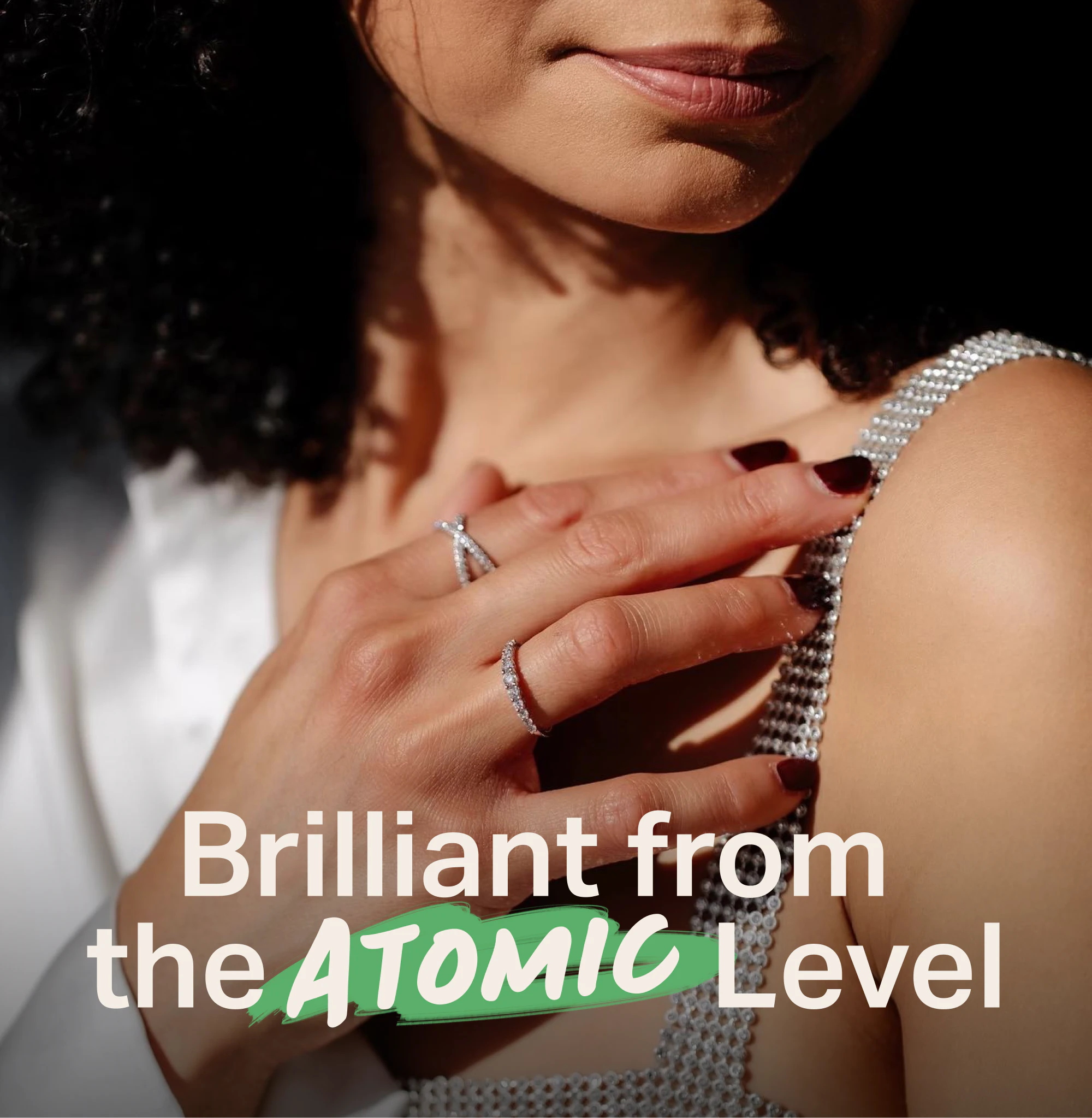
As a response, YummyColours proposed a strategy to establish the lab-born diamond jewelry collection as a distinct sub brand designed to resonate with the next generation luxury market but also retain loyalty and pique curiosity with Verlas’ modern day luxury client. YummyColours achieved this by putting emphasis on the harmony of human service and sophisticated technology and honing in on 360 experience of science, craft and service. This gave way to the creative platform of Perfect Chemistry and the creation of: “Part science. Part art. Pure magic.” Next, YummyColours dubbed the new collection Atmos by Verlas, named as a nod to the earth’s atmosphere and the concept of luxury just within reach. It puts science (that which makes lab-born diamonds a reality) at the forefront, while still evoking a romantic mood.
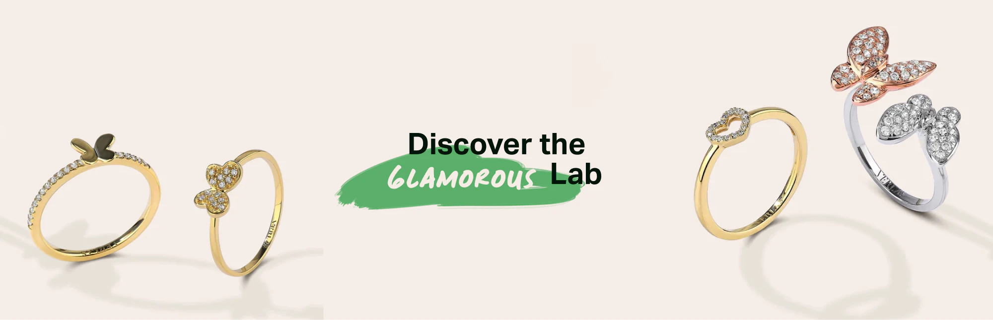
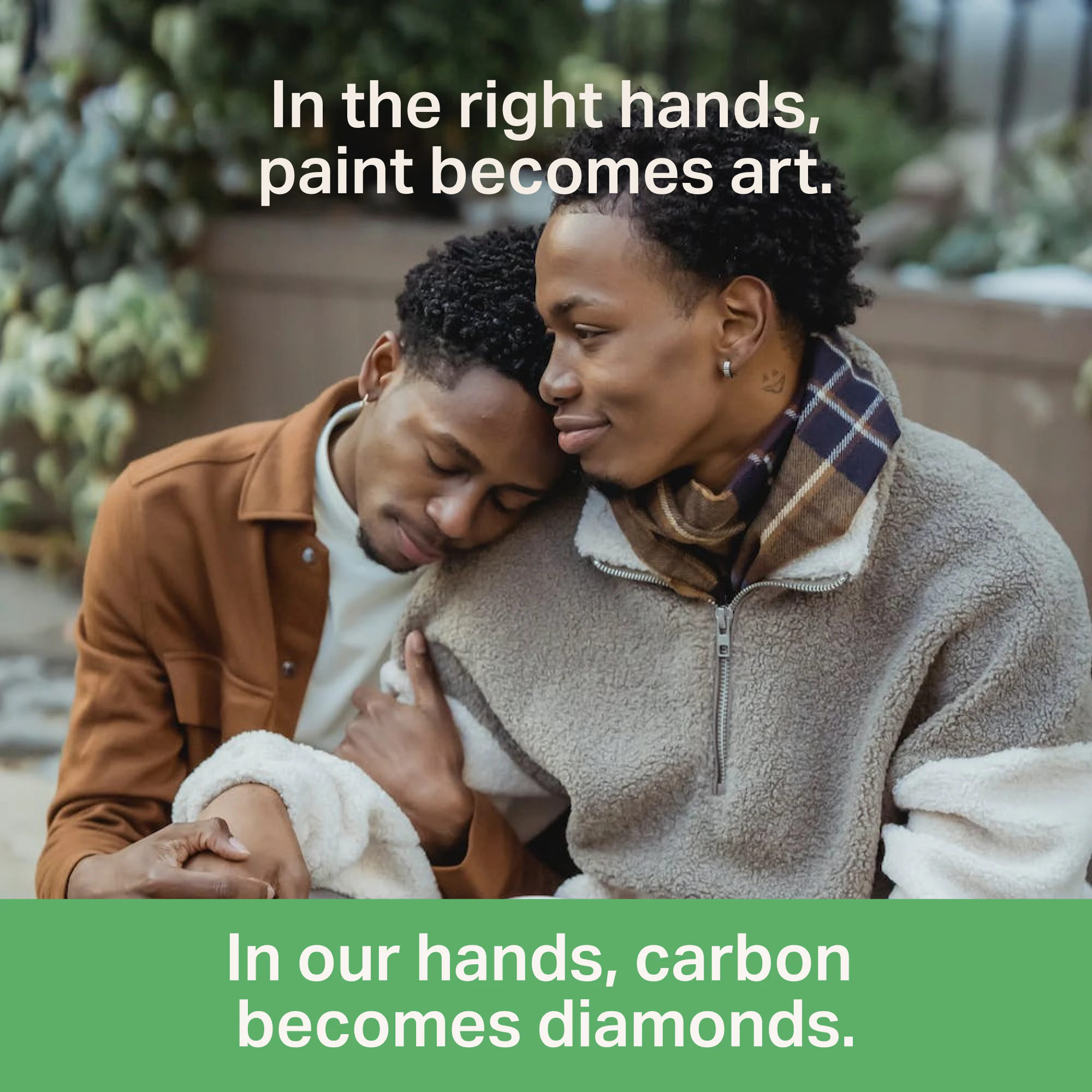
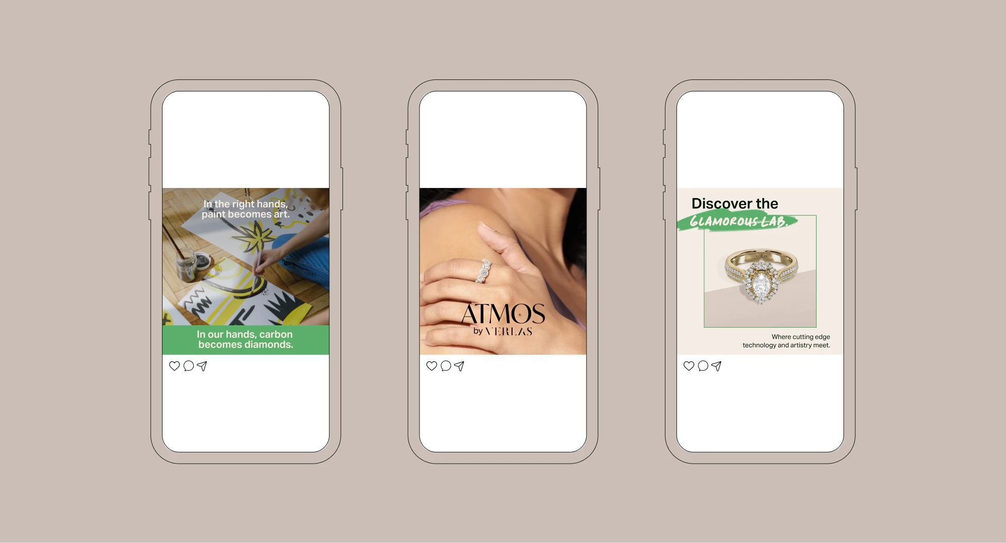
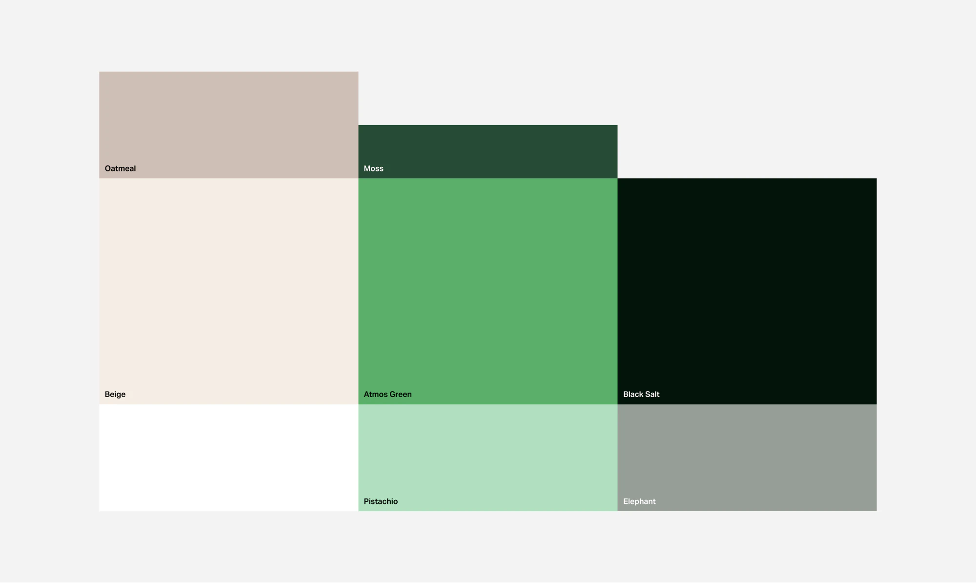
YummyColours continued this theme with the development of the In My Workshop campaign concept featuring real artists practicing their craft while showcasing stunning Atmos jewelry with the message, “In the right hands, paint becomes art. In our hands, carbon becomes diamonds.” The concept expanded further to include the Glamourous Lab where we change the idea of what a diamond lab looks like. YummyColours completed the Atmos visual identity with a color palette consisting of an Atmos signature green with compliments of Pistachio and Moss surrounded by clean neutrals - including a soft beige that makes a key appearance in Atmos’ digital presence. Jan Maack’s Ivy Mode creates a modern and minimal yet elegant wordmark that is supported by Verlas’ Aktiv Grotesk, ensuring the two brands are seen as one family. YummyColours infused a hint of playfulness and a nod to artists by pairing custom painstrokes underneath Cecep’s Handwriting for a keyword pop.
Denize Maaløe
Diego Marini
Dewi Billano
Jen Holsman
Kiyomi Dong
Mia Le